
Sharing the worlds finest logos, symbols and trademarks, Logobook is a source of inspiration for designers, entrepreneurs and anyone who simply loves logos.
Joined February 2017
- Tweets 69
- Following 20
- Followers 1,993
- Likes 1,404
50 Photos and videos


31 Oct 2024
A new vision of portrait illustration for all. A powerful new logo for a powerful new technology - MyPortraits.com
1
8
735
27 Jan 2024
How to draw a timeless logo?
Our number 2 choice from the 1960s was the outstanding British Rail logo, designed by UK design team Design Research Unit, by Gerald Barney, Rupert Armstrong, Milner Gray and Collis Clements:
creativebloq.com/features/be…
logobook.com/logo/british-ra…
17
1,263
20 Jan 2024
How to draw a timeless logo?
Creative Bloq, asked us to choose the best logo designs of the 1960s, alongside others #pentagramdesign. We agreed on the 1964 Woolmark logo, amongst others:
creativebloq.com/features/be…
logobook.com/logo/woolmark/
1
1
23
1,154
5 Oct 2023
Great feature by @AntoniaEmilyW on the best logo designs from the 60s - creativebloq.com/features/be… - Thank you @CreativeBloq for reaching out to Logobook. One more addition would be Stephan Kanchev’s Central Puppet Theatre logobook.com/logo/central-pu…
5
1,288
24 Jul 2023
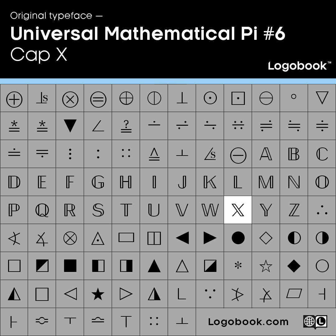
'X' Marks the spot
The future 'X' app logo is a letter from the Universal Mathematics Pi #6 typeface. A mathematics dingbats font, with hidden letters.
Great reveal of a beautiful hidden glyph.
We will surly be featuring it on logobook.com as soon as it goes live.

4
14
77
10,300
19 Sep 2019
A slightly controversial classic logo that we have not featured yet, has recently been redesigned. Which version should be featured on Logobook? Suggestions welcome.
3
3
36
8 Mar 2019
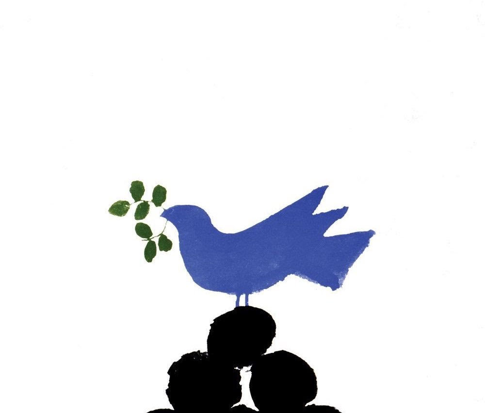
The maple leaf proves inspirational again for Ted Larson in this great logo for Canada’s Environmental Choice - see other great plant and leaf inspired logos here: logobook.com/nature/plants/ but the birds are key to bringing this logo to life: logobook.com/nature/birds/
3
2
32
7 Mar 2019
A classic logo by Ben Bos for De Gruyter, while at the legendary Dutch design studio Total Design logobook.com/design-company/…
1
1
22
5 Mar 2019
Speaking of photographers again, this logo for @Ali_Sharaf by @MashCreative highlights a good eye - logobook.com/logo/ali-sharaf…
5
5 Mar 2019
Authodontists are there to help us smile! Great ‘S’ logo from @nancywudesign for @FreySmiles on Logobook logobook.com/logo/freysmiles…
1
1
4
4 Mar 2019
Another great photography logo for @Fotografiska by @ida_wessel in Sweden. logobook.com/logo/fotografis…

1
7
1 Mar 2019
We love this photographers logo! Designed by @manasteriotti - logobook.com/logo/studio-ko…

1
6
1 Mar 2019
A brilliant and timeless design commissioned by @heinemannDF in 1972. Designed by the late Alan Fletcher. We would buy the t-shirt. logobook.com/logo/gebr-heine…

1
6
Logobook retweeted

6 Apr 2018
Adrian Frutiger logos from the 60s and 70s logodesignlove.com/adrian-fr…
30
21
123
Logobook retweeted

23 Jan 2018
The rather useful @logobooked is proving to be a popular student research resource for us logobook.com
2
4 Jan 2018
Le Pussycat cinema logo by Gilles Robert logobook.com/designer/gilles… and Raymond Bellemarre logobook.com/designer/raymon… 1969
12
4 Jan 2018
We are happy to share the news that there has been a significant update to the logobook collection over the past few weeks. Please feel free to browse all our categories with fresh eyes. Happy 2018! - logobook.com
4
4 Jan 2018
We are happy to share some beautiful work from Dublin based agency @workbypost - Thank you Seàn logobook.com/design-company/…

1
2
19
4 Jan 2018
Burton Kramer just shared another outstanding design that we had not seen before - Scene Magazine logo from 1982 - logobook.com/logo/scene-maga… Thank you Burton.

5
12 Dec 2017
Thank you for the beautiful work that will inspire us forever. Rest in peace Ivan Chermayeff - logobook.com/design-company/…
1
2
3