Typeface designer and font developer.
Joined April 2008
- Tweets 2,960
- Following 167
- Followers 6,262
- Likes 1,950
268 Photos and videos
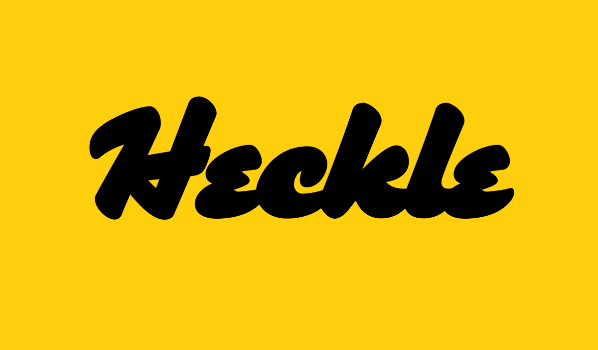


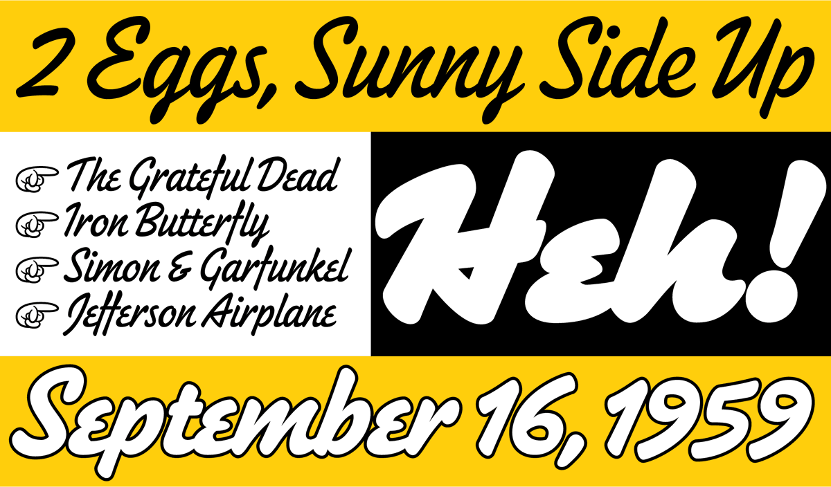
New! Heckle is a brush script typeface for display use. It started as a tiny sketch for a t-shirt design in 2005, based on my memories of script lettering from the ’40s and ’50s.
More info here: marksimonson.com/notebook/vi…
And here: marksimonson.com/fonts/view/…
3
9
368
Fifty years ago this month is when my interest in type design began... marksimonson.com/notebook/vi…
2
1
19
1,068

13 Dec 2025
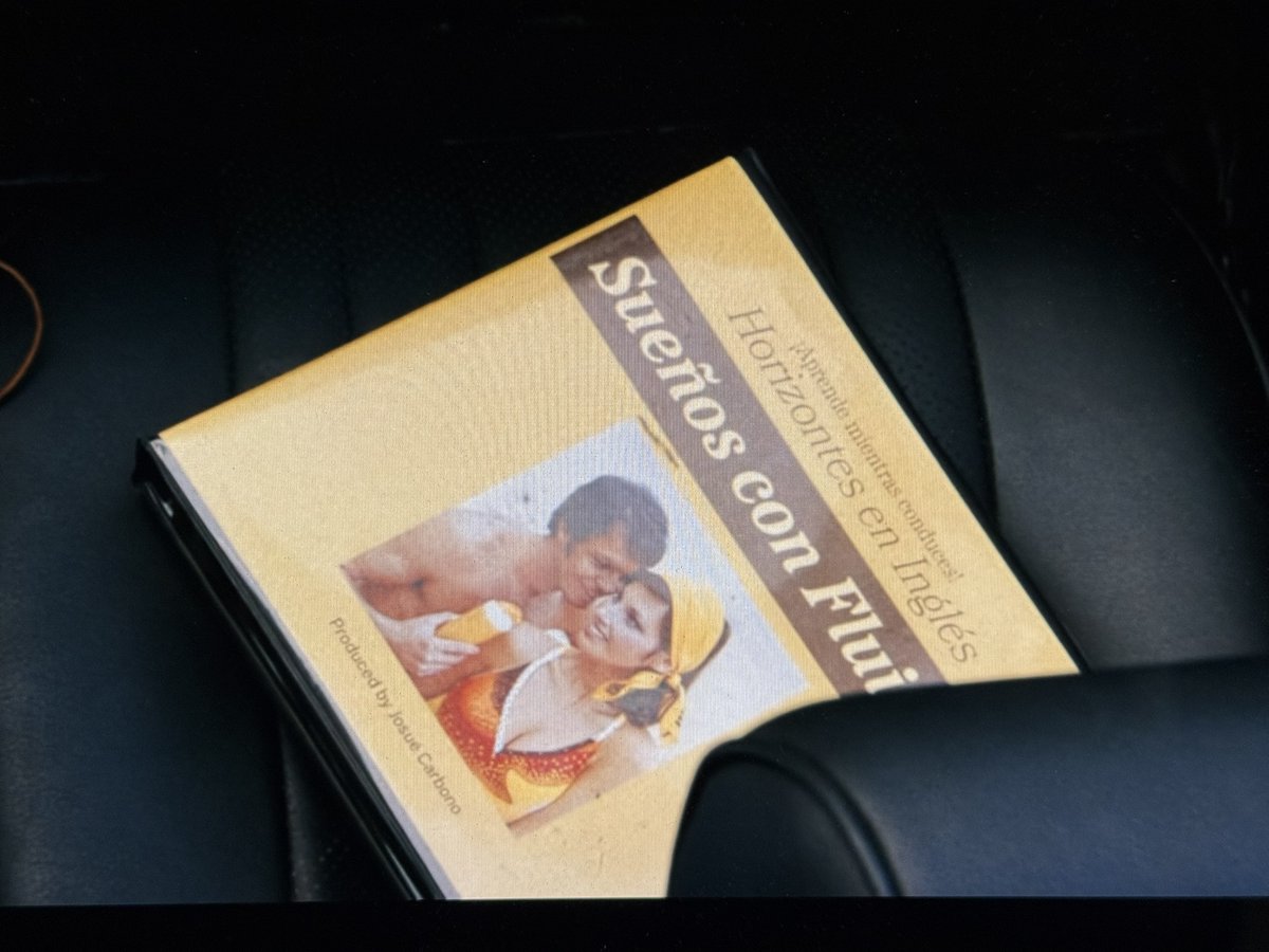
My Bookmania (Light Italic) and Etna (Bold Italic and Condensed) showed up for a couple of seconds in tonight's episode of #Pluribus ... (I hope this isn't a spoiler...)

5
334
Mark Simonson Studio retweeted

11 Nov 2025
More vintage modern goodness from @marksimonson today!
Vintage because I get phototypesetting vibes.
Modern because it is ripe for the serif trend happening right now.
10 Nov 2025

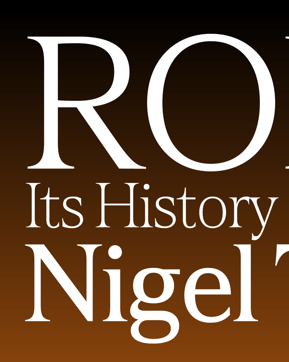
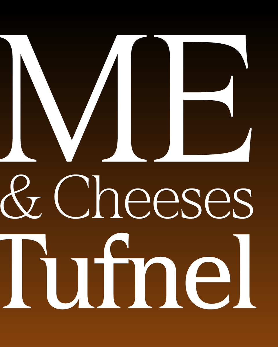
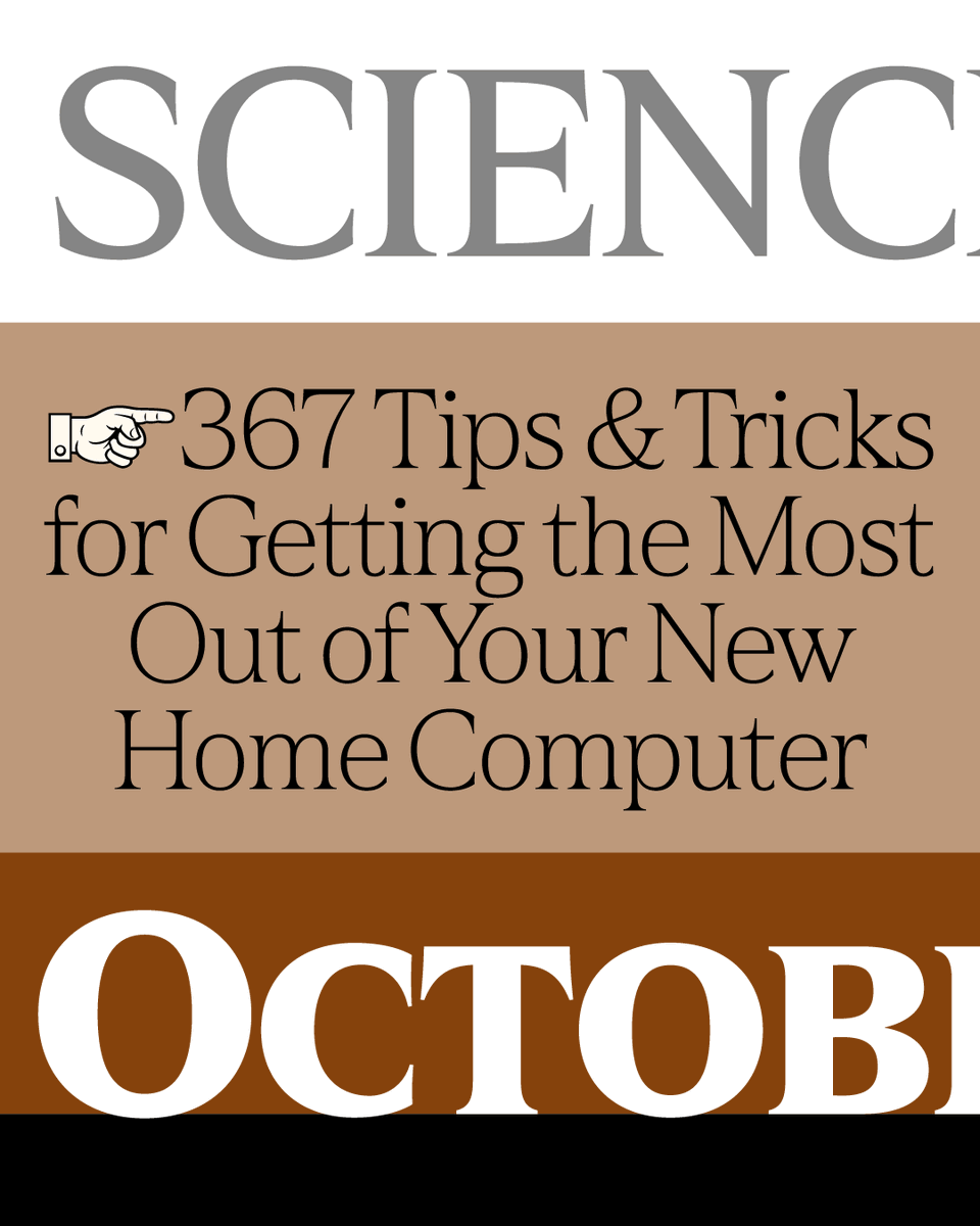
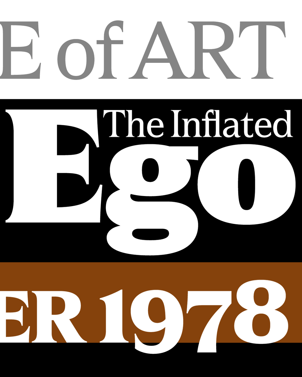
New! Hardcover is an elegant serif typeface intended for display use. It was one of my earliest typeface ideas, dating back to a sketch I did in 1978, inspired by the slick lettering I’d seen on mass-market book covers.
More info here: marksimonson.com/notebook/vi…
And here: marksimonson.com/fonts/view/…
1
4
393
10 Nov 2025
New! Hardcover is an elegant serif typeface intended for display use. It was one of my earliest typeface ideas, dating back to a sketch I did in 1978, inspired by the slick lettering I’d seen on mass-market book covers.
More info here: marksimonson.com/notebook/vi…
And here: marksimonson.com/fonts/view/…
1
11
679
22 Oct 2025
A few weeks ago, I did a talk for the Type Tuesday group in Minneapolis about the backstory behind Douglas F. Jones' Skin & Bones typeface and my revival of it. If you'd like to see the talk, I put it on YouTube: youtube.com/watch?v=jDAG7txa…
2
4
395
21 Oct 2025
My entire font library is now available on Typographer!
typographer.com @TypographerApp
13
693
24 Sep 2025
Mark Simonson Studio at 25: It didn't start out as a digital type foundry... marksimonson.com/notebook/vi…
1
11
446
21 Jul 2025
I'm not alone in being unimpressed by Apple Intelligence, but this is one of the most unimpressive examples: It frequently summarizes and highlights as "priority" phishing attempts in the Mail app as if they are real, but somehow lacks the brains to identify them as fraudulent.
1
326
30 Jun 2025
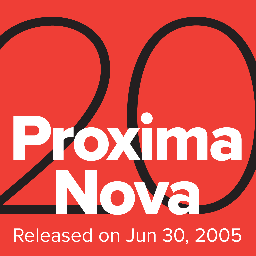
The growth and popularity of Proxima Nova in the last twenty years is beyond my wildest, most optimistic expectations when I released it in 2005. I feel incredibly lucky and grateful to everyone who has helped along the way, and especially to all the designers who decided that it was the best font for the job. marksimonson.com/notebook/vi…
3
2
51
3,565
18 Mar 2025
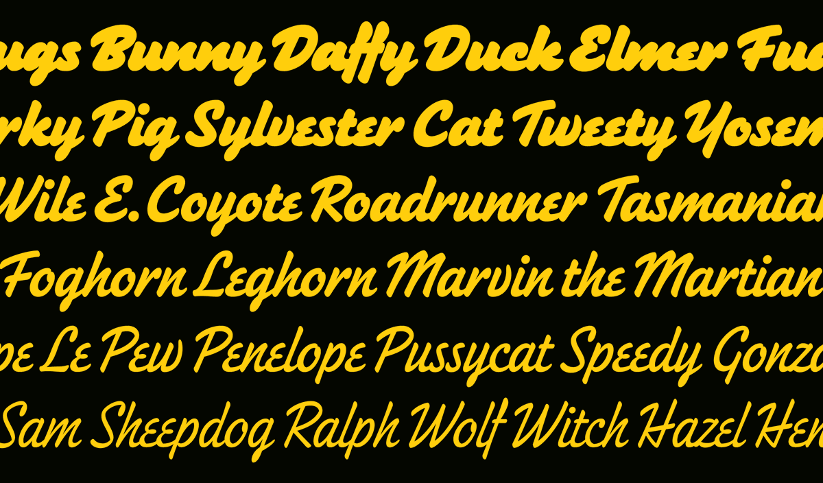
I'm happy to see that WB Animation is still using the lettering I did for them in 2008 (the part below the WB shield). Seen on the trailer for their latest feature, "The Day the Earth Blew Up," which I hear is good.

2
3
15
1,096
6 Mar 2025
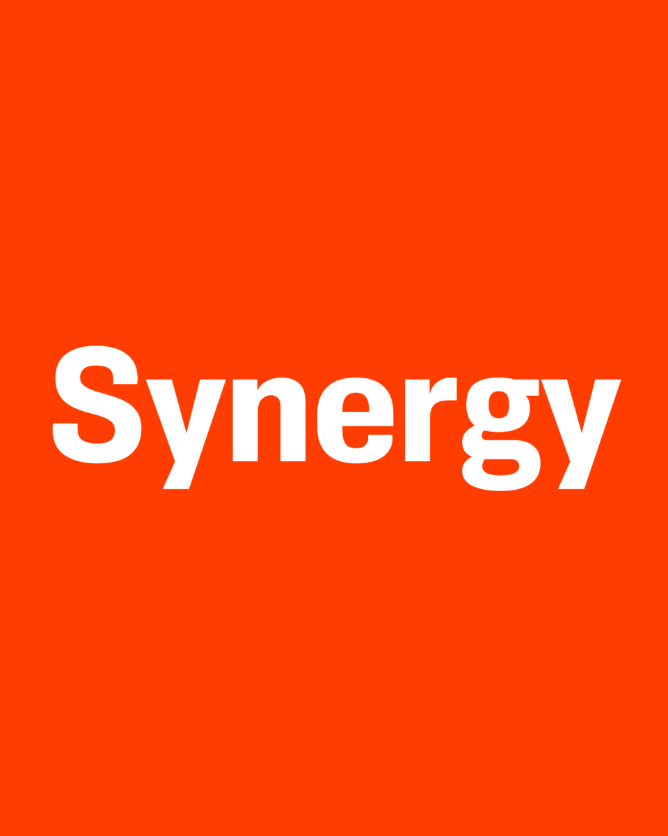
The story of my latest typeface, Synergy, goes back to a couple of sketches in 1981. Read more here: bit.ly/3FimrO5
3
2
25
1,352
4 Mar 2025
Synergy is a new sans serif I’ve created. It’s a simplified grotesque with a clean, modern appearance. Suitable for display and text with its open shapes, matching italics, small caps, and a wide range of weights. bit.ly/3QLGszo
2
24
1,056
23 Feb 2025
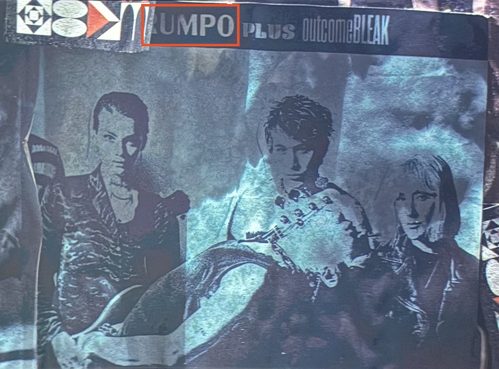
I've been rewatching season 1 of Severance and spotted my Acme Gothic on a band poster. It's only there for a split second, but it caught my eye, of course. The name is obscured, but thanks to a little research, I discovered that it's "ABRUMPO" (latin for "separated") fronting for "Fissureman."
2
4
491
4 Feb 2025
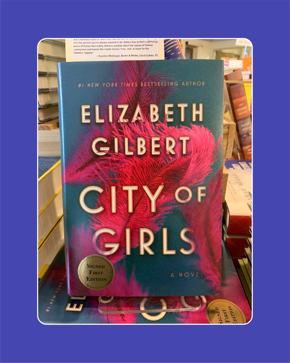
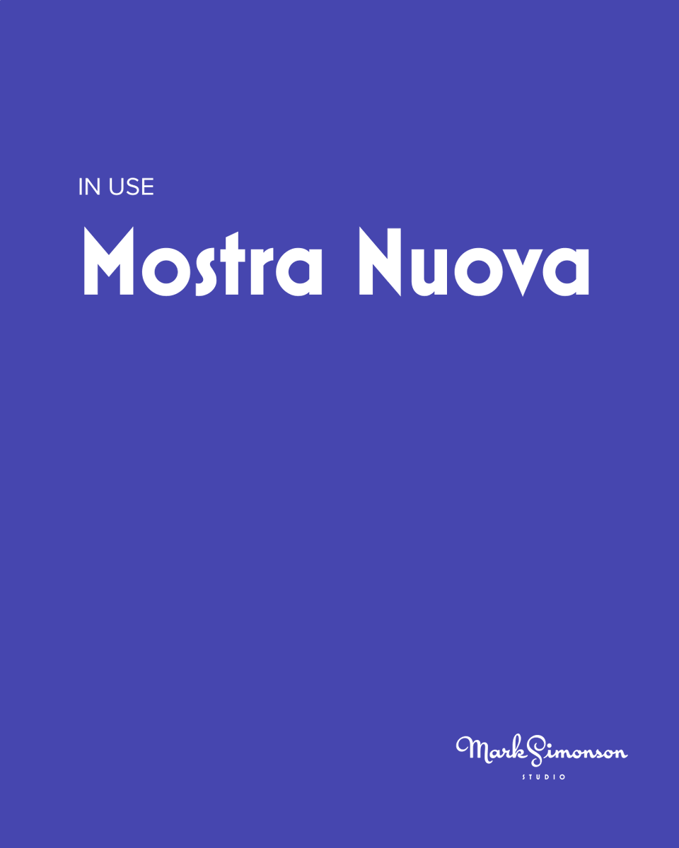
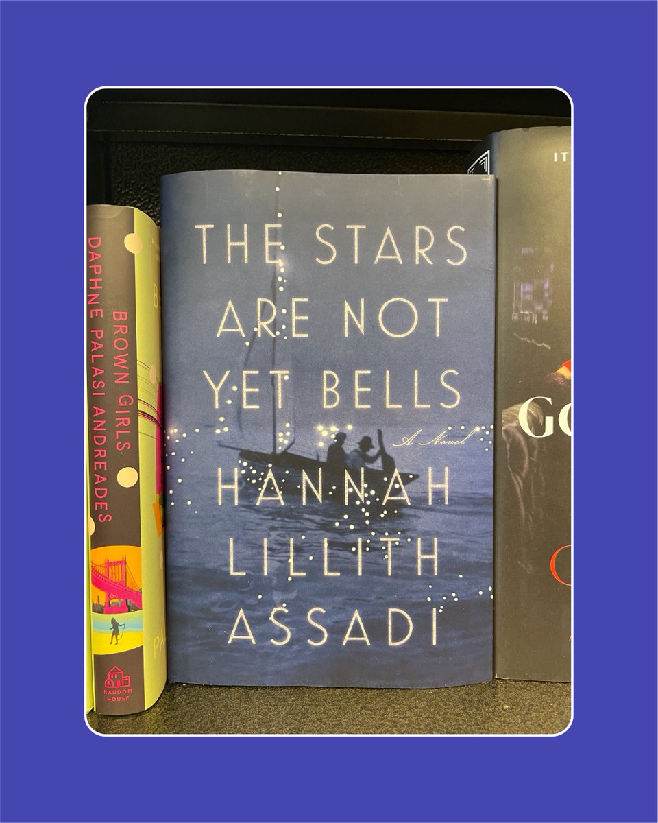
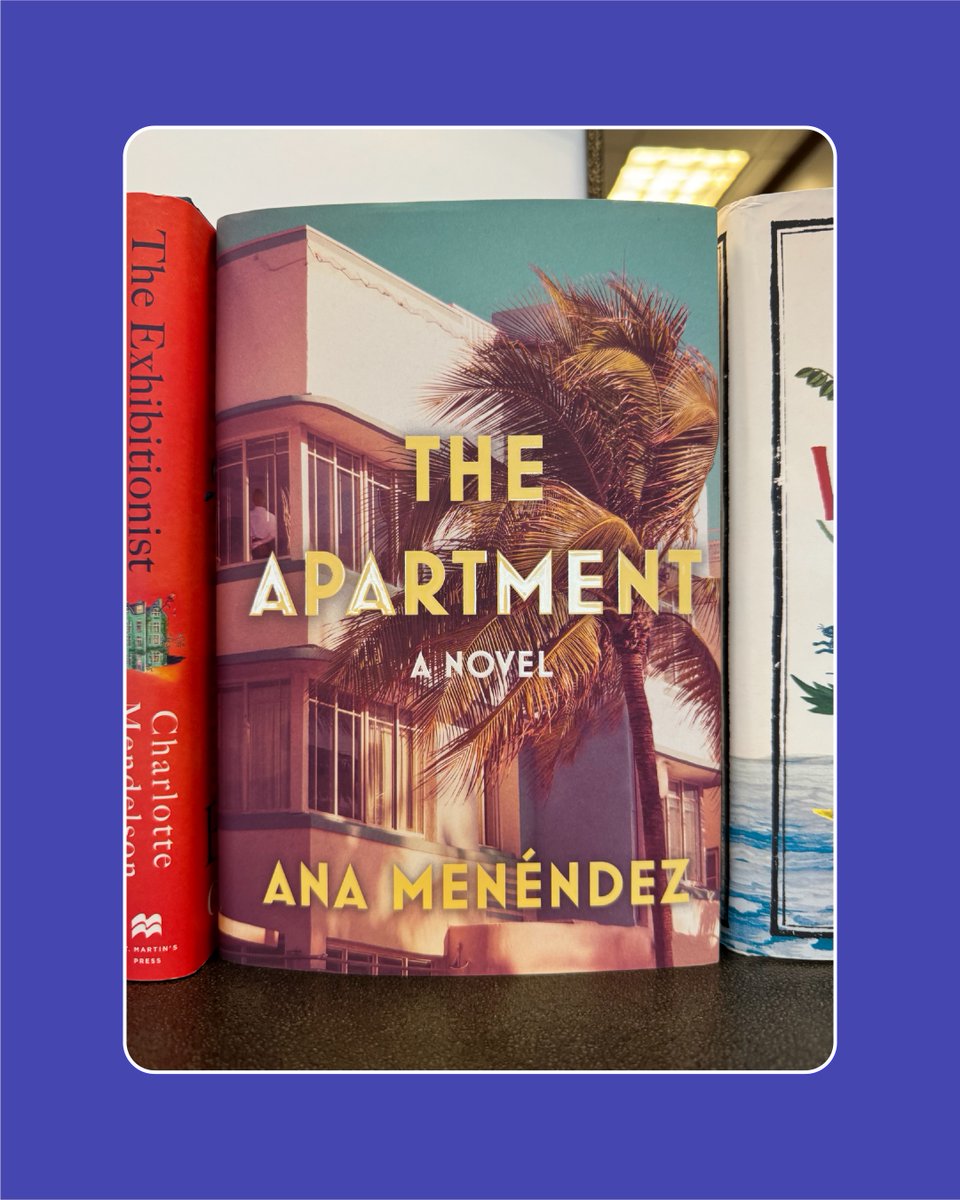
Mostra Nuova, a geometric Art Deco face, has been used on many, many book covers. The variety seen here—a small sampling from my personal collection—is impressive for a family so specific.
License it here: bit.ly/3WLEnGW


1
4
303