
marketing, creative direction, content, & branding for web3 🖼 im something of an art collector myself
Joined March 2021
- Tweets 1,091
- Following 972
- Followers 3,180
- Likes 1,513
220 Photos and videos


Pinned Tweet

27 Apr 2022
Missed out on @okaybears?
Graphic designer here trying to break down the genius of their branding and how to spot another branding play like this early on 🧵👇🏻
97
285
1,342
18 Jul 2023
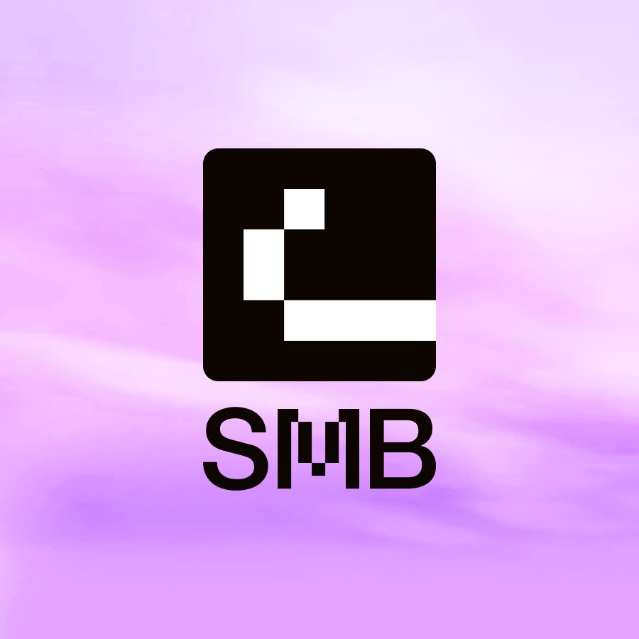
one last thing that bothers me though is the typography. it’s not in a consistent typeface.
maybe the designer wanted to emphasize the “M” for monke but it looks way too distracting here and throws off the visual balance
3
4
686
18 Jul 2023
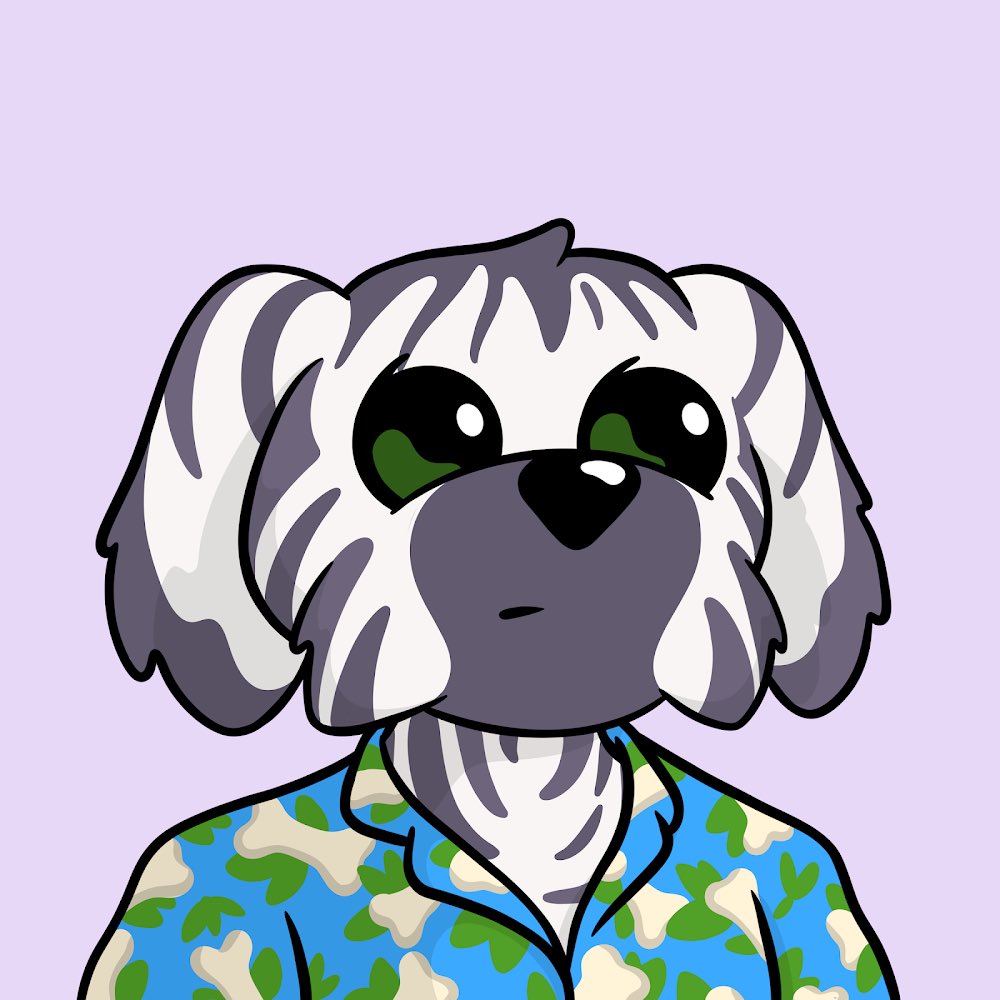
love @MonkeDAO though and i hold barrels, gen2, and gen3 so this is all just constructive criticism cause i see room for improvements as a graphic designer
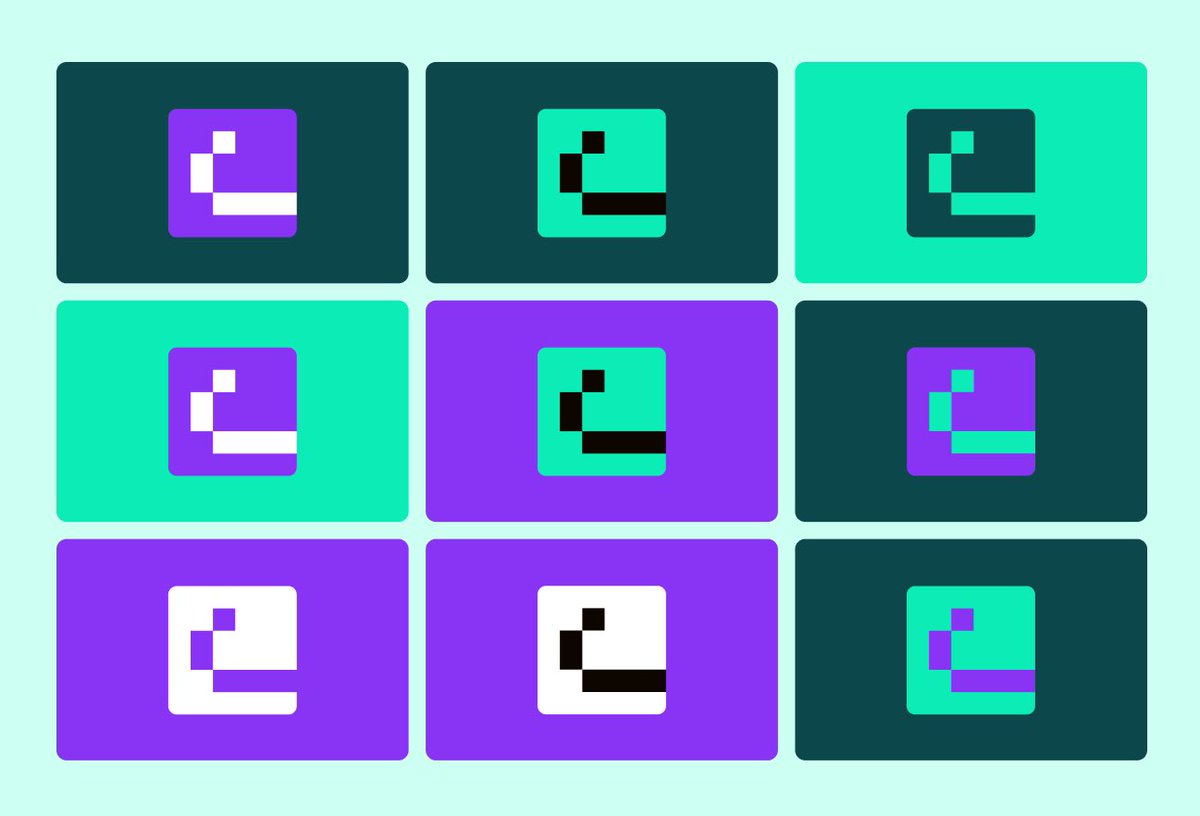
what do you think of the new branding?
4
490
18 Jul 2023
as a graphic designer i like this take a lot minus the “s” solana logo. just a lot more recognizable with the eyes added
logos aren’t supposed to be so straightforward but when it’s barely recognizable to most holders, there’s a huge disconnect there
1
1
13
957
6 Jul 2023
been a while since i bought something just for the art! finally some quality art! @Tainaker @fivedollarnft
1
1
729
6 Jul 2023
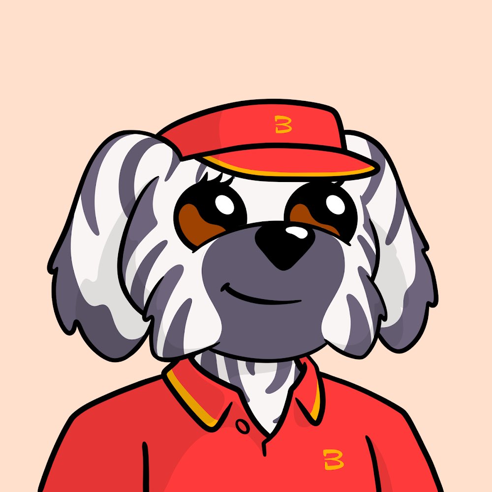
finally pulled the trigger after wanting one ever since i started nfts! thought he looked clean and matchy
how’d i do? @SolanaMBS @MonkeDAO
33
9
166
10,171
4 Jul 2023
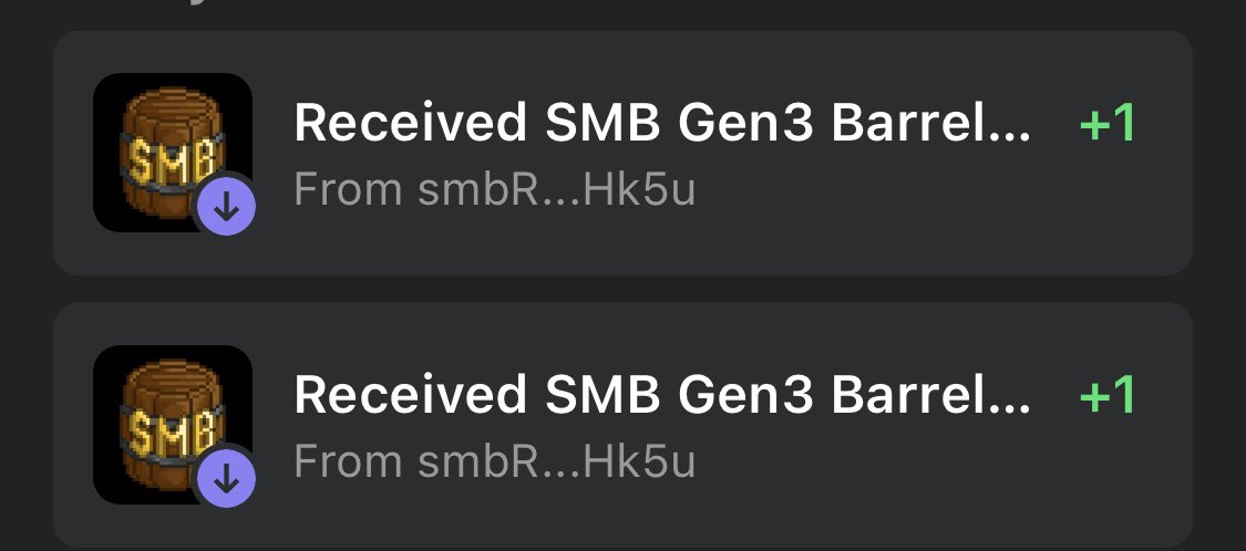
won a legendary @BoDoggosNFT just for buying smb barrels on @solsniperxyz!
best marketplace for buying. so underrated honestly. more people should be using it 🫶🏻
16
21
88
5,134