
Software designer
Joined March 2011
- Tweets 2,103
- Following 1,539
- Followers 1,088
- Likes 18,595
298 Photos and videos


Pinned Tweet

27 May 2024
Little weekend prototype: iMessage style card stack. Always love a good reason to dive into @FacebookOrigami and work through visual interactive puzzles like this. Here’s a bit about how I built it and a link to download ↓
37
71
1,333
166,855

Nate Smith retweeted

Apr 25
You can turn 10,000 photos into anything once you get access to the GPU.
68
194
4,785
369,674
Apr 26
Arbitrary scroll clipping is one of my biggest pet peeves in UI. Gradient fades are a nice technique, especially when they only appear on-scroll.

Kinda related: Inline scroll areas that cut off suck as well.
Adding a scroll-driven mask to the top and bottom makes it feel much smoother
2
285
Nate Smith retweeted

Mar 31
i think its disrespectful to have others read your AI slop that you probably spent less time inputting a prompt for than it would take us to read

when software had a soul
there was a moment around 2005 when using a Mac felt like touching something alive.
the dock bounced. the genie effect swooped. exposé scattered your windows like cards on a table. none of it was strictly necessary. all of it felt like someone cared – not about metrics, but about the feeling of using a machine.
software back then had texture. it had a philosophy. you could feel the person behind it. someone made a decision to make that icon beautiful, to animate that transition just so, to write that error message with a little warmth. apps had personalities. some were weird. some were over-designed in ways that would make a modern PM flinch. but they were alive.
the web was the same. personal sites were genuinely personal. blogs felt like letters. forums had regulars. you knew who made what. the internet had neighborhoods, and each one felt different.
nothing was optimized for scale. things were made by people who loved what they were making.
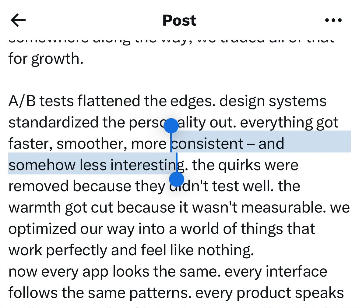
somewhere along the way, we traded all of that for growth.
A/B tests flattened the edges. design systems standardized the personality out. everything got faster, smoother, more consistent – and somehow less interesting. the quirks were removed because they didn't test well. the warmth got cut because it wasn't measurable. we optimized our way into a world of things that work perfectly and feel like nothing.
now every app looks the same. every interface follows the same patterns. every product speaks in the same calm, frictionless voice, siloed in their own little islands. the humanity got rounded off.
and then came AI agents. and the speed got inhuman.
now you can generate an entire product in an afternoon. ship a feature before lunch. spin up ten variations before anyone's had their coffee. the gap from idea to code is basically zero.
which sounds incredible. and it is. but there's a catch.
when making things are too easy, the slop comes for free too. mediocre things don't look obviously bad – they look fine. they work. they ship. they pass review. and now there are infinite of them. the internet is filling up with software that functions but means nothing. interfaces that are correct but feel dead. products made by agents, reviewed by no one, shipped into the void.
this is the thing that keeps me up at night. not that AI will replace people who care. but that it will drown them out.
here's what I still believe: the best things are made by people who couldn't help themselves. someone who lost sleep over an icon. who rewrote the same line of copy twelve times. who added an animation nobody asked for because it made the thing feel right. that obsession – that's not inefficiency. that's the whole point.
AI doesn't make that irrelevant. it actually makes it rarer and more valuable. taste is not a markdown skill. caring is not a parameter. the weird, specific, "soul" thing you put into something – that can't be programmed into existence.
the path forward isn't to make more slop faster. it's to finally give people with real vision the tools to make the thing they always imagined but couldn't build alone. the designer who had the idea but couldn't code. the kid who saw something nobody else saw. the person who cared too much about something most people wouldn't notice.
if we get this right, we don't get a faster factory. we get a renaissance. more strange, personal, opinionated software made by teams of people who care and mean it.
that's still possible. but only if the people who care get the space and tools to actually express themselves – and don't just hand the wheel to the agent and walk away.
17
30
1,003
61,876


Jan 28
Hey @figma, i got used to pressing CMD T and having the search field auto-focused; this let me immediately open a new file. now you made this fancy new overlay menu and don't autofocus the field.. this adds real friction to my workflow.
1
1
167
1 Nov 2025
It’s abysmal

328
7 Oct 2025
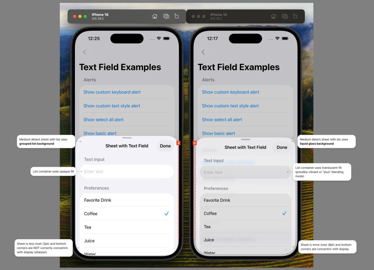
There are so many islands here… so much more visual noise than if it were a single, docked bar with icons and subtle separators. Hard to imagine that this is a UI paradigm that will stick around for long in its current form.

Yes, the new toolbar has The Glass. It’s got some other neat tricks, too. We’ll save those details for the big reveal.
This redesign is so nearly ready, beta dropping very soon.
3
6
1,764
7 Oct 2025
In a few years, docked bars are gonna come back, and ppl are gonna act like it’s the greatest thing since sliced bread.
1
130
24 Sep 2025
Yea I noticed this yesterday. It’s super subtle, but all of the glass elements have a bit of HDR boost, especially the edge highlights, which totally disappear in SDR screenshots.
Lightroom has a handy “Visualize HDR” option, which shows this nicely.

23 Sep 2025

this is not an accurate representation of how it actually looks on-device
Apple did a very… Apple thing here and realised that they may as well use the hardware they make, so Liquid Glass on light mode is literally whiter than white
these elements ALWAYS render in HDR — not intensely, but they are indeed slightly brighter than #FFFFFF
SDR screenshots simply flatten this to the same white as the background and therefore, the contrast does not come through
this is another reason why the macOS implementation of the new design is less successful, as while they can reasonably expect most iPhones to be able to render these colours, the same cannot be said for most Macs


1
434
23 Sep 2025
Yoooo @figma @skuwamoto, really disappointed to see in a recent update, that menus seem to be always be opening underneath the pop-up button, where up to this point, they aligned to the currently-selected item. Really hoping this is an unintentional regression 🤞🥲
2
2
320
23 Sep 2025
CC @rsms this has me thinking back to your phenomenal talk from a few years ago youtube.com/watch?v=76b3c_ss…
1
2
304
16 Sep 2025
Big if true

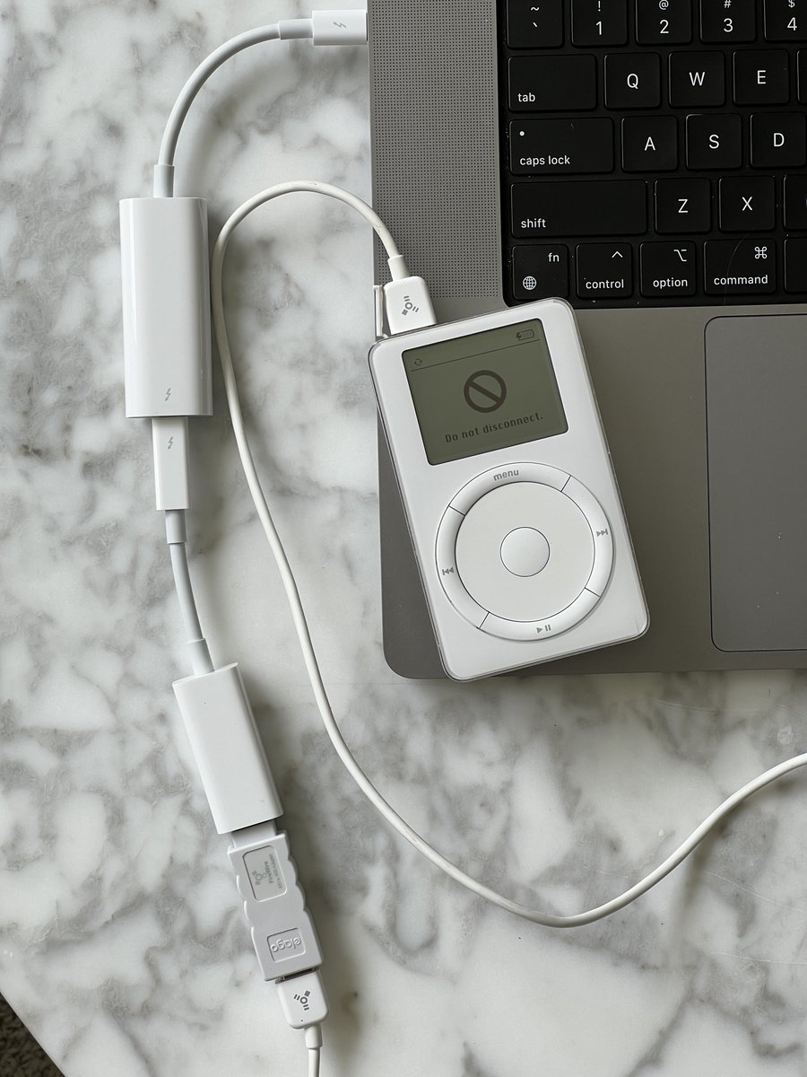
i don’t know who needs to hear this but don’t update to macOS Tahoe if you use 3 dongles to connect to your original iPod via FireWire. Tahoe removes FireWire support
1
295
14 Sep 2025
Super cool. Thanks for the great breakdown @hybridherbst
13 Sep 2025

Apple's 3D viewer is based on @threejs, uses @glTF3D and gets more impressive every year!
CAD meshes, environment blends, reflection probes, occlusion: let's take a look at what's special this time –
(long thread ahead)

1
3
586
Nate Smith retweeted

10 Sep 2025
More copy often means less differentiation 😕


5
3
117
15,071
10 Sep 2025
Capacitive touch is the worst thing to ever happen to kitchen appliances.
2
151
Nate Smith retweeted

19 Apr 2025
The old iOS default reload animation was awesome
36
74
1,404
133,487
9 Sep 2025
I so wish you could turn off the ringing sound on FaceTime, and it would work more like Slack Huddles. You just “turn on the video,” and the other person can join. Let’s move on from the “calling” metaphor.
1
3
139