
1,084 Photos and videos


$NEAR is not fighting resistance anymore
It’s trading below levels that were once major cycle tops
And that’s exactly why this chart is interesting
Back in 2021-2022, the $3.3 zone acted as a key pivot
In 2024, the market rejected hard from the $8.9 region
Today, $NEAR is sitting near $2 while both of those levels remain untouched overhead
That creates a very clean roadmap
First target sits around $3.3
Not because it’s a random number
but because that’s where previous support and resistance repeatedly changed hands
Above that, the real test begins
The $8.9 area marked one of the most important rejection points of the last cycle
Reclaiming it would completely change the long-term structure
and likely attract a wave of momentum traders back into the market.
And if that level breaks?
The chart opens up toward the $20 region, where the previous cycle peak still sits waiting
Most traders only start paying attention after the move is already obvious
Right now, $NEAR is still trading far below its major historical resistance zones
That’s exactly what makes the setup worth watching
4
16
137
6,344
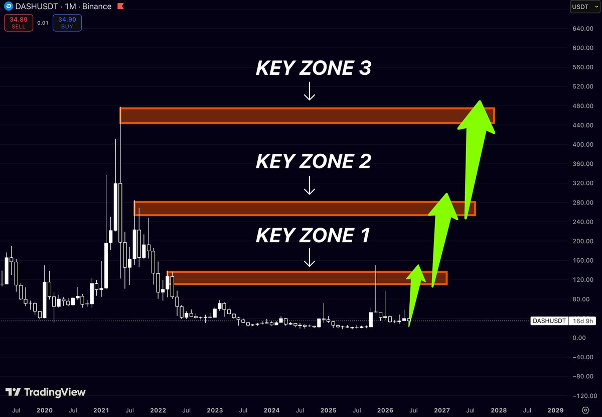
$DASH has been trading inside a massive accumulation range for years
Most traders only remember the 2021 top
What matters now is where price is sitting relative to the next major liquidity zones
On the monthly chart, three levels stand out:
First key zone: ~$120-140
Second key zone: ~$260-280
Third key zone: ~$450-480
Current price is still trading near the bottom of the entire structure
That means the market hasn’t even started testing the first major supply area yet
The interesting part is that every cycle in $DASH has produced explosive moves once momentum returned
Years of sideways price action have compressed volatility to the point
where even a move back into the first liquidity zone would represent a substantial expansion from current levels
The market is treating $DASH like a forgotten coin
But forgotten assets often become some of the biggest movers once capital starts rotating into laggards
The chart isn’t showing a breakout yet
It’s showing a setup where the upside remains significantly larger than the downside
That’s why this one deserves attention
11
17
733
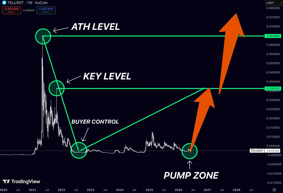
What if $TEL has already printed its cycle bottom?
After a brutal multi-year downtrend, $TEL is back trading near the same accumulation zone that launched the 2021 rally
What’s interesting is that sellers have had years to push price lower
and they haven’t
The chart has spent months building a base while volatility continues to compress
For me, the level that changes everything sits around $0.036
That’s where the market structure shifts from accumulation to expansion
Reclaim that zone, and the next major target becomes the previous cycle high near $0.065
Most traders won’t care until the breakout happens
That’s usually how bottoms are formed
3
10
808
People are still treating $CRV like it’s dead
The chart says otherwise
For almost 4 years
$CRV has been trading inside a massive range while everyone moved on to the next shiny narrative
Now look at the levels that actually matter:
📍 $6.76 - the first real wall
📍 $23.19 - the level that changes everything
That’s not a 20% move
That’s the kind of structure that can redefine an entire cycle
The funny part?
Most traders won’t touch $CRV until it’s already above $5-6
They’ll call it “strong” after it has already done a 20x from the lows
Right now it’s still sitting where conviction is required
The crowd buys confirmation
The biggest returns usually come before it
2
12
775
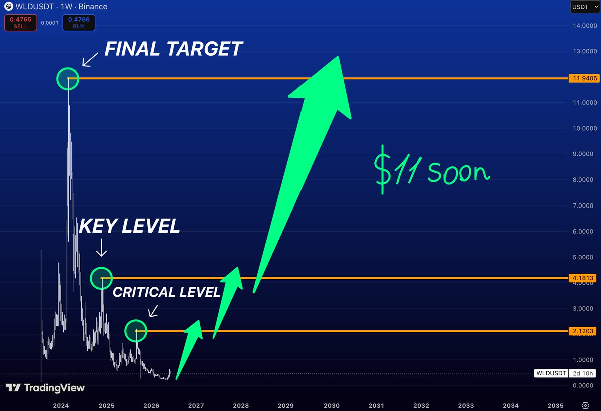
$WLD is one of the few major AI coins still trading near cycle lows while the narrative remains stronger than ever
The chart is simple
🎯 $2.12 - critical breakout level
🎯 $4.18 - major resistance from the previous distribution range
🎯 $11.94 - macro target and former cycle high zone
What’s interesting is that $WLD spent more than a year getting completely destroyed while the project itself kept expanding globally
Most market participants only became interested near the highs
Now price is sitting in the exact opposite environment: maximum pessimism
minimum expectations, and a chart that’s starting to build a base
A reclaim of $2.12 would be the first major signal that buyers are taking control again
Above that, the path toward $4.18 becomes realistic
And if the AI sector catches another strong bid this cycle, revisiting double digits is no longer a crazy idea
The best opportunities usually appear when nobody wants to look at the chart
$WLD might be entering that phase
1
9
24
1,816
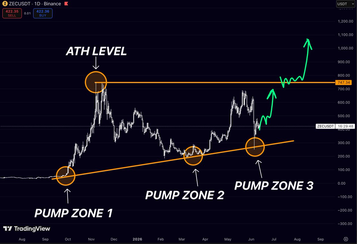
$ZEC keeps respecting the same trend that started near the cycle lows
Three major reactions off the trendline
Three separate expansions
Now price is once again holding above the area where the last impulsive move began
📍 Trend support around $250–300 continues to hold
📍 Major resistance sits at $747
📍 Above that, there’s very little historical resistance until the previous highs
What’s interesting is that $ZEC isn’t trying to recover from the lows anymore
It’s already trading hundreds of percent above the first accumulation zone and continues printing higher lows on the larger timeframe
The next big test is simple:
Can bulls push price back into the $747 region and finally challenge the level that capped the previous expansion?
If they do, the conversation around $ZEC could look very different in a few months
5
2
34
2,186
$LUNC still looks like one of the cleaner high-beta recovery setups on the board
What’s interesting is that the chart isn’t asking for a new ATH
It’s only asking for a return to levels that were already traded multiple times during the last cycle
🎯 Target 1: 0.000180
🎯 Target 2: 0.000278
🎯 Target 3: 0.000649
That’s roughly:
160% to Target 1
300% to Target 2
850% to Target 3
from current levels
The funny thing about $LUNC is that people either love it or completely ignore it
There is almost no middle ground
But historically, every time this chart spends months grinding sideways near the lows
the next expansion move tends to be violent
Not because the fundamentals suddenly change
Because liquidity comes back and traders start chasing the same levels everyone forgot about
The first real test sits around 0.000180
If bulls reclaim that area, the conversation shifts from “dead coin” to “why is $LUNC suddenly outperforming?”
And once momentum starts building, the path toward 0.000278 opens surprisingly fast
Still early on the structure
But after years of compression, this is exactly the type of chart that can wake up when nobody expects it
4
748
$TAO DOESN’T NEED NEW HIGHS TO PRINT A MASSIVE MOVE
The chart already tells the story
Every major rally in $TAO has started after reclaiming levels that most traders stopped paying attention to
Right now, price is sitting below three of the most important resistance zones on the entire chart:
🎯 $385
🎯 $750
🎯 $1,250
From current levels, that’s roughly:
80% to Target 1
250% to Target 2
500% to Target 3
The interesting part?
While most AI narratives come and go every few months
$TAO continues to be one of the few AI tokens that consistently attracts capital whenever the sector wakes up
Nobody knows if it reaches all three targets
But if AI becomes the market’s favorite narrative again, these levels are the ones I’ll be watching
4
8
395
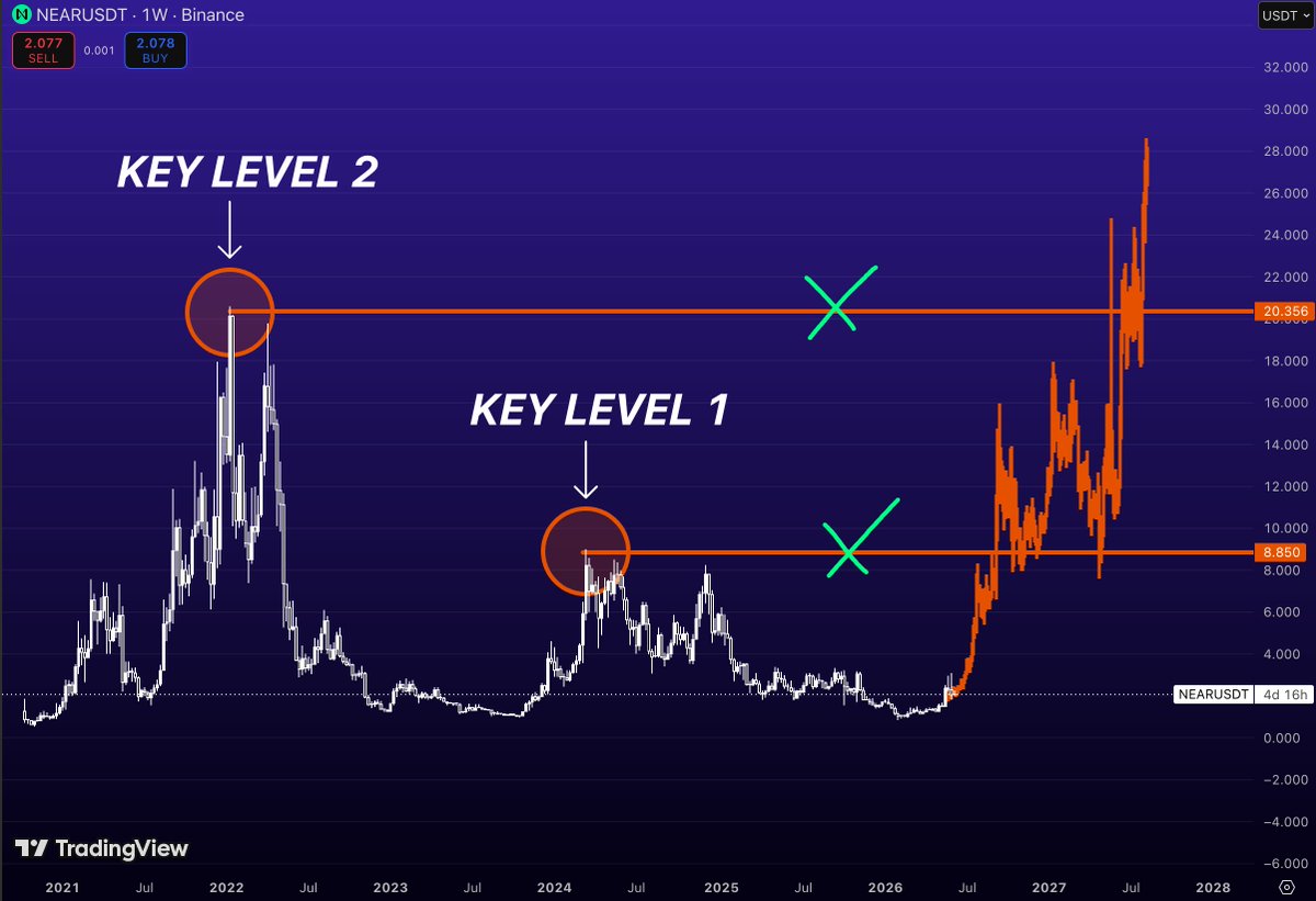
$NEAR ALREADY SHOWED THE ROADMAP
Most traders are waiting for confirmation
The chart is showing what happens after confirmation
$NEAR has two major historical levels that stand out on the weekly:
$8.85 - the first major supply zone
$20.35 - the cycle-defining resistance
What’s interesting is that these aren’t random targets
They’re the exact areas where previous rallies lost momentum and where the market spent months distributing before collapsing
Now imagine $NEAR starts reclaiming them one by one
First comes $8.85
That alone would represent a move of roughly 4x from current prices
Then comes the real test
The $20.35 region
A level that acted as a ceiling during the strongest phase of the last cycle and where an enormous amount of trapped supply was created
If buyers can absorb that liquidity, the market enters price discovery territory again
Right now everyone is focused on what’s happening around $2
The bigger picture sits much higher
And the distance between those two realities is exactly why charts like this become interesting
6
85
3,122
What if $DASH has spent the last 4 years building a giant Wyckoff accumulation?
Sounds crazy
Until you zoom out
The structure is surprisingly clean:
2021 blow-off top and distribution
Multi-year markdown phase
Years of sideways price action near the lows
Repeated tests of support with diminishing downside follow-through
Volatility contraction across the entire range
This is exactly the type of environment where accumulation is supposed to happen
Not during excitement
Not during headlines
During maximum boredom
The most interesting part of the chart is that price has spent years respecting the same broad range while public interest continued to disappear
That’s what accumulation often looks like
Quiet
Slow
Painfully slow
Of course, Wyckoff isn’t confirmed until the market proves it
A schematic is not a signal
But if this interpretation is correct, then the real move doesn’t start from the lows
It starts when price finally escapes the range that trapped it for years
After that, the market begins repricing an asset nobody wanted to own
Most traders see a dead chart
Wyckoff traders see a potential cause being built before the effect
The longer the accumulation, the larger the expansion that can follow
4
18
62
3,172
Three cycles
Same pattern
And $XLM might be setting up for the fourth leg higher
Back in 2018, Stellar exploded into a major cycle top before meeting resistance near the upper trendline
In 2021, price repeated the exact same behavior
rallying into the same diagonal resistance zone before getting rejected again
Today, the chart is sitting at the opposite side of that structure
Not at resistance
At the base
That’s what makes this setup interesting
The entire chart can be viewed through one long-term rising channel:
📍 Target 1 → previous cycle reaction zone around $0.30-$0.40
📍 Target 2 → 2021 cycle resistance around $0.80-$0.90
📍 Target 3 → upper channel resistance near $1.70-$1.90
None of these levels have been reached
None have been reclaimed
They are simply the major historical reaction zones if momentum returns to Stellar
The market loves to dismiss assets that spend years moving sideways
Until the next expansion phase begins
And when you zoom out
$XLM is still trading near the bottom of a structure that has produced explosive moves multiple times before
Three cycles
One trendline
The next move decides whether history repeats again
3
13
89
3,861
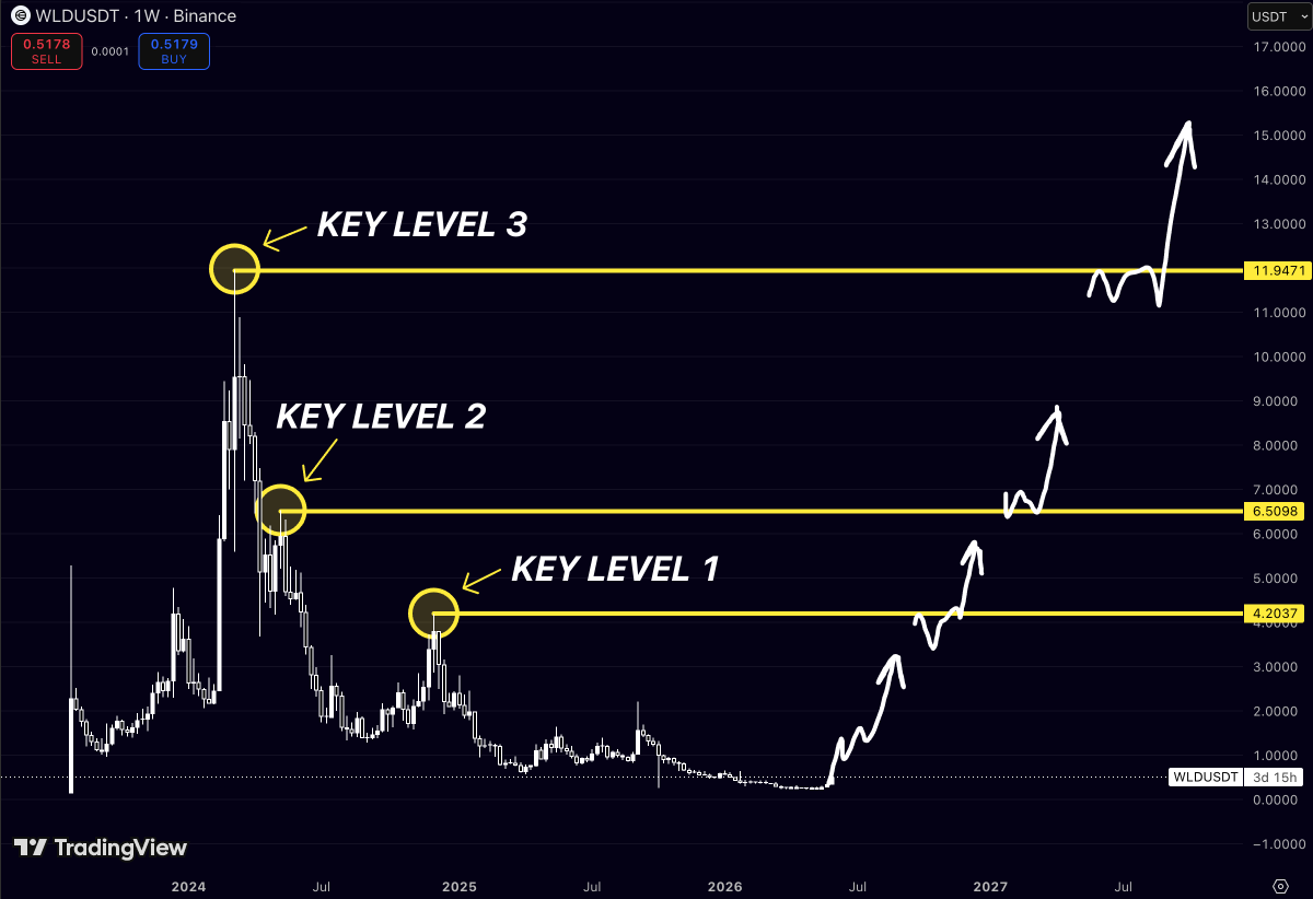
$WLD is approaching the same levels that have rejected every major rally since launch
Most traders see a chart sitting near the lows
I see three liquidity zones the market keeps remembering
Target 1 → $4.19
Target 2 → $6.51
Target 3 → $11.95
These aren’t arbitrary targets
Each level marked a major rejection point where buyers lost momentum and supply overwhelmed demand
Now zoom out
After a brutal decline, $WLD has spent months building a base while volatility disappeared and interest faded
That’s usually how large moves begin
Not with excitement
With boredom
The first real test sits at $4.19
If bulls reclaim that level, the next major obstacle becomes $6.51
And above that?
The chart opens toward the largest supply zone on the board near $12
What’s interesting is how compressed price has become relative to those levels
The market is pricing $WLD as if the trend is over
The chart suggests the opposite
When an asset spends a long time building a floor beneath historical resistance
every breakout creates a path toward the next liquidity pocket.
Three targets
Three major rejection zones
And a market that’s still looking the other way
3
9
34
3,282
The market is treating $SUI like a finished story
The chart says it’s still in the first chapter
Current price: ~$0.70
Above price sit three major historical resistance zones:
🎯 $2.00
🎯 $4.50
🎯 $5.50
These aren’t arbitrary targets
They’re the exact levels where previous rallies stalled, liquidity was absorbed, and sellers took control
Now look at the downside
After a brutal correction from the highs
$SUI is sitting near the same region that repeatedly acted as support throughout its market structure
That’s what creates asymmetry
Risk is defined
Upside is massive
From current levels:
$2.00 = ~3x
$4.50 = ~6x
$5.50 = ~8x
Most traders spend their time chasing green candles after they’ve already moved
The biggest opportunities usually appear when a chart looks boring, sentiment is weak, and nobody is paying attention
That’s exactly where $SUI is today
If the broader crypto market enters another expansion phase
reclaiming $2 would likely open the door toward $4.5 and eventually a retest of the $5.5 cycle highs
The market loves making people buy late
The chart rewards those willing to look early
1
12
31
1,937
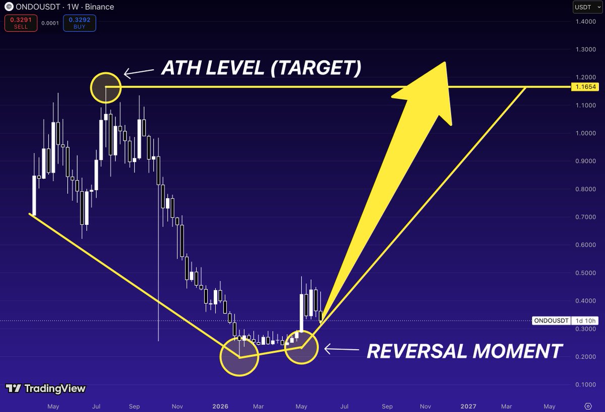
$ONDO might be showing one of the CLEAREST accumulation-to-expansion transitions in the market
Most people are staring at the ATH.
I’m watching what happened after the collapse.
Price spent months bleeding lower, then finally found a floor around the $0.20 area.
Not once.
Twice.
That double-bottom structure is what changed everything.
The second touch wasn’t weakness.
It was confirmation.
Since then, $ONDO has started printing higher lows while holding above the reversal zone that ended the entire downtrend.
That’s how major trend reversals begin.
Not with euphoria.
With a quiet shift in market structure.
The interesting part?
The previous all-time high sits around $1.16.
Current price is still trading dramatically below that level.
If the reversal continues to develop and buyers keep defending the new higher-low structure, the chart has a very obvious magnet above it.
The old ATH.
Markets have a habit of revisiting important levels.
And ONDO has already done the hard part:
It stopped going down.
Now the question becomes how aggressively it starts moving up.
$ONDO looks like it’s transitioning from accumulation to expansion.
4
17
1,188
$DASH might be one of the most overlooked setups in crypto
The chart has spent years compressing after a brutal bear market
but the important part isn’t where price is today.
It’s where price has repeatedly reacted in the past
🎯 Target 1: $148
🎯 Target 2: $284
🎯 Target 3: $477
Notice something interesting
Each major cycle left behind a clear liquidity level
The 2021 peak
The 2021 breakdown
The final distribution zones before the collapse
Markets rarely forget these areas
They revisit them
Not because of nostalgia
Because that’s where unfinished business remains
At current prices, $DASH sits far below every major historical level that once attracted aggressive participation
If capital rotates into forgotten large-cap altcoins, the path of least resistance isn’t a new prediction
It’s a return to the levels the market has already validated.
Sometimes the biggest opportunities aren’t hidden
They’re simply ignored
10
47
111
2,942
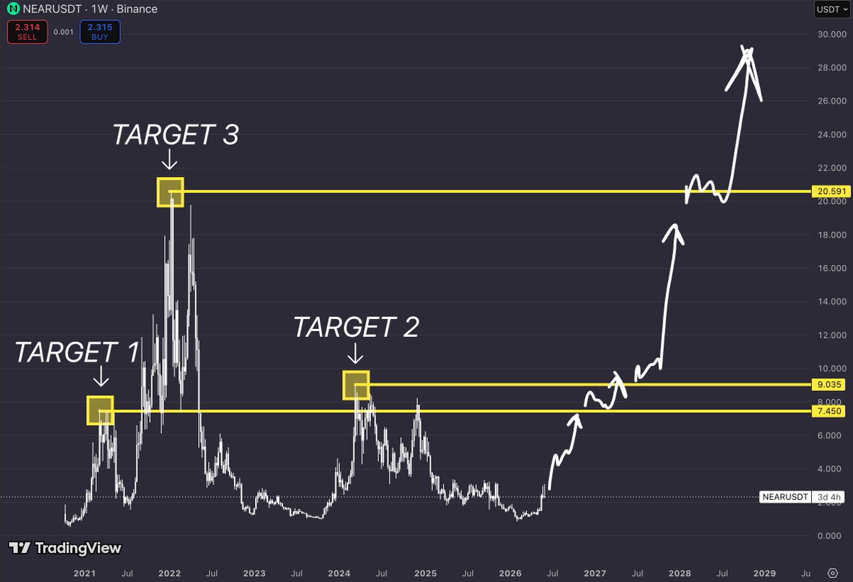
$NEAR is one of those charts that looks boring until you zoom out.
Then suddenly you realize it’s been building the same roadmap for years.
The market loves chasing new narratives.
But some of the biggest moves come from assets that spend years quietly preparing for them.
Right now, the chart highlights three major historical levels.
The first target sits at $7.45.
This zone marked a critical reaction point during the previous cycle and represents the first major test for any long-term bullish continuation.
Reclaiming it would signal that the current recovery is no longer just a bounce from the lows.
It would be the beginning of a much larger structural move.
The second target stands at $9.03.
Historically, this level acted as a major supply zone where rallies struggled to maintain momentum.
Breaking above it would remove one of the last significant resistance barriers before the chart opens toward higher valuations.
But the real prize sits much higher.
Target three is located at $20.59.
This is where previous cycle euphoria accelerated and where some of the strongest buying pressure in $NEAR history appeared.
Revisiting this area would place the asset back among the strongest performers of the market cycle.
The roadmap is simple:
$7.45 - Target 1
The level that confirms the recovery is becoming a trend.
$9.03 - Target 2
A major resistance zone that could unlock the next expansion phase.
$20.59 - Target 3
The long-term objective and the level that would put $NEAR back into the spotlight.
What makes this setup interesting is how compressed the current valuation still looks compared to previous cycle highs.
Markets spend most of their time building bases.
They spend very little time moving between them.
If momentum continues to build, the move from Target 1 to Target 3 could happen much faster than most participants expect.
The crowd usually starts paying attention near the end of the move.
The chart suggests $NEAR may still be in the stage where patience matters more than excitement.
2
14
147
8,374
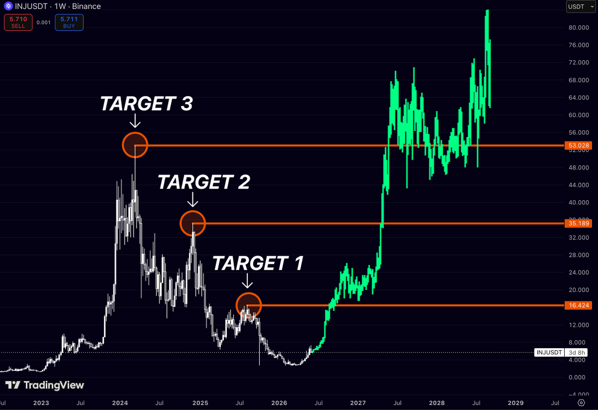
Everyone is watching AI tokens
Almost nobody is watching what $INJ is building
That’s usually where the biggest moves come from
The chart tells a pretty simple story
Every major Injective rally eventually found its way back to the same liquidity magnets:
🎯 $16.4
🎯 $35.1
🎯 $53.0
Right now price is sitting around $5.
Not $35.
Not $53.
Five.
And that’s exactly why this chart is interesting.
Most traders only become bullish after a coin has already delivered a 500% move.
They need confirmation.
Then more confirmation.
Then a YouTube thumbnail with 17 arrows.
Then maybe they’ll buy.
Meanwhile, $INJ is quietly building a structure that looks very similar to the one that launched previous expansions.
If buyers keep stepping in, the path is obvious:
$5 → $16
$16 → $35
$35 → $53
The funny thing about crypto is that everyone wants the 10x…
But nobody wants to sit through the part where it still looks boring.
$INJ might be giving that opportunity right now.
Patience is usually the hardest trade.
And the most profitable one
5
14
1,063
$WLD is one of the most hated charts in crypto right now
And honestly?
That’s exactly what makes it interesting
The market spent months turning early believers into exit liquidity
Every rally got sold
Every bounce got faded
Every “bottom” found a lower bottom
Eventually people stopped talking about it
That’s usually when charts start becoming dangerous
Right now, $WLD is sitting around $0.50
Meanwhile, three massive historical levels are waiting above:
🎯 $4.20
🎯 $6.50
🎯 $11.95
Think about that for a second
Most traders are busy searching for the next shiny token that launched yesterday
$WLD is already sitting on one of the strongest brands in crypto, trading more than 95% below its former highs
Nobody wants it
Nobody believes in it
Nobody cares
Until price starts moving
Then suddenly Twitter transforms into a documentary called:
“I was bullish the whole time.”
Crypto has the memory of a goldfish
2
5
29
4,074
$ONDO just completed the move most traders were waiting for
Now the question is simple:
How much higher can this trend go?
Most people are chasing the breakout
What matters now is understanding where the next major historical resistance zones are located
The chart highlights three key levels that previously acted as major turning points:
Target 1 - $0.4864
Target 2 - $0.7043
Target 3 - $1.1711
These aren’t random price targets
Each level comes directly from previous market reactions where momentum stalled and sellers regained control
What’s interesting is that $ONDO has already reclaimed Target 1 and Target 2
Both resistance zones have now been broken and flipped into support during the current advance
That’s often how strong trends develop
Former resistance becomes support
Then price begins targeting the next major liquidity zone higher
Right now, all attention shifts toward $1.1711
This is the most important resistance level visible on the chart
It’s the area where a major distribution phase began during $ONDO previous expansion cycle
Markets have a tendency to revisit the exact levels that defined their history
And when multiple resistance zones are reclaimed one after another, the probability of testing the next untouched level increases significantly
The structure is difficult to ignore:
Reclaim Target 1
Reclaim Target 2
Attack Target 3
If momentum continues building and buyers maintain control above former resistance
$ONDO could be preparing for a move toward one of the most important levels on its entire chart
Sometimes the biggest opportunities appear after the breakout, not before it

6
5
34
4,210
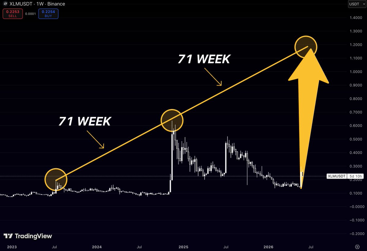
Most traders are watching $XLM price
But the real signal on this chart is time
Last cycle, Stellar needed 71 weeks before the move fully played out
Now the same amount of time is lining up again
The difference?
This time the projected target sits much higher than the previous peak
That’s what makes the setup interesting
Not the current candle
Not the short-term noise
The timing
$XLM already showed how powerful the move can become once the market leaves accumulation
If the cycle rhythm repeats, the next expansion could send price into a completely new range
71 weeks was the clue last time
Now the clock is running again
12
38
205
13,790