Median household income varies widely across the U.S. Coastal and Northeast states tend to earn more, while much of the Deep South and Appalachia lag behind. DC, MA, and NJ lead the nation — while MS, WV, and LA sit at the bottom. Data: 2024 ACS.
According to the 2024 GSS, happiness rises steadily with education level.
Education doesn’t guarantee happiness — but the trend is hard to ignore.
📊 Source: 2024 GSS (NORC)
#PursuitofHappiness#DataDrivenHappiness
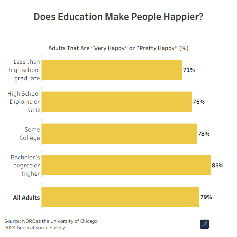
ALT Horizontal bar chart titled “Does Education Make People Happier?” showing the percent of adults who report being “very happy” or “pretty happy” by education level. Less than high school: 71%. High school diploma or GED: 76%. Some college: 78%. Bachelor’s degree or higher: 85%. All adults: 79%. Source: 2024 General Social Survey (NORC at the University of Chicago).
Winter weather is imacting millions of Americans this weekend and will continue to into next week. Check out where the impacts may be the strongest and what large communities will be impacted. ❄️📍
#WinterStorm#DataViz#WeatherRisk#EmergencyPreparedness#datadriven
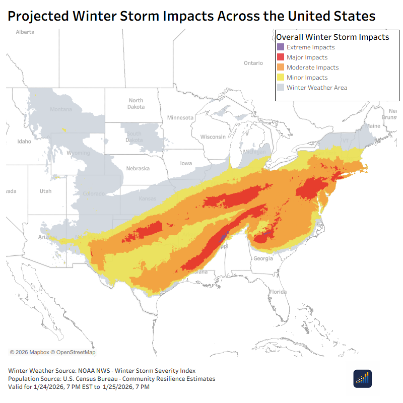
ALT Map of the United States showing projected winter storm impacts. Colored bands indicate minor, moderate, major, and extreme impacts stretching from the Southwest through the South and into the Northeast, with lighter gray areas showing broader winter weather risk.
ALT Horizontal bar chart showing population living in areas with potential winter storm impacts: 23.3 million in winter weather areas, 42.8 million in minor impacts, 80.5 million in moderate impacts, 58.2 million in major impacts, and 0.3 million in extreme impacts.
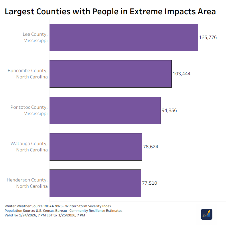
ALT Bar chart showing counties with the largest populations in extreme winter storm impact areas. Lee County, Mississippi has the highest population, followed by Buncombe County, North Carolina; Pontotoc County, Mississippi; Watauga County, North Carolina; and Henderson County, North Carolina.
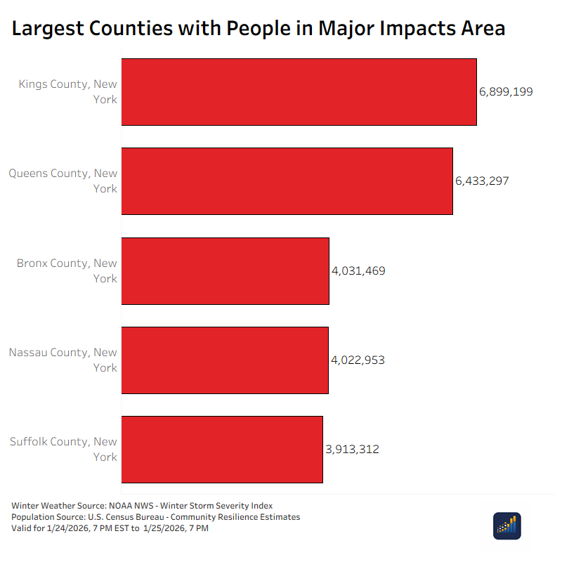
ALT Bar chart ranking counties with the largest populations in major winter storm impact areas. Kings County, New York leads with about 6.9 million people, followed by Queens County, New York at 6.4 million, Bronx County at 4.0 million, Nassau County at 4.0 million, and Suffolk County at 3.9 million.
Living alone in the U.S. has more than doubled since 1960.
Back then, just 13% of households were one person.
Today? Nearly 30%.
A massive demographic shift with big implications for housing, community, and well-being.
Source: U.S. Census Bureau
#dataviz#datadriven
Since the introduction of the iPhone, "childbearing has plummeted among liberal" but not conservative women. This means there is now "a 31-percentage point gap between young conservative women and their liberal peers today." ifstudies.org/blog/the-lefts…@FamStudies
Voter turnout in 24 wasn’t evenly distributed.
New data shows turnout rises sharply with education:
36% → less than high school
53% → high school grad
66% → some college
77% → bachelor’s
83% → graduate degree
Visuals below break down both raw # and %.
#Election2024#Census
Mapping Monday 🗺️
Where are America’s youngest states?
Utah leads the nation — 26.6% of its population is under 18 — followed by Texas and Nebraska.
Meanwhile, D.C., Rhode Island, and Vermont have the smallest shares.
🔗 OverflowData.com#MappingMonday#DataViz
Congressional District of the Week: California’s 11th
Home to ~730K residents, this district blends iconic cityscapes with some of the highest education and income levels in the nation and is home of Nancy Pelosi.
👇 Let’s look at the data that defines CA-11.
#DataViz#CA11
🏠 Median household income: $142,524
🎓 Bachelor’s degree or higher: 64.1%
🚗 Households with no vehicle: 34.7%
👶 Households with children: 15.5%
💻 Broadband access: 93.7%
🍽 Receive SNAP benefits: 12.1%
The numbers show a highly educated, well-connected city.
Nearly 89,000 households in Minority Leader Hakeem Jeffries’ district (NY-08) rely on SNAP benefits, about 30.8% of all households.
This interactive map shows how food insecurity varies across America’s congressional districts 👇
🔗 overflowdata.com#DataViz#USPolitics
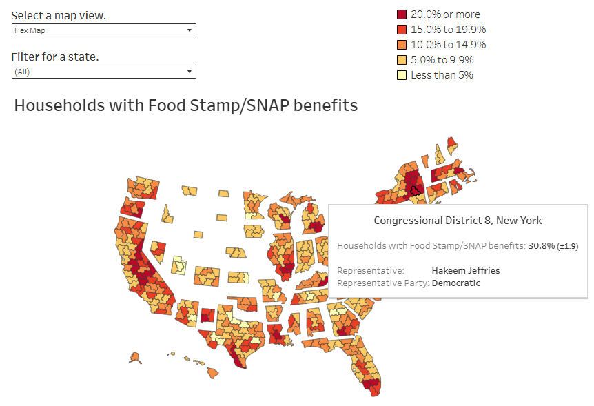
ALT A hex map of the United States shows the percentage of households in each congressional district receiving Food Stamp/SNAP benefits. Dark red areas represent districts where 20% or more of households rely on SNAP, while light yellow areas represent less than 5%. A tooltip highlights New York’s 8th Congressional District, represented by Hakeem Jeffries, where 30.8% (±1.9) of households receive SNAP benefits—nearly 89,000 households. The map includes dropdown filters to select map type and state.
Millions of Americans rely on SNAP to afford food. 🍎
This map shows how many households in each congressional district depend on food stamp benefits and who could be most affected by the 2025 government shutdown.
Explore the data ⬇️
🔗 overflowdata.com/demographic…
In the 2024 Presidential Election, 65% of U.S. adults reported voting (Census Bureau, CPS). But turnout looks very different by age group:
🔹 18–24: 48%
🔹 25–34: 57%
🔹 35–44: 64%
🔹 45–54: 69%
🔹 55–64: 71%
🔹 65–74: 75%
🔹 75–84: 76%
📊 Older adults continue to lead the way.
% only tell part of the story. In raw #, voter turnout in 2024 looked like this:
🔹 18–24: 13M voted
🔹 25–34: 22M voted
🔹 35–44: 24M voted
🔹 45–54: 24M voted
🔹 55–64: 27M voted
🔹 65–74: 25M voted
Millions of young adults voted—but older adults still dominate the electorate.