
Pharmacist💊💉 | Packaging Design Expert | Brand identity Designer🎨💻. "Specialist in crafting packaging designs and building memorable brand identities.
Joined April 2020
- Tweets 5,570
- Following 975
- Followers 3,039
- Likes 126,545
405 Photos and videos


Pinned Tweet

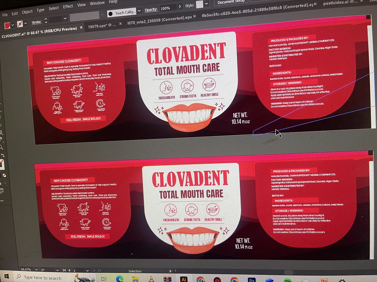
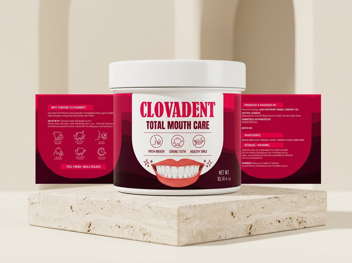
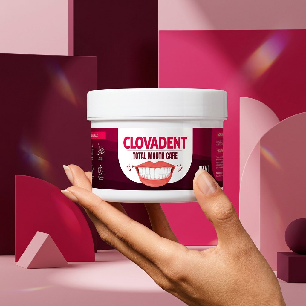
Work in progress ✨
Label design exploration for Clovadent Total Mouth Care 🦷
Still exploring directions, layouts, and details to get the perfect balance of clean, fresh, and premium.
What’s do you think?🤔
5
5
39
1,359
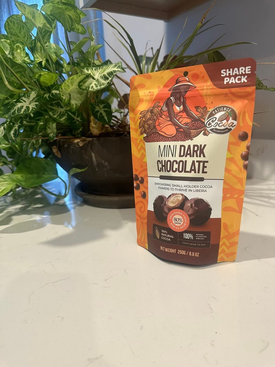
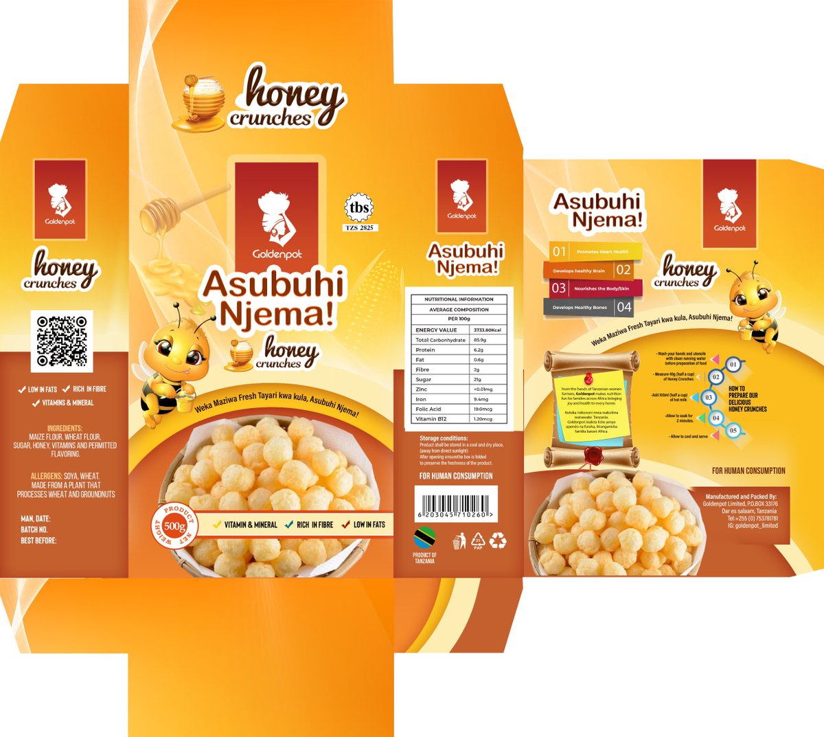
The final produced packaging is looking beautiful! 🥰🥳
Proud to see this project come to life for Patience Cocoa Products, Liberia 🇱🇷.
From concept to shelf-ready packaging,
always a rewarding experience seeing the finished product in the real world.
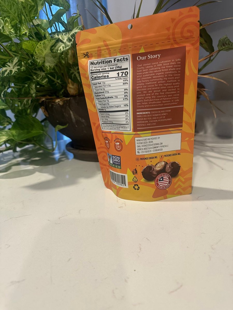

A client just shared photos of the final produced packaging I designed for their product, and I can’t stop smiling. Seeing a design move from screen to shelf exactly as envisioned is one of the most satisfying parts of this profession.
Packaging design truly has my heart. ❤️
5
1
14
341
A client just shared photos of the final produced packaging I designed for their product, and I can’t stop smiling. Seeing a design move from screen to shelf exactly as envisioned is one of the most satisfying parts of this profession.
Packaging design truly has my heart. ❤️
5
429
More shots on Clovadent Total Mouth care Packaging 🥰❤️
Work in progress ✨
Label design exploration for Clovadent Total Mouth Care 🦷
Still exploring directions, layouts, and details to get the perfect balance of clean, fresh, and premium.
What’s do you think?🤔
1
10
473
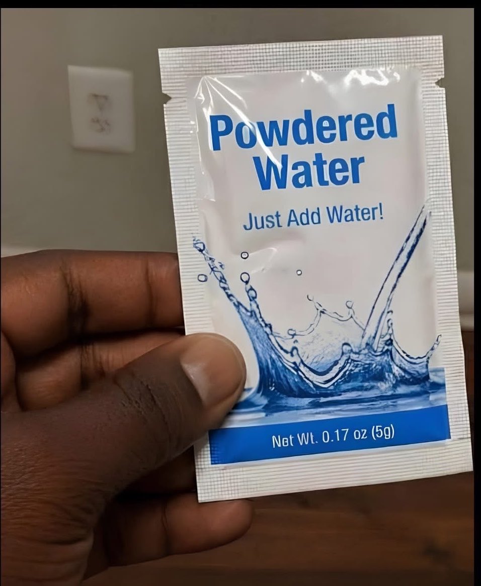
Why do I feel uncomfortable with the choice of color ?
The sachet no longer feels safe to drink


1
8
637
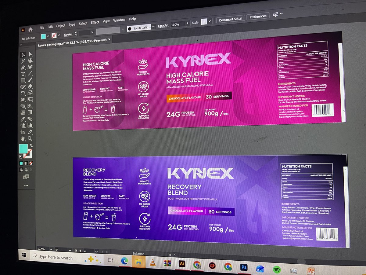
Working on a label design for a fitness product brand, still a Work in progress ❤️‼️
KYNEX
Collab with @kunle_Design

1
3
22
390
Dat PACKAGING DESIGNER 🎨💻 retweeted

May 29
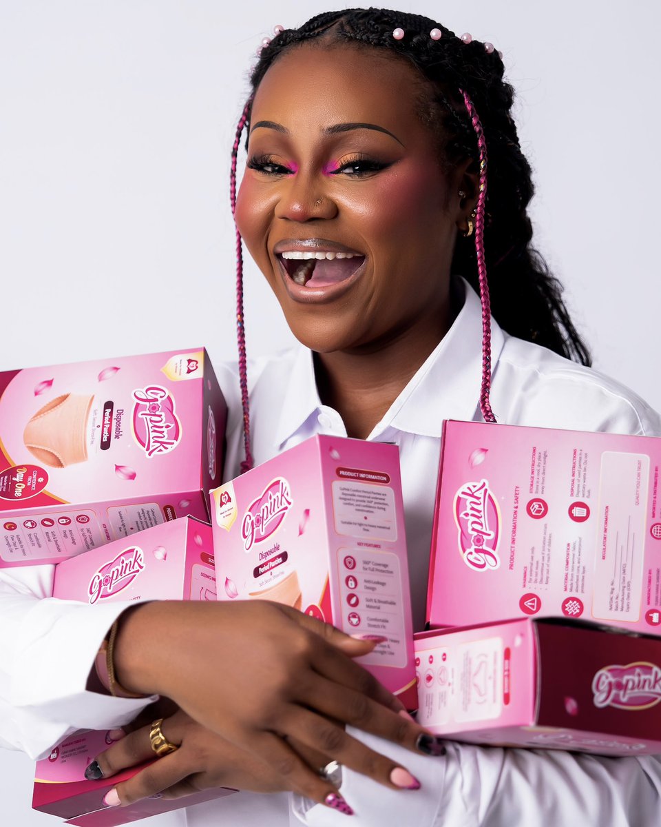
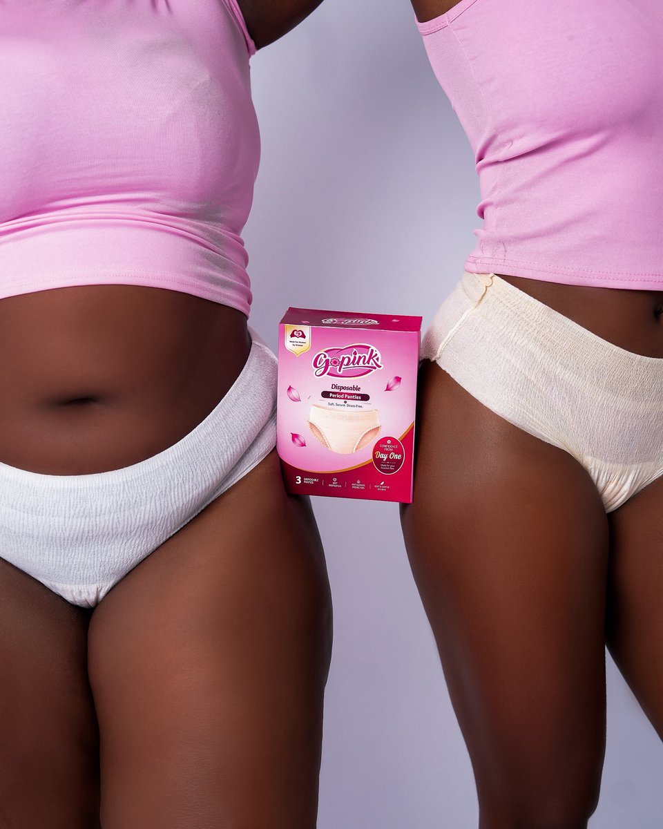
GoPink was designed with you in mind because a woman made it, and she thought of everything. No more compromising. No more putting up with what didn’t work. Innovative, intentional period care that finally gets it right. Confident & secure, every day of the month. For women. By a woman. @Gopink_ng
260
675
4,994
645,457
❤️❤️🔥
May 29

GoPink was designed with you in mind because a woman made it, and she thought of everything. No more compromising. No more putting up with what didn’t work. Innovative, intentional period care that finally gets it right. Confident & secure, every day of the month. For women. By a woman. @Gopink_ng
5
157
This is a beautiful idea …
Love ❤️ it

thought of an idea to expand the ecosystem of popular brands of everyday use an idea popped what if ? the whole idea was prompted by the OG @BasitOriola
1
1
9
191
Did you know?
The Cruelty-Free symbol 🐰 on packaging means the product was not tested on animals during its development.
You’ll mostly see it on:
• Skincare products
• Cosmetics
• Beauty brands
• Personal care packaging
However, not every bunny logo means the same thing. Some are official certifications like the “Leaping Bunny,” while others are just custom icons used by brands.
As a packaging designer, it’s important to understand the difference between decorative graphics and actual certified symbols. Compliance and credibility matter a lot in packaging design.
3
136
The Cruelty-Free symbol 🐰 on packaging means the product was not tested on animals during its development.
You’ll mostly see it on:
• Skincare products
• Cosmetics
• Beauty brands
• Personal care packaging
However, not every bunny logo means the same thing. Some are official certifications like the “Leaping Bunny,” while others are just custom icons used by brands.
As a packaging designer, it’s important to understand the difference between decorative graphics and actual certified symbols. Compliance and credibility matter a lot in packaging design.
‼️3. The FSC Certified symbol 🌲
The FSC Certified symbol 🌲 on packaging means the paper, carton or wood material used comes from responsibly managed forests.
It helps show that the materials were sourced with environmental and sustainability standards in mind.
You’ll mostly see it on:
• Cartons
• Paper packaging
• Corrugated boxes
• Product tags
As a packaging designer, don’t just place the FSC logo because it “looks eco-friendly.” Brands usually need proper certification approval before using it.
4
387
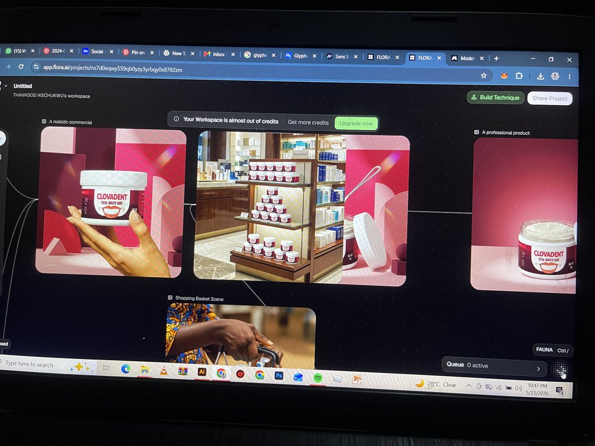
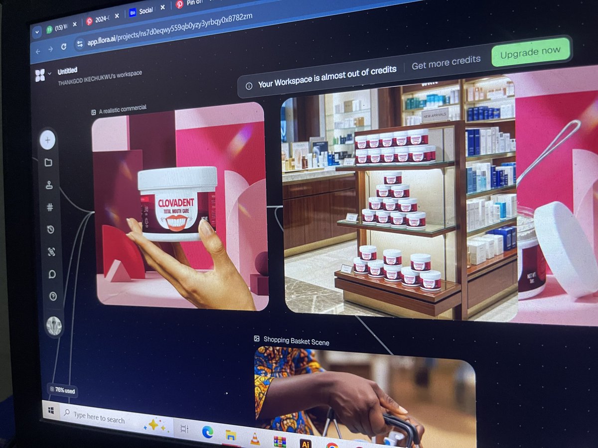
Been integrating AI into my packaging design workflow lately using Flora AI for faster exploration, mockup directions, and idea generation.
1
23
633
Clovadent total mouth care Packaging ❤️
Work in progress ✨
Label design exploration for Clovadent Total Mouth Care 🦷
Still exploring directions, layouts, and details to get the perfect balance of clean, fresh, and premium.
What’s do you think?🤔
4
221
Are you a:
- Graphic Designer
- Illustrator
- UI/UX Designer
- Motion Graphics Artist
- Brand Strategist
- Art Director
- Web Designer
- Interaction Designer
- Visual Designer
- Product Designer
- Creative Director
- UX Researcher
- Packaging Designer
- Environmental Designer
- Game Designer
- 3D Designer
Drop a "Hi!" in the comments and let’s connect with fellow design enthusiasts!
33
21
1,914
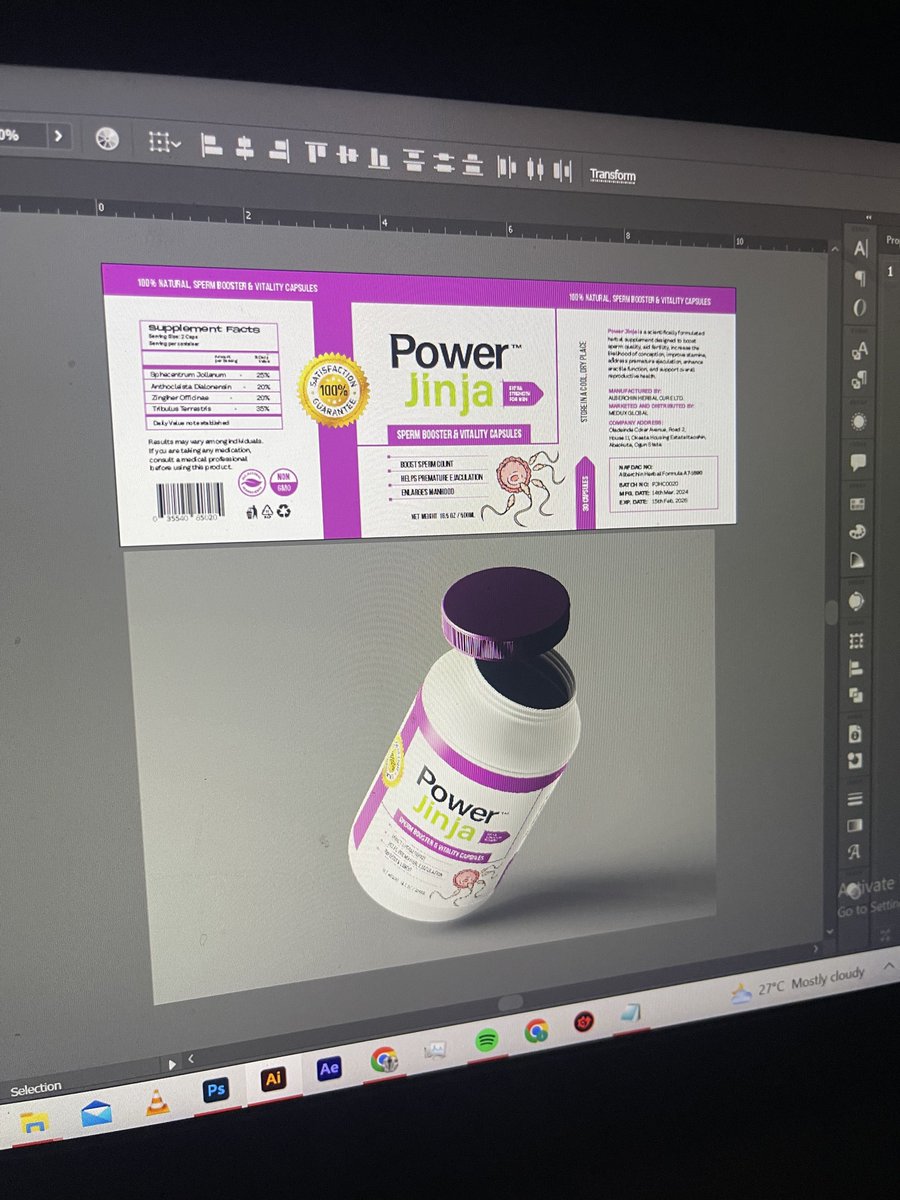
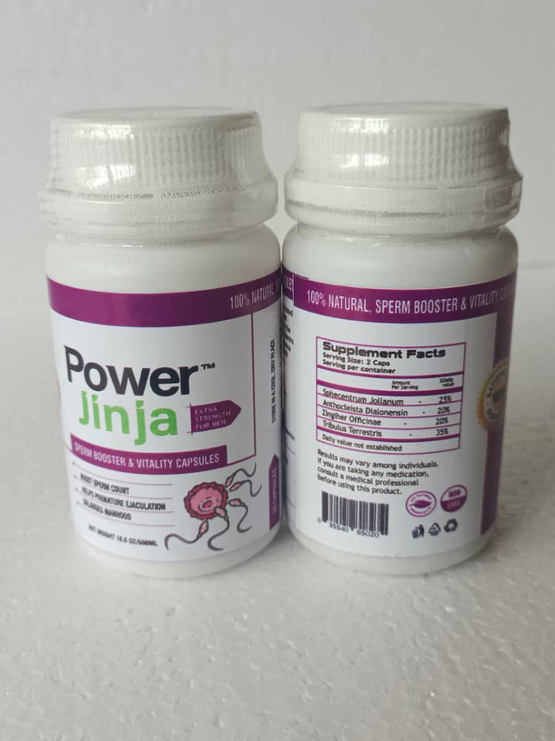
Power Jinja product packaging design ⚡️
Design & mockup vs Printed
4
6
64
1,800
‼️3. The FSC Certified symbol 🌲
The FSC Certified symbol 🌲 on packaging means the paper, carton or wood material used comes from responsibly managed forests.
It helps show that the materials were sourced with environmental and sustainability standards in mind.
You’ll mostly see it on:
• Cartons
• Paper packaging
• Corrugated boxes
• Product tags
As a packaging designer, don’t just place the FSC logo because it “looks eco-friendly.” Brands usually need proper certification approval before using it.
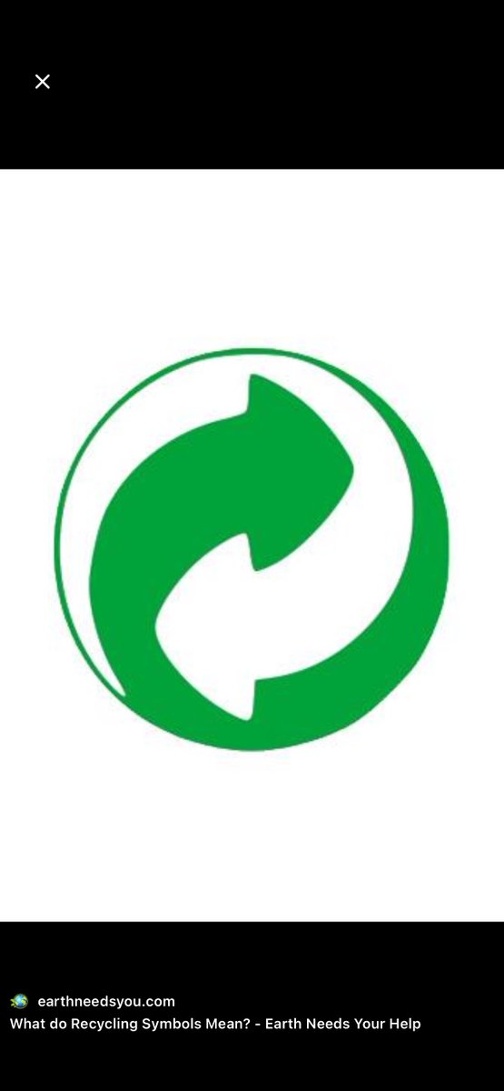
‼️ 2. Green Dot Symbol
The Green Dot symbol ♻️ is one of the most misunderstood symbols in packaging design.
A lot of people think it means the packaging is recyclable .
The Green Dot simply shows that the brand or manufacturer contributes financially to a recycling/recovery program, mostly used in Europe. It means the company has paid into a system that helps collect and process packaging waste.
So:
❌ It does NOT automatically mean the package is recyclable
❌ It does NOT mean the package is made from recycled materials
It only means the company supports the recycling system financially.
You’ll mostly see it on:
• Food packaging
• Cosmetic products
• Household products
• FMCG packaging sold in European markets
As a packaging designer, this is important because many designers place sustainability symbols randomly without understanding their meanings.
Every symbol on a package should have a purpose and proper compliance behind it.

1
5
548
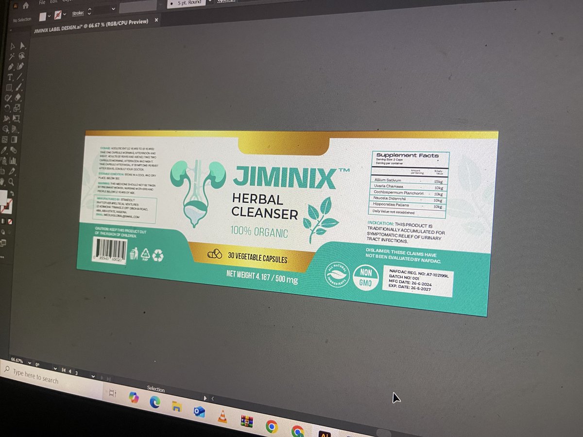
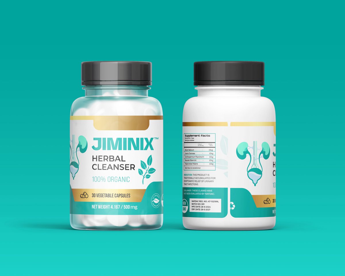
Sometimes you look back at a project and still smile because everything just came together perfectly 😮💨✨
Revisiting this cleanser packaging I worked on for Jiminix Herbal Cleanser and honestly… I still love how clean, bold and shelf-ready it feels.
One thing about packaging, good design will always age well 🤲🏼🔥
2
3
50
762
Dat PACKAGING DESIGNER 🎨💻 retweeted
‼️ 2. Green Dot Symbol
The Green Dot symbol ♻️ is one of the most misunderstood symbols in packaging design.
A lot of people think it means the packaging is recyclable .
The Green Dot simply shows that the brand or manufacturer contributes financially to a recycling/recovery program, mostly used in Europe. It means the company has paid into a system that helps collect and process packaging waste.
So:
❌ It does NOT automatically mean the package is recyclable
❌ It does NOT mean the package is made from recycled materials
It only means the company supports the recycling system financially.
You’ll mostly see it on:
• Food packaging
• Cosmetic products
• Household products
• FMCG packaging sold in European markets
As a packaging designer, this is important because many designers place sustainability symbols randomly without understanding their meanings.
Every symbol on a package should have a purpose and proper compliance behind it.
‼️‼️Here are some of the most common packaging symbols/icons used in packaging design and what they mean:
1. Mobius Loop ♻️(Recyclable Symbol)
1️⃣ PET (Polyethylene Terephthalate)
Common for water & soft drink bottles. Lightweight, clear and widely recyclable.
2️⃣ HDPE (High-Density Polyethylene)
Used for detergent, shampoo and chemical containers. Strong and durable.
3️⃣ PVC (Polyvinyl Chloride)
Found in some plastic wraps and blister packs. Difficult to recycle and less preferred today.
4️⃣ LDPE (Low-Density Polyethylene)
Used for nylon bags, sachets and flexible packaging. Soft and flexible.
5️⃣ PP (Polypropylene)
Very common in food containers, bottle caps and microwave-safe packs. One of the most preferred plastics in food packaging.
6️⃣ PS (Polystyrene)
Used for foam cups, takeaway packs and egg trays. Lightweight but hard to recycle.
7️⃣ OTHER
Mixed plastics and special materials that don’t fall into the first 6 categories. Usually difficult to recycle.
As a packaging designer, don’t just copy and paste these symbols from Pinterest or other designs.
The recycling code must match the actual packaging material being used, else it can create compliance and production issues.
2
2
14
1,249
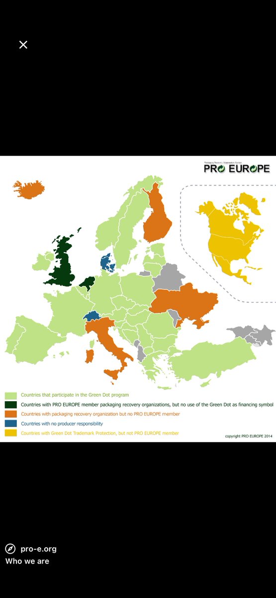
Did you know? ‼️
‼️ 2. Green Dot Symbol
The Green Dot symbol ♻️ is one of the most misunderstood symbols in packaging design.
A lot of people think it means the packaging is recyclable .
The Green Dot simply shows that the brand or manufacturer contributes financially to a recycling/recovery program, mostly used in Europe. It means the company has paid into a system that helps collect and process packaging waste.
So:
❌ It does NOT automatically mean the package is recyclable
❌ It does NOT mean the package is made from recycled materials
It only means the company supports the recycling system financially.
You’ll mostly see it on:
• Food packaging
• Cosmetic products
• Household products
• FMCG packaging sold in European markets
As a packaging designer, this is important because many designers place sustainability symbols randomly without understanding their meanings.
Every symbol on a package should have a purpose and proper compliance behind it.
3
271