
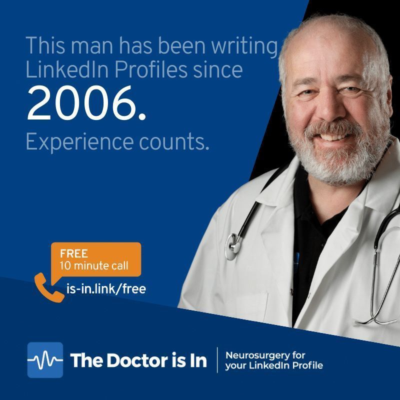
I make you visible legible and credible. I've been writing LinkedIn Profiles since 2006. Scottish.
Joined March 2007
- Tweets 62,901
- Following 1,894
- Followers 3,303
- Likes 7,600
957 Photos and videos


Pinned Tweet

I have a face made for podcasts. But here's my 30-second hello video from my #LinkedIn Profile.
Connect with me or follow for regular LinkedIn Tips and Advice specially for entrepreneurs at linkedin.com/in/davidpetheri…
1
9
924
David Petherick — LinkedIn Profile Doctor retweeted

26 Dec 2025
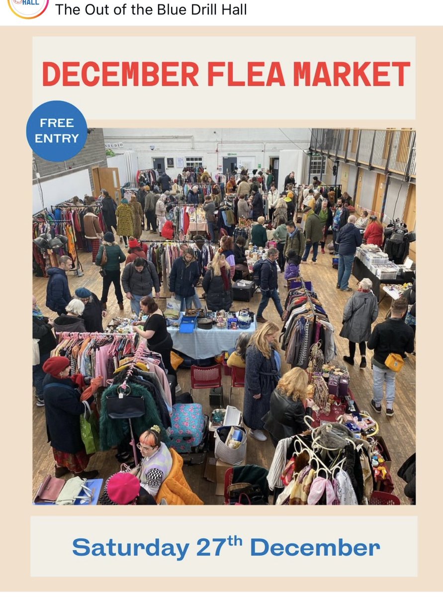
Tomorrow . Saturday . the Out of the Blue Drill Hall. Flea market. 10am till 3pm / come and spend your Christmas money sustainably.
2
2
54
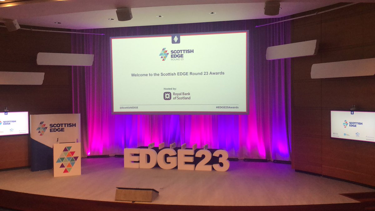
Special offer for delegates to
@ScottishEDGE
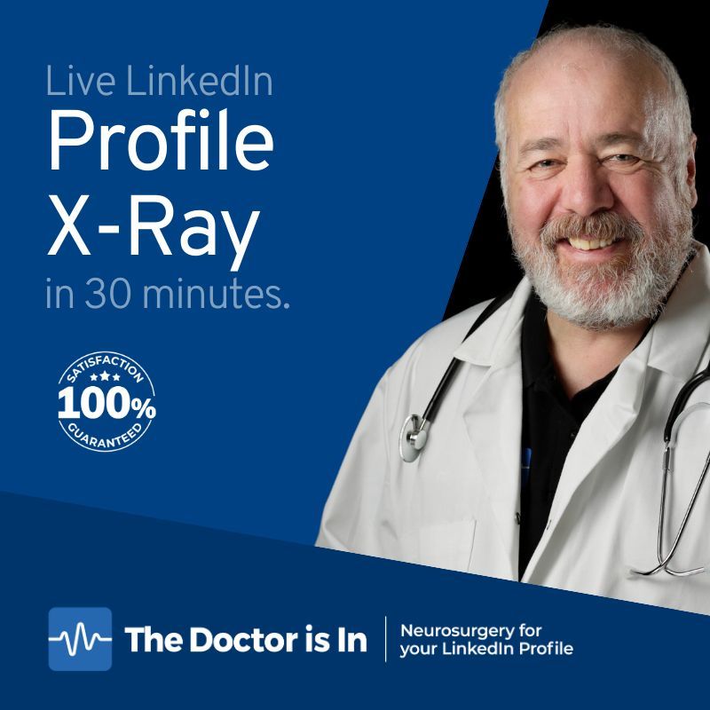
#EDGE26 today - save £218 on a LinkedIn Profile X-Ray and pay just £39. Offer expires 14th December. app.animo.co/eMDuD/save-218-… — Get your LinkedIn Profile assessed by an expert and get a written diagnosis from Doctor David Petherick.
1
48
Scan the QR code to get this special offer.
29
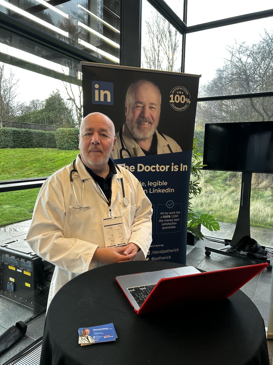
Exhibiting today at
@ScottishEDGE
#EDGE26 — giving free ten-minute 1-to-1 #LinkedIn Profile Consultations. All EDGE Finalists can take advantage of my hugely discounted services — full details at doc.scot/edge #thedoctorisin
2
91
I've set up an account with animo.co and have a special offer activation for delegates to @ScottishEDGE #EDGE26 today - save £218 on a LinkedIn Profile X-Ray and pay just £39. Offer expires 14th December. app.animo.co/eMDuD/save-218-…
33
LinkedIn launches AI-powered people search: My analysis and what you need to change on your profile...
linkedin.com/pulse/linkedin-… 54 comments and counting — take a look at what this means for writing your #LinkedIn Profile.
38
'LinkedIn profile writing for leaders. If you're a CEO, CMO CxO or VP, I'll improve your #LinkedIn Profile so you can connect, converse and convince.
doc.scot/linkedin-profile-wr…
I've been writing LinkedIn profiles since 2006 and have over 70 recommendations on my LinkedIn Profile.
1
40
I'm offering my #LinkedIn Profile X-Ray Service for just £127 this October, saving you £130 on the normal price of £257.
Book your 30-Minute Zoom consultation with the Good Doctor today at doc.scot/x-ray-130/
"Recommended. Highly"— @patphelan
34
How good is your #LinkedIn Profile? Pop by my stand at @ScottishEDGE #EDGE25 today for a lightning profile diagnosis. And swap your business card with mine for the chance to win a £257 Profile X-Ray. X-Ray Details at doc.scot/linkedin-profile-x-…
1
70
Drop by the exhibition area during the break at @ScottishEDGE #EDGE25 for your chance to win a £257 #LInkedIn Profile X-Ray. Just look out for the man in the white coat. Stethoscope ready to listen to your LinkedIn ailments.
59
All set up exhibiting at the @ScottishEDGE Finals at Royal Bank of Scotland Conference Centre in Edinburgh. Drop by the stand for a chance to win a £257 #LinkedIn Profile X-Ray. #EDGE25
1
4
322
Profit over planet. Everything that’s wrong with energy supply in one succinct message.

BP's chief executive will scrap a target to increase renewable generation 20-fold by 2030, returning the focus to fossil fuels, as part of a strategy shift announced to tackle investor concerns over earnings, two sources told @Reuters reut.rs/4beY6ES
1
46
UPDATED FOR 2025: How to create an effective #LinkedIn Profile for Entrepreneurs . Interactive ungated online guide with Ten Key Areas of advice. is-in.link/effect
1
54
David Petherick — LinkedIn Profile Doctor retweeted

DFM @_KateForbes has said two new awards will help to "develop our pipeline of future innovators."
@ScotEnt is investing £1.5 million in @ScottishEDGE to drive innovation in key sectors, while @CodeBaseTech is supporting young tech entrepreneurs.
ow.ly/tjPF50UPyeK

1
5
7
1,258
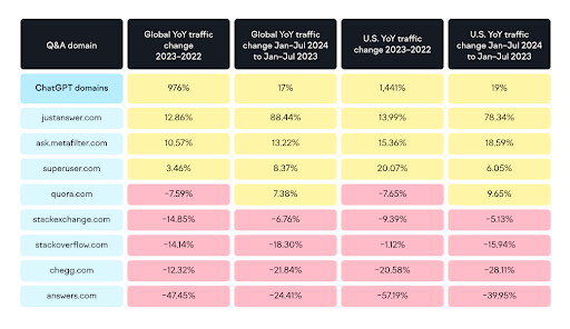
Semrush report worth your attention if search visibility is part of your remit.

ChatGPT's traffic increased 976% globally within its first year after launch, significantly disrupting the online Q&A landscape.
What does this mean for you? Find out in our new report "The evolution of online search after ChatGPT" social.semrush.com/4iTZfp3.
3
49
Actually, LinkedIn, I want to make my marketing work easier. Not harder.
67
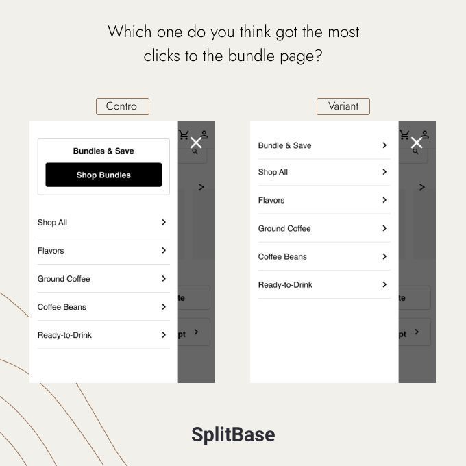
Nice example of why A/B testing is essential. And you should 'never assume nothing'! A staggering 130% difference in click-through rates.
3 Jan 2025

Which version do you think would receive the highest number of clicks to the bundle page?
Pretty sure 99% of people would guess that the "Control" version would get more than the "Variant" version.
But a recent test showed the exact opposite, and the variant increased clicks by 130%! Here's why we think this was the case:
After an in-depth nav analysis, our analytics team found it odd that the super-visible promo block on the mobile's navigation menu wasn't getting a lot of clicks compared to the rest of the links.
We hypothesized that Banner Blindness was at play.
(Banner blindness is when an element is so visible that people subconsciously end up not seeing it)
We decided to run an A/B test where we tested the original, versus making the Shop bundles link visually the same as the other links.
Boring, I know. Counter-intuitive? Definitely!
The results were striking -> the boring, link-only version got 130% more clicks!
People were, indeed, ignoring the big button and call-out in the Control.
This is why testing is key - and why best practices don't always work.
What's "obvious" isn't always what ends up working.
2
44
I'm available for a new part time or full time role from Monday 3rd March 2025. View my CV — petherick.org
I make people visible legible and credible.
34
✅ How to create an effective #LinkedIn Profile for entrepreneurs: is-in.link/effect
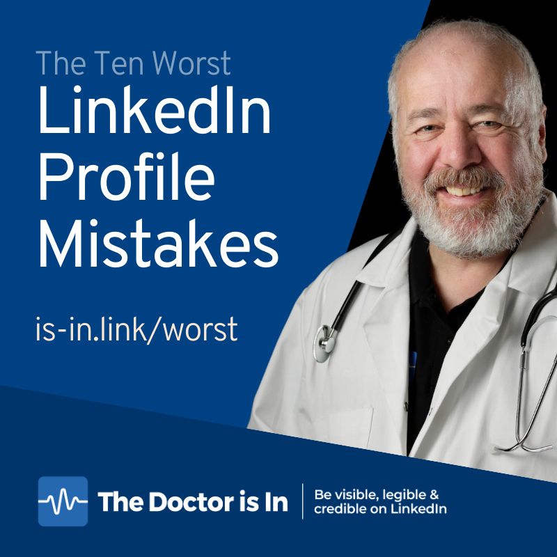
✅ 10 Worst LinkedIn Profile Mistakes: is-in.link/worst
✅ 10 Top Tips for a better LinkedIn Profile: is-in.link/ten
✅ The LinkedIn 5-a-Day Diet: is-in.link/five
1
1
48
If you're attending the @semrush Spotlight Conference in Amsterdam today, I have something for you: —
You can book a free 15-minute 1-to-1 #LinkedIn Profile Microsurgery via Zoom with me, worth £35.
Visit doc.scot/spotlight to book your call. #spotlightconf
1
3
100