
Security of State of Antifa
Joined November 2012
- Tweets 15,934
- Following 1,521
- Followers 253
- Likes 4,876
1,738 Photos and videos


that’s quite an age gap


263
8,659
159,783
2,739,086

That woman in white in the below vid is dancing like the guy in maroon in the vid I post

59
Honourable_Rowland retweeted

May 21
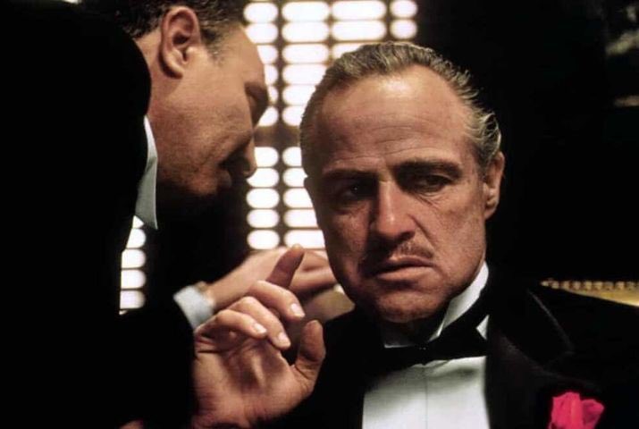
The Godmother?
May 21

A fourth ‘GODFATHER’ film is in the works.
Based on the novel “Connie” and told from the perspective of Vito Corleone’s only daughter.
6
8
88
15,086
Honourable_Rowland retweeted

May 16
R.I.P. Michael Jackson, you woulda loved air fryers
96
2,022
18,199
1,047,734
Honourable_Rowland retweeted

Apr 22
The Story Behind the Premier League’s Lion Redesign.
Stuart Watson, former Executive Creative Director at DesignStudio, led the Premier League’s identity rebrand in collaboration with Robin Brand Consultants, shaping a visual system rooted in the people who power the game, fans, communities, and players. The process was far from cosmetic. A six-month audit revealed that 90% of stakeholders wanted to retain the iconic lion, reinforcing its role as a symbol of strength, heritage, and authority within global football. From there, the team explored over 600 sketches, using eye-tracking technology to understand how audiences engaged with different variations, ultimately refining the lion into a more confident, modern mark focused on its face. The updated wordmark, set in a custom title-case FF Mark font developed with Monotype, introduces a more approachable and balanced tone, improving legibility and alignment across platforms. This evolution marks the league’s third identity in 24 years, less a reinvention, more a strategic refinement designed to future-proof one of sport’s most recognizable brands.
#logodecks

8
246
1,618
89,394


Honourable_Rowland retweeted

Apr 15
this is why nonsexual nudity in art is peak
554
31,093
447,967
6,295,579

Apr 17

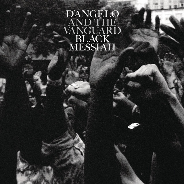
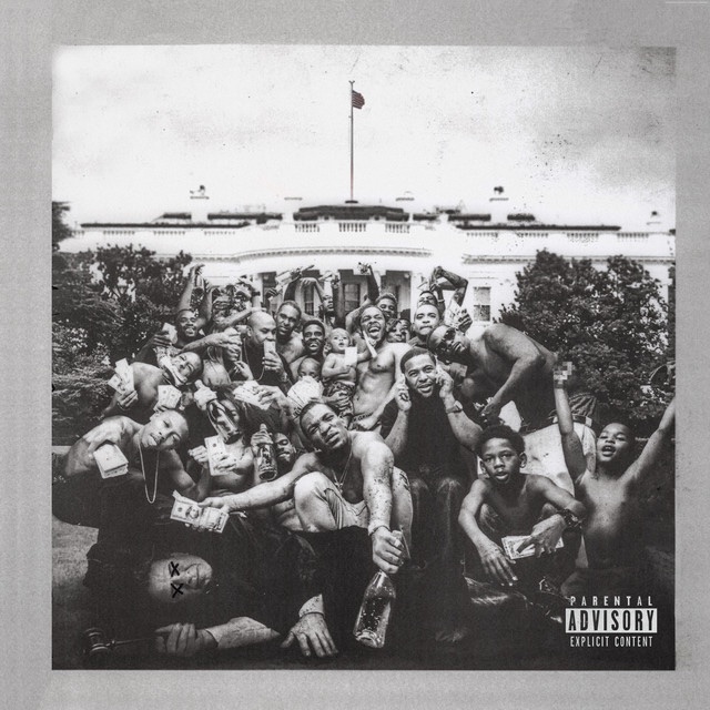
Which two albums are sisters/brothers/cousins in your head?
15
787
4,289
149,325
Honourable_Rowland retweeted

B.B. King in the 1990s playing a slow blues groove
13
294
1,282
40,483

bro was just born and went straight to retirement

481
15,767
183,948
3,640,989
Honourable_Rowland retweeted

Apr 5
Isn’t this you twerking in your grandmothers face and food? You guys aren’t the moral police especially when it comes to being sexually explicit in public.
Apr 4

I really would not want a bitch that be naked all the time around my kids.
467
2,997
37,108
5,158,939
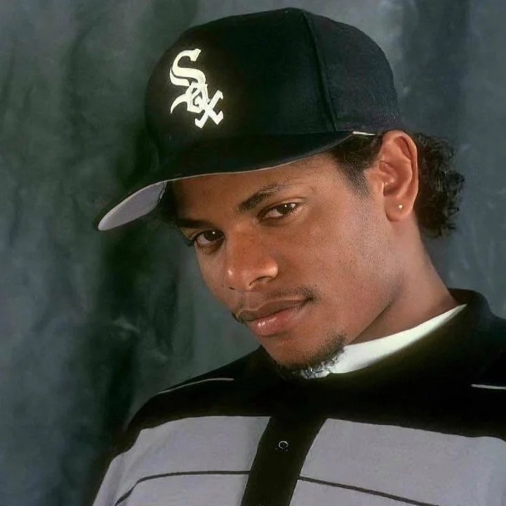
Snoop or 2pac

46
Honourable_Rowland retweeted

Mar 30
Europe’s social democratic parties are collapsing — and their leaders don’t seem to know how to reverse the trend.
politico.eu/article/europe-s…
89
143
580
732,643
Greatest film of all time


36

Reporter: Congressman, were you sad that Trump wouldn’t shake your hand?
Van Orden: See, they ask these stupid questions and they want me to say something. So this guy, his only promotion potential is like, to become a nagging mother-in-law.
69
77
611
141,122
Great film this

51

Honourable_Rowland retweeted

Feb 21
A baby girl’s reaction after seeing clearly for the first time with glasses 🥹
150
876
12,584
237,443
Honourable_Rowland retweeted

Feb 17
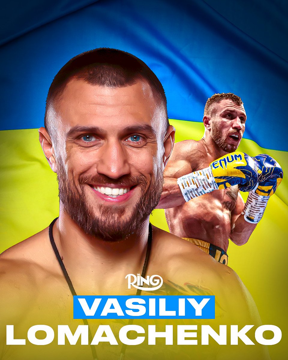
🗓️ On this day in 1988, Vasiliy Lomachenko was born in Ukraine 🇺🇦
The three-division champion won The Ring’s ‘Fighter of the Year’ in 2017 👑
15
46
472
18,203
