We've been helping businesses big and small build long-lasting brands through effective brand strategy, design, advertising, social and web since 2009
- Tweets 1,995
- Following 274
- Followers 251
- Likes 341


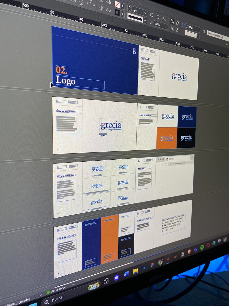
ALT A5 brochure layout with a structured grid system inspired by Swiss design and clean typography. The left side features dark backgrounds with white text blocks, showcasing sections like ‘Impactful communication’ and ‘Tactile interaction.’ The right side displays open white space with placeholder grey boxes to represent images, arranged within a balanced grid. Each spread combines columns and modular grids to guide content, highlighting compact storytelling through thoughtful typography. Text emphasizes practicality, eco-friendliness, and visual clarity, ideal for brochures aiming to convey concise information and strong brand identity.

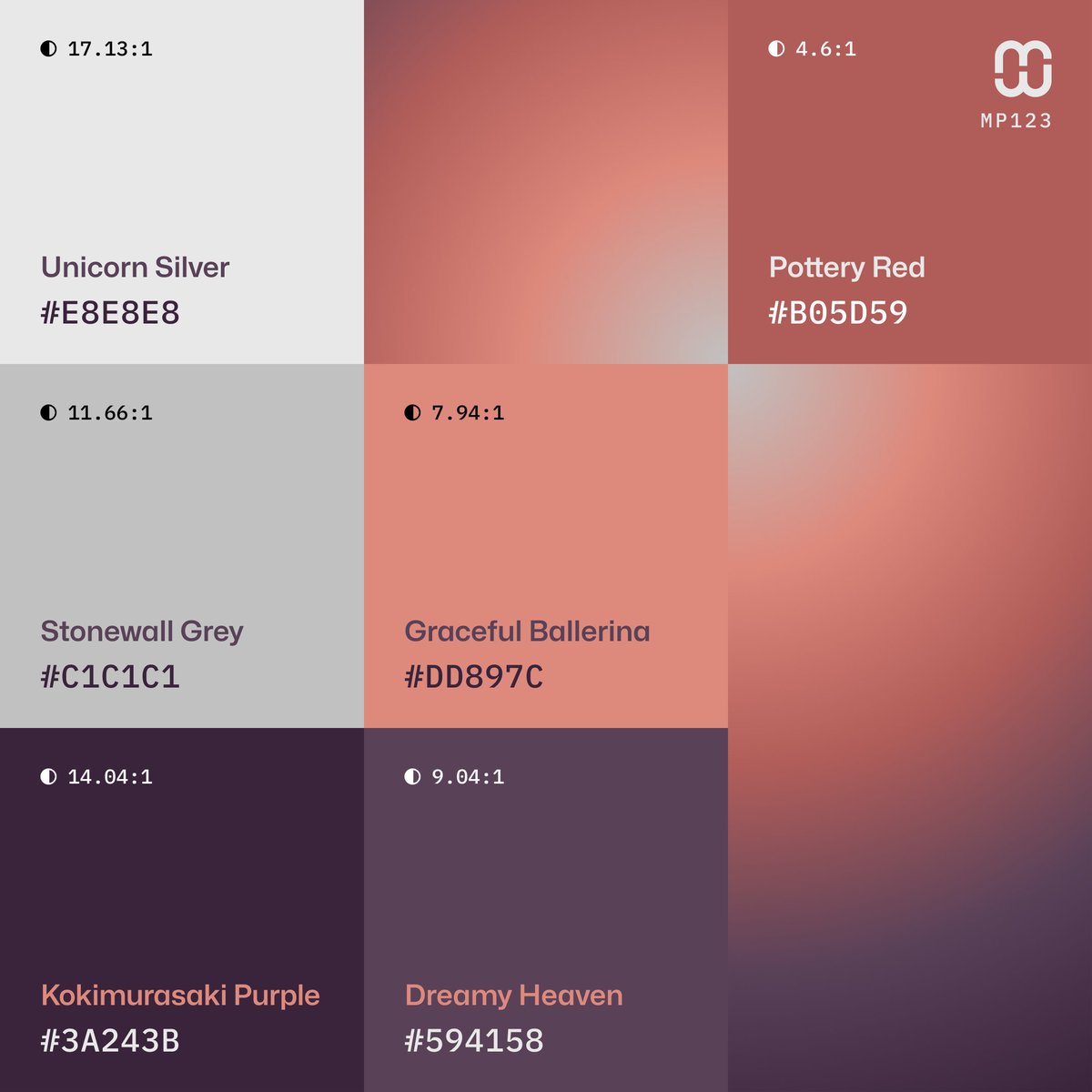
ALT Mindful Palettes Series № 123 - Color dominance grid and sampler with color codes #E8E8E8, #C1C1C1, #DD897C, #B05D59, #594158, #3A243B