
Joined January 2024
- Tweets 1,226
- Following 171
- Followers 17,239
- Likes 9,220
534 Photos and videos


Pinned Tweet

22 Sep 2025
We’re The Screenshot First Company
We just hit 10k followers 🎉
It’s the perfect time to re-introduce ourselves:
We specialize in creating captivating visuals and adding rizz that make your app shine in stores.
Clients: Promova, Gringo, Happn, Bump, Paired, Cal AI, Sleepiest, Purp, Kismia, Uxcel, Jammable, Riveo, and counting.
Huge thank you to everyone who’s been part of the journey 🚀

18
13
423
71,156
sorry just kidding

fable 5 one shotted these app store screenshots 🤯
1
28
3,300
fable 5 one shotted these app store screenshots 🤯

Introducing Claude Fable 5: a Mythos-class model that we’ve made safe for general use.
Its capabilities exceed those of any model we’ve ever made generally available.
22
13
410
54,856
created these App Store screenshots with just a couple of prompts
Introducing Claude Fable 5: a Mythos-class model that we’ve made safe for general use.
Its capabilities exceed those of any model we’ve ever made generally available.
22
213
31,955
3/ The same assets can also be used in Apple Ads.
1
8
2,868
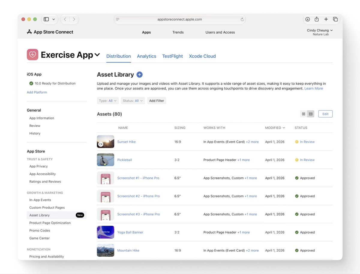
5/ This new media can be submitted through the version page.
Or through Apple’s new Asset Library, without waiting for a new submission every time.
1
50
39,309
More control also means more to test.
Do not rush to add every new surface just because it exists.
If you want help making your App Store listing clearer, feel free to reach out.
1
6
2,875
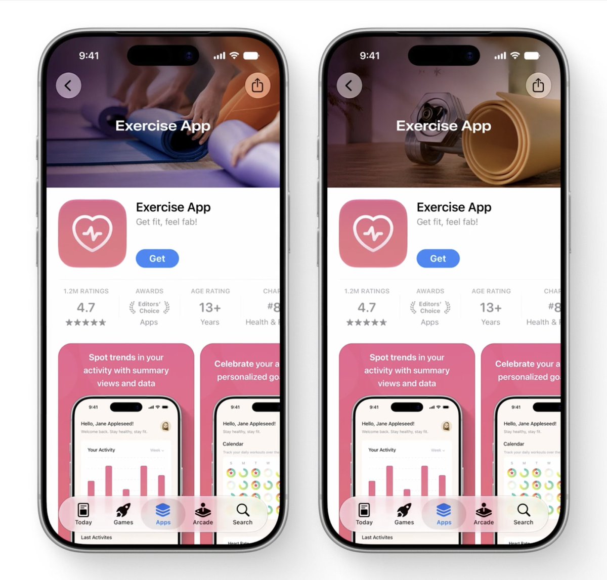
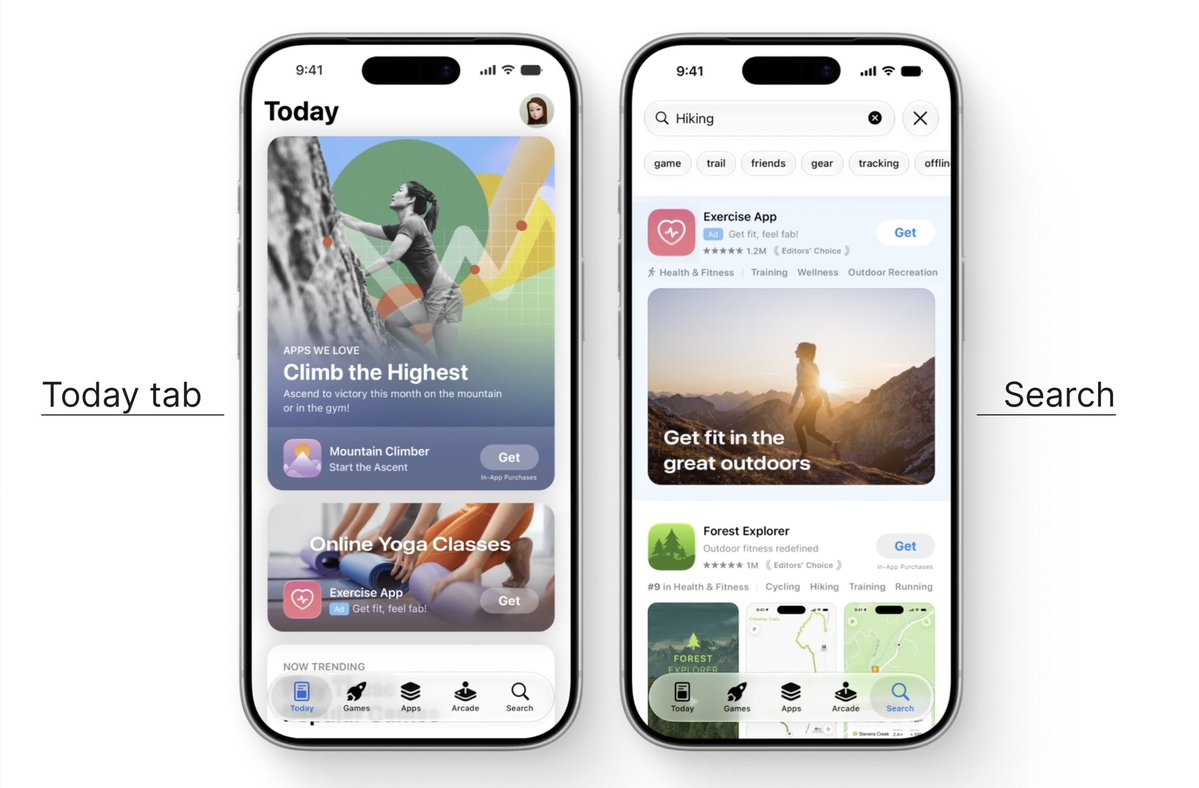
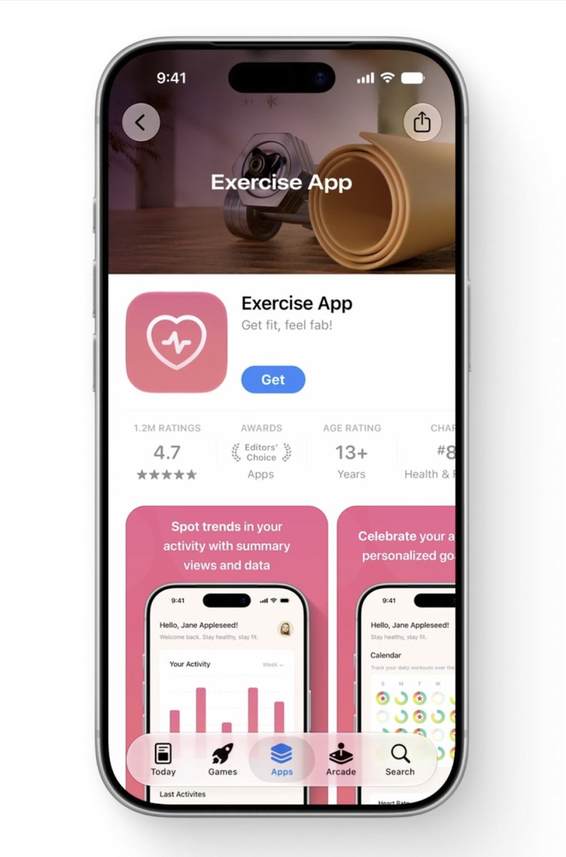
1/ Product pages now have app-level headers.
Apps can place an image or video above the screenshot set.
1
22
2,759
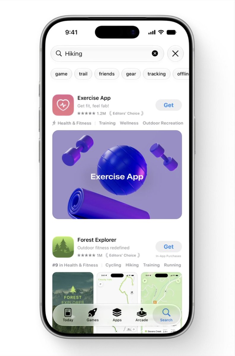
2/ Search is changing too.
Apps can now use image and
video assets there as well.
1
16
2,357
#WWDC26 changed a few important things in App Store presence.
Here is the short version.
1
4
65
10,566
App Store screenshots design for LingoLooper
29
2,272
Quentin asked for an honest roast, here it is @QuentinMerabet 🙏
Each frame on its own is a masterpiece. Really beautiful work. But because every frame is so strong individually, they fight each other instead of working as a set. There's no rhythm, no contrast, no story pulling you through.
Few things to try:
- Play with contrast across the set. Right now everything competes at the same intensity. Try going dark on frames 1 and 2, then light on 3, 4, 5. The contrast alone would make the whole thing breathe and feel like a real sequence.
- Frame 1 needs a stronger visual hook. The lifestyle photo is nice but it's not eye-catchy enough. A clear portrait / mascot almost always works for storytelling apps. A real human face with emotion stops the scroll way harder than a landscape.
- Frames 4 and 5 are pure gold. Honestly. The community frame and the writer frame are some of the best execution we've seen lately. The challenge is they're sitting at the end where most people never reach. Find a way to bring some of that storytelling energy earlier.
- Less is more on frame 3. The collage is great but there are too many covers competing. Strip it back to the most striking ones and let them breathe. Right now it reads as busy instead of curated.
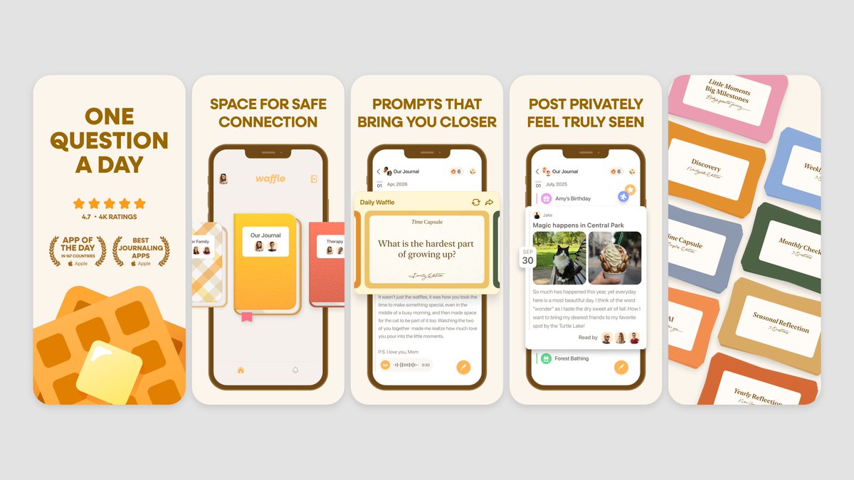
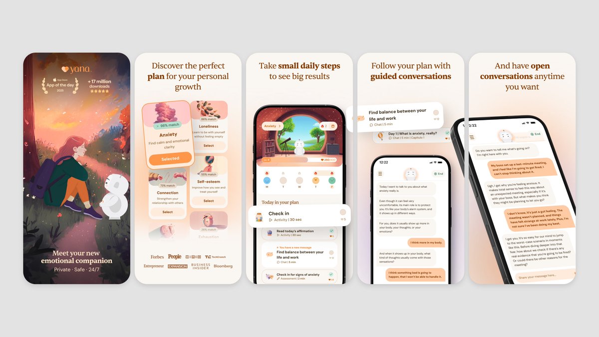
Refs below are journaling and story-adjacent apps that nail the contrast and rhythm thing. Look at how Untold opens with a dark hero shot then opens up. Yana goes dark/illustrated on frame 1, then bright UI after. That's the move.
Some examples below 🌈

1
3
90
8,475
Favorite highlights from May 🌈
Which App Store screenshots stand out to you the most?
3
1
72
3,513
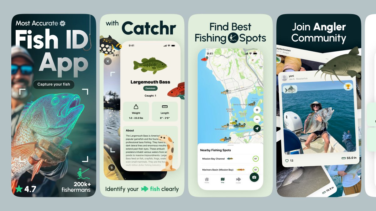
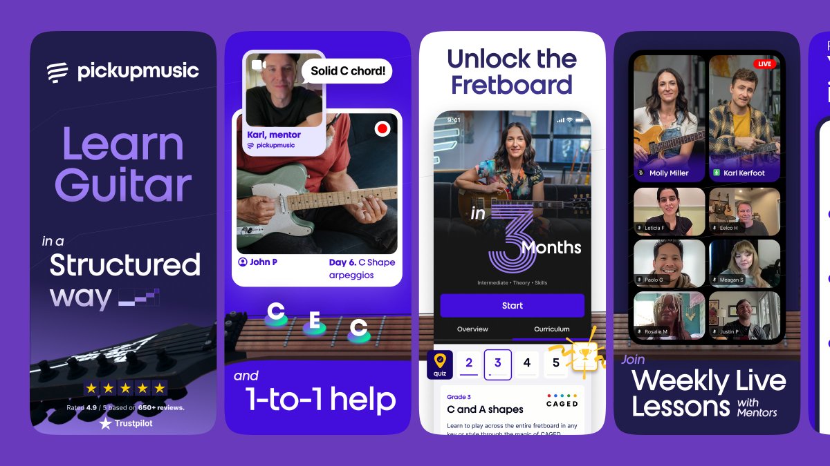
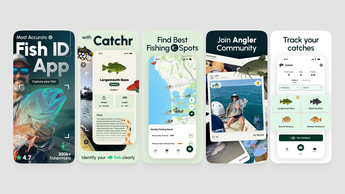
App Store screenshots design for Catchr
6
1
110
4,801
Good question from @emil406p. Honest answer, the best screenshots find balance between things that pull in opposite directions.
A few we'd flag:
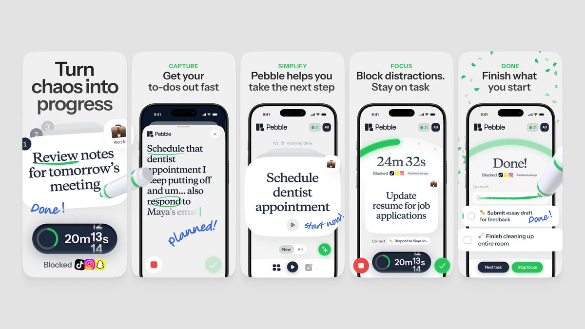
- Simple, but not boring. Strip it back without going flat. Pebble does this really well, lots of white space but the handwritten notes give it life.
- Eye catchy, but still structured. You want to stop the scroll, but the eye also needs somewhere to land. TripBff is wild and collage-y but each frame still has a clear focal point.
- Storytelling, not just feature listing. Every frame should pull you to the next one. Catchr opens with a hero photo, then the product, then the proof, then the community. There's an arc.
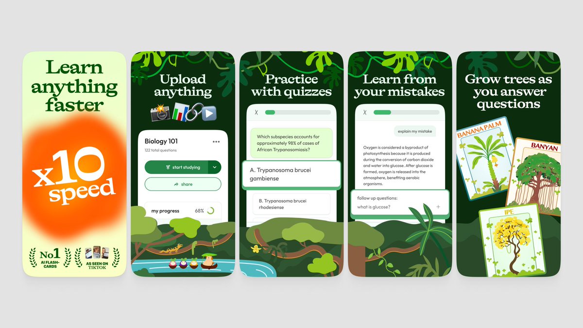
- One strong hook on frame 1. People decide in 2 seconds. unstuck nails this with a giant "x10 speed" claim that you can't miss even at thumbnail size.
The real trick isn't picking one side or finding some perfect balance once.
It's constantly testing what works with your specific audience.
Use every tool you have, custom product pages, A/B tests, different angles for different traffic sources, and adjust each part to who's actually showing up for your app.
Some examples below 🌈

Jun 1

These are really cool. Any tips for what SHOULD be included in good App Store screenshots?
1
5
103
7,408
App Store screenshots design for Peggy
31
26
773
30,947
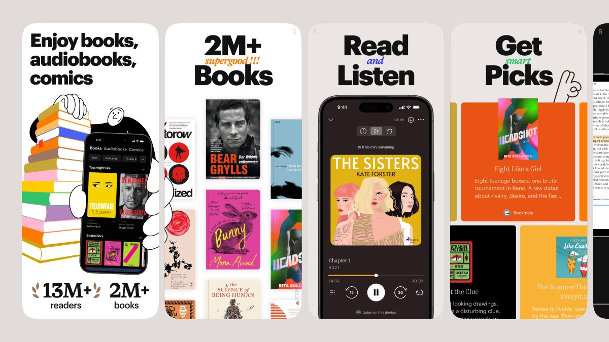
App Store screenshots design for Bookmate
7
5
156
6,612
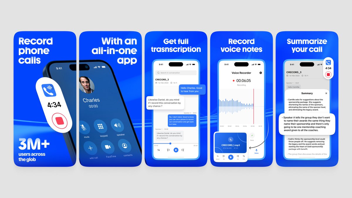
App Store screenshots design for GetCalls
7
1
51
2,991
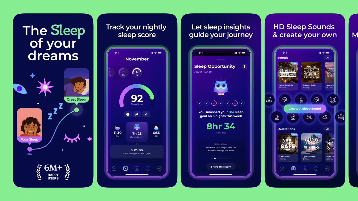
App Store screenshots design for Sleepiest
1
3
30
2,905
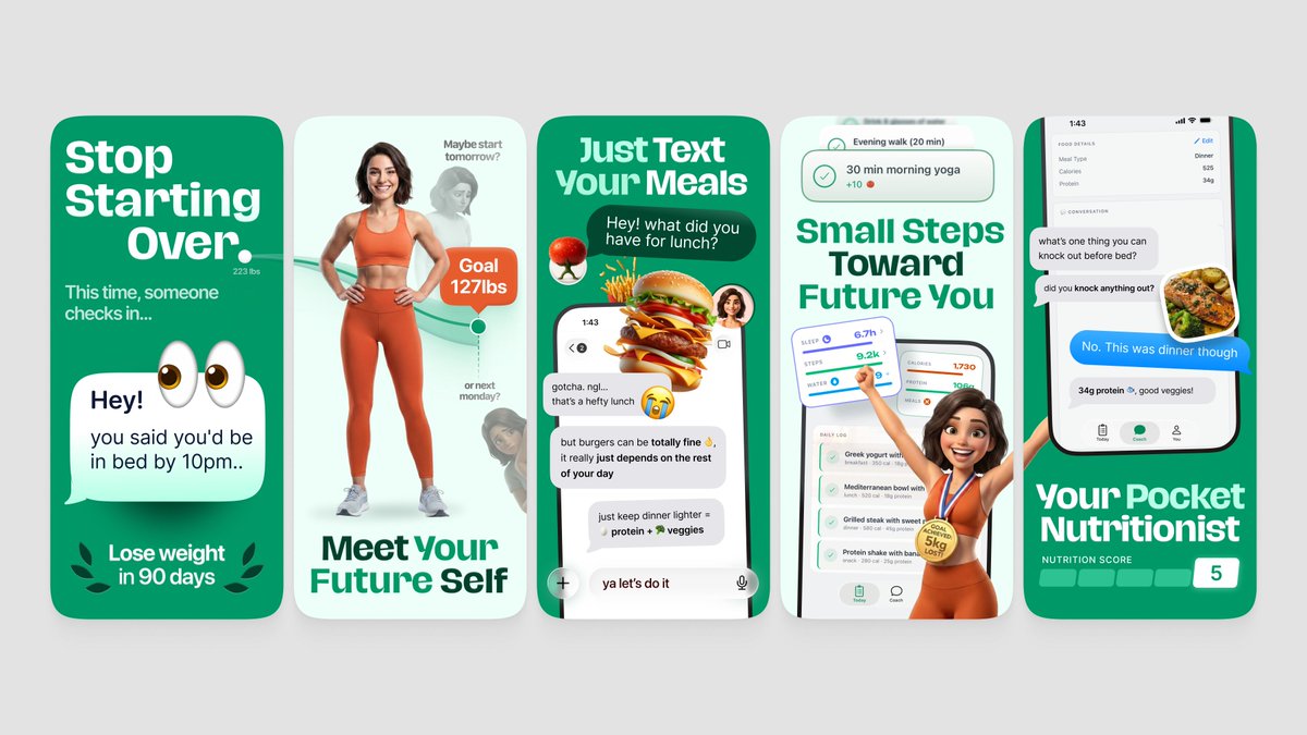
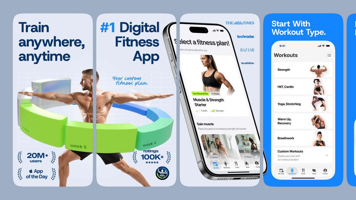
App Store screenshots design for Fitify
4
2
66
3,527