
Helping Series A-C B2B companies build sites that look enterprise-ready and give marketing teams full control to move faster | Founder @ ideapeel
Joined July 2022
- Tweets 2,387
- Following 586
- Followers 673
- Likes 20,984
416 Photos and videos


Jun 17
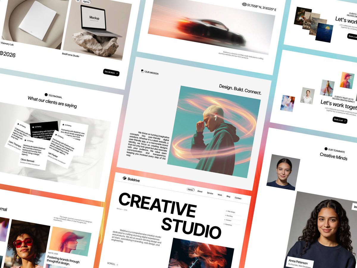
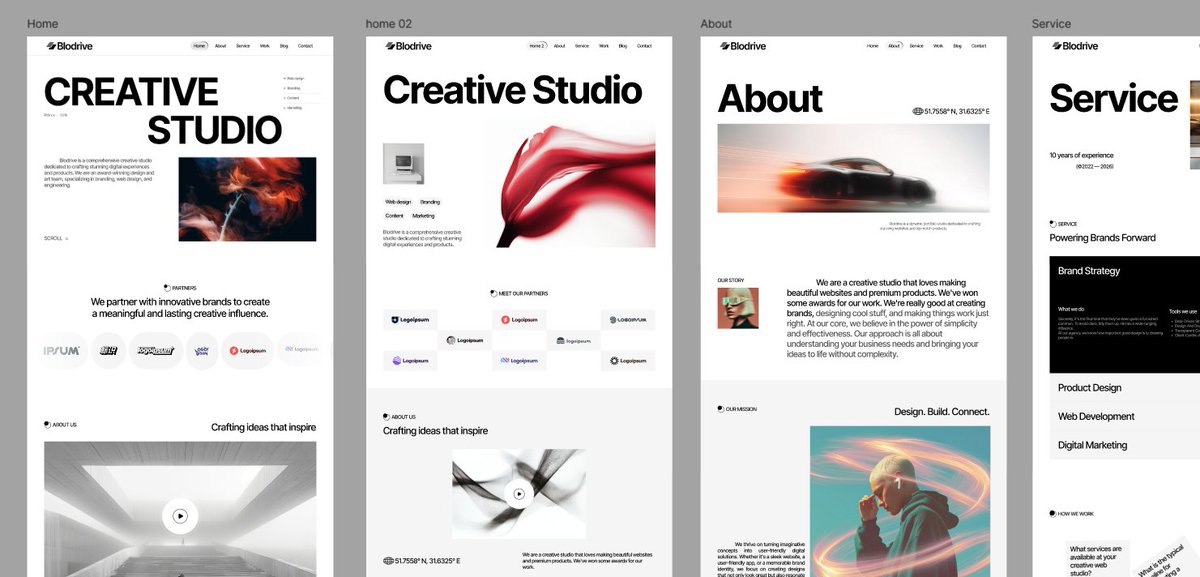
I have 30 Webflow templates. Today I shipped my first one on @framer .
Meet Boldrive — a dark, bold template for creative
studios & agencies. CMS portfolio blog, custom cursors, scroll effects.
First of many. Feedback welcome 👇
boldrive.framer.website
1
23
Jun 8
Most construction websites look the same.
Dark blues. Stock photos of hard hats. Generic layouts.
We built a template specifically for the construction niche.
Bold, high contrast, built to convert.
Orange wasn't random. It signals energy, reliability, and action, exactly what construction clients want their customers to feel.
This is what niche-specific design looks like.
What would you change about it?
1
1
56
Jun 8
Full template here if you want to use it or customize it for your clients:
buildline.webflow.io/
1
65
Jun 8
The most frustrating client isn't the one who pushes back.
It's the one who doesn't know what they want.
Here's how I spotted the pattern, and what I do now before every discovery call.
1
1
44
Jun 8
The pre-scan trigger awareness changed how I run every project.
I show up knowing their visual language before they explain it.
I catch confusion early instead of designing into it.
And I almost never get to delivery and hear "this isn't what I had in mind."
1
13
Jun 8
If you do client work, the discovery call isn't about selling yourself.
It's about understanding them before they understand themselves.
What's your biggest challenge with clients in the early stages?
Drop it below, I read every reply.
8
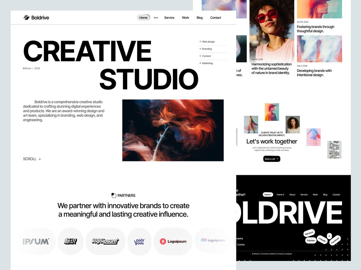
Jun 5
Built this as an early look into what we’re bringing next.
BOLDRIVE is our first template moving into the Framer space while still keeping the same clean structure and creative direction we’ve been building in Webflow.
Framer Webflow release soon.
boldrive.webflow.io/
3
33
May 2
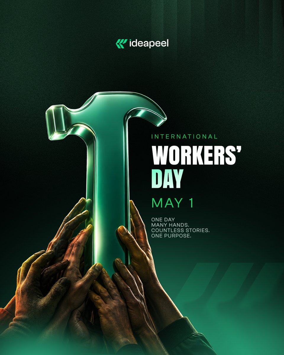
Built by hands you don’t always see.
Today is for the people who keep everything moving.
Respect the work. Respect the workers.
37
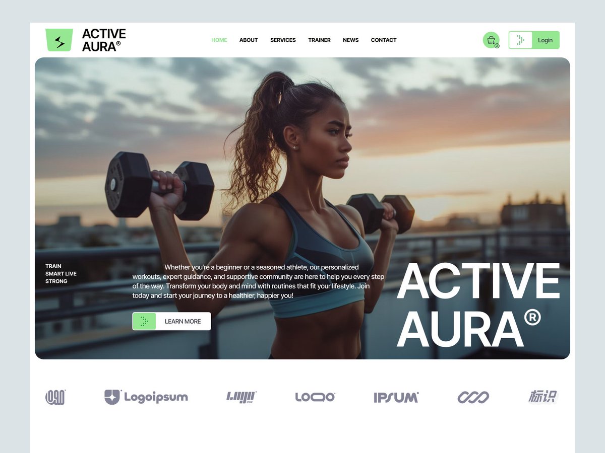
Apr 21
Every gym says “we’re different”
but their websites all look the same.
Built ActiveAura to fix that.
Something that actually feels alive.
Live on @webflow — link below.
49
Apr 19
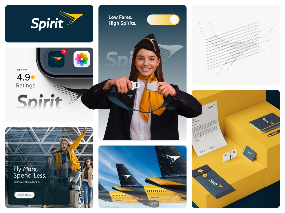
We rebranded Spirit Airlines.
Not just visuals.
The entire experience.
Same low fares.
Completely different feel.
Case study soon 👇
2
118
Apr 19
Ai Could Never Outsmart Real Designer Brain.
Take my words.
Apr 18

This it not even close to a design tool.
Design is about experimentation, direction, iteration, and ideation.
Which requires human taste and experienced craft to be well done.
Designers are not going anywhere.
We are now just getting more (super) powers than ever!
1
40
Apr 11
Creative agencies deserve better websites.
Not just pretty.
Not just trendy.
Websites that sell the work before you say a word.
Meet InoVis.
Built for agencies that want to look premium
and convert like it.
👇
3
57

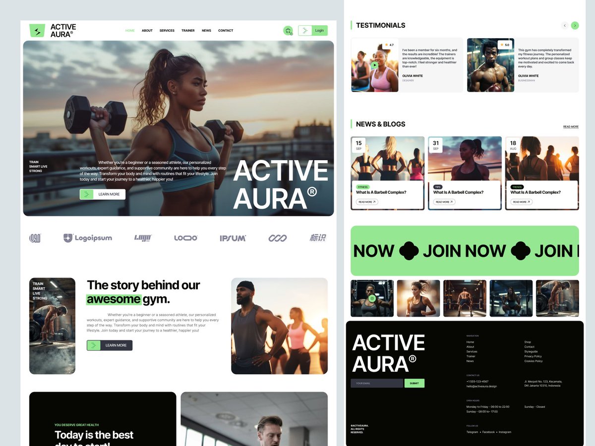
Apr 9
Fitness brands deserve better websites.
Most look good.
Almost none convert.
Meet Active Aura.
Built for gyms that want more than just traffic
they want members.
👇
22