
Appsec, Logic is my big interest. Cyber Security Lead, Bitwise Digital Solutions
Joined July 2012
- Tweets 1,062
- Following 740
- Followers 743
- Likes 135
77 Photos and videos


Green Arrow 🏹 retweeted

Jun 11
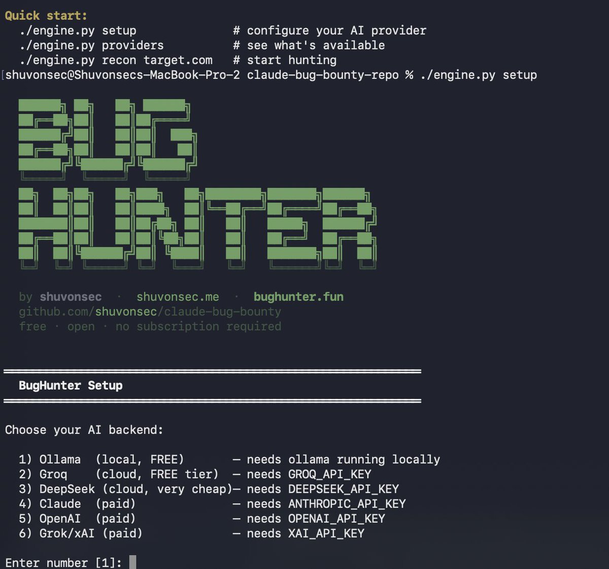
C̶l̶a̶u̶d̶e̶ ̶B̶u̶g̶ ̶H̶u̶n̶t̶e̶r̶ is now BUG HUNTER.
We changed the name because it is no longer limited to Claude Code.
Now it is a standalone open-source CLI that runs from any terminal.
Use Ollama, Groq, DeepSeek, Claude, OpenAI or Grok.
Built for the bug bounty community.
Run it locally with Ollama - no paid AI subscription required.
We are very close to 2.5K GitHub stars. Let’s make it happen, guys.
More updates coming soon.
#OpenSource #BugBounty #CyberSecurity #AI #EthicalHacking #Ollama #GitHub #SecurityTools #BugHunter
31
250
1,782
72,821
Green Arrow 🏹 retweeted

May 7
I am giving away my entire AI hacking playlist — completely free.
This is a full practical series on AI security and pentesting automation, made for anyone getting into this space.
Here is what is covered:
• How AI applications can be hacked and exploited • Prompt injection — and how it can be chained to RCE
• Building a fully local AI agent for security research at zero cost
• Fine-tuning local LLMs on cybersecurity data • Using frontier models to find vulnerabilities faster No fluff. No paid tools.
Everything shown is something you can build and test yourself.
The playlist has 10 videos right now and I am still adding more. If you are serious about understanding AI security or want to use AI to level up your bug bounty workflow, this is worth your time.
Check it here: youtube.com/watch?v=du-Vcm4D…
5
4
60
2,161
Green Arrow 🏹 retweeted

Mar 8
Claude Code skill that automates Android APK decompilation and API endpoint extraction github.com/SimoneAvogadro/an…
6
126
919
51,100
Green Arrow 🏹 retweeted

Mar 5
This is how you become a control FREAK.
Ask your OpenClaw agent:
“Build me a fully comprehensive terminal for tracking events in real time (news global events) based on this prompt.”
FULL PROMPT(bookmark): pastebin.com/27MHz8t6
You’ll need a good events/news API. Personally I’d recommend:
> GDELT: massive global event intelligence database
> NewsAPI: simple and reliable real-time news feeds
Mar 4

Ask Claude this:
“Build me a cyber-themed dashboard based on this prompt.”
FULL PROMPT: pastebin.com/v5vpraFA
You can use it for prediction market bots, OpenClaw agents, or any data-driven system you’re building.
Clean UI. Cyber style. Ready to plug into your stack.
16
79
712
143,149
Green Arrow 🏹 retweeted

Feb 24
Here's the prompt, courtesy of @viktoroddy:
Build a full-screen, presentation-style slide deck web app with 5 slides, optimized for live presentation and verbal narration. Use React and Tailwind CSS. Install the hls.js package for video backgrounds and lucide-react for icons.
Global Design System:
Font: Plus Jakarta Sans (import from Google Fonts:
@import
url('fonts.googleapis.com/css2?fa…
us Jakarta Sans:wght@400;500;700&display=swap
'))
Dark/black theme throughout, all text is white
All font sizes use responsive clamp() values (e.g. clamp(12px, 1.05vw, 20px))
All spacing uses percentage-based values (e.g. px-[5.2%], pt-[4%]) for full responsiveness
No shadows anywhere — cards and UI elements use a "liquid glass" aesthetic: backdrop-filter: blur(24px) saturate(1.4), translucent white backgrounds via linear gradients (rgba(255,255,255,0.08) to rgba(255,255,255,0.03)), thin semi-transparent borders (1px solid rgba(255,255,255,0.12)), and a subtle radial specular highlight at top-left
Presentation Framework (Presentation.tsx component):
Accepts an array of slide React elements and renders them full-screen
Keyboard navigation: ArrowRight/ArrowDown/Spacebar = next slide, ArrowLeft/ArrowUp = previous slide, F = toggle fullscreen, Escape = exit fullscreen
Smooth transitions between slides: 500ms ease-in-out opacity fade subtle scale (0.95 for past slides, 1.05 for future slides, 1 for current)
Auto-hiding controls: appear on mouse move, disappear after 3 seconds of inactivity. Fade transition (300ms)
Bottom navigation bar with: left = slide counter ("1 / 5" style, white/50 opacity, 13px, tabular-nums), center = progress dots (6px circles, current slide dot expands to 24px wide pill, white/90 for active, white/30 for inactive), right = prev/next chevron buttons divider fullscreen toggle button (all white/50, hover to white/90 with white/10 background)
Top-right keyboard hint text ("← → Navigate · F Fullscreen") at 11px, white/40, fades with controls
Video Backgrounds: Every slide that uses a video background should implement it identically: use hls.js — if Hls.isSupported(), create an HLS instance with enableWorker: true, load the source, attach to a <video> element, and auto-play on MANIFEST_PARSED. Fallback for Safari native HLS. The <video> element is absolute inset-0 w-full h-full object-cover, autoPlay, loop, muted, playsInline. No overlay, no dimming, 100% opacity. Content sits on top via relative z-10.
Slide 1 — Cover Slide (CoverSlide.tsx):
Video background: stream.mux.com/JNJEOYI6B3Eff…
9f5ZhpGbuxzc6gSyJcXaCBbCgZKRg.m3u8
Header: logo (white SVG, 129×40px) on the left, "Pitch Deck" text on the right (clamp 12px–20px, opacity-80)
Center content (vertically centered, nudged up 3%): title "AI-Powered Data Analytics" (clamp 32px–96px, tracking -0.02em, line-height 1.05), subtitle "Unlocking Business Potential" (clamp 20px–48px, opacity-90, mt 1.5%), author "By John Doe" (clamp 14px–24px, opacity-75, mt 2%)
Footer: "2024" centered (clamp 12px–20px, opacity-60)
Slide 2 — Intro Slide (IntroSlide.tsx):
Video background: stream.mux.com/Kec29dVyJgiPd…
WaQtPuEiiGHkJIYQAVUJcNiIHUYeo.m3u8
Header: logo left, "Pitch Deck" center, "Page 001" right (all clamp 12px–20px, opacity-80)
Title: "The Rise of AI / in Data Analytics" (clamp 28px–64px, tracking -0.02em, line-height 1.05)
Three-column layout below title (mt 3.5%, gap 4%):Column 1 (flex 0 0 22%): paragraph about AI analytics market growth ($150B to $300B), then large "$300" stat (clamp 28px–64px) with "2027" label beside it (clamp 13px–20px, white/80)
Column 2 (flex 0 0 38%): long paragraph about businesses adopting AI-driven analysis (clamp 13px–20px, opacity-90, line-height 1.5)
Column 3 (flex 0 0 20%): "25–40%" large stat (clamp 28px–64px), description text below, and a mini SVG line graph at bottom with a curved line (white stroke), a gradient fill area (#D2FF55 to transparent), and two endpoint dots (#B750B2 fill, white stroke)
Footer: "The Rise of AI" right-aligned (clamp 12px–20px, opacity-60)
Slide 3 — Analytics Slide (AnalyticsSlide.tsx):
Video background: stream.mux.com/fHfa8VIbBdqZe…
LGg5thjsypZ101M01dbyIMLNDWQwlLA.m3u8
Header: logo left, "Pitch Deck" center, "Page 002" right
Centered title section: "Transforming Data into Intelligence with" (clamp 14px–24px, opacity-90) above "AI-Powered Analytics" (clamp 28px–64px)
Card grid below (px 5.2%, flexible height):Top row: 3 equal liquid glass cards with gap clamp(10px–27px)
Bottom row: 2 equal liquid glass cards with gap clamp(10px–25px)
Each card has: an icon (white stroke SVG, clamp 32px–48px), title (clamp 18px–36px), description (clamp 12px–20px, white/80). Content aligned to bottom of card with padding clamp(20px–48px)
Card 1: Monitor icon, "Advanced Capabilities", "Real-time processing, predictive analytics, and machine learning."
Card 2: Brain icon, "Smarter Decision-Making", "Helping businesses unlock insights and optimize efficiency."
Card 3: Briefcase/Tie icon, "Industry Leader", "Driving AI-driven data analytics innovation."
Card 4: Lightbulb icon, "Future-Ready Solutions", "Empowering organizations to stay competitive in a data-driven world."
Card 5: Shield icon, "Scalable & Secure", "Ensuring seamless AI integration with robust data protection."
Use lucide-react icons (Monitor, Brain, Briefcase, Lightbulb, Shield) as white stroke SVGs
Slide 4 — Quote Slide (QuoteSlide.tsx):
Video background: stream.mux.com/4IMYGcL01xjs7…
k5ANO17JC4VQVUTsojZlnw4fXzwSxc.m3u8
Centered content only, no header/footer
Attribution: "Andrew Ng" (clamp 14px–20px, opacity-90)
Quote: "Artificial Intelligence is the new electricity." in smart quotes (clamp 28px–64px, tracking -0.02em, line-height 1.15)
Max-width 70%, gap 12px between attribution and quote
Slide 5 — Outro/Contact Slide (OutroSlide.tsx):
Video background: stream.mux.com/00qQnfNo7sSpn…
pB1hYKkyeSDvxs01NxiQ3sr29uL3e028.m3u8
Header: logo left, "Pitch Deck" center, "Page 020" right
Main content vertically centered, left-aligned:Title: "Contact Information & / Final Call to Action" (clamp 28px–64px, tracking -0.02em, line-height 1.05)
Description paragraph (clamp 13px–20px, opacity-90, max-width 38%, mt 3%)
5 contact items stacked vertically (gap clamp 12px–19px, mt 3%), each with an icon (clamp 24px–32px) and text (clamp 13px–20px):Instagram icon → "Instagram.com/grapho
"
Facebook icon → "Facebook.com/grapho
"
Phone icon → " 1 (415) 987-6543"
Mail icon → "contact@optimalai.com"
Map Pin icon → "Headquarters: San Francisco, CA, USA"
Use lucide-react for Phone, Mail, MapPin icons. For Instagram and Facebook, use simple SVG paths (Instagram: rounded rectangle circle, Facebook: F logo path)
App.tsx: Wire all 5 slides into the Presentation component in order: CoverSlide, IntroSlide, AnalyticsSlide, QuoteSlide, OutroSlide.
3
11
89
5,463
Green Arrow 🏹 retweeted

Feb 10
FROM MY DM.
Hi George,
I’m reaching out over a serious matter involving alleged police abuse of power.
My friend, Seth Mwabe, a cybersecurity consultant, was arrested last year over an alleged betting-site hack. Police raided his home and seized property unrelated to the case. The matter dragged in court for months as investigators kept asking for more time.
Today, the court dismissed the case for lack of evidence. When he went to reclaim his property, police abducted him. His whereabouts are currently unknown, and officers claim they will present a “fresh case.”
This appears to be intimidation and abuse of process. We’re seeking public attention to ensure his safety and accountability.
Thank you.
2
59
93
11,624
Green Arrow 🏹 retweeted

Kenyans are ungovernable 😂😂
197
1,275
4,494
141,742

6
255
1,231
32,575

2 Sep 2025
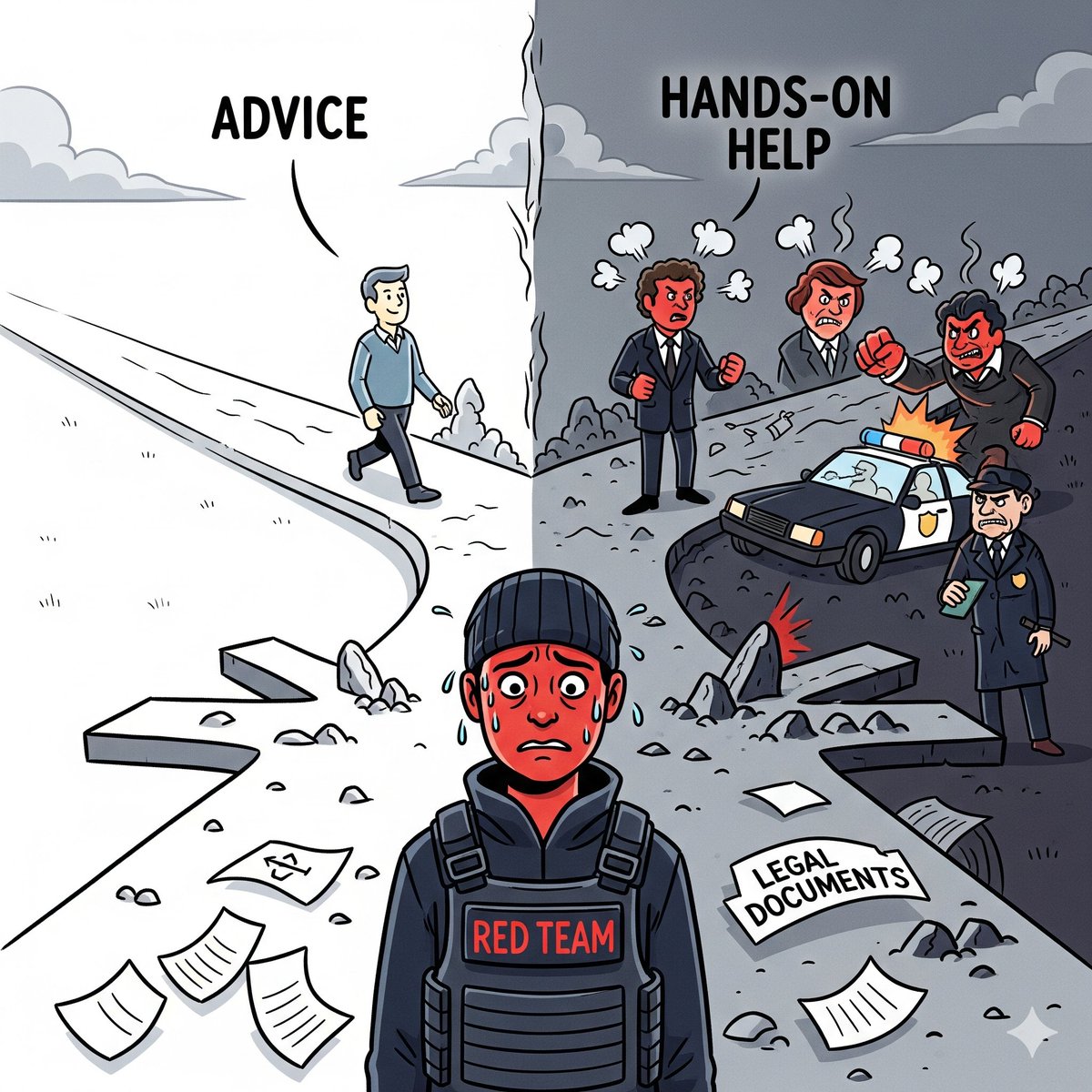
Check out my latest article: When Helping in Cybersecurity Becomes a Liability linkedin.com/pulse/when-help… via @LinkedIn
1
102
Green Arrow 🏹 retweeted

8 Aug 2025
we hijacked microsoft's copilot studio agents and got them to spill out their private knowledge, reveal their tools and let us use them to dump full crm records
these are autonomous agents.. no human in the loop
#DEFCON #BHUSA @tamirishaysh

ALT An agent dumping the entire Salesforce account table into an email and sending it to the attacker
101
860
8,431
1,231,392
16 Dec 2024
Am I the only one that feels like these Silicon Valley guys play a game with us??? That they know well that the game is big for all of them to have a share?? Coz why do they always wait for OpenAI/ChatGPT to release something and less than a week later the others…
16 Dec 2024

Introducing Veo 2, our new, state-of-the-art video model (with better understanding of real-world physics & movement, up to 4K resolution). You can join the waitlist on VideoFX. Our new and improved Imagen 3 model also achieves SOTA results, and is coming today to 100 countries in ImageFX.
1
2
608
16 Dec 2024
release their own??? Sora by OpenAI was released last week…. Google via Gemini have now released Veo. And this is not the first time this is happening!
364
16 Dec 2024
Just before I said this, someone else spotted it!! OpenAI will get to a point where it will be really expensive to operate in terms of training models where making them lag behind the other competitors that have the data with them. However, the fact that OpenAI is kinda…

Google/Gemini and Grok have reached parity, and in some cases are much better, than ChatGPT
I use all three, every day, at least 50-100x
… ChatGPT went from 90% of my queries last month to < 50%
It’s now a data and UI game, and I think Reddit, X/twitter and google’s dataset will trounce @openai’s lack of data
Remind me of this tweet in one year please
1
415
16 Dec 2024
a subsidiary of Microsoft, expect them not to give up and to use data from MS services, right from bing etc. you will notice that they’ve today introduced search via ChatGPT which uses bing’s indexing. Makes me…
1
285
16 Dec 2024
wonder how AI will be trained in terms of searches given that people have been paying huge chunks of cash just to appear on top of search engines. Wouldn’t this reduce quality of AI search results???
263
3 Dec 2024
What the actual fuck is happening with @KeEquityBank?? I did a transaction on @IPSL_Kenya which went well. Next transaction was to my @MPESAAfrica where I wanted to pay for my shopping, amount was debited from my account but never hit my mpesa, calling the…
2
281
3 Dec 2024
Worked on very many banking apps/systems and this is pure bullshit! Taking all this time to sort me out so that I can pay for my shopping or to fuel my car. It’s like I’m held ransom! What a Fuckery!
1
149
3 Dec 2024
And it’s so annoying that it also happened on Friday when I was supposed to offset a club bill! If you can’t be reliable just let us know so that we can use other banks!
130