
452 Photos and videos


Pinned Tweet

May 26
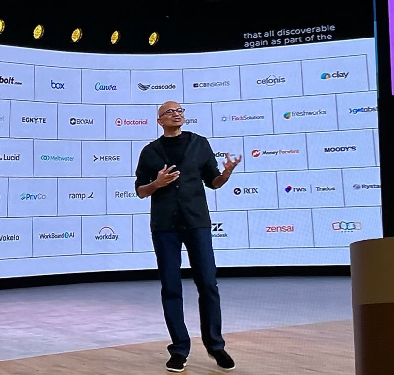
Introducing Merge Gateway - Build Your Own Router.
You're three sprints into your coding assistant.
You pick the most hyped model, integrate, test, deploy.
A month later, a new model drops.
Now you re-test, re-integrate, re-deploy.
Your product didn't change, but the benchmark did.
That's how most AI teams operate.
Chasing a "best" defined by people who've never seen their product.
There is no best model.
There's only the right one for your product, users, and use-cases.
Build Your Own Router runs on your definition of good.
Pick your benchmarks, weigh them, add your own evals.
@merge_api routes every request to your winner.
👉$100 in credits to the first 200 people that comment
merge.dev/gateway
242
410
1,999
3,659,398
Unlimited Merge Gateway access too

Jalen Brunson is about to have unlimited bagels and OMNY credits for the rest of his life
1
25
2,218
14h
If you are using a routing policy through @merge_api Gateway, there is no disruption to your customers.
Jun 13

As a result of a US government directive, we are suspending access to Claude Fable 5 for all users. You can continue to use all other Claude models.
Here’s what this means for you:
Across Claude products, new sessions will run on your selected default model or Opus 4.8, and existing Fable 5 sessions will end with an error.
On the Claude Platform, requests to Fable 5 will also return an error. Please update your integrations to other Claude models.
We know this is a disruption to your workflows; we appreciate your patience and support.
2
15
2,293
Jun 12
a token tracking world is here
Jun 12

SCOOP: Meta plans to clamp down on skyrocketing AI costs inside the company by imposing limits on employees’ token usage, the company told staff in a memo on Tuesday, just weeks after it pushed them to adopt AI tools in their work.
5
1
17
5,717
Jun 12
Jun 3

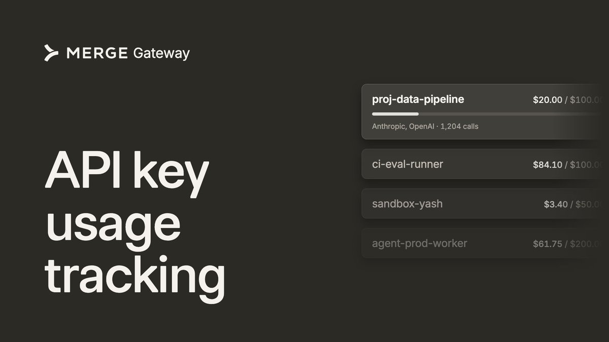
Most companies give employees AI access with zero visibility into who's doing and spending what. It's all I see on X and LinkedIn lately.
That stops today.
We just launched per-employee and use-case API keys with spending limits built in.
Track budget, usage, and spend per person or use-case. Then let Merge's intelligent routing send each request to the most cost-efficient model that can do the job.
Works with coding agents like OpenCode, Claude Code, Codex, and more.
Check it out here: gateway.merge.dev
6
584


Jun 11
most dramatic 6 years of my life, and i wouldn't trade anything for it
1
13
348
Jun 11
🙂
Jun 8

Live chat is now on Merge Gateway.
Talk to a real person when you need help. Wild.
1
13
1,150
Jun 10
the cost of fable is going to make smart model routing impossible to ignore
14
9
128
15,252
Jun 9
Fable is 25% off right now on @merge_api Gateway

Introducing Claude Fable 5: a Mythos-class model that we’ve made safe for general use.
Its capabilities exceed those of any model we’ve ever made generally available.
4
3
25
2,440
Shensi Ding retweeted

Jun 9
Claude Fable 5 is now available on Merge Gateway.
It came out ahead of every other model in our internal benchmarks, and we were extremely impressed.
If you're on Gateway, point your existing requests at Fable 5. Same API.

4
5
38
1,712
Jun 9
Merge Gateway usage has grown nearly 7x in just the last week...
It's clear the market is shifting to multi model and multi provider as the default. Save on costs, build more reliable products, and prevent vendor lock-in.
Join the wave: gateway.merge.dev
13
14
124
278,616
Shensi Ding retweeted
Jun 9
my signup easy
my integration secure
my logos the best
KNICKS IN FOURRRRR

Jun 8

Our old Merge Unified signup page felt like an exam. Email, name, company, password, consent checkbox, etc all stacked next to each other.
We just shipped a new one to help get users through the flow quicker. The first ask is just your work email or Google, then the rest of onboarding gets unlocked later on. The first interaction is one small ask instead of a dense form.
Also redesigned the whole page so it looks like the actual Merge product instead of a generic signup template. Check it out:
app.merge.dev/signup

2
6
21
2,046
Jun 8
Live chat is now on Merge Gateway.
Talk to a real person when you need help. Wild.
5
1
18
3,023