
Professional interface design training for working designers. A proven framework that helps you finish your work to the level it deserves. Made by @mds
Joined February 2019
- Tweets 665
- Following 1
- Followers 11,352
- Likes 660
166 Photos and videos


Pinned Tweet

29 Dec 2025
↓

In the AI era, design judgement is the differentiator.
Shift Nudge teaches the process that takes the guesswork out.
→ shiftnudge.com
1
6
3,393
Shift Nudge retweeted

Jan 23
Just finished @mds's @shiftnudge course after seeing his episode on @ridd_design's @joindiveclub.
Gotta say it was an absolute masterclass and would recommend for any product designer looking to upskill on visual/ui design.
1
2
4
4,827
Shift Nudge retweeted

25 Sep 2025
The first leg up I got was in my first month, I took a Ui design course from @shiftnudge, really great content that will ramp you up into UI-UX.
From there, it's copying other peoples work, following design tutorials here on X, and then copying more peoples work - really helps to give an idea of how your favorite designers create their UI
2
1
3
2,193
24 Jun 2025
⚡️
6
4,666
22 Jun 2025
🥳👇
22 Jun 2025

Just finished Shift Nudge, easily the best UI course I’ve taken.
It gave me that rare “aha!” feeling and changed how I think about design.
Not just a course a guide I’ll keep returning to.
Thanks @mds for this gem!
#ShiftNudge #UIDesign #UXDesign
1
3,765
3 Mar 2025
We’re investigating an issue with our payment provider that’s causing checkout failures.
Will update as soon as we have more info.
1,529

Been getting great feedback for the UI Principles workshop yesterday.
Posted the replays and the schedule for all of the weekly live critiques coming up for Shift Nudge students.
If you want in on the action...
→ shiftnudge.com
1
1
15
3,407
13 Feb 2025
📐👇
Someone asked me...
"Why is ChatGPT using 24px of padding on the left and 16px on the right? Instead of only 16 or only 24?"
↓ If I had more time I'd make a shorter video
3
1,599
12 Feb 2025
👀
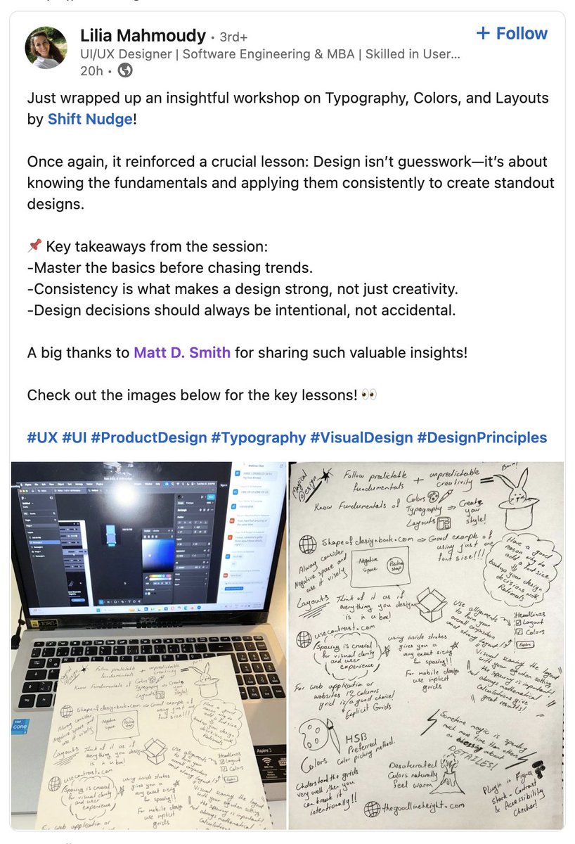
Some details to consider to enhance clarity, usability, and visual cohesion in this card UI...
TYPOGRAPHY
- Increase title font size to make project names more prominent and easier to scan.
- Use uppercase for status labels to enhance visibility and reinforce importance.
- Adjust text hierarchy by de-emphasizing secondary details (e.g., deadlines, progress) to keep focus on project titles.
LAYOUT
- Add more spacing around elements for a cleaner, less cramped appearance.
- Ensure consistent alignment for text and progress bars to create a more structured layout.
- Position status labels at the top of each card for quicker identification of project states.
COLOR
- Use a cohesive color palette for status labels to enhance harmony and polish.
- Double-check color contrast to ensure small text on colorful backgrounds meets AA accessibility standards.
- Match progress bar colors to status labels for visual consistency and stronger progress tracking.
- Opt for softer, refined colors over harsh primary tones to create a modern, intentional design.
STYLE
- Reduce border contrast for a cleaner, more modern aesthetic.
- Refine progress bar design with even spacing and alignment for clarity and intention.
- Place status tags in a distinct location to improve scannability and reinforce project states.
---
Example pulled from the @shiftnudge community.
Enrollment is starting soon—hop on the list to get notified when we go live...
→ shiftnudge.com

5
1,406
1 Sep 2024
⚡️

One of the most enjoyable lessons from @shiftnudge so far has been creating illustrations from references.
Remade @OnDeck in Figma and it blew my mind how far you could get with simple shapes, gradients, and layer effects.
8
7,327
31 Jul 2024
"Earlier this week I wrapped up 6 months of dedicated work with the Shift Nudge Interface Design course by Matt D. Smith. After nearly a decade in the field, I wanted to break down and rebuild one of my skill areas that I felt had some room for growth.
After finishing this course, I can say with certainty that my UI design skills have been re-tooled from the ground up, and it has hands down been the best investment I've made in my career thus far. Cannot recommend the course enough if you want to sharpen your skills - let me know if you'd like to hear more about my experience with it."
linkedin.com/feed/update/urn…
1
11
5,449
2 Jul 2024
origin story
Here's my Config talk about unlocking opportunities and building your brand through side projects.
1
20
3,135
What does Apple, Meta, Google, Slack, YouTube, Figma, Amazon, BP, EA, Lyft, Dropbox, Etsy, Github, Quicken, Netflix, Shopify, Pentagram, Intercom, Windows, and Uber...
...all have in common? 🤔
The've all had people join Shift Nudge and go through the course to sharpen their visual design skills.
Today's the last day enrollment is open, so if you know someone looking to level up their visual design craft, let them know.
→ shiftnudge.com
I'll share some student reviews in the thread below...
3
1
47
9,873
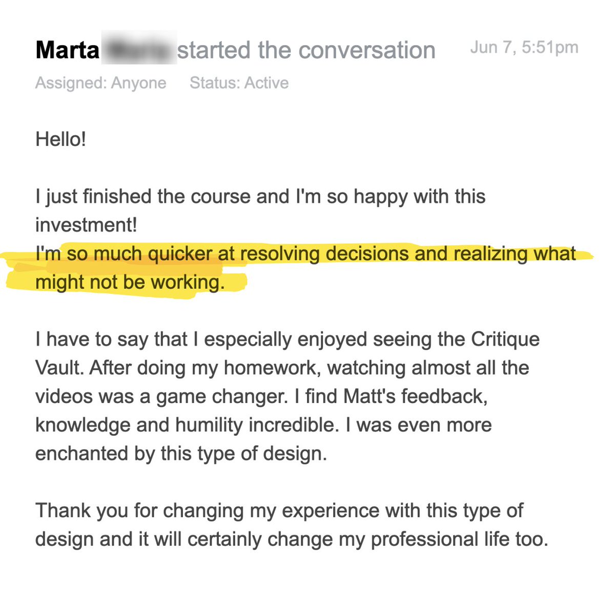
7 Jun 2024
"I'm so much quicker at resolving decisions and realizing what might not be working."
2
1,585