
Accessibility specialist and blogger. I post links to my articles here; if you have any questions I'd love to hear from you on Bluesky, Mastodon, or LinkedIn.
Joined April 2009
- Tweets 17,044
- Following 140
- Followers 946
- Likes 1,013
1,228 Photos and videos


31 Dec 2025
✍️ Safari 26.2 prompted me to write about the HTML5 document outline algorithm 🪦 tempertemper.net/blog/the-fi… #accessibility #a11y
36
25 Nov 2025
39
31 May 2023
Every idea comes from a good place, but some well-intended features are actually bad for usability; limiting form field input is one of those things ✍️ tempertemper.net/blog/dont-m… #accessibility #a11y
2
368
4 May 2023
New profile pic #MayThe4thBeWithYou
ALT My usual avatar showing a very low resolution pixellated version of me, this time with a helmet like the main character from The Mandalorian TV series, and Grogu (The Child) standing next to me.
6
403
3 May 2023
The whole point of VoiceOver is that it talks out loud, but sometimes you need it to be quiet for a moment… Here's how to get it to shut up when you need 📷 tempertemper.net/blog/gettin… #accessibility #a11y
210
29 Mar 2023
The difference between Increased Contrast Mode and Windows High Contrast Mode (Forced Colours Mode) ✍️ tempertemper.net/blog/the-di… #accessibility #a11y
175
22 Mar 2023
In order to make my website’s keyboard focus outlines pretty in Safari, I had inadvertently broken things for people who use Windows High Contrast Mode with the keyboard alone… ✍️ tempertemper.net/blog/window…
#a11y #accessibility
1
1
199
2 Mar 2023
I just tapped (with great pleasure) Tweetbot’s “I Don’t Need a Refund” button daringfireball.net/2023/03/t…
131
2 Jan 2023
When an interactive element like a button, link, or form field sits on top of another interactive element, accessibility (and usability) problems arise ✍️ tempertemper.net/blog/overla… #accessibility #a11y
1
1
337
22 Dec 2022
‘Alt’ text is vital for people who can’t see an image, but what about those who don’t use a screen reader but still struggle with low contrast images? ✍️ tempertemper.net/blog/images… #accessibility #a11y
1
3
349
Martin Underhill retweeted

22 Dec 2022
Day 26 of #A11yAdvent - confused about when to use html section elements?
@tempertemper gives a good explanation about how to make them accessible in this blog post tempertemper.net/blog/when-a…
2
2
535
30 Nov 2022
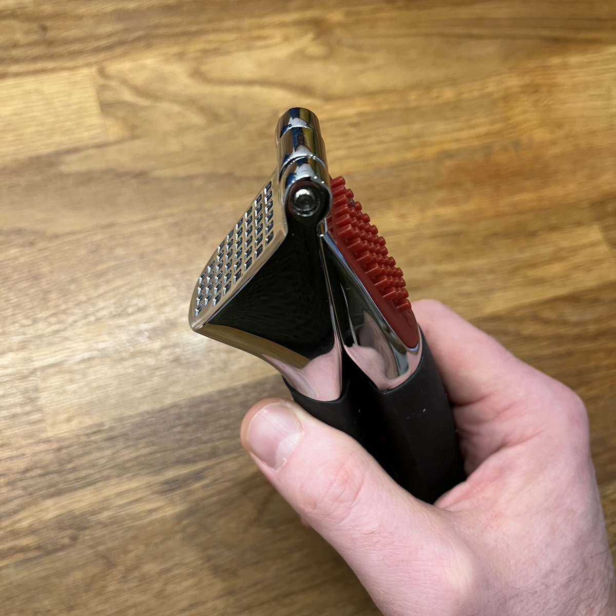
Check this beaut out! 😍
ALT A solid looking metal garlic crusher with a black rubberised handle and a red plastic part to push the bits of garlic out of the holes.
2
30 Nov 2022
Based on the price and apparent quality, I’m hoping this is the last garlic crusher I’ll ever buy.
1
30 Nov 2022
I enjoy that it’s stuff like this I get excited about these days 😂
Martin Underhill retweeted

24 Nov 2022
Super excited the new #numberanxiety #accessibility poster made available, thanks @GirlCalledMalic Ollie and @zenfunkmaster seeing the final artifact makes me happy 😊 thanks also @abbott567 for your help accessibility-manual.dwp.gov…
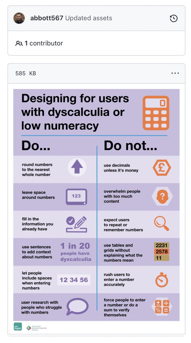
ALT Screenshot of the brand new GOV.UK accessibility poster, title: Designing for users with dyscalculia or low numeracy
2
33
109
21 Nov 2022
There was a controversial (rightly!) article a year or two ago about accessible and elegant digital design being mutually exclusive.
Not having any luck searching for it… Does anyone have the link?
#Accessibility #A11y
2
16 Nov 2022
Does anyone have a recommendation for a good human live captioning service? #a11y #accessibility
1

This post goes into more detail about our usability testing with frequent screen reader users; the common patterns that stood out, and why they should matter to people involved in the web.
#a11y #accessibility #userTesting
jessbudd.com/blog/screen-rea…
1
13
22
Martin Underhill retweeted

4 Nov 2022
1
1