You don't need media queries for a responsive card grid.
grid-template-columns: repeat(auto-fit, minmax(240px, 1fr));
auto-fit counts the columns. minmax sets the floor and lets each column grow with 1fr. Resize the window, cards reflow. One line. Sound on 🔊
I made a rock song about CSS justify vs align.
The rule that fixed it for me forever:
- justify → side to side
- align → up and down
- items → one box
- content → the whole group
Flex or grid. Same four words. Sound on 🔊
I made a rock & roll song about CSS subgrid.
Cards never line up. Titles wrap, buttons drift, the row looks broken.
One line: grid-template-rows: subgrid;
Now the children share the parent's tracks. Everything snaps.
Sound on 🔊
Native HTML accordion. Zero JavaScript 👇
<details>
<summary>FAQ</summary>
Answer, hidden until clicked.
</details>
Keyboard screen-reader friendly by default. Add name="faq" and only one stays open at a time.
More no-JS tricks 👉 theosoti.com/you-dont-need-j…
HTML has a built-in modal.
The <dialog> element gives you showModal(), a backdrop, ESC-to-close, and focus trapping. All from the browser.
No Bootstrap modal. No Radix. No react-modal.
A song about the most underrated HTML tag 🎵
You don't need JavaScript for fancy UI details.
CSS ::before and ::after give you quote marks, badges, arrows, dropcaps, gradient overlays. Zero markup, zero JS.
A song about the most underrated CSS feature 🎵
I created a funny song about CSS position: absolute, sticky, and relative.
It is short, funny, slightly absurd, but practical if you ever needed clarification about why your design ended up somewhere else.
ch matches the width of the “0” character.
lh equals the element’s line-height.
cap matches the height of capital letters.
ex follows the height of the lowercase “x”.
cqi scales with a container’s inline size.
vmin and vmax follow the smallest or largest viewport side.
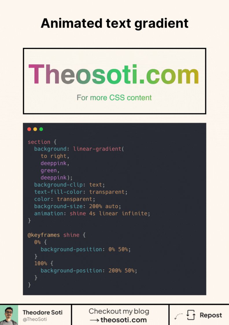
Animated text gradients with pure CSS.
background-clip:text color:transparent, then animate background-position.
Use background-size, and repeat the first color in the gradient (c1 c2 c1) to avoid a visible “jump” on loop.
Chromium WebKit are solid; Firefox is catching up.
Stop rounding corners. Start shaping them.
border-radius sets the size.
corner-shape sets the geometry (bevel, scoop, squircle...). Same radius, totally different vibe.
Works today in Chromium. No Safari/Firefox yet, so ship it as progressive enhancement.
Stop hardcoding input heights or widths.
field-sizing: content; lets inputs, selects, and textareas size to their content (even placeholders).
Cleaner forms, zero JS.
Support is growing (about 74%): Chrome/Edge Safari 26.2 . No Firefox yet.
Would you use it?
Mirror reflection in pure CSS with ONE property:
-webkit-box-reflect: below 0px linear-gradient(transparent, rgba(0,0,0,.5));
No pseudo-elements. No duplicate images.
Works in Safari Chrome Edge but not Firefox.
Would you ship it as progressive enhancement?
Ever noticed how numbers often look misaligned?
It’s not your layout. It’s the font.
Most fonts default to proportional digits.
So “1111” is much narrower than “8888”.
Columns won’t line up perfectly.