
Joined September 2020
- Tweets 5,750
- Following 329
- Followers 2,182
- Likes 102,359
797 Photos and videos


Pinned Tweet

26 Aug 2025
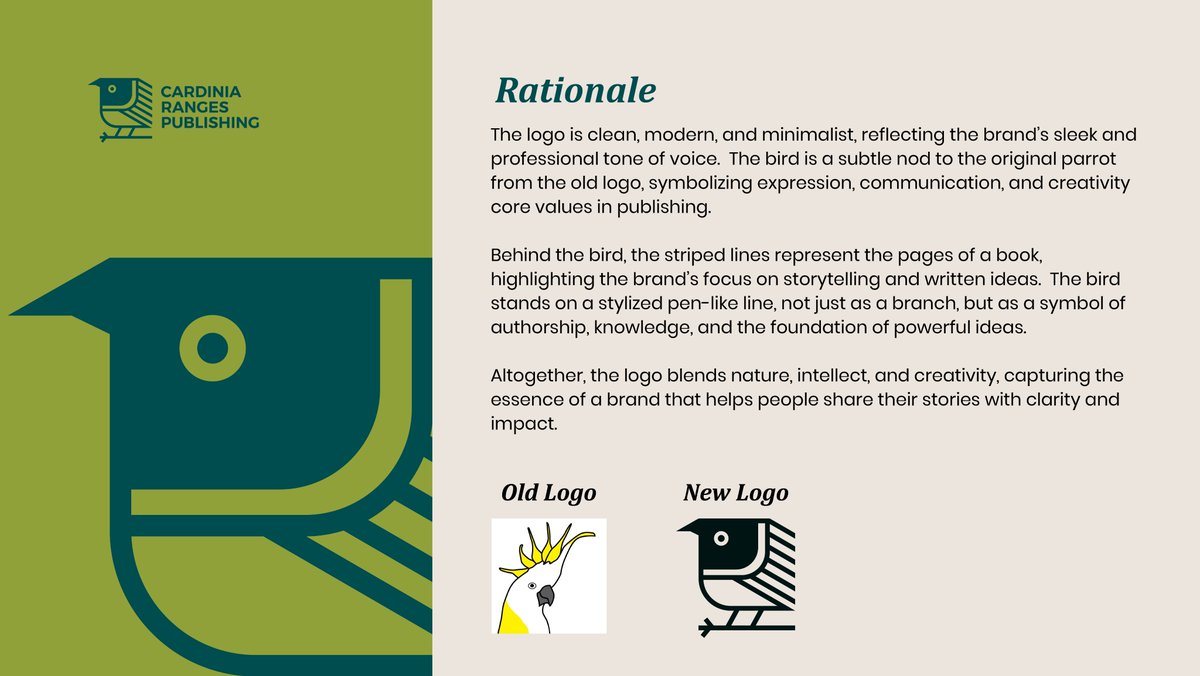
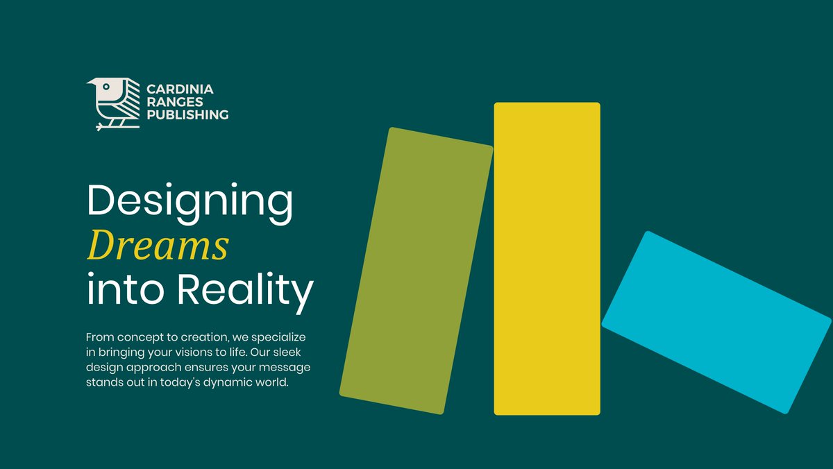
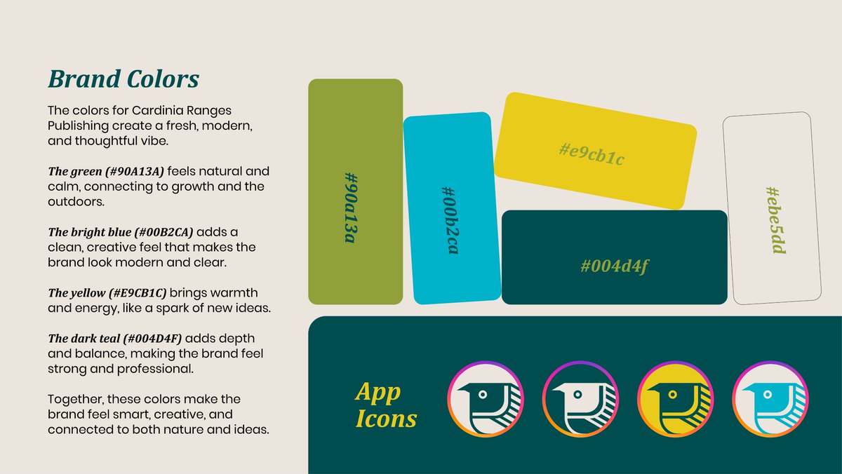
Cardinia Ranges Publishing - Logo Redesign.

17
13
363
11,279

Jun 2
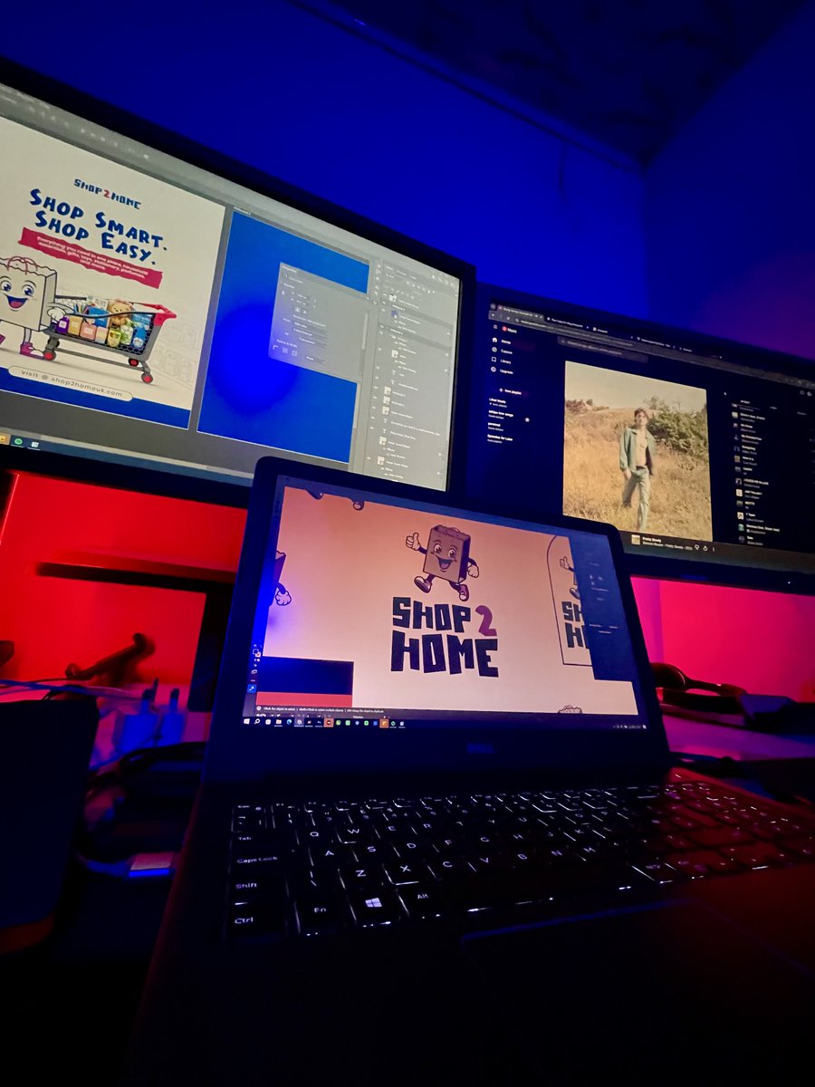
Shop2Home’s original logo was trying to do too much at once. Between the abbreviations, random icons, and crowded layout, the brand message got lost.
For the redesign, I focused on what actually matters: making the brand easier to recognize, remember, and connect with.
I brought the full brand name forward and introduced a simple shopping bag mascot to give the brand some personality. It instantly communicates shopping and delivery while making the logo feel more friendly and approachable.
Sometimes good logo design isn’t about adding more, it’s about removing the things that don’t need to be there.
1
9
97
The Tipbrat retweeted
May 27
Most times we send our CVs, rate cards, or PDF portfolios to clients and attach a link so they can view more of our work online.
This is one of the easiest ways to add clickable links directly to objects in Adobe Illustrator 👀
Simple.
Clean.
Professional.
Save this for later ✍️
1
2
17
457
May 29
Most photography logos look the same.
A camera icon.
A lens.
A shutter.
Repeat.
When I started working on this identity, I quickly realized there were countless versions of the same idea already online.
So instead of creating another photography logo, I focused on creating something unique to the brand.
The final mark combines:
📸 A camera focus point - representing precision, attention to detail, and capturing the perfect moment.
🔠 The brand’s initials - creating a distinctive symbol that belongs to the brand, not the industry.
The result is a logo that feels elegant, memorable, and recognizable even without the full brand name.
Because the best logos don’t just tell people what industry you’re in.
They tell people who you are.
What do you think of the final direction?
2
7
150
May 28
WhatsApp, Facebook & Instagram are slowly becoming pay-to-play if you want to reach more potential clients.
Twitter (X) is already there.
To access the internet, you pay for data.
Freelance platforms are getting more competitive and expensive by the day.
Even electricity isn’t free anymore.
Honestly, I really feel for beginners trying to start from scratch today.
2
6
197
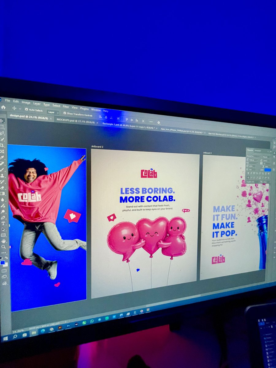
May 25
The old Colab logo had the idea… but not the energy.
So I redesigned it to feel louder, bolder, and more expressive while still keeping the original social element alive.
I introduced:
✦ Custom typography for stronger personality
✦ Playful layouts to reflect creativity
✦ Rounded shapes for a more human feel
✦ Better contrast for stronger visibility
✦ A cleaner, more intentional composition overall
The goal was simple:
Make the brand feel less boring… and more Colab.
What do you think about the redesign? 👀
2
21
245


May 21
I Gave Bayside Bakes a fresh new logo makeover✨
A home-based bakery creating beautifully crafted cakes and desserts deserved an identity that feels just as sweet and premium.
Thoughts on this redesign?
#logo #photoshop #illustrator #logodesigner
14
333
The Tipbrat retweeted

May 20
Mock up's and icon screens from recent project


May 20

Spool is a video collaboration platform for creatives who design, edit, and produce ad campaigns and short films.
The goal was to not feel like traditional video editors.
Here is the visuals and logo design for spool.


7
7
66
3,421
May 16
I did yesterday, and I’ll create again today ✨

Did you create today?
1
6
123
May 16
If they don’t reply, ask someone else.
I’ve learned so much these past few months just by asking people with more experience what to do.
Just ask bro.
May 12

This is so trueeee but most times, it is usually difficult to ask another person after the first person doesn't respond.
2
7
230
The Tipbrat retweeted
May 13
Most clients think they only need a logo… but a logo alone doesn’t build a brand.
A logo is just an identifier. What actually makes a business look professional is the entire system behind it, the visual direction, the consistency, the presentation, and how everything connects together across every platform.
That’s why branding goes beyond just creating a symbol. It involves building a full identity with guidelines, supporting visuals, social media assets, brand imagery, collaterals, mockups, patterns, icons, and every little detail that makes the business feel intentional and recognizable.
Because no matter how good a logo looks, if the rest of the brand feels inconsistent, people notice it immediately.
The goal isn’t just to “have a logo.”
The goal is to build a brand people can recognize, trust, and remember.
#logodesign #branddesign #logodesigner
2
1
15
236
The Tipbrat retweeted
May 15
Brand visuals for Softure, a software development brand.
The logo was built from interconnected “greater than” and “less than” symbols, two of the most recognizable elements in programming. By transforming these coding symbols into a unified geometric mark, the identity directly reflects software engineering, logic, and digital systems.
The continuous flow of the symbol represents connectivity, collaboration, and scalability, showing how different technologies and ideas come together to build functional digital solutions. Its rotational structure symbolizes innovation, iteration, and constant progress, while the balanced geometric form reinforces stability, precision, and reliability.
At first glance, the mark feels abstract and modern, but beneath it lies a subtle coding reference that makes the identity intelligent, memorable, and deeply connected to the tech space.
3
3
20
304
May 15
Fixed my light earlier this week… and honestly, nothing beats the feeling of having steady 24/7 power supply fr.
5
60