
31 Photos and videos


We are very excited to announce that tipofili.com is now live!
1
10
70
Tipofili retweeted

31 Dec 2024
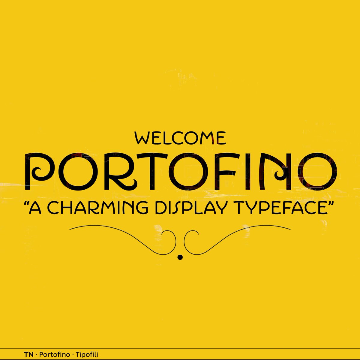
Influenced by Italian hand-lettered posters from the early twentieth century, #Portofino by @tipofili is a charming display typeface with expressive forms complementing its underlying geometric proportions.
👉 License Portofino on TN: buff.ly/3ZUuQxQ

3
6
348
As a part of @louisefili’s rebrand of Triennes, we drew a custom script that was tailored to work at a fairly small size while still feeling at home with the logotype.
2
8
781
Tipofili retweeted
6 Mar 2024
Influenced by Italian hand-lettered posters from the early twentieth century, #Portofino by @tipofili is a charming display typeface with expressive forms complementing its underlying geometric proportions.
👉 License Portofino on TN: buff.ly/3wB1WYK

4
16
1,026
Tipofili retweeted
15 Aug 2023
Influenced by Italian hand-lettered posters from the early twentieth century, #Portofino by @tipofili is a charming display typeface with expressive forms complementing its underlying geometric proportions.
👉 License Portofino on TN: buff.ly/3PBFm7V
3
9
1,783
Tipofili retweeted
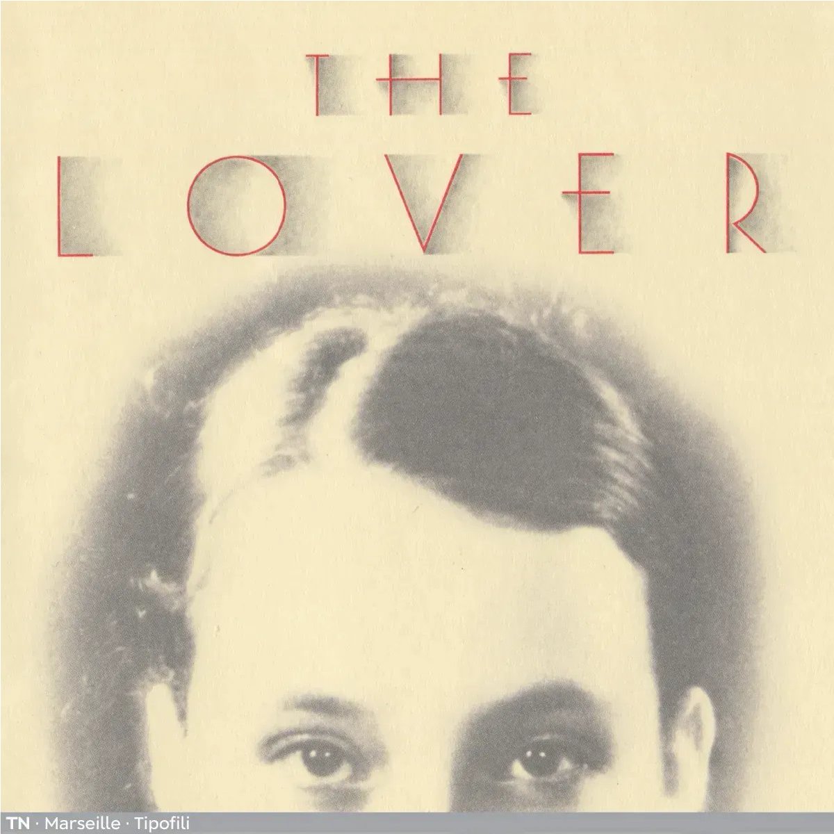
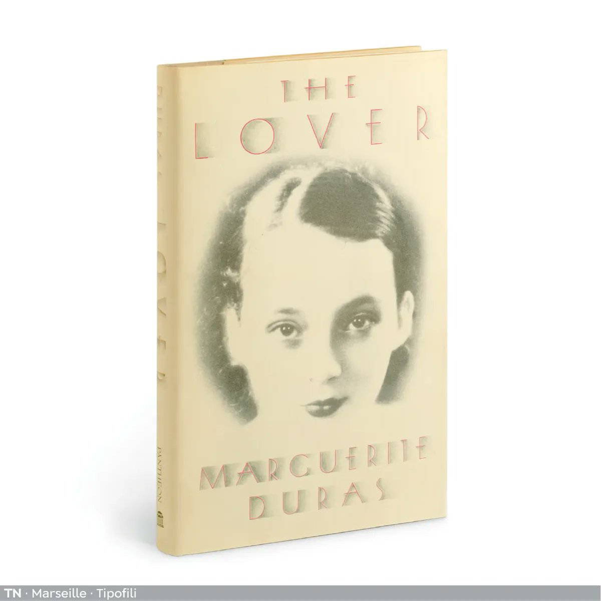
12 Aug 2023
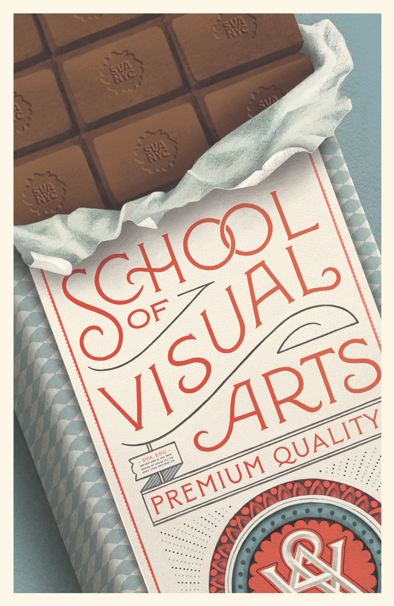
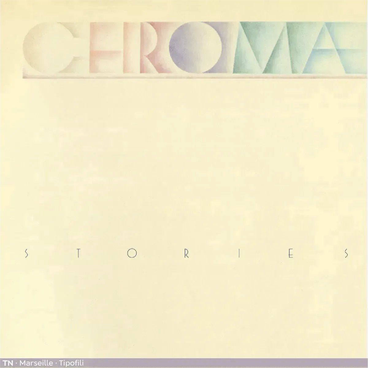
An Art Deco-inspired typeface based on Louise Fili’s iconic cover design for The Lover, @tipofili's #Marseille comes in six weights, giving it a variety of expressions while remaining timelessly elegant.
👉 License Marseille here: buff.ly/3YDQaGO
2
4
1,117
Tipofili retweeted

6 Apr 2023
Here is a sneak peek of the redesigned packaging for Royale Montaine, a cognac and orange liqueur. The seal features Marseille from @Tipofili which we modified using its OpenType features. We’ll share the whole bottle and label once it hits the shelves later this spring.
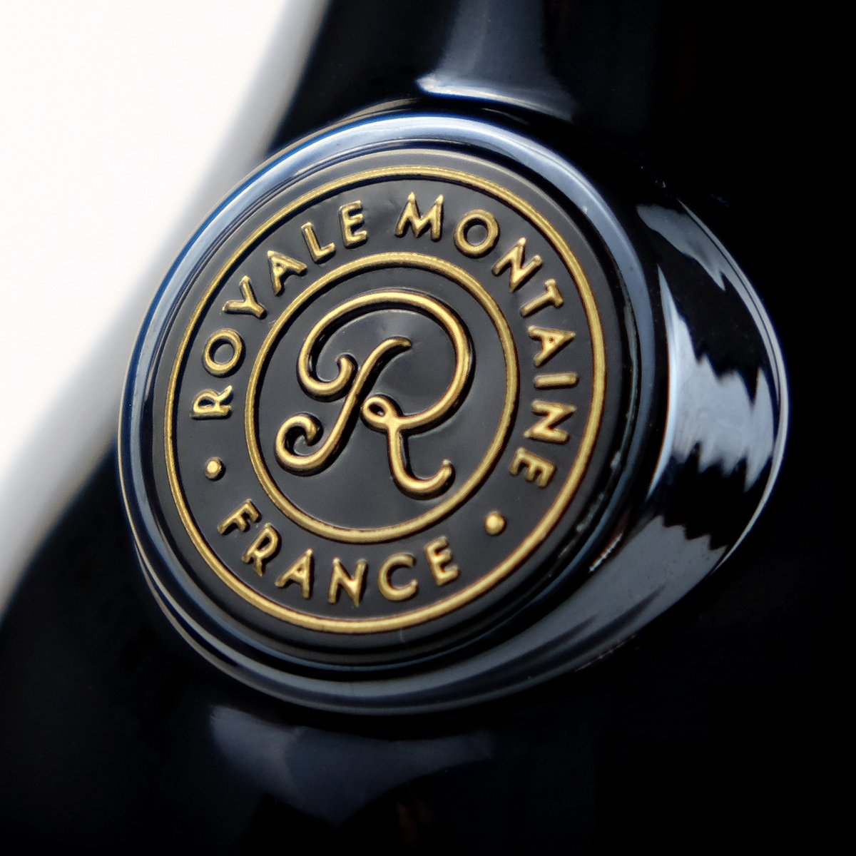
ALT Royale Montaine • France
3
23
4,900
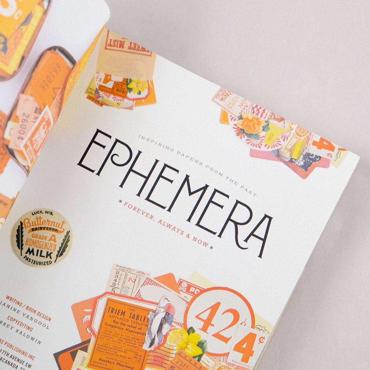
Some details from @uppercasemag’s book, Ephemera, featuring the original style of Montecatini Pro: Stretto Light.
See the whole family here: tipofili.com/fonts/montecati…
ALT Ephemera book open to the title page which is typeset in Montecatini Pro. The spread is filled with orange ephemera.
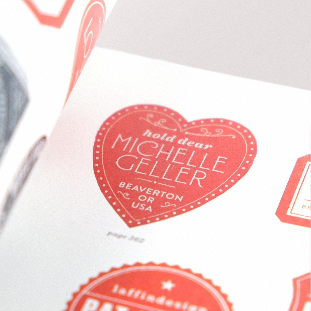
ALT A detail shot of the book featuring a red heart with “Michelle Geller” written inside of it.
1
4
317
While the book is out of print, you can see some more lovely details here: uppercasemagazine.com/produc…
1
169
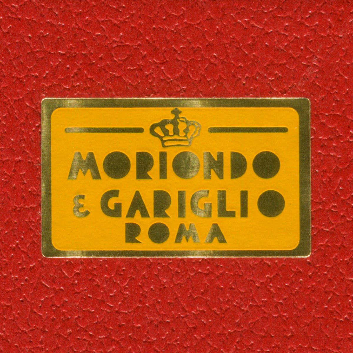
Louise just returned from Rome, so of course she brought back some chocolate! While they were tying the ribbon around the box, Louise specifically asked them to include this sticker. ❤️ #moriondoegariglio
ALT Orange and gold sticker which reads “Moriondo e Gariglio • Roma” on a red box.
3
1
17
1,747
Tipofili retweeted
6 Mar 2023
Influenced by Italian hand-lettered posters from the early twentieth century, #Portofino by @tipofili is a charming display typeface with expressive forms complementing its underlying geometric proportions.
👉 License Portofino on TN: buff.ly/3Fuycxw

3
18
1,171
Tipofili retweeted
5 Mar 2023
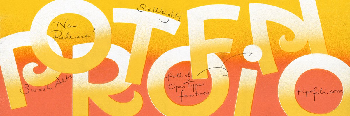
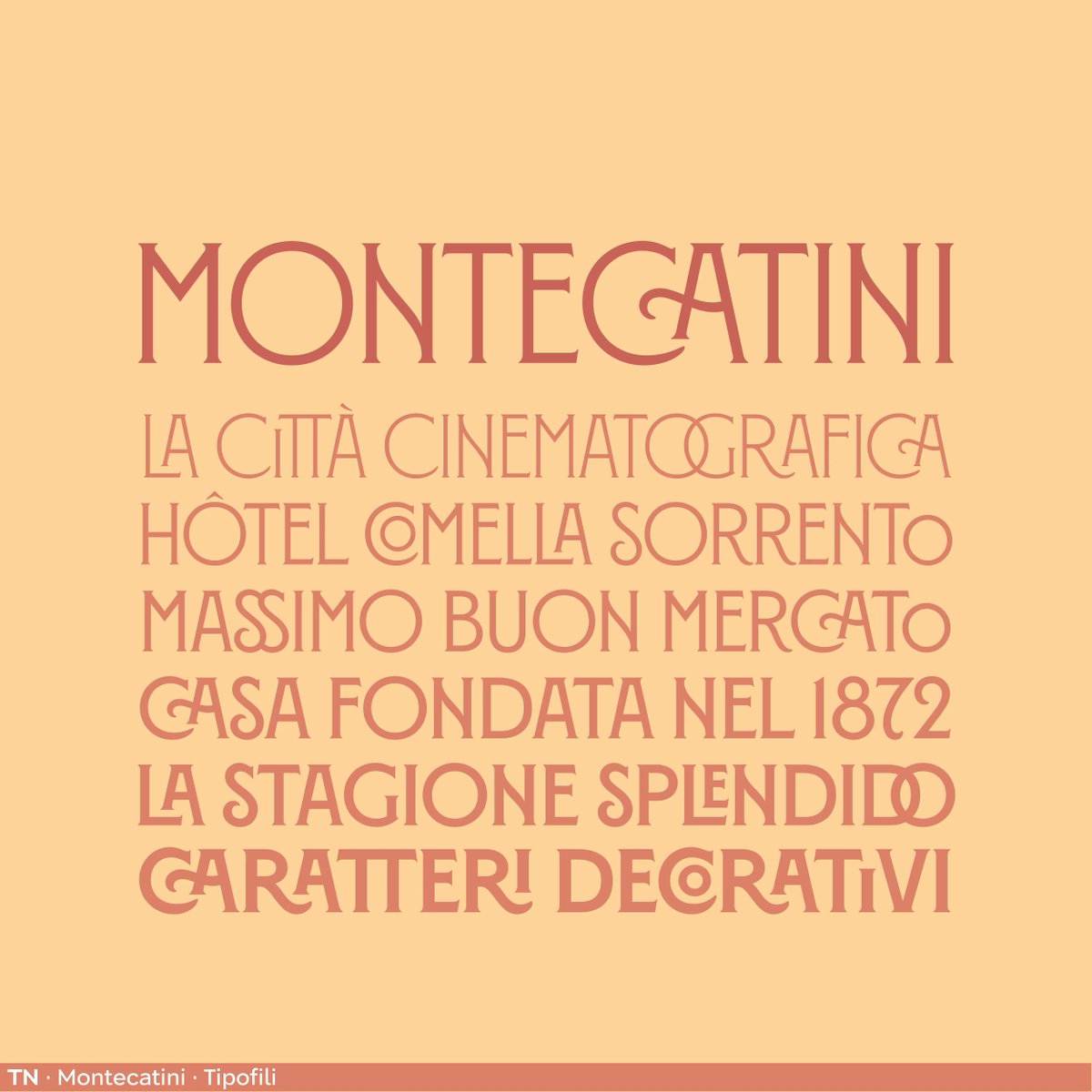
#Montecatini from @tipofili takes its cues from the elegant Stile Liberty travel posters of early 1900s Italy. The 24-style family spans six weights and four widths to create a vibrant typographic system.
👉 License Montecatini here: buff.ly/3W6TXui
2
18
1,596
Tipofili retweeted
4 Mar 2023
An Art Deco-inspired typeface based on Louise Fili’s iconic cover design for The Lover, @tipofili's #Marseille comes in six weights, giving it a variety of expressions while remaining timelessly elegant.
👉 License Marseille here: buff.ly/3uXsWxB
3
15
3,370
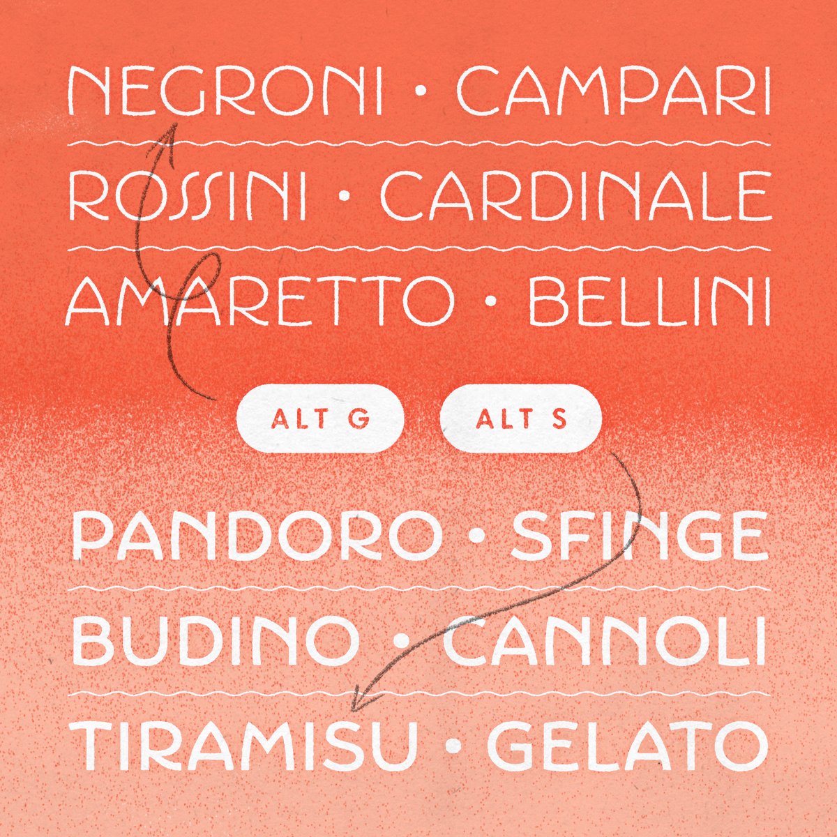
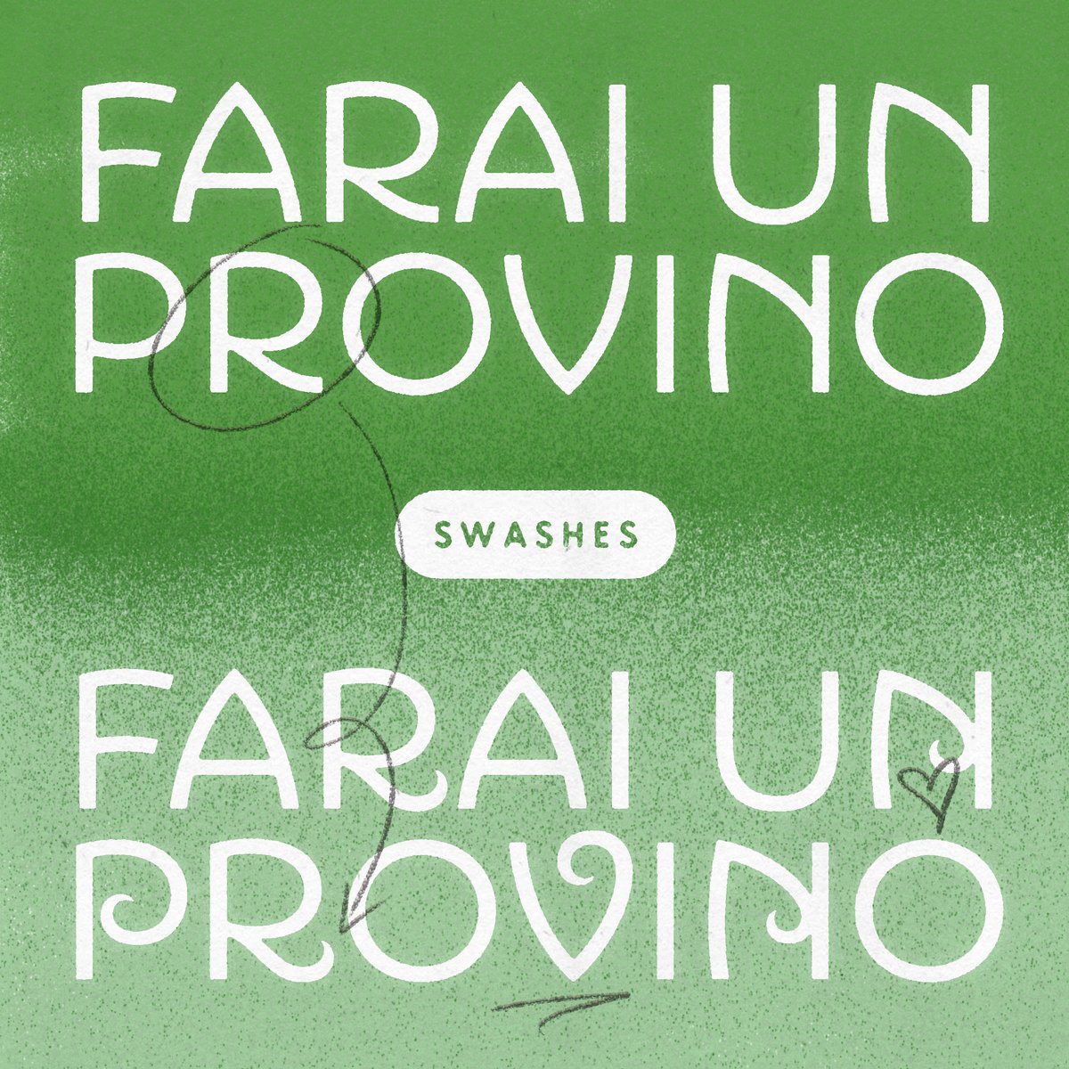
Montecatini’s distinctive ligatures span across all 6 weights and 4 widths. You can test them all directly on our site or by downloading our test fonts.
tipofili.com/fonts/montecati…
1
10
200
8,756
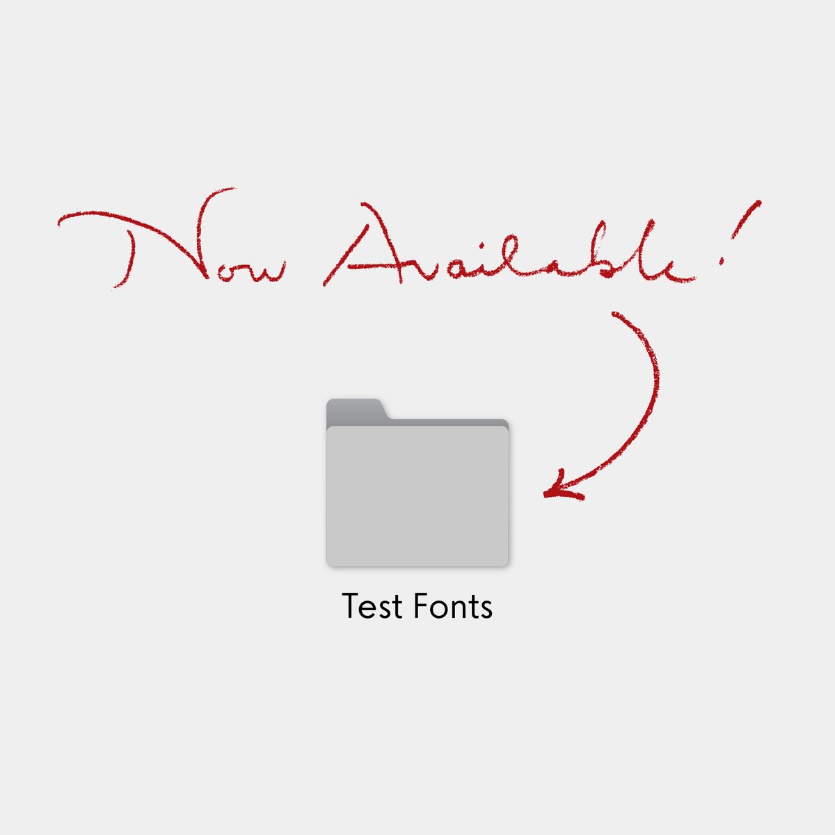
You can now download free test versions of all our fonts! Use these to test our fonts in your designs, mockups, or pitch documents for approval before licensing the full versions.
tipofili.com/test-fonts
ALT Test fonts are now available!
1
3
830
Montecatini in use by @mikesmith187

3
508
Tipofili retweeted
21 Dec 2022
An Art Deco-inspired typeface based on Louise Fili’s iconic cover design for The Lover, @tipofili's Marseille comes in six weights, giving it a variety of expressions while remaining timelessly elegant.
👉 License Marseille here: buff.ly/3uXsWxB
1
2
739
Tipofili retweeted
20 Dec 2022
Introducing the newest Type Network foundry partner, @tipofili!
Led by renowned designer @louisefili, their fonts are inspired by classic Italian letterforms. Portofino, Marseille, and Montecatini are now available in our catalog!
👉 License them here: buff.ly/3jbndl9
7
14
2,367
Thank you, Dan! We are very excited to be a part of @TypeNetwork
285