
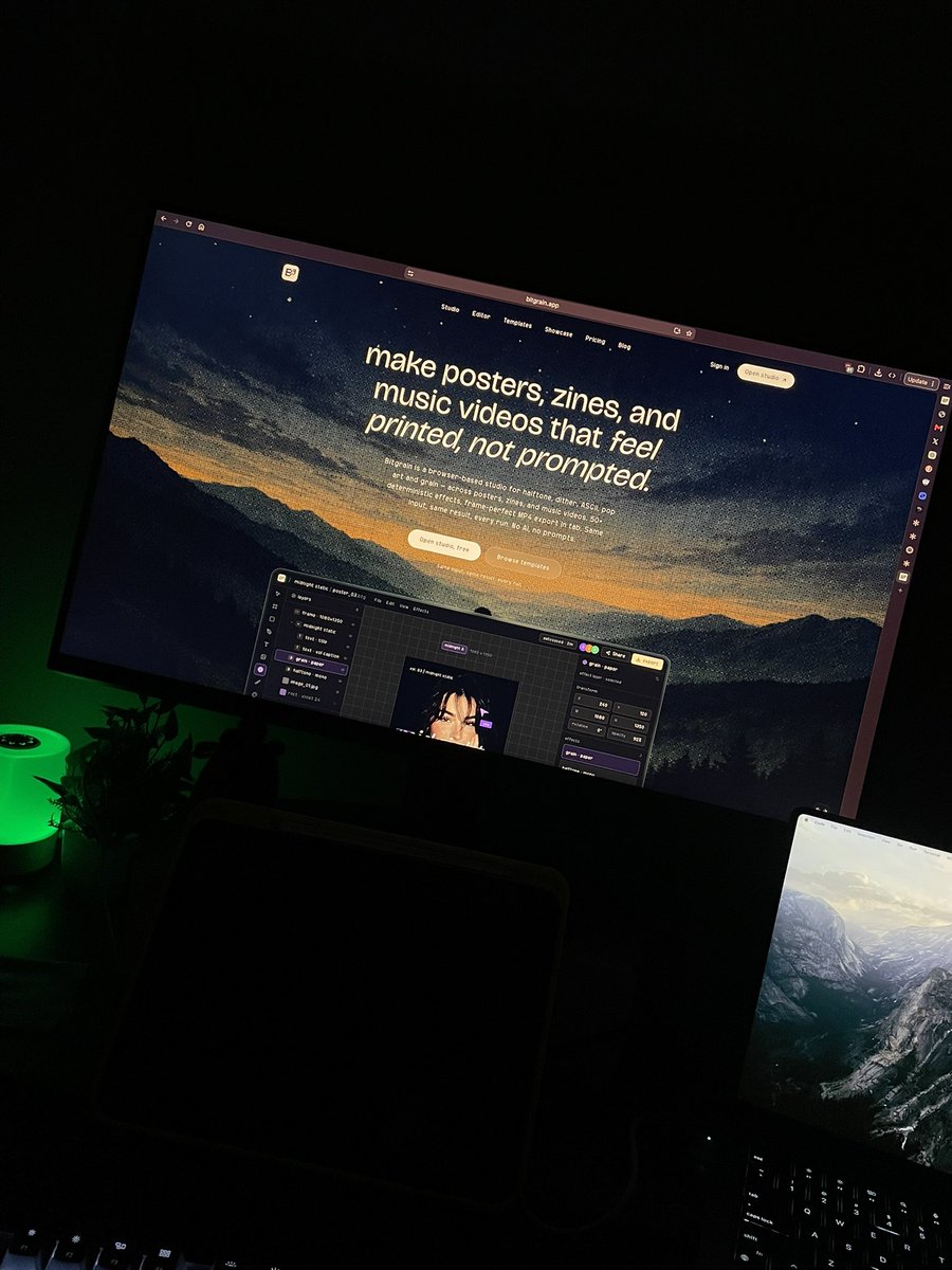
make posters, covers, and zines that feel printed, not prompted. dither, halftone, ascii, studio, video. no ai. bitgrain.app
Joined April 2026
- Tweets 85
- Following 7
- Followers 26
- Likes 443
19 Photos and videos


Jun 7
it seems that this AI bubble is already bursting!
the number of people being satisfied with kinda imperfect human made stuff, than a super perfect AI content, is rising!
5
88
Jun 4
Getting users is easy, getting users who actually want your product is difficult :)
4
44
Jun 4
(Thread 1/4)
Never use perfect kerning on display text if you want real analog soul.
Digital fonts are designed to look flawless on screens
But printed posters and letterpress work never were. Hand-set type has natural inconsistencies that feel alive and human. That “too perfect” look is exactly what makes many designs feel cold and digital.
1
5
35
Jun 4
(Thread 3/4)
Old letterpress printers placed each wooden/metal letter by hand. Slight rotations, height variations, and uneven spacing were normal.
Modern perfect kerning removes that imperfection, and with it, the warmth.
A little controlled chaos makes people stop scrolling. It feels premium and tactile, like real ink on paper : )
1
4
24
Jun 4
(Thread 4/4)
Try this on your next poster headline and compare before/after.
The difference is subtle but massive, suddenly your design has breath and personality.
What’s your favorite way to add analog soul to type? Loose kerning, texture, ink bleed, something else?
Drop it below. Happy designing : )
3
22
Jun 4
There's a quiet confidence in people who don't feel the need to document everything.
Not every meal needs a photo.
Not every achievement needs an announcement.
Not every thought needs a post.
Some experiences become more valuable when they're fully lived instead of partially shared : )
4
22
Jun 3
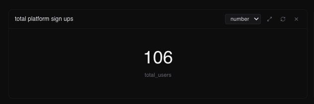
It’s been almost a month since bitgrain launched. since then we have a total of
256 signups.
11.8k users who visited.
600 templates.
15 paying users (thank youu sm for trusting im us)
till now.
Let’s where this journey takes us :)
if you haven’t used bitgrain yet, well visit bitgrain.app today :)
5
64
Jun 3
The biggest flex in 2026 isn't money.
It's uninterrupted time.
Time to read.
Time to think.
Time to learn something slowly.
Time to take a long walk without checking your phone.
The wealthiest people I know aren't always rich.
But they control their attention :)
4
23
Jun 3
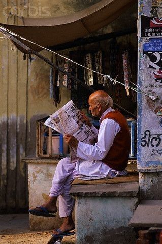
Old Indian print never tried to be minimal
It screamed. Bright colors.
Clashing type.
Zero white space.
Yet it stuck in your head for decades.
Today we design clean, calm, 'premium' interfaces and wonder why nothing memorable remains 5 minutes later.
Maybe the secret to attention isn’t less noise. It’s better noise.The kind that feels alive.
4
37
Jun 2
India didn't stop reading.
We just stopped sitting still.
The country's biggest problem isn't a lack of content.
It's a surplus of it.
Every minute:
• Hundreds of videos uploaded
• Thousands of posts published
• Millions of notifications sent
And yet a Sunday newspaper can still hold someone's attention longer than an entire day on social media.
That's not nostalgia.
That's design.
Print has a beginning and an end.
The internet doesn't.
One helps you finish.
The other keeps asking for one more scroll.
Maybe that's why independent magazines, literary journals, and niche print publications are finding readers again.
In a world obsessed with speed, slowing down has become a luxury.
4
59
Jun 2
Prediction:
The next decade won't be about helping people consume more information.
It'll be about helping people filter information.
The winners won't be content creators.
They'll be attention curators !!
4
22
Jun 2
"AI makes it look perfect.
Bitgrain makes it look printed.
Choose your fighter."
Which direction do you like most?
3
24
Jun 2
Funny how the future of media ended up looking a lot like the past!
People don't want more content.
They want less noise, instead a little bit of quality???
The companies that spent 15 years optimizing for clicks are now learning from independent magazines that are optimized for meaning (Not the noise)
2
25
Jun 2
Everyone said print was dead. Turns out people were just tired of being online all the time.
For years, media companies chased clicks, algorithms, and endless feeds. Meanwhile, independent magazines quietly did the opposite: fewer issues, better writing, stronger design, higher quality, and a clear point of view.
Now something interesting is happening.
The same industry that pushed everyone toward digital is bringing print back. Not because paper suddenly became modern again, but because attention became scarce. In a world of notifications, AI-generated content, outrage headlines, and infinite scrolling, a magazine offers something surprisingly rare: focus.
You don't get recommendations. You don't get interrupted. You don't get trapped in a content loop.
You just read.
The lesson isn't really about magazines. It's about products, businesses, and even careers. When everyone competes on speed, the winners are often the ones who compete on depth. The future isn't always the newest thing. Sometimes it's an old idea executed with more intention : )
Print didn't survive by beating the internet at being the internet.
It survived by being something the internet can't.
ALT bitgrain.app
3
28
Jun 1
Most people assume confidence comes from succeeding repeatedly.
I think it comes from surviving failure repeatedly.
From realizing that embarrassment isn't fatal.
Mistakes aren't permanent.
And bad days eventually become stories.
Once you understand that, taking risks becomes a lot easier : )
6
33