
Joined April 2025
- Tweets 153
- Following 8
- Followers 68
- Likes 0
134 Photos and videos
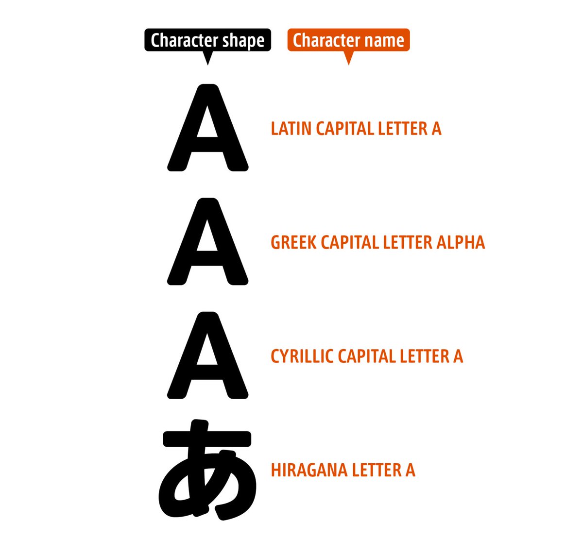


‘Most modern computers, smartphones, consumer electronics, etc. use a character encoding called Unicode to handle characters, but in Unicode, the name of the Latin alphabet character “A” is “LATIN CAPITAL LETTER A.”’
Character Names and Glyph Names 01
staffblog.typeproject.com/en…
1
33
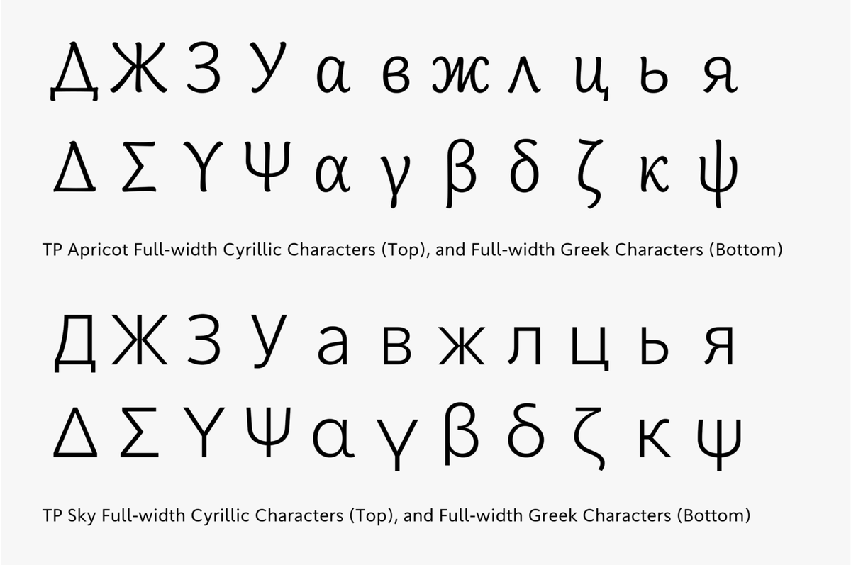
‘For that reason, for Cyrillic and Greek characters, we produced character shapes that have more of a brush-written feel, rather than the shapes seen in existing Mincho and Gothic typefaces.’
TP Apricot Development Story 05
staffblog.typeproject.com/en…
1
2
269
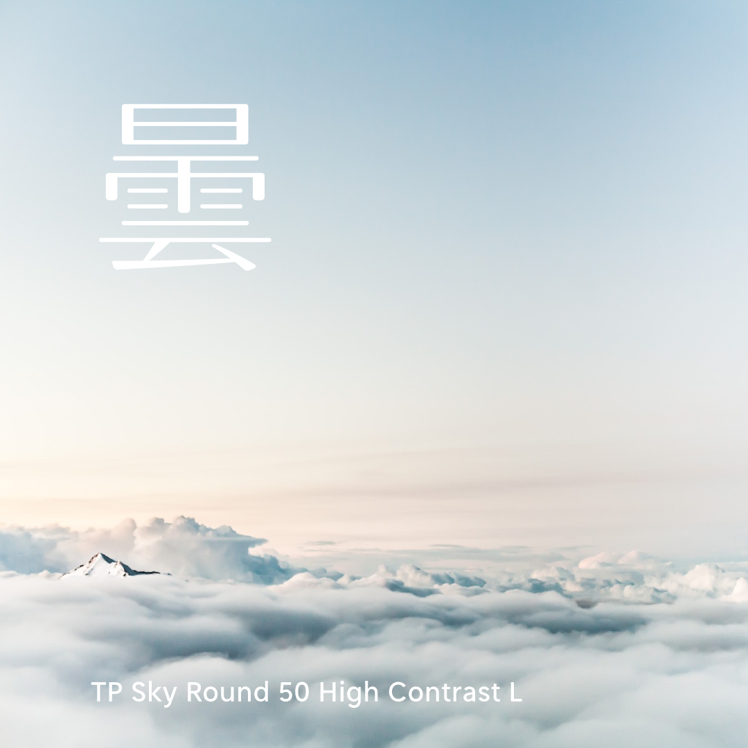
Smartphone Wallpaper Feature: June’s font is TP Sky Round. Under TP Sky’s grand concept of “Sky,” TP Sky Round 50 is envisioned with the keyword “Cloudy,” and TP Sky Round 100 with “Rainy.” Try out this wallpaper—it’s perfect for the June mood! staffblog.typeproject.com/47…
1
67
It’s raining heavily in Tokyo today because of the typhoon. TP Sky Round 100 uses “雨 (Rainy)” as a metaphorical keyword.
Discover more on our Instagram: instagram.com/typeproject_of…
2
5
544
‘Today, I would like to introduce “In Praise of Type.”This book is a collection of essays on print culture by 26 notable figures from various fields, including editors, designers, typography researchers, and writers.’
[TP Staff Blog]
staffblog.typeproject.com/en…
32
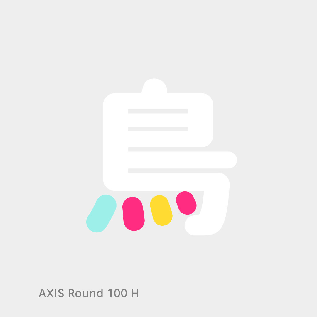
AXIS Round 100 is a “contemporary round Gothic” that is both approachable and possessed of a sense of being neatly attired.
Discover more on our Instagram: instagram.com/typeproject_of…
2
3
251
‘IExtreme point refers to the position in which the angle of the handle used to draw a curved line is completely “horizontal (0 degrees)” or “vertical (90 degrees).”’
[TP Staff Blog]
Story of Hints 05: “Extreme Points and Hints”
staffblog.typeproject.com/en…
1
57
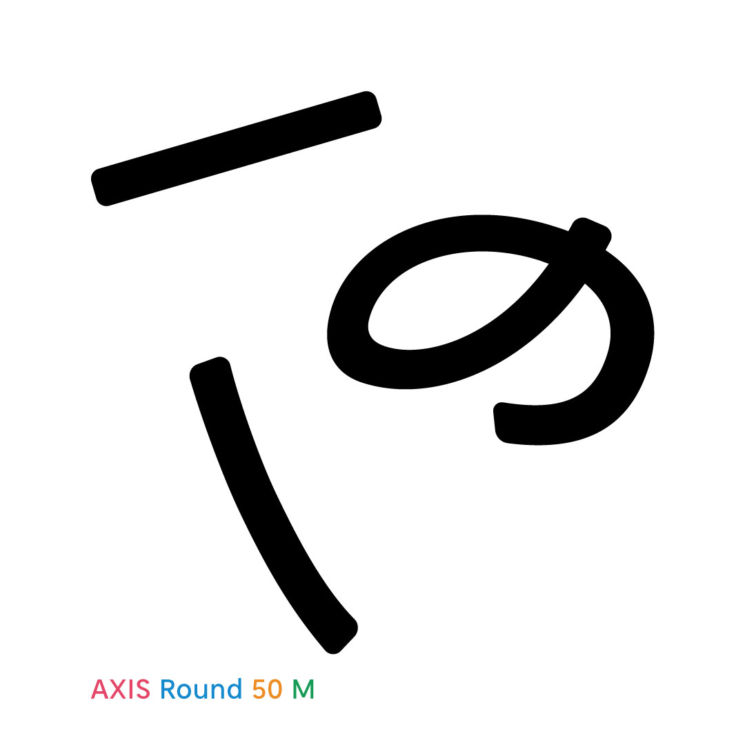
With its sharp AXIS Font contours given a subtle rounding, AXIS Round 50 retains the crisp feeling of the modern sans-serif while generating a soft and airy quality.
Discover more on our Instagram: instagram.com/typeproject_of…
83
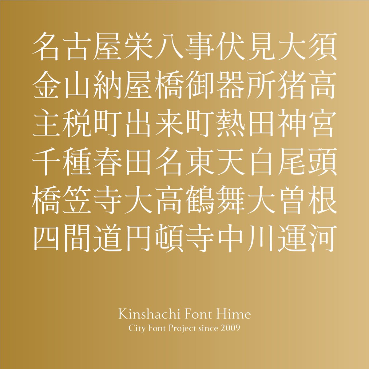
A key charm of Kinshachi Font Hime’s Kanji is the dynamic energy of the ツ and ソ-shaped components in 栄, 金, 来, and 笠. Fine details in the entry strokes and uroko (serifs) add to its luxurious, gorgeous look when typeset.
1
98
Look at Kinshachi Font Tonos Kanji side by side, and its unique design accents instantly stand out. The most eye-catching feature is the upward-curling terminals on characters like 八, 大, 金, and 天. There are plenty of other hidden gems—can you spot them all?
1
64
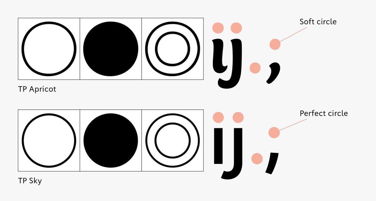
‘For the circle, we deliberately avoided making a perfect circle but just made it a soft shape. The dots in Latin characters like “i,” “j,” “.,” “;,” etc. are slightly softer and rounder, so we have aligned them accordingly.’
TP Apricot Development Story
staffblog.typeproject.com/en…
3
6
956
Hama Mincho’s design incorporates the scale and distinctive character of the city of Yokohama, and for styles that accentuate vertical/horizontal stroke contrasts.
Discover more on our Instagram: instagram.com/typeproject_of…
79
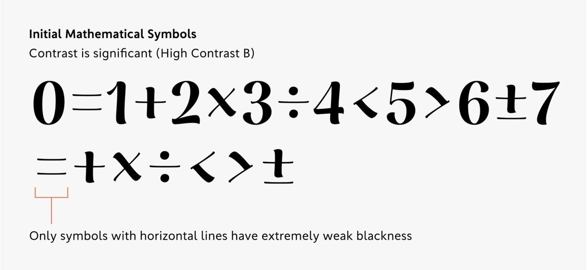
‘During the design process of TP Apricot, the design of mathematical symbols required ingenuity in adjusting thickness. For thick weights in high contrast in particular, we struggled to determine the appropriate thickness.’
TP Apricot Development Story 03
staffblog.typeproject.com/en…
71
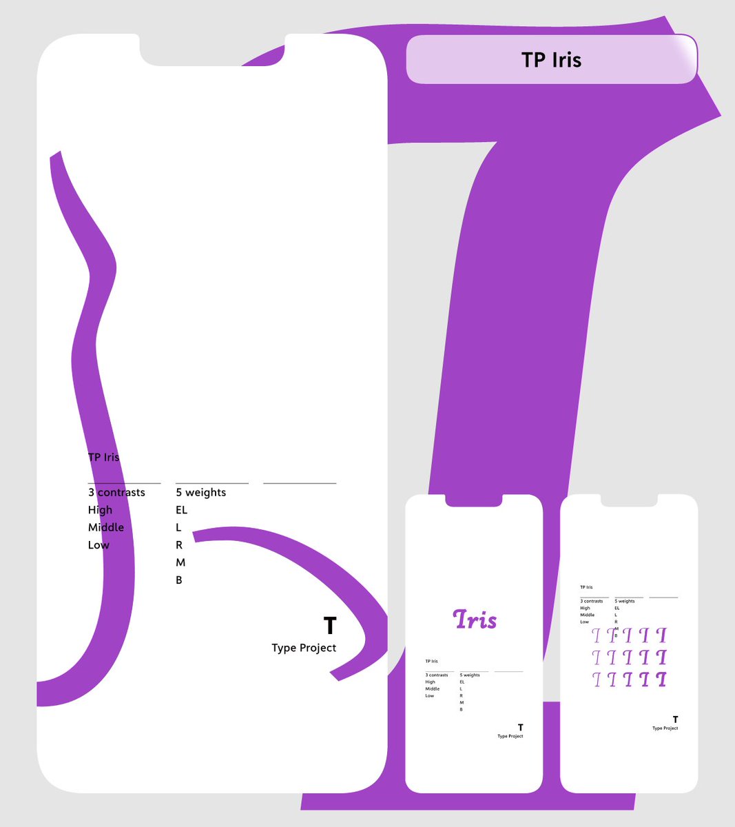
Our smartphone wallpaper series is going strong, and May’s featured font is TP Iris, inspired by early-summer irises. There are still very few known examples of the font in actual use, so we’d love to see you bring out its full potential! staffblog.typeproject.com/47…
184
A hands-on online workshop will follow the next week on May 9. The program is designed for participants to select a Latin typeface of their choice and design Kanji, Hiragana, and Katakana characters that harmonize with it. wordsoftype.com
1
13
1,809
An online lecture featuring Yui Yoshitomi (Type Project) and Ikumi Honda (Iwata) will be held on May 2. Hosted by wordsoftype.com, this session will provide an overview of the history of Kanji, Hiragana, and Katakana, alongside insights into contemporary typeface design.
2
6
2,200
‘horizontal hints cannot be specified for characters that do not have horizontal stems, such as the uppercase letter “I” in sans-serif typeface. In cases like these, ghost hints are used.’
[TP Staff Blog]
Story of Hints 04: “What are Ghost Hints?”
staffblog.typeproject.com/en…

80
‘It is a story blending fantasy and mystery, in which a witch and an investigator team up to tackle magical crimes. Jun Mincho and TP Mincho High Contrast are used in the title, for the name of the author, and on the book band part.’
[TP Staff Blog]
staffblog.typeproject.com/en…

1
2
624
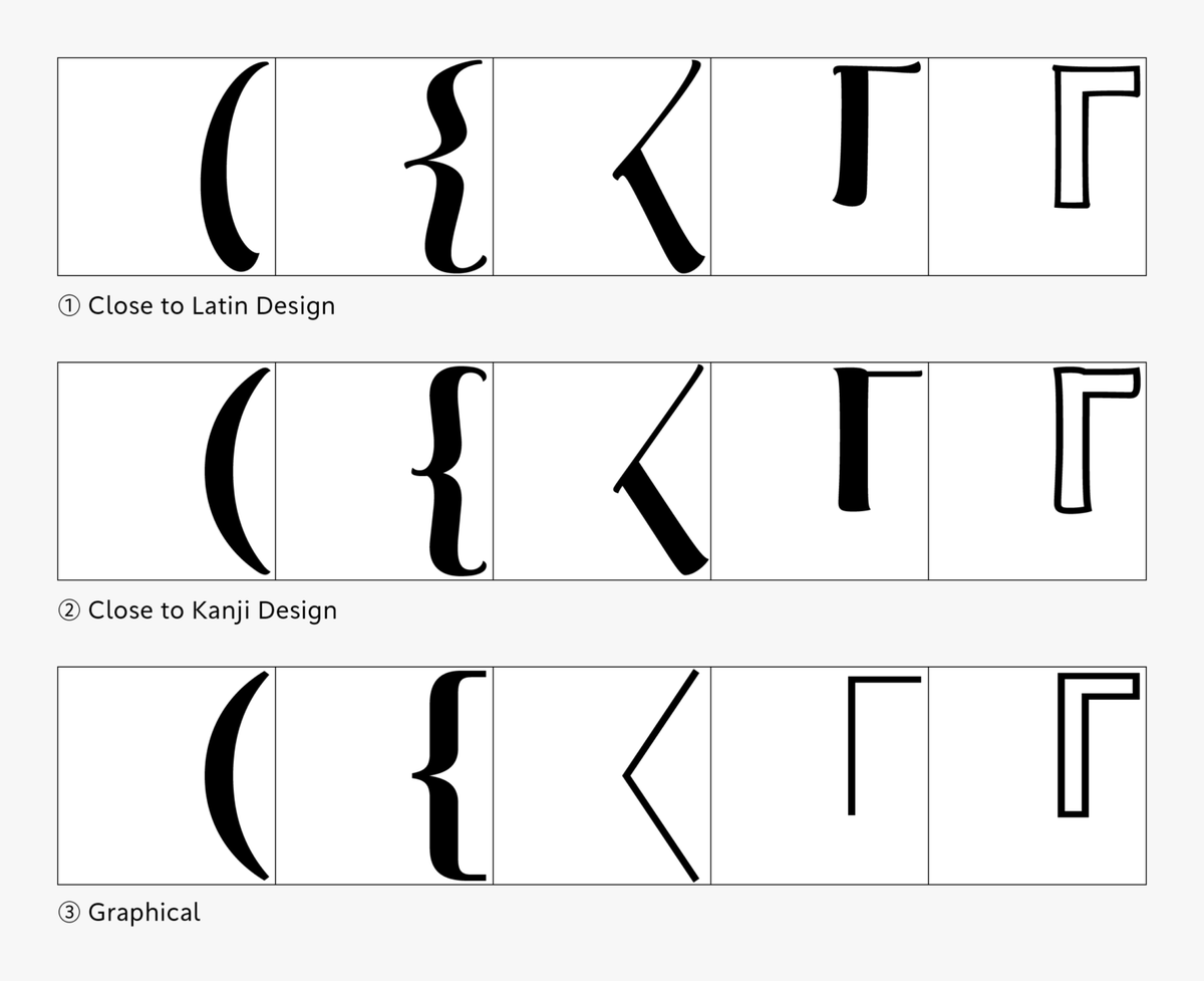
‘Because I experienced a lot of twists and turns with the hiragana design, I created three design proposals for Japanese brackets in the initial prototype.’
[TP Staff Blog]
TP Apricot Development Story 02:
Japanese Brackets, Three Types of Prototypes
staffblog.typeproject.com/en…
2
5
398