
Designing solutions | Product Designer | UX, brand identity & innovation | AI & Web3 enthusiast
Joined November 2018
- Tweets 1,380
- Following 314
- Followers 222
- Likes 15,215
67 Photos and videos


Umar M.K retweeted

21 Nov 2025
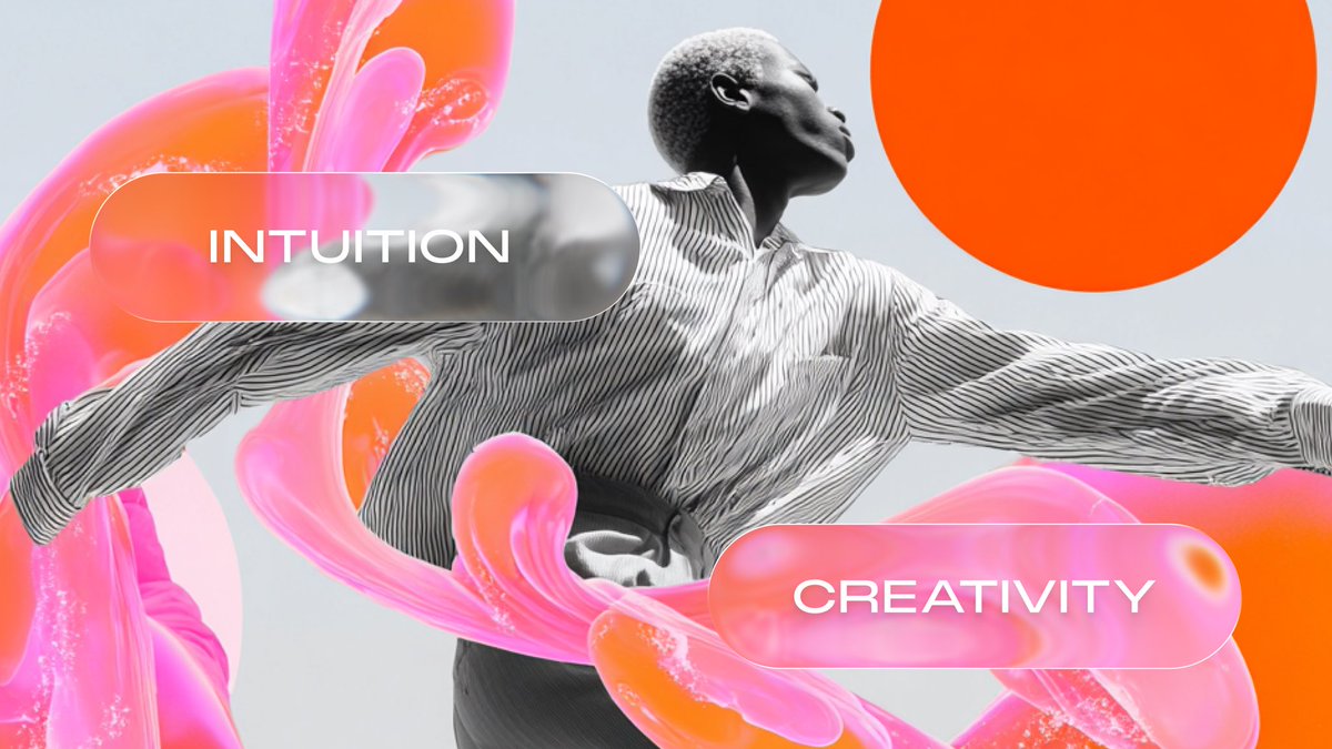
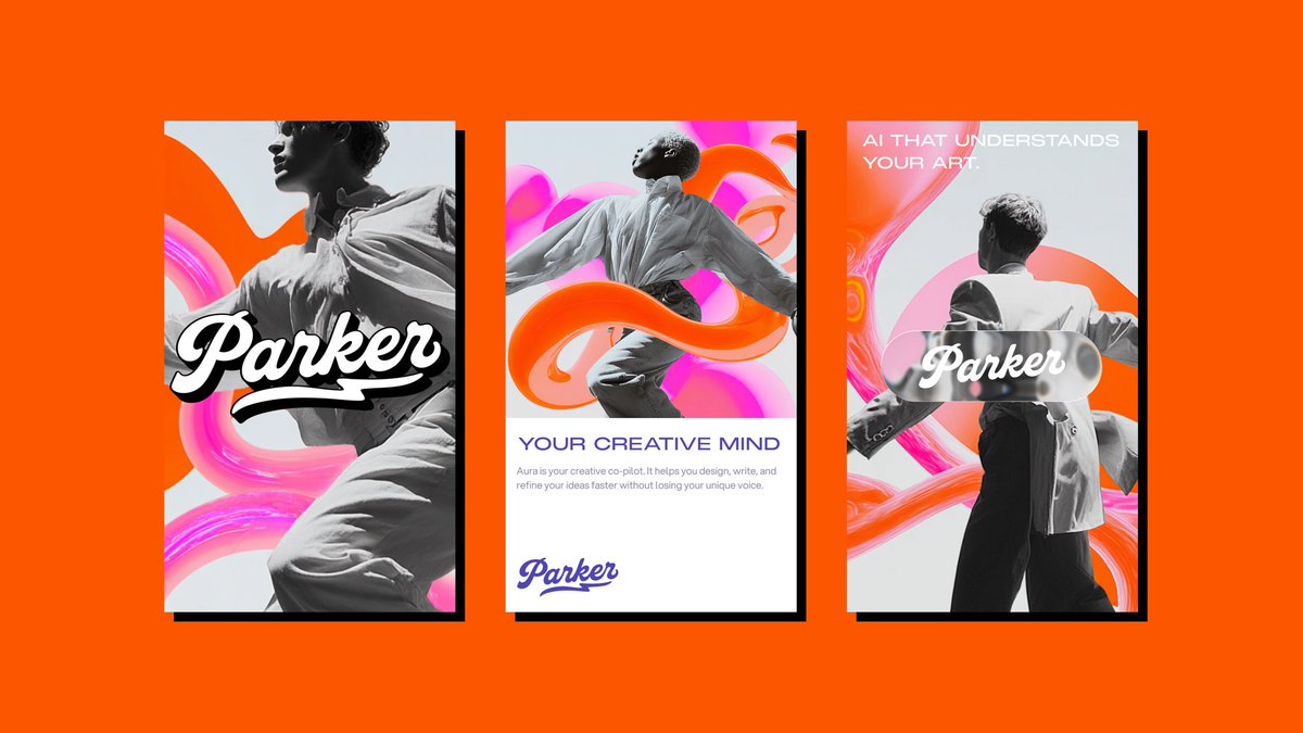
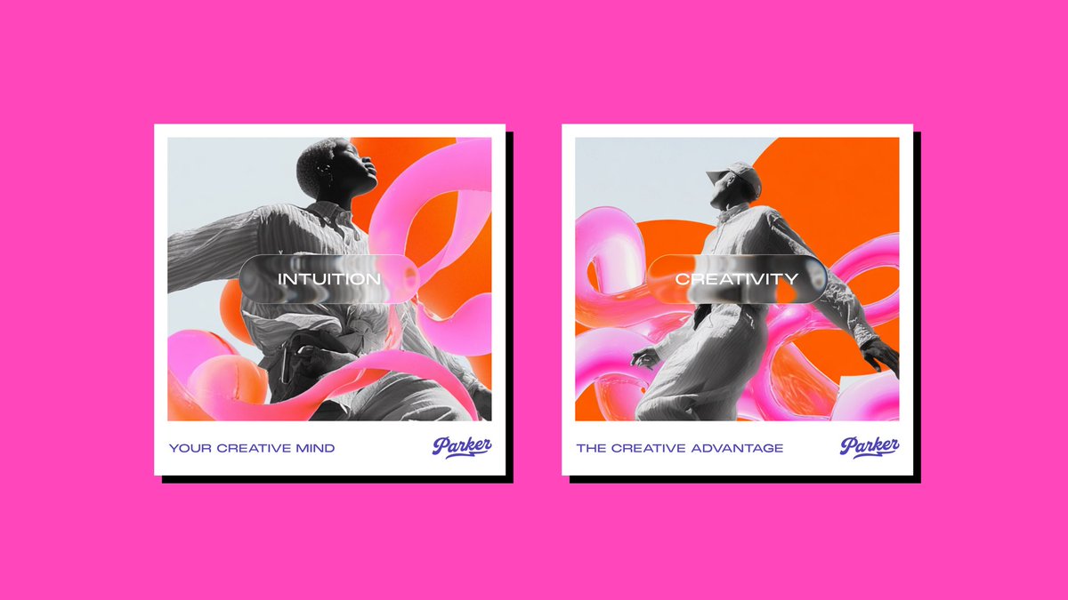
Design is not art.
But you can borrow the right art style and turn a brand into something people remember.
I’ve been mixing strategy with art styles lately.
Clear user, clear problem, clear positioning, plus a style that hits hard and gives the brand a soul.
This mix gives your brand a clear personality and makes it memorable from the first look.

13
8
188
14,688
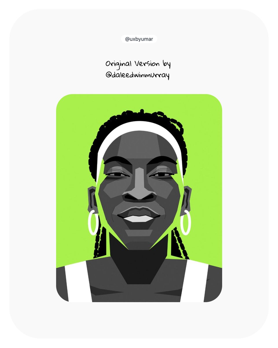
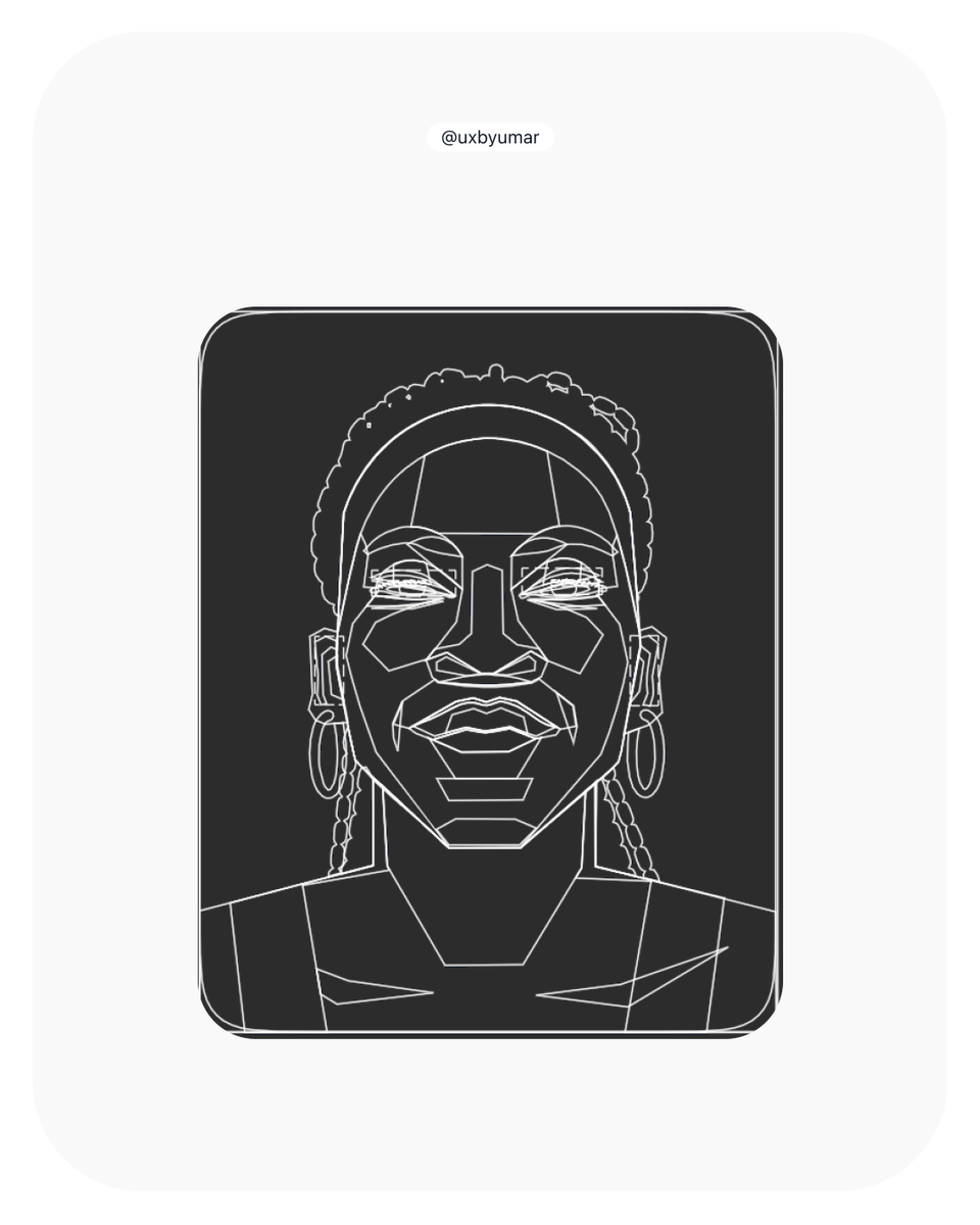
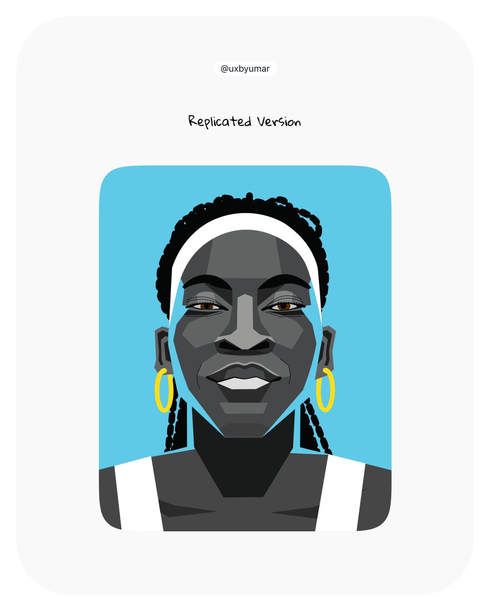
Been practicing by replicating an illustration and honestly, the growth is wild
Last year I was basically fighting Illustrator with only strokes to form a sketch.
This time, I actually understood how to build shapes properly and make everything easy to fill.
Progress is progress.
2
1
8
128
Umar M.K retweeted

13 Nov 2025
The moment you've ACTUALLY been waiting for... Introducing Deep Research!
Rolling out now, Deep Research browses hundreds of sites to craft an organized report AND gives you an annotated list of sources for deeper exploration, all of which you can add directly to your notebook.
224
862
6,601
1,666,831

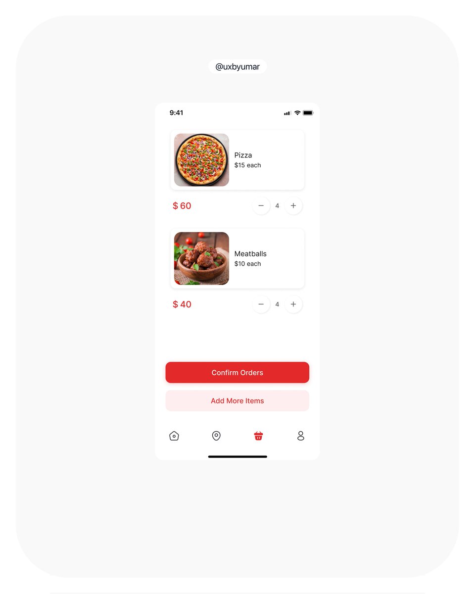
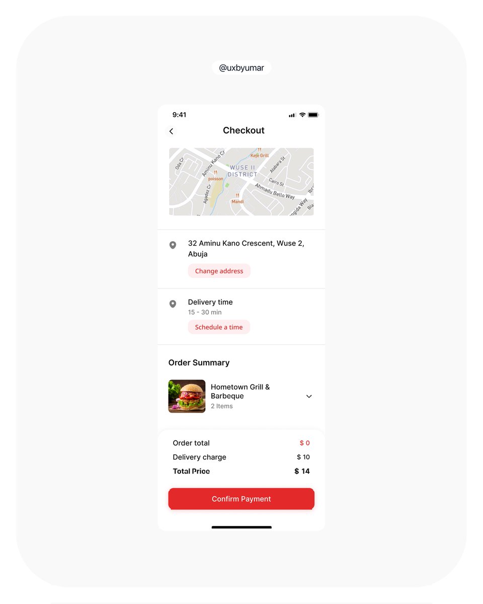
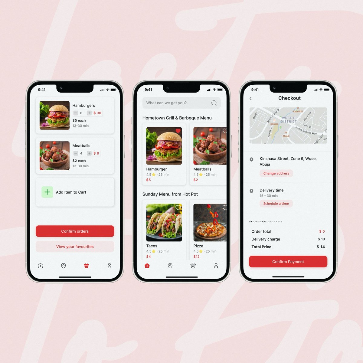
This is a snippet from a collaborative case study with two other designers, showcasing how we approached key UI decisions while redesigning an existing application

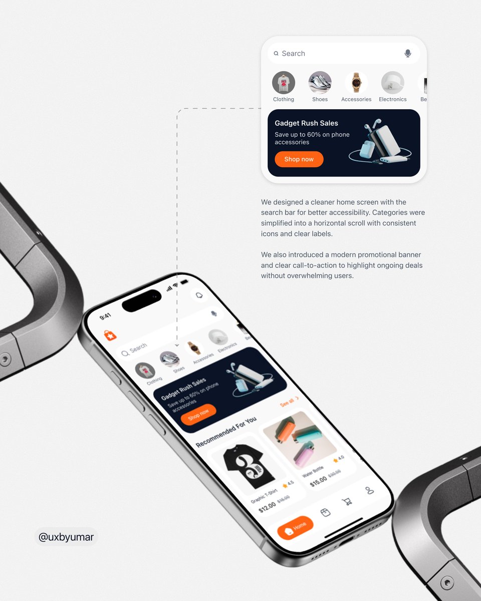
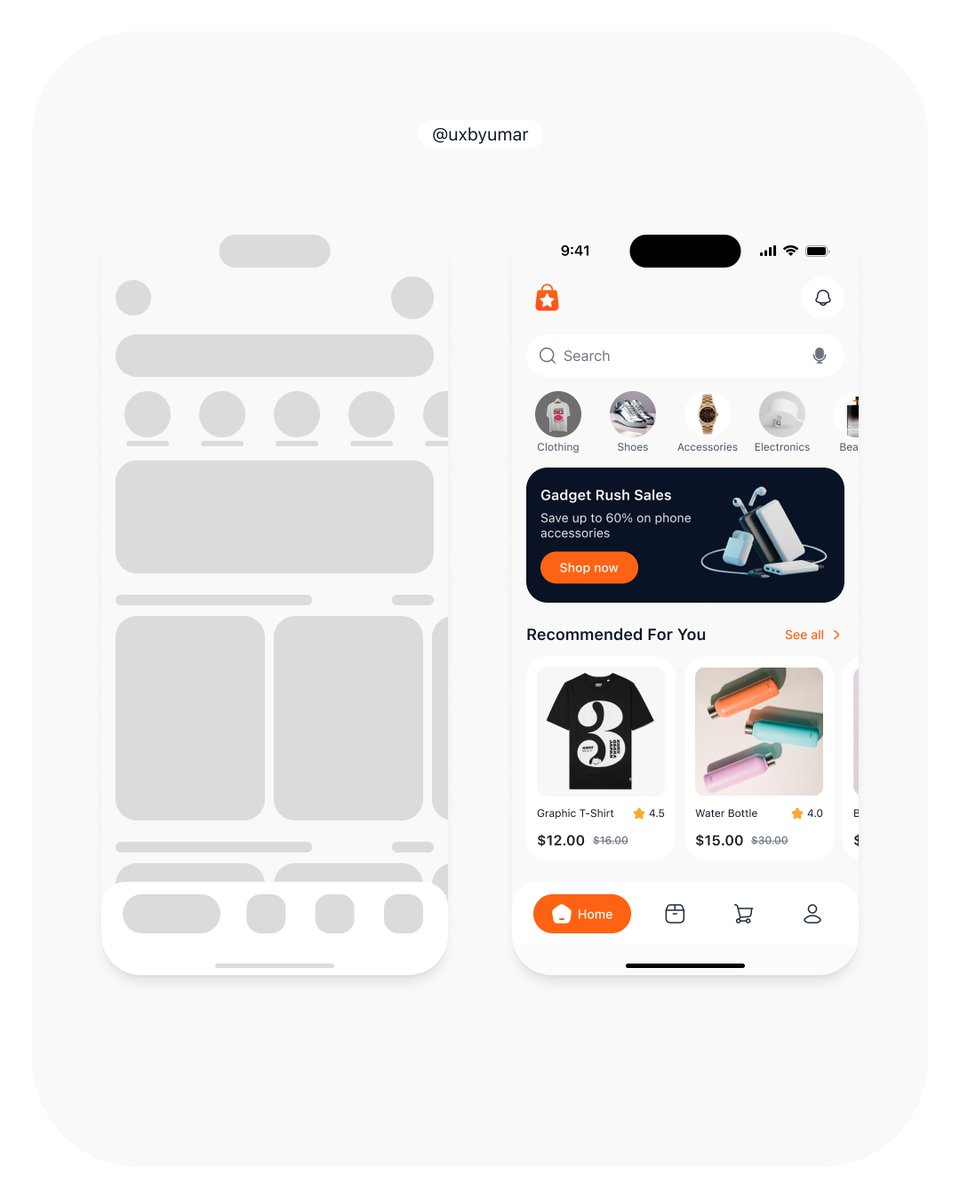
Redesigning an e-commerce app (WIP). Focused on solving real user problems around product discovery with better structure and flow.


1
5
100

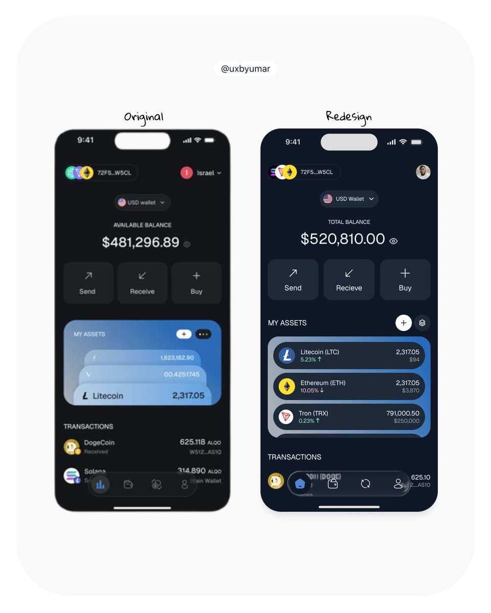
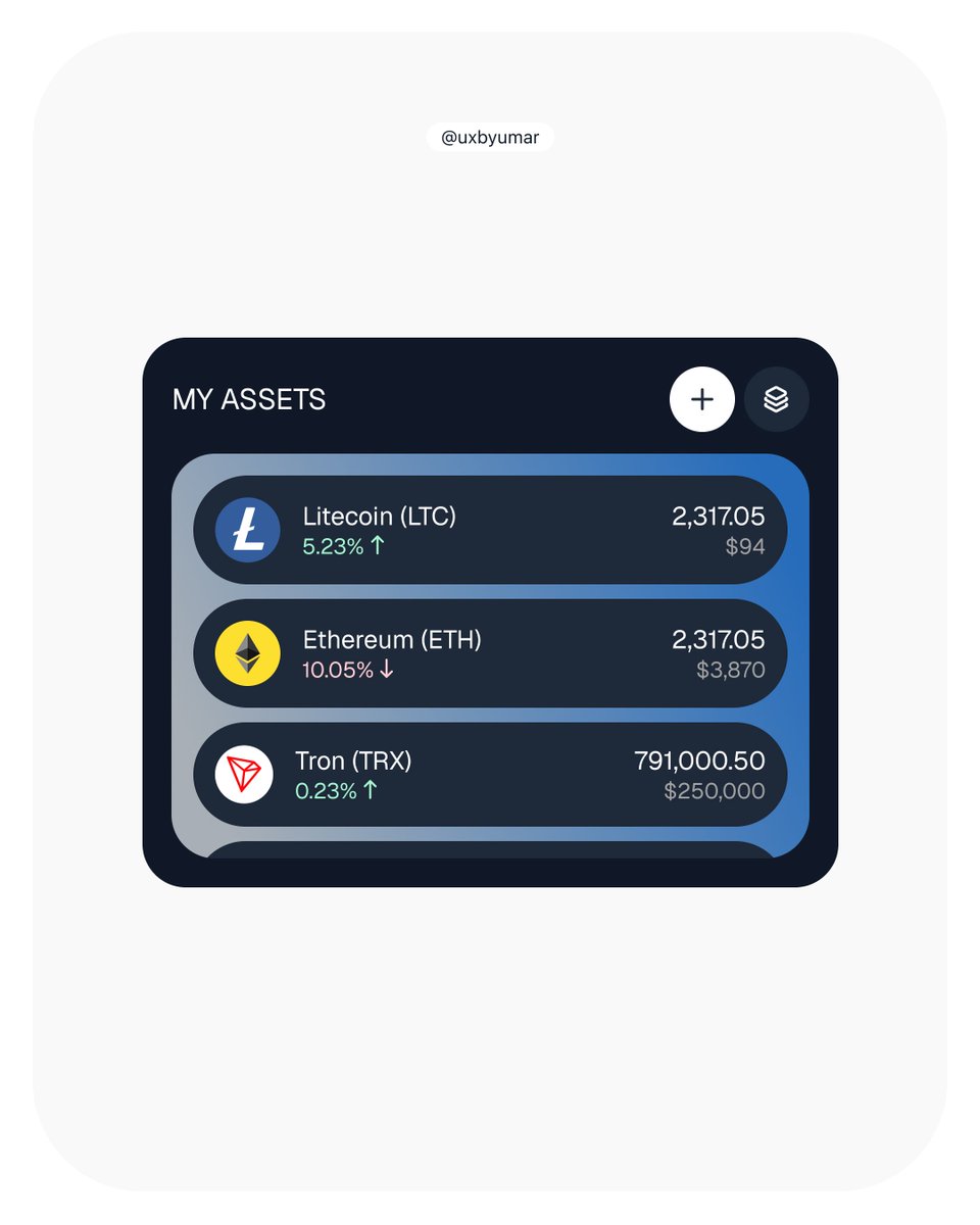
List and card view for crypto assets.
Found this design on Pinterest and decided to redesign it. The original had stacked cards showing how much of each asset you have. Now, users see a list with relevant info by default, with an option to switch back to the card view. Let me know what you think.

2
4
43
Another redesign of a shot I found on Pinterest. Let me know what you think.
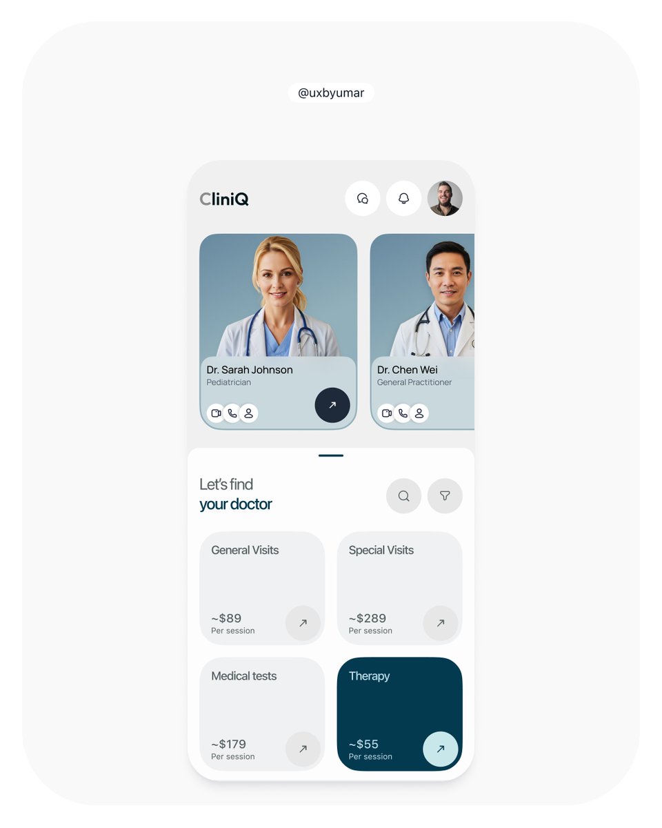
Found this design on Pinterest and decided to redesign it. The original had stacked cards showing how much of each asset you have. Now, users see a list with relevant info by default, with an option to switch back to the card view. Let me know what you think.
1
10
282
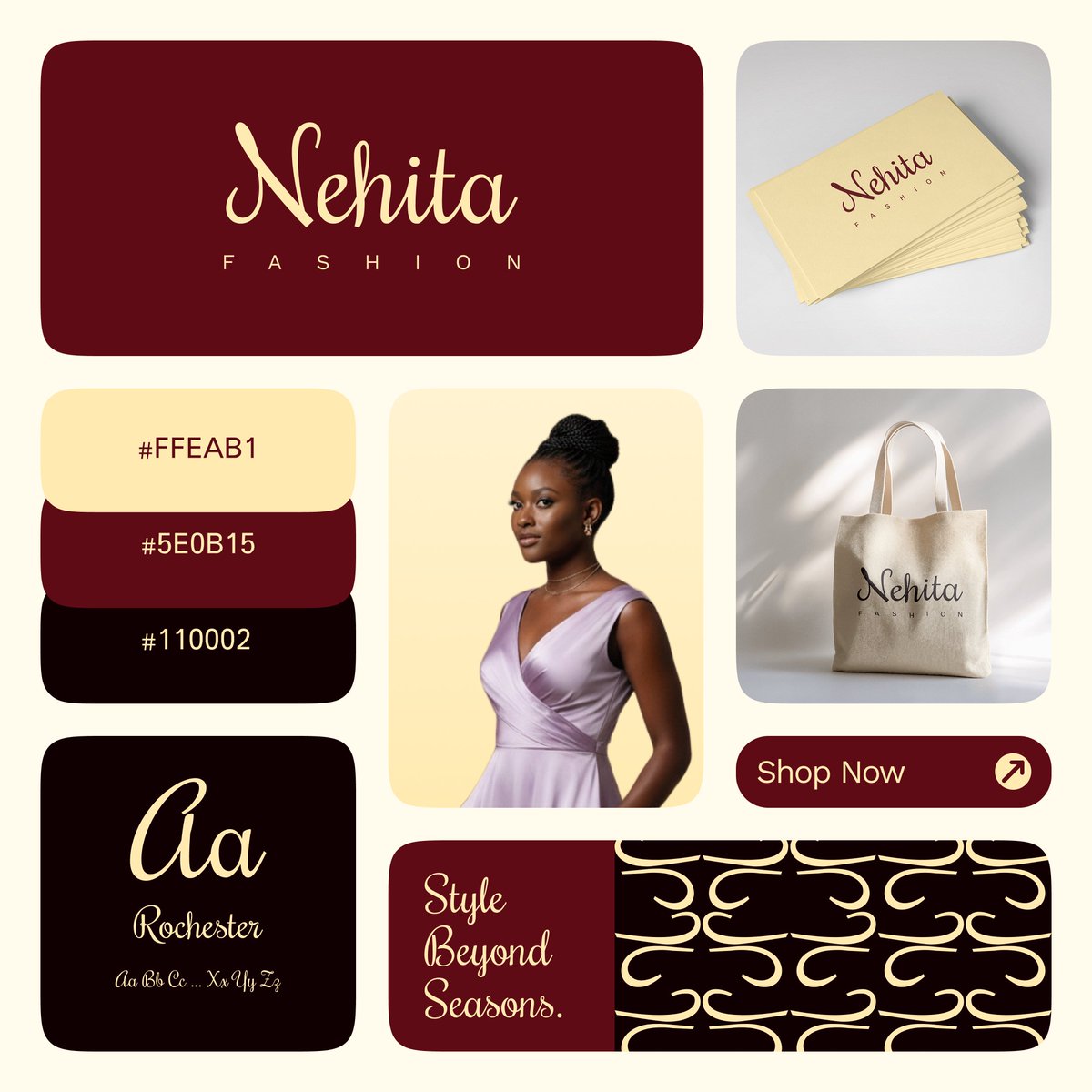
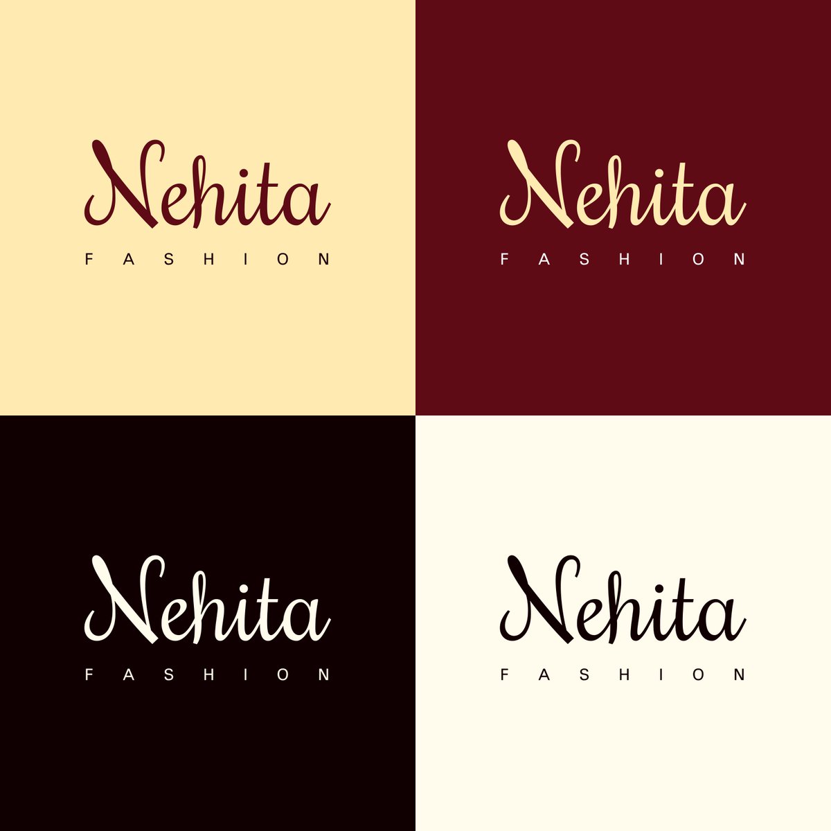
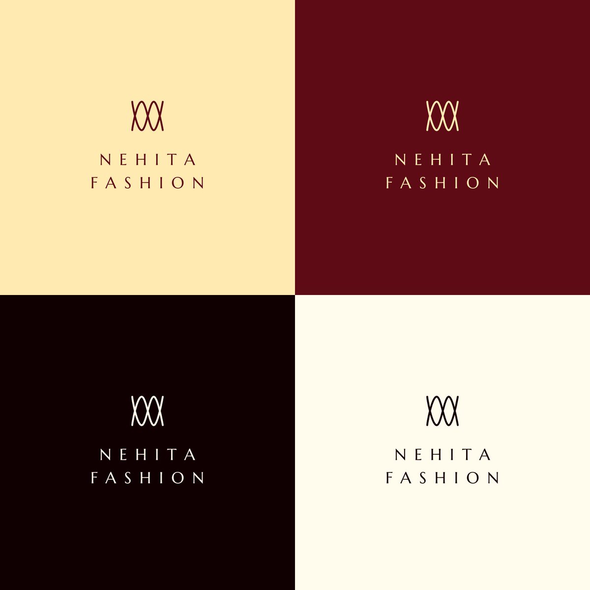
Crafting an elegant visual identity. Really pleased with how the velvet red and gold palette is coming together. Stay tuned for more mockups!
Working on a visual identity for a client. Still refining a few things. I wanted to go for something simple but still distinct, let me know what you think.
5
72
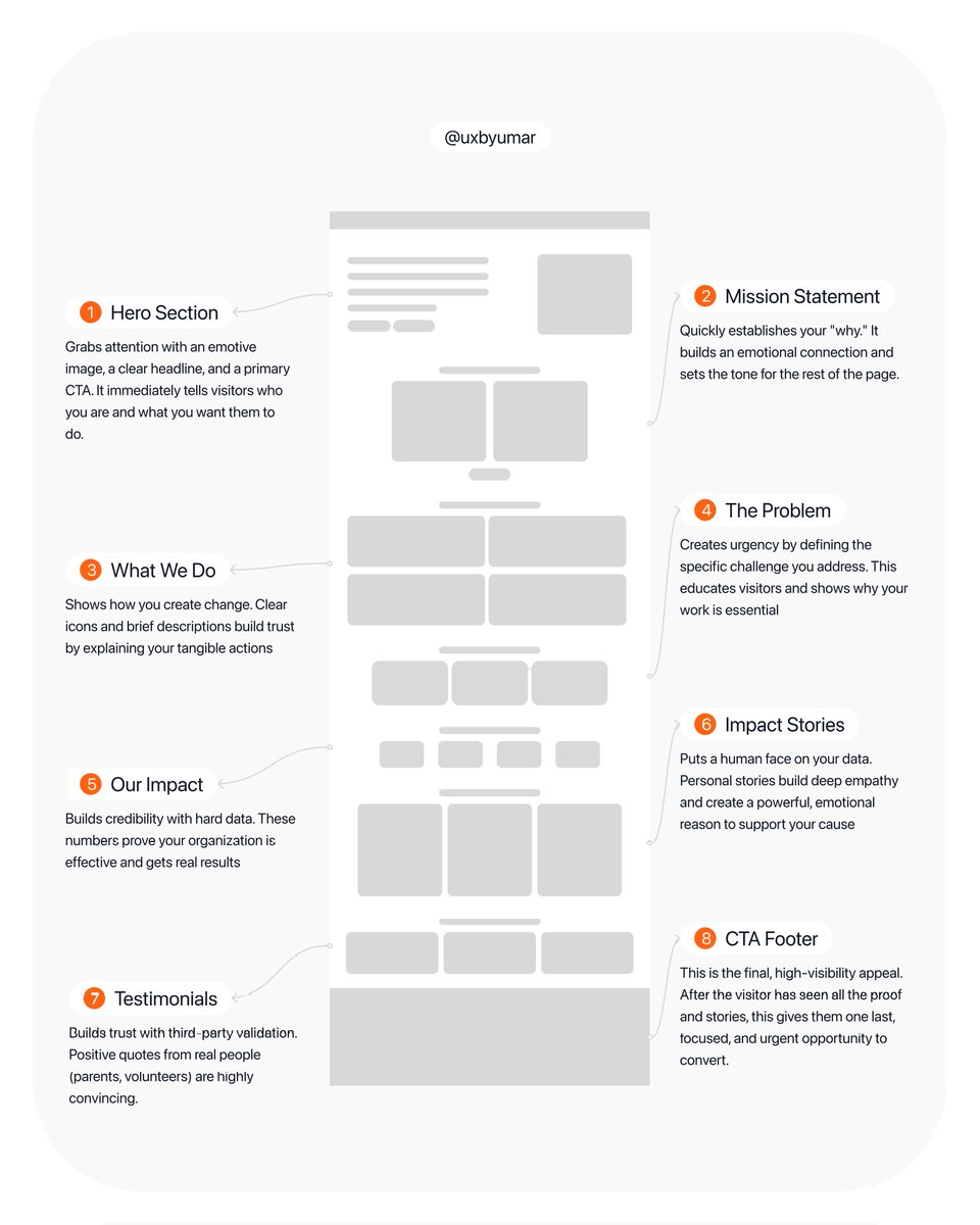
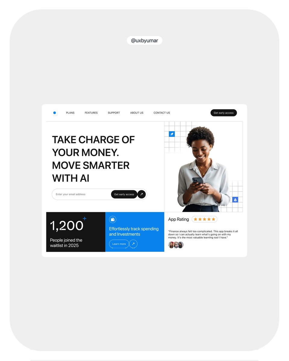
Unlock the power of your non-profit's online presence! Here's the anatomy of an effective landing page designed to tell your story, showcase your impact, and drive support. I used this structure recently for a project and the client was impressed with the result.
2
6
94
Made this prototype with figma make, it's so easy to use.
Designed the chat area today, it's still a work in progress though, the next thing would be designing how a conversation between the LLM and the user would actually look like. And I have come up with different structures for that. Stay tuned.

1
3
142
Worked on another version of the logo but kept the same color. This time, I went for an abstract mark. While it’s not entirely unique, I think it clearly represents what the brand stands for. Let me know what you think.
Working on a visual identity for a client. Still refining a few things. I wanted to go for something simple but still distinct, let me know what you think.
1
3
81
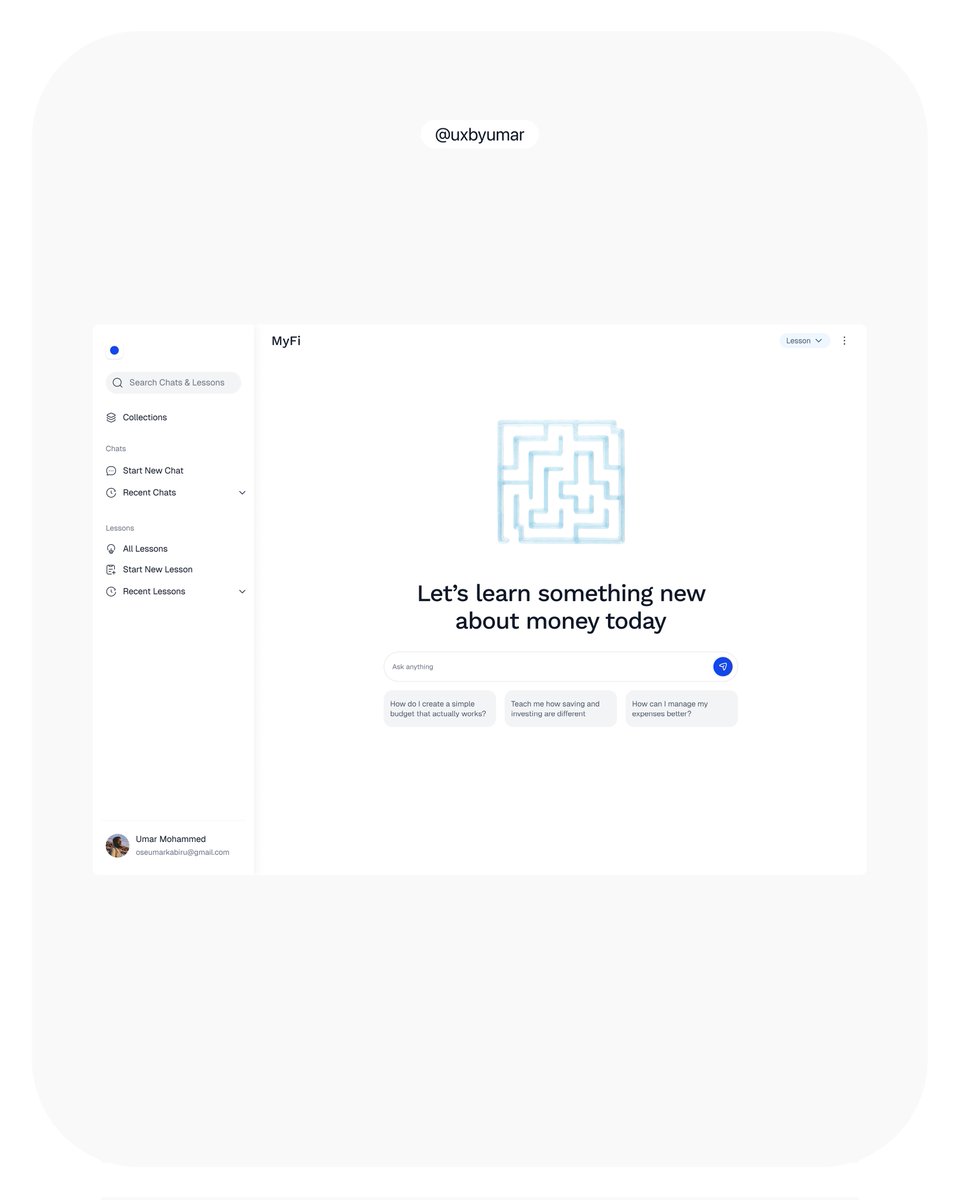
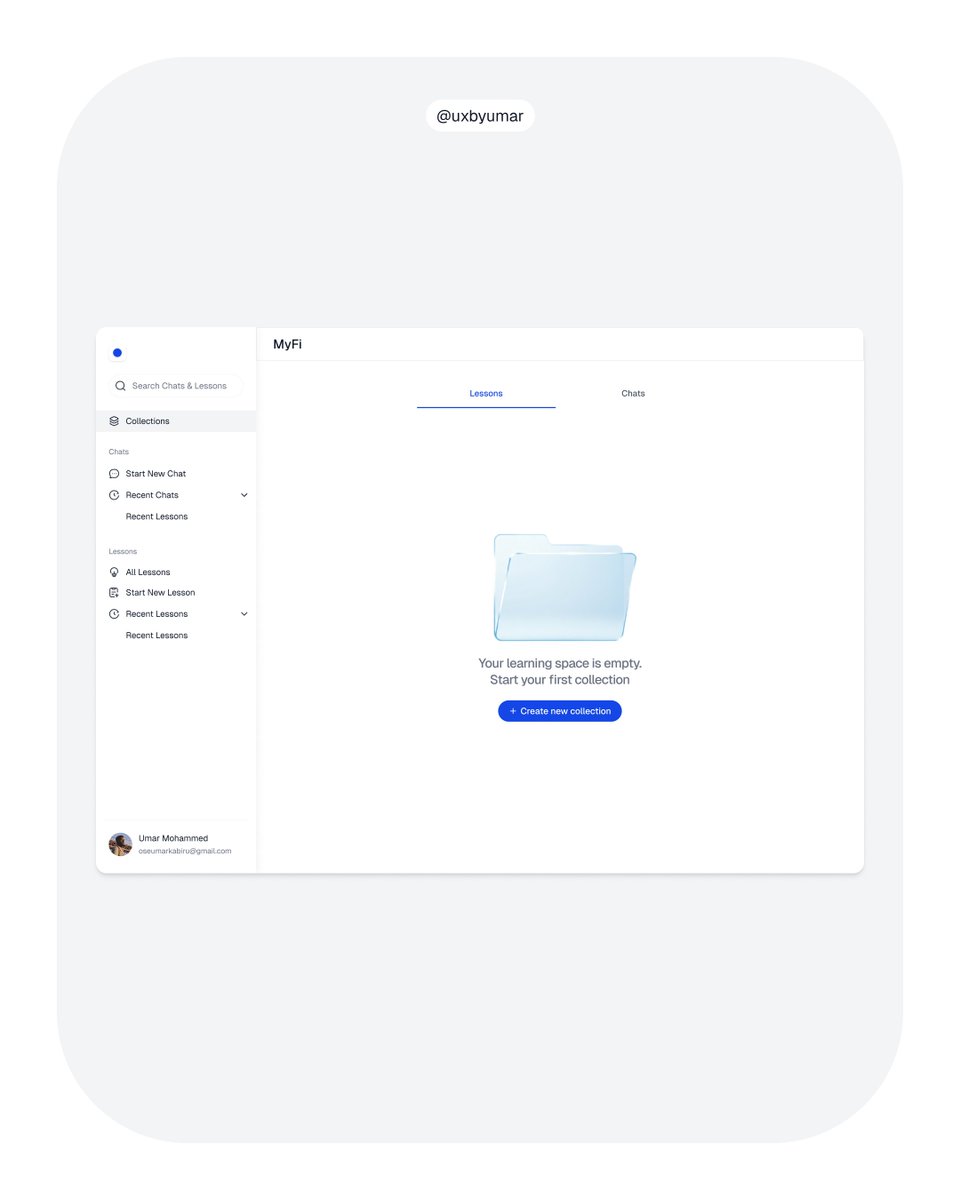
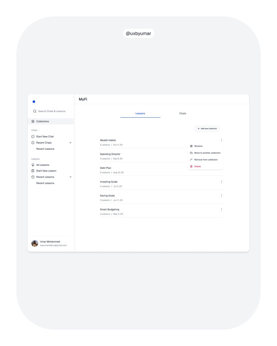
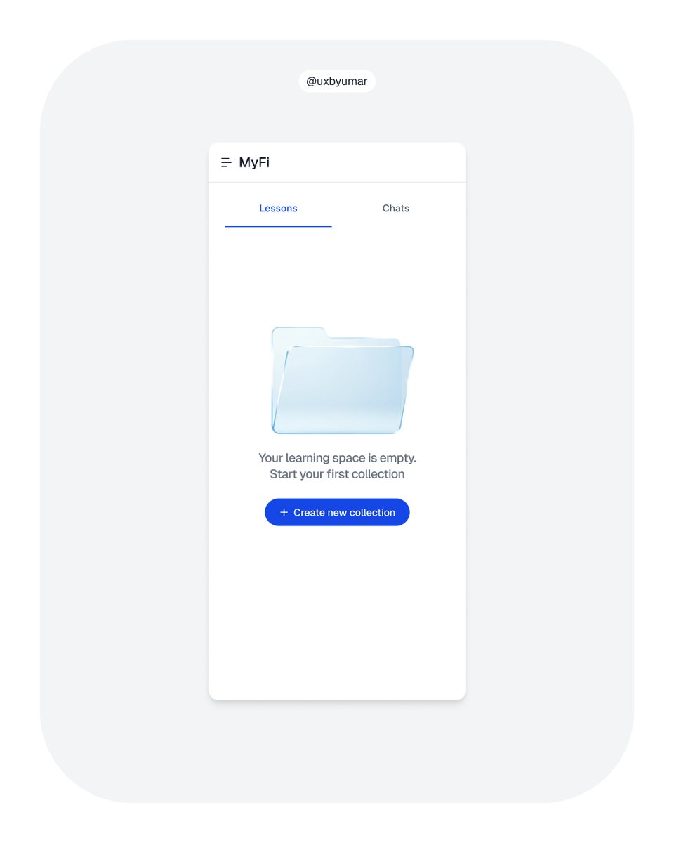
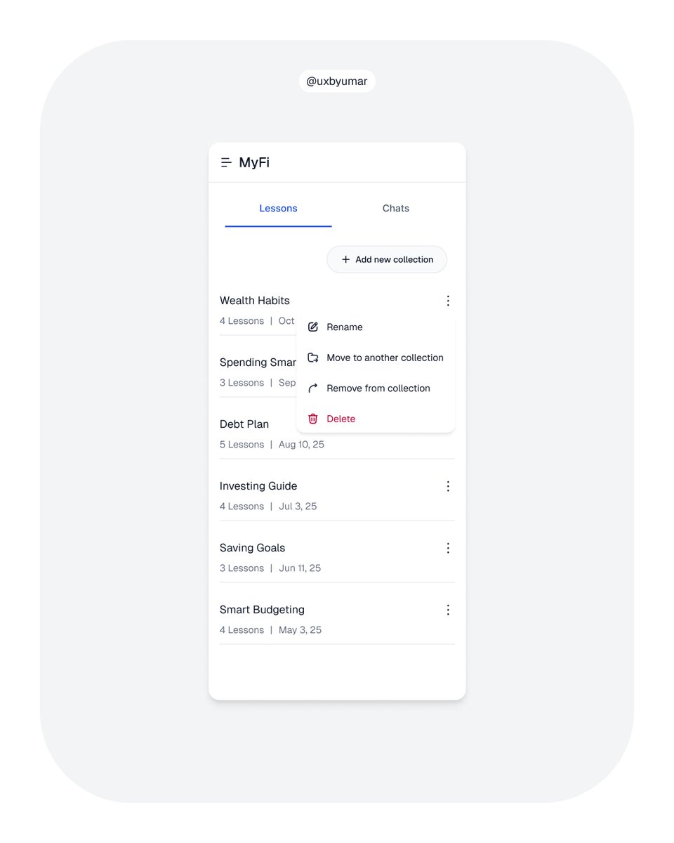
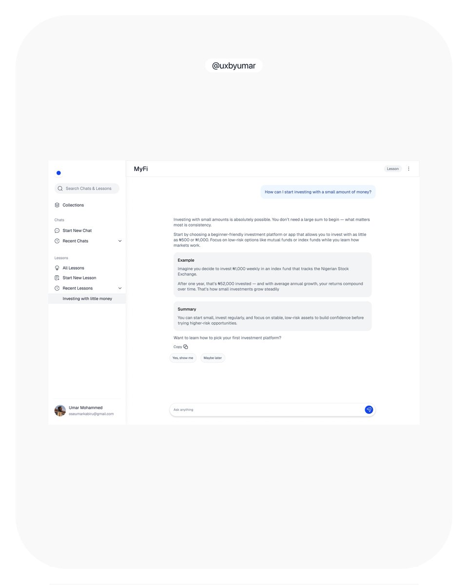
I split Lessons and Chats to separate quick inquiries from structured learning. The Collections page ties it together, a space to save lessons and recurring chats for easy access and better organization.
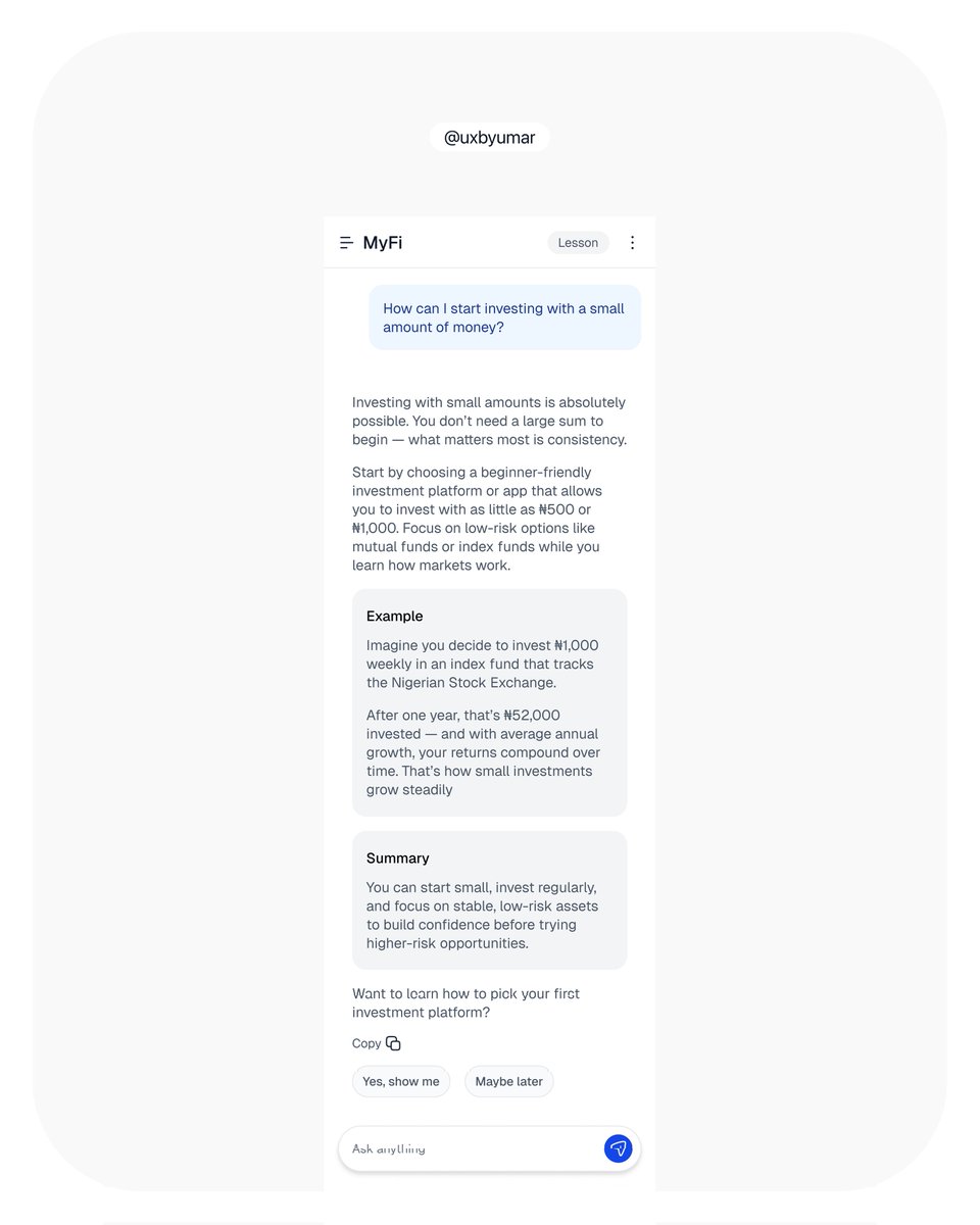
Chat interface between the user and Chatbot in lesson mode. The response is structured as follows: a main explanation in plain text, followed by examples and a summary (each highlighted with color). This helps users grasp concepts easily by clearly separating content.

1
4
33