
building agents, with agents. strings and silicon.
Joined February 2016
- Tweets 165
- Following 30
- Followers 19
- Likes 10
18 Photos and videos


spent the last 2 years building around llms: infrastructure, rag, multi-agent workflows, deep research products.
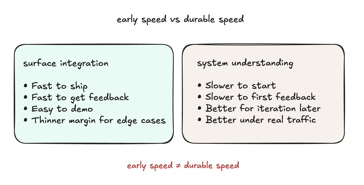
across all of that, one thing has become clearer to me: the model matters, but it isn't the whole agent.
the model is the core. the agent takes shape when you build context, action, and workflow around it. that's what people actually interact with.
as more ai products move from copilots toward agents, i've been thinking about where human judgment should stay, and how people can learn to steer them well.
writing some of that down here, and trying to stay grounded while this space moves fast.
2
2
683
Felix retweeted

Jun 8
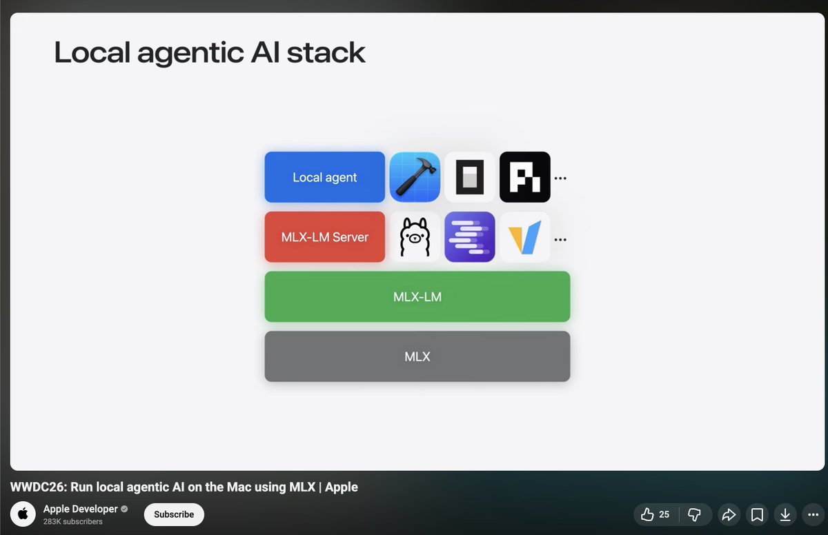
never thought anything i built would show up at WWDC. but here we are.
youtube.com/watch?v=wykPErJ8…
42
38
1,051
28,477
My everyday go-to (rss & epub) reader. Completely missed this in the changelog, so glad I caught it here.
Jun 4

New in Reader: Quick Lookup
Long-press any word, name, or term and get its meaning instantly.
Reader synthesizes the author's own definition of terms, pulled from their usage in the document.
One more tap saves the definition, so what you look up actually stays with you.
1
7
1,191
People's tastes in beauty are always shifting. As a result, my blog's style also received some adjustments.
I used to assume that a sans serif pairing was the go-to choice. However, after reviewing more use cases and type specimens, comparison and experimentation, I realized that a serif serif combination can also differentiate headings from body text while maintaining stylistic consistency at the same time.
Additionally, I used to think headings had to be bold and semibold could be a milder, more reader-friendly emphasis. But you can't rely on constantly making things bolder or larger or on adding various effects to establish visual hierarchy. It's breaking the color.
P.S. Söhne is a beautiful, steady grotesque. Maybe I'll bring it back someday for body text.

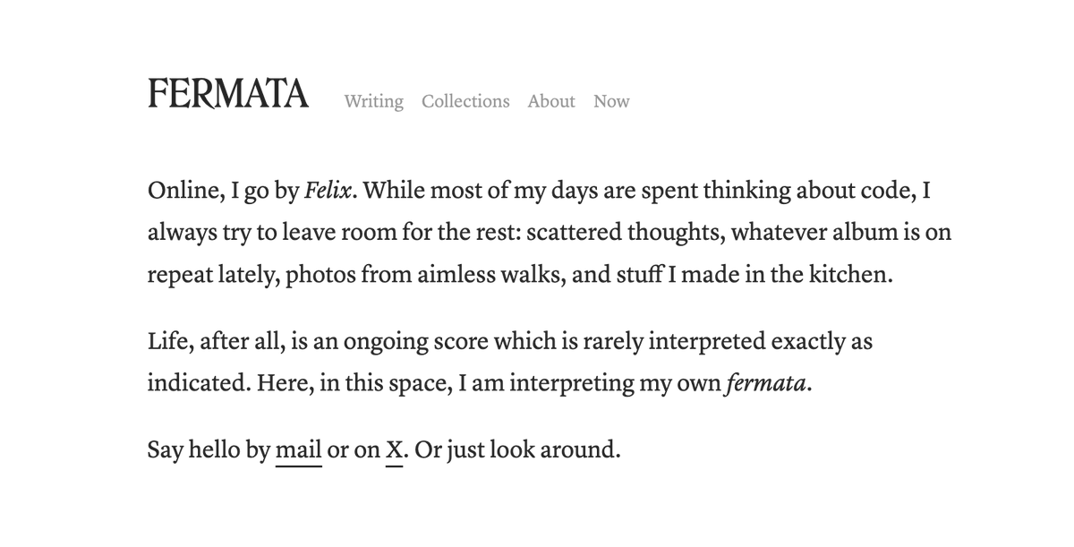
Finally decided to work on a personal site. Calling it Fermata. I wanted a space that isn't just about code, but leaves room for the rest.
Still putting the plumbing together and filling it up, but the front page is starting to feel right.
1
30
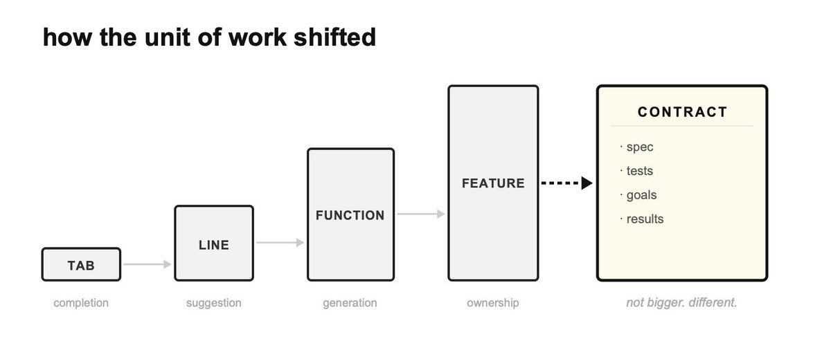
quote:
- Quality of output will solely depend on input, not capability of the model.
- The unit of work becomes the delegated task, not the code to be written.
- Software engineering shifts away from code and toward product thinking, shaping systems, judging tradeoffs, and business outcomes.
- The most valuable engineers will be system thinkers and operators that can increase business value. That is and will remain unchanged.

1
43
Developers love tinkering with what's technically possible, but nobody cares about a cool demo if it doesn't solve real business pain.
We thought browser use, or even computer use, was the breakthrough point.
It turns out that a lot of real business pain sits in ordinary workflows:
- processes that rely heavily on Excel
- PDF parsing and document-to-data extraction
- manual copy-paste between systems
And agents filling complex forms in internal software or on websites are still not as accurate or fast as expected.
24
expanded my prompt library
May 23

If you struggle to describe UI transitions in Claude or Codex, these commonly used transition terms can help. Save this for later.
26
As LLMs and agents move into enterprise, the tech itself is just the surface. Leaders will pay for the tokens (and maybe the agents), trying to fix how the company runs.
The real signal of success is quite simple:
- less manual grunt work
- people spend less time in meetings
- teams finally shipping things that used to be impossible.
It is just business transformation with a new engine.
30


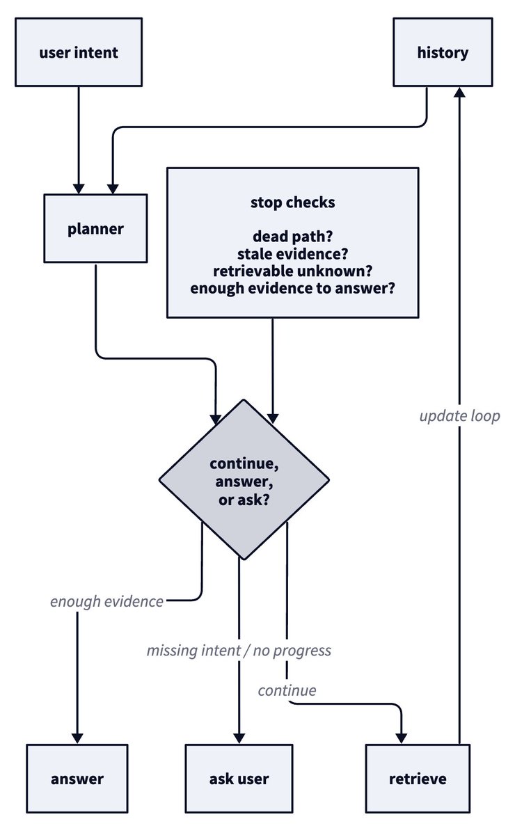
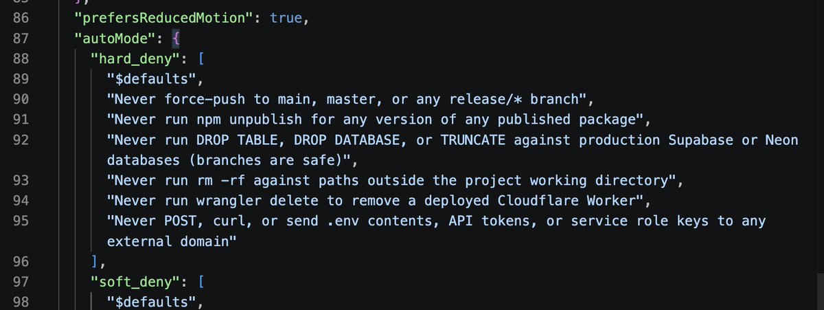
You can prompt an agent to flag uncertainty, but you can't rely on that prompt as the boundary. "Stop and ask for help" is soft guidance rather.
If you need the agent to actually stop and escalate to a human, that rule has to be enforced outside the agent as a hard constraint.
May 17

the way I think about it:
soft_deny is a guardrail. if you tell claude "force-push this branch" it'll do it, the rule was just a hint
hard_deny is a wall. allow rules don't carve exceptions, your prompt doesn't unlock it, the classifier just refuses
39
Coding agents are actually decent at writing code. The real failure happens when they start hallucinating the entire environment around that code.
When starting a new Go codebase, I define constraints and hooks before asking the agent to generate anything.
Here is the setup I use to keep agents on track.
2
45
Hooks give the agent automatic feedback inside the development workflow.
The trick is to tie verification to Git lifecycle events, so the agent can detect failures and fix them before the code leaves the local repo.
On `git commit`:
- format
- lint
- test
- build
AGENTS.md includes a pre-push instruction for the agent:
- review the diff for over-engineering and unnecessary abstractions
- check whether docs or configs need updates
- run full verification
If a check fails, the agent has to fix the real problem.
2
45