
Left 9-5 | Freelance software developer 💻 | Founder @yapyapai Building fast. Shipping faster 🚀 Websites | MVPs | SaaS ⚡
Joined February 2025
- Tweets 2,462
- Following 199
- Followers 242
- Likes 6,700
345 Photos and videos


27 Dec 2025
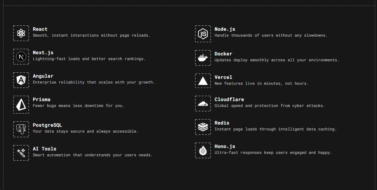
Just finished the tech-stack section of new portfolio.
How much you rate it out of 10 ?
1
4
160
27 Dec 2025
Just finished the tech-stack section of new portfolio.
How much you rate it out of 10 ?
1
1
121
27 Dec 2025
6,04,800 seconds into rebuilding my portfolio.
Others chase timelines.
I track intention.
Music still on 🎧
Cold still biting ❄️
Focus unchanged.
Updates:
✅ Refined skill hierarchy
✅ Stronger first impression
✅ Cleaner flow
✅ Words now say less mean more
No rush.
No noise.
Still building.
Still precise.
2
4
118
26 Dec 2025
5,18,400 seconds into rebuilding my portfolio.
Others count days.
I count seconds.
Music on 🎧
Cold outside ❄️
Locked in.
Updates:
✅ Added a skills section
✅ Removed noise
✅ Improved structure
✅ Sharper copy
Still building.
Still focused. 🟢
1
6
80
26 Dec 2025
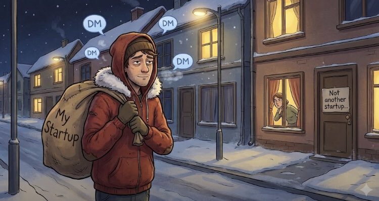
The trust mistake I made in my first startup
I believed this:
👉 Build a good product and people will come.
They didn’t.
I was in people’s DMs saying:
“Hey, try my product”
“Can you give feedback?”
“It’s free”
But I was a stranger.
No audience.
No proof.
No trust.
So every message felt like spam even though I genuinely cared.
The truth I learned:
People don’t buy products first.
They buy belief.
Belief that:
You know what you’re doing
You’ll still be around
Others already trust you
I had none of that.
That’s why it was hard.
Now I do it differently:
=> I share what I’m building.
=> I share what I’m learning.
=> I show up before I sell.
When people trust you, marketing stops feeling like begging.
They come to you.
That was the signal I missed.
Won’t ignore it again.
Happy Christmas Eve.
1
6
174
26 Dec 2025
Good Morning ☀️
Bonjour
Buenos días
Guten Morgen
सुप्रभात
1
3
48
25 Dec 2025
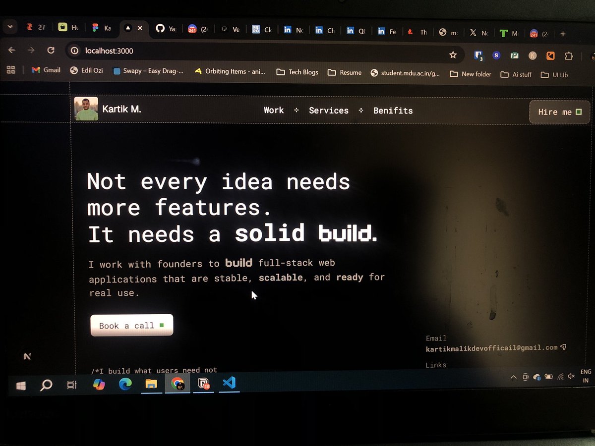
Just added this grid to my new portfolio.
How it’s looking ?
3
1
6
110
25 Dec 2025
Day 5 of rebuilding my portfolio.
No Christmas break 🎄
Just focus.
Hip-hop on the deck.
No colors, no distractions. 😂
I don’t add visuals until the mission is clear.
Structure first. Intent first.
Because design isn’t decoration.
It’s discipline.
Still building.
Still locked in.
1
6
77
Zero Lunier🥊 retweeted
24 Dec 2025
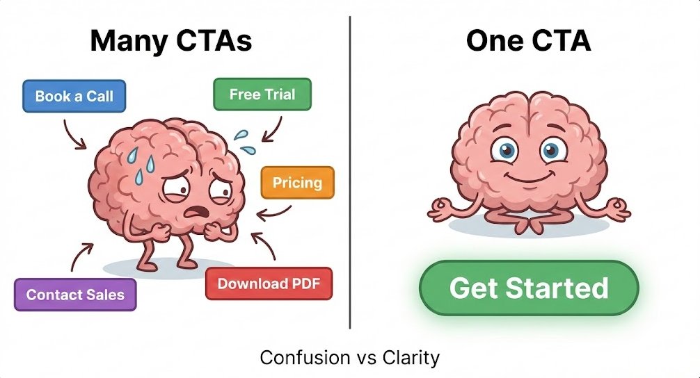
One CTA vs Many (learned this the hard way)
I thought more options = more conversions.
So I added everything.
• Book a call
• Start free trial
• View pricing
• Contact sales
• Download PDF
• (Probably “Subscribe to newsletter” too)
Result?
Users looked at my page like
👀
…
and left.
Turns out:
👉 Multiple CTAs don’t give freedom.
They give users anxiety.
When users have to think, they hesitate.
When they hesitate, they bounce.
What actually worked:
✔ One main CTA
✔ One clear next step
✔ Zero decision-making Olympics
Now I design pages like this:
• Landing page → do ONE thing
• Other links → quiet, in the background
• Decisions → unlocked step by step (like a game level)
If your page isn’t converting,
don’t redesign it.
Start deleting buttons.
Clarity converts. 🚀
3
1
8
166
24 Dec 2025
Everyone’s preparing for Christmas 🎄
We don’t have leaves.
Only hustle.
Only code.
Only shipping.
Only marketing.
Not missing the holidays.
Just building something worth celebrating later.
1
6
70
24 Dec 2025
Day 4 of rebuilding my portfolio.
Removed a section.
Added a tiny animation.
Spent 30 minutes deciding if it was too much.
Unlimited-energy music doing all the heavy lifting 🎧
Still building.
3
62
23 Dec 2025
Day 3 of rebuilding my portfolio.
Today wasn’t about visuals.
It was about decisions.
What to remove.
What to keep.
What not to explain.
No buzzwords.
No “full-stack ninja” energy.
If a section needs a paragraph to justify its existence, it’s gone.
A portfolio shouldn’t introduce you.
It should filter the right people in — and the wrong ones out.
Still building.
Still refining.
4
3
69
Zero Lunier🥊 retweeted

23 Dec 2025
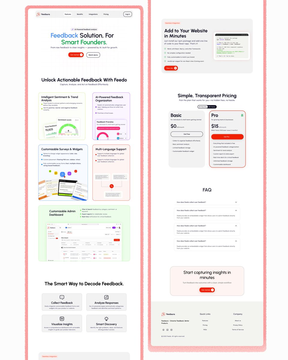
Looking back at this year, working on Feedaura was a turning point for me.
It was my first paid freelance project, done a couple of months ago, with @zerolunier.
Designing for a real SaaS product changed how I approach landing pages.
1
1
3
151
Zero Lunier🥊 retweeted
22 Dec 2025
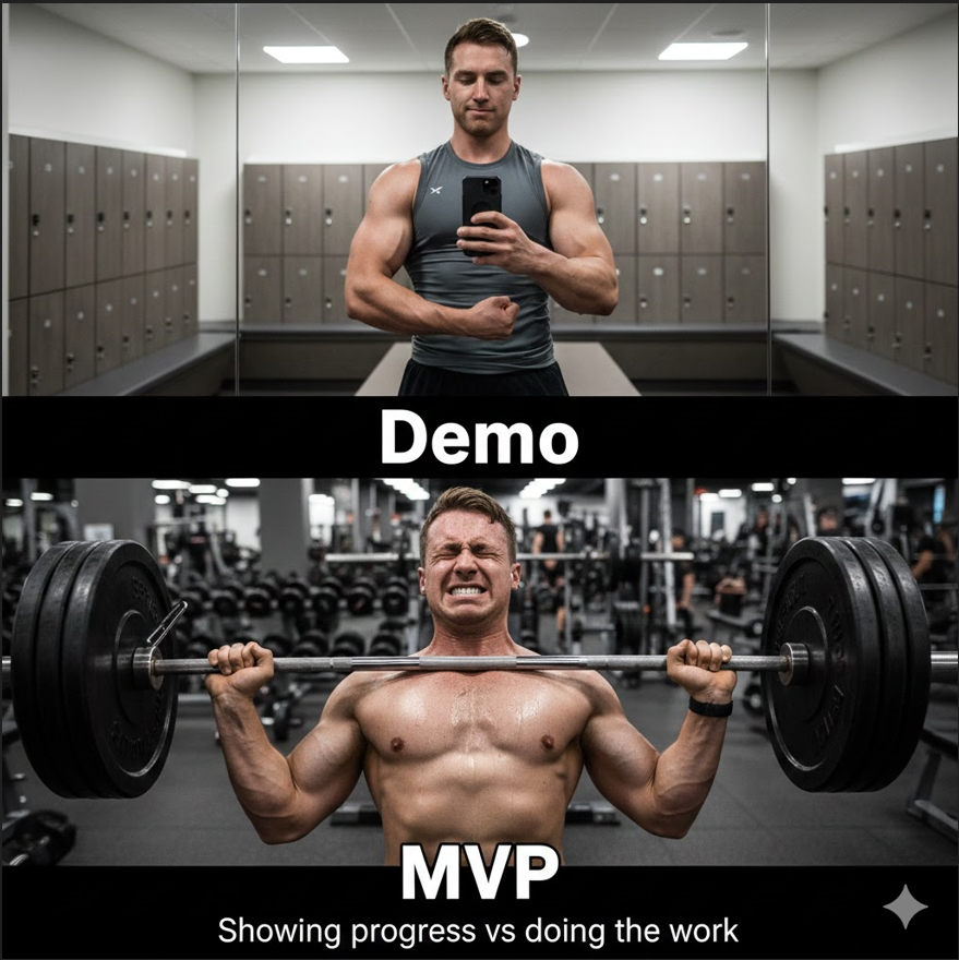
Most founder miss the differcene between MVP & Demo.
A demo answers:
“Does this look impressive?”
An MVP answers:
“Will someone actually use this?”
Demo:
• Happy path only
• Fake data is fine
• Built to show
• Works in a call
MVP:
• Real users
• Real friction
• Real bugs
• Works without you explaining
If users need a walkthrough, you built a demo, not an MVP.
#founders #vibecoding #CodingJourney
1
1
51
22 Dec 2025
Day 2 of rebuilding my portfolio.
This time, the approach is different.
Less noise. More intent.
Dark mode of course.
Sleek, minimal, and future-proof.
Not just a portfolio.
A product mindset in disguise.
4
6
73