
For every complex problem there is an answer that is clear, simple, and wrong.
Joined January 2009
- Tweets 23,004
- Following 2,228
- Followers 5,313
- Likes 5,054
1,632 Photos and videos


“Wereld minder vreedzaam”.
Ze nemen uitgaven aan defensie mee als maatstaf. Meer defensie, is minder vreedzaam. Sure….
nos.nl/l/2617849
3
235
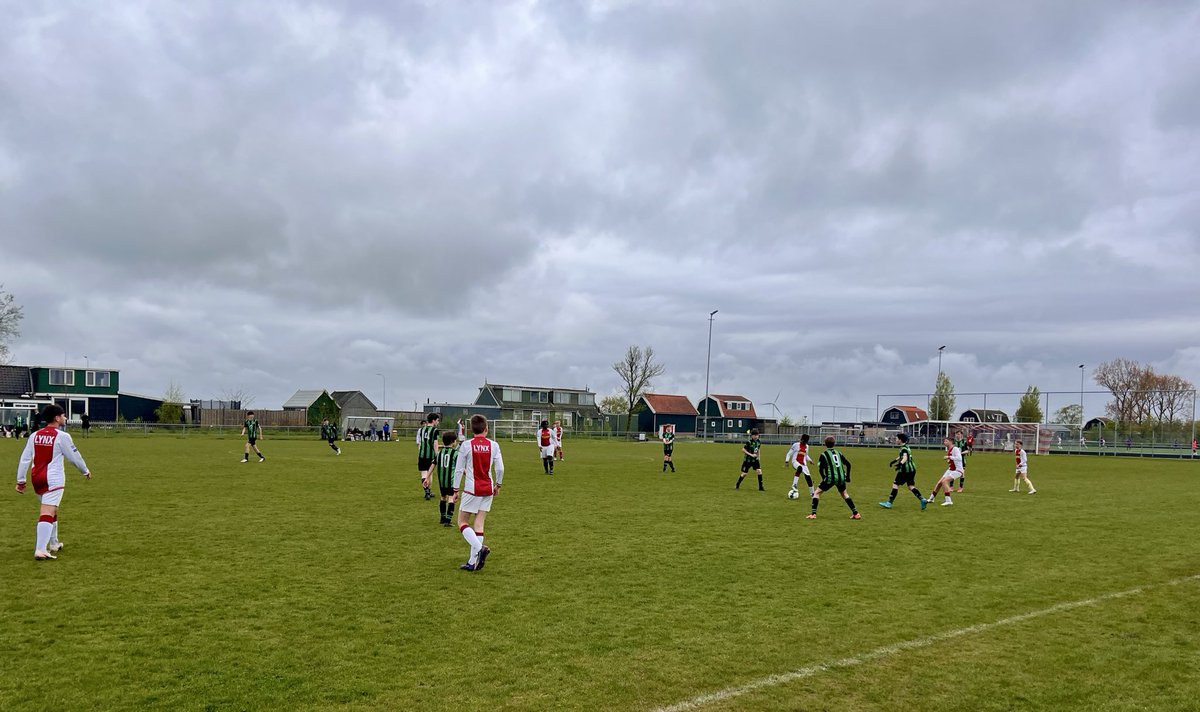
We spelen de eerste helft richting de harde kern tribune. Dat is positief.
Indrukwekkende minuut stilte voordat het los gaat op de tribunes.
#nedoez
5
965

May 27
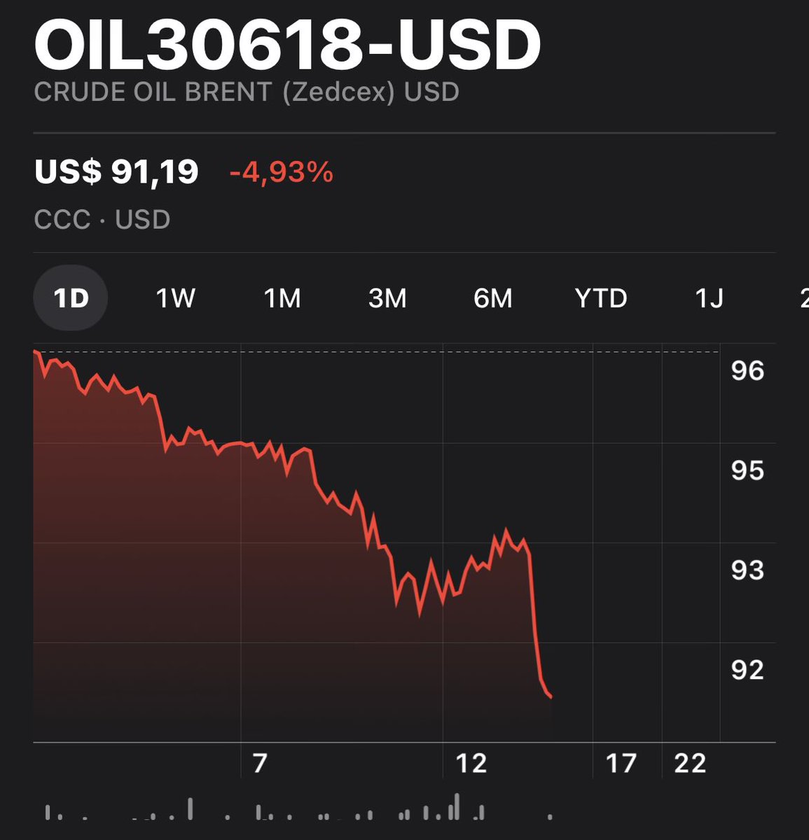
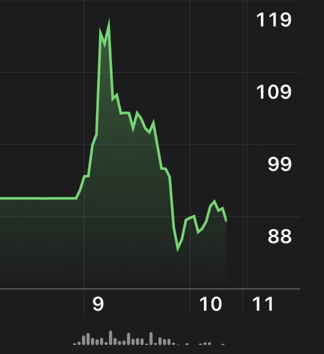
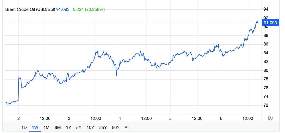
Vrede in de straat. Olieprijs weer omlaag, dus lekker goedkoop tanken. Hoera!
Trump die regelt dat gewoon even voor de wereld. Zo is ie.
1
2
373
May 23
Vast een leuke sport dat autoracen, maar ben het lawaai van het circuit inmiddels wel zat.
De rest van het dorp vast ook. Toch 100.000 inwoners.
May 23

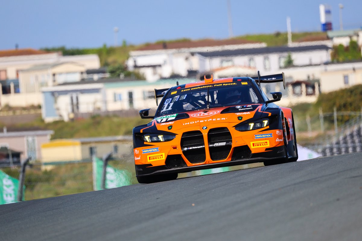
Leyton Fourie and Tim Zimmermann make up three positions and beat the Schubert BMW of Juliano and Sandro Holzem to win Race 1 of the ADAC GT Masters at Circuit Zandvoort for FK Performance Motorsport.
📸 ADAC Motorsport | #GTMasters
2
1
1
2,824
May 17
Volendam tijdrekken in eerste helft, straks reken ik op Koeman dat hij een kwartiertje speeltijd afsnoept. Go Telstar! #voltel
1
995
May 12
Index tegen de straat
May 12

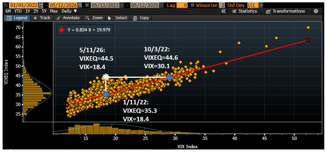
Here's a good way of appreciating how much diversification is priced into the options market.
The scatter plot shows the level of the $VIX versus the VIXEQ (the single stock VIX, calculated from option prices on NVDA, GOOG, MSFT, AAPL, etc.).
The VIX is always lower than the VIXEQ because on any given day, some stocks rise, some fall in the SPX, reducing the overall level of volatility at the index level. The question is how much lower should it be.
The white star shows today's level of 18.4 VIX and 44.5 VIXEQ.
Two questions. First, historically, what level of VIXEQ has coincided with today's VIX level? The blue dot shows, for example, that in early 2022, a VIXEQ of 35.3 coincided with the same 18.4 VIX we see today. Single stock volatility was nearly 10 lower to get the same VIX.
Next question, when the VIXEQ was at today's level, where have we historically seen the VIX? The second blue dot shows that in Oct'22, a VIXEQ of 44.6 saw a VIX of 30.1, nearly 12 higher than today.
The ratio of the VIXEQ to the VIX maps directly to the 1m implied correlation (IC) on SPX options (second chart, IC is inverted).
All of this makes sense in light of the low correlation between stocks like GOOG, MSFT and NVDA. A risk would be that this never seen before level of return dispersion stops.

1
2
3,802
May 12
En eind dat jaar speelde zodoende HFC Haarlem achter het ijzeren gordijn tegen Spartak Moskou - met wellicht de grootste stadionramp aller tijden met meer dan 300 doden.
May 12

HFC Haarlem Herinnering
Europa, here we come! Piepjonge Ruud Gullit kwalificeerde zich met HFC Haarlem voor Europees voetbal rodi.nl/haarlem/sport/493889…
619
May 11
En inmiddels is ufunded verboden in Nederland. Vanavond een kaarsje aansteken voor Kevin Timmer.
Jan 30

De AFM waarschuwt voor Ufunded. Nederlandse consumenten worden daarheen gestuurd door Kevin Timmer.
1
1
3
1,945
Canadees pensioenfonds HOOPP vroeg onterecht 200 mln dividendbelasting terug. Dan incasseerden ze 1,3 mld dividend. En gaat het pakweg over 33 mld Nederlands aandelenvermogen.
Ook over 5 jaar: zo groot zijn hun beleggingen niet in Nederland.
om.nl/actueel/nieuws/2026/05…
3
1
1,044
Pensioenfondsen zijn vaak vrijgesteld van dividendbelasting. Gast pakte tijdelijk aandelen op zijn boek van partijen die dat wel betalen. Deelden de winst, gaf daarna aandelen weer terug aan echte eigenaar.
1
227

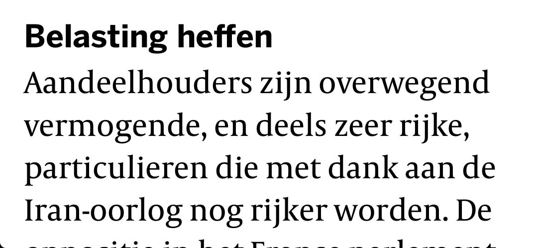
Ach ja, de Volkskrant. Vergeten even de pensioenfondsen en andere institutionele beleggers.
Aandelen zijn voor zeer rijke particulieren!
13
4
60
3,769
Apr 27
Sportverenigingen kunnen BOSA subsidie krijgen: Bouw & onderhoud sport accomodaties). Geen klein bier want tot 30% terug op kosten voor bv tenues, doelen etc.
Loket opende 5 januari. First come first served. Maarrrr ministerie VWS maakt er een potje van 1/2
1
1
908
Apr 27
Ministerie weet niet meer wie eerst was. Computerproblemen. Er is meer aangevraagd dan er beschikbaar is.
En nu? VWS gaat loten. Niet naar rato uitdelen, maar een loterij organiseren. Dat worden leuke jaarrekeningen voor de sportverenigingen. 2/2
318
Apr 16
Crypto brokers gaan over tot het aanbieden van perpetual future contracten op aandelen.
Crypto Tesla perps. Ja 24/7 en makkelijk met crypto’s. Maar ik zie het voordeel niet voor beleggers.
1
327
Maarten Mosselman retweeted

A simply incredible goal in Paraguay yesterday.
The striker missed the penalty and then the opposition player smashed it into his face for the goal.
Incredible 😂😂😂
138
853
7,349
831,540
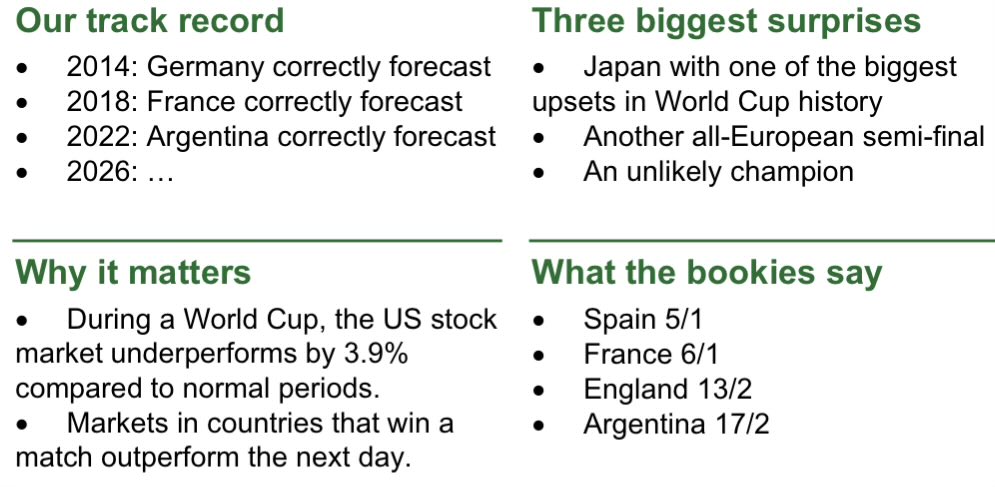
Econoom Joachim Klement voorspelt traditioneel de winnaar van wk voetbal.
Al drie edities een correcte voorspelling. Winnaar 2026 zal u verbazen 👉
panmureliberum.com/media/317…
4
1
4
2,385