
1,719 Photos and videos


Alva Majo retweeted

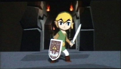
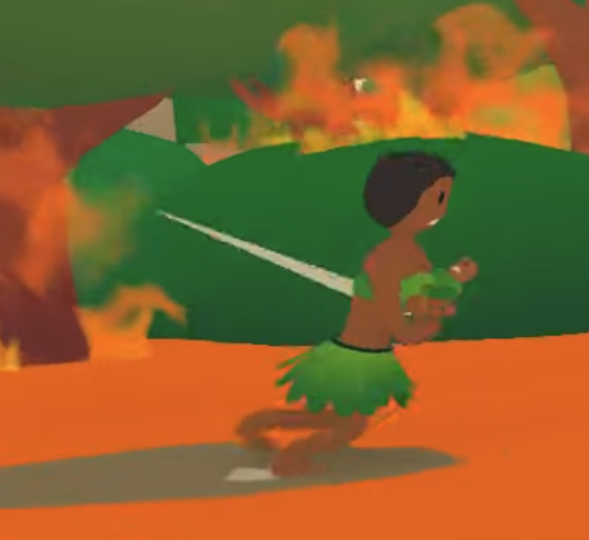
A personal opinion of mine:
Color tones are a key part to artistic vision, if you're truly trying to replicate something its important to take into account.
Nintendo bumps the saturation filter to neon colors, its not necessarily bad, but something was lost here and I want to acknowledge it.


29
47
847
72,364

Alva Majo retweeted

A lot of awesome sales on PlayStation 🔥🔥🔥
😼KinnikuNeko: SUPER MUSCLE CAT -35%
🧙♀️Ambidextro -30%
🪩pureya -40%
🧙♀️🪩Ambidextro pureya bundle -40%
🤖🍣Sushi for Robots -35%
⛳️Golfing Over It -20%
⁉️Majotori -25%
🤖Robot Detour -20%
Links ⬇️⬇️

2
12
34
4,781

Ayer jugamos los tres a Shipped pensando "bah, barquitos, risas tranquilas".
Error
A los 5 minutos estábamos gritando, chocándonos y culpando a @5ro4 de haber creado un experimento de romper familias.
youtu.be/1V_i18fvfaE
2
4
18
4,337
Alva Majo retweeted

Nominees for the Godot Game Awards 2025 were announced this morning.
You can now vote for the winners 🏆
stayathomedev-git.github.io/…
Winners will be announced in two weeks.
#GodotEngine
1
4
23
6,092
En este podcast tuve que defender la alocada idea de que los juegos competitivos van de ganar.
youtube.com/watch?v=2m4IInCs…
7
7
121
11,283
Alva Majo retweeted

Apr 29
Steamで友人にこのゲームをプレゼントしました:「Ambidextro」。Alva Majo(@5ro4)が完全に開発した作品です。自分でも買いたくなるくらいでした。皆さんにも共有します。試してみる価値のあるゲームだと思います。
store.steampowered.com/app/3…
2
25
3,402
Cool new project from Butterfly Soup's creator. Just backed it.
kickstarter.com/projects/psy…
1
33
3,568
Alva Majo retweeted

Apr 11
Splitgate is implementing P2P servers as an end of life plan and even citing #StopKillingGames as part of the motivation for doing so. That's excellent and in a sane world would be standard practice.
store.steampowered.com/news/…
28
365
2,381
76,377
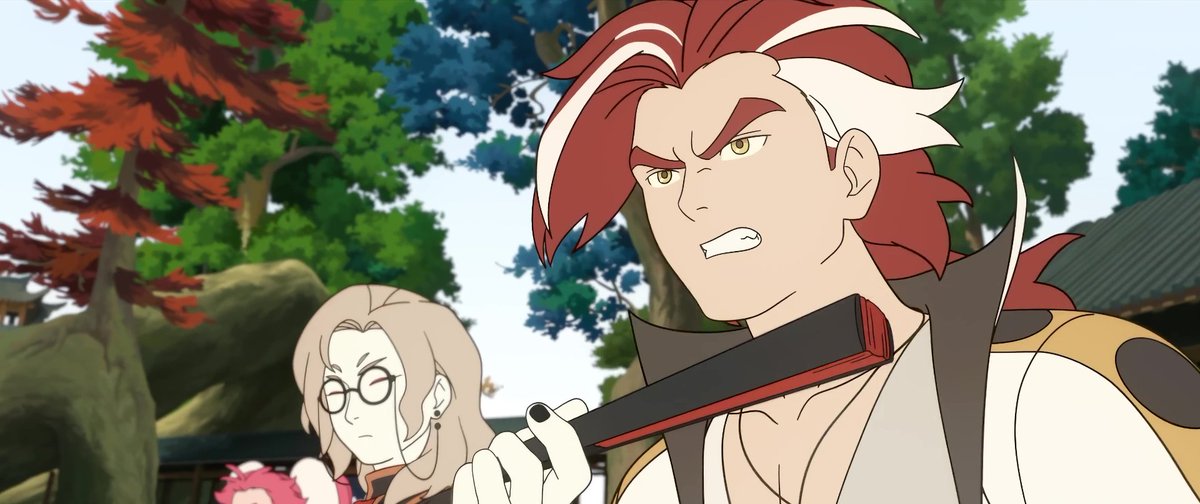
Watched the Luo Xiaohei Zhanji (The Legend of Hei) movies. Really liked the 1st one. Loved the 2nd one.
The animation is impeccable, the character designs are awesome, the backgrounds gorgeous, they are full of incredible action sequences, and the plot is basic but enjoyable.
4
5
228
10,345
I had tried installing an emoji font through the terminal and that somehow did nothing, but installing it by putting it in the fonts folder worked (for most emoji; a few weird ones such as 🈁️show as an ugly monochrome even if they are included in the font).

Godot doesn't display emojis in Nobara Linux 😭
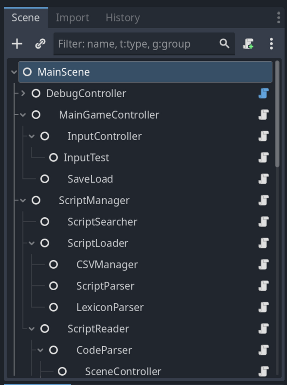
This is a deal breaker for me. My whole organizational and debug systems depend on them.
Seems to be a Fedora issue. Can it be fixed?
9
3
264
18,112
Mis juegos muy baratos:
store.steampowered.com/bundl…
11
15
148
14,335
I installed Linux Mint. Spent a couple of days tinkering to get some Windows functionality such as being able to configure my mouse or having Super V bring up the clipboard history.
The 3rd day I did some work, then attempted to play indie games on stream and the dream died.
89
13
992
68,769