


ALT Excel spreadsheet with formulas and charts connected to a Qlik Sense dashboard, showing two-way data flow
ALT Advanced Sankey Chart extension for Qlik Sense, showing a Sankey diagram of a global supply chain inside a Qlik Sense analytics app interface

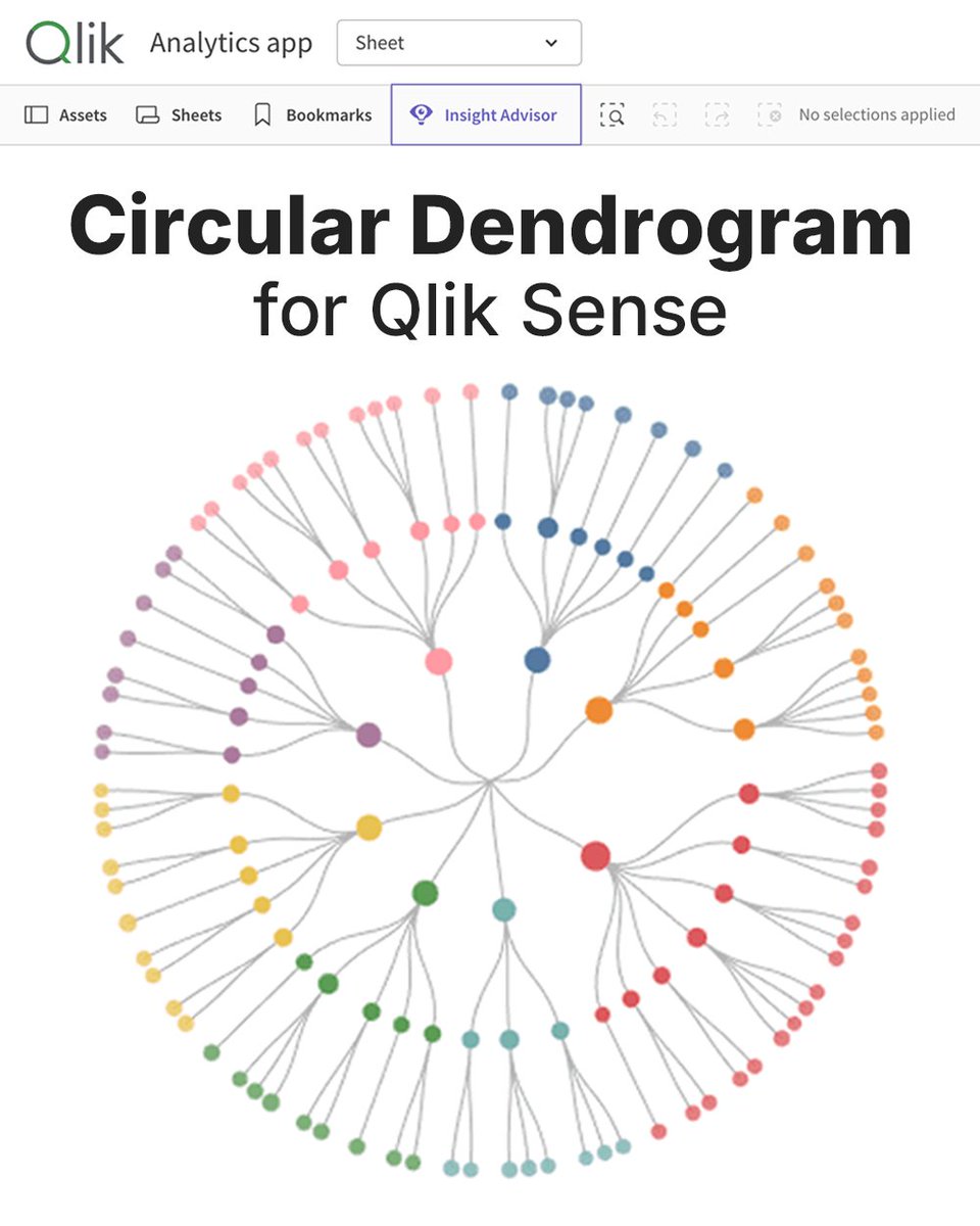
ALT Circular Dendrogram for Qlik Sense, with a radial dendrogram chart showing parent-child hierarchy links in a Qlik analytics app
ALT New Data Visualization Work Deserving a Closer Look, Featured This Week in DataViz Weekly
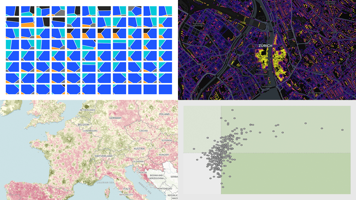
ALT A Quick Look at the Interesting Data Maps From Around the Web Featured in This New Edition of DataViz Weekly
ALT A tablet displaying an interactive JavaScript step line chart outside the New York Stock Exchange on Wall Street
ALT Four Recent Data Visualization Projects That Held Our Interest
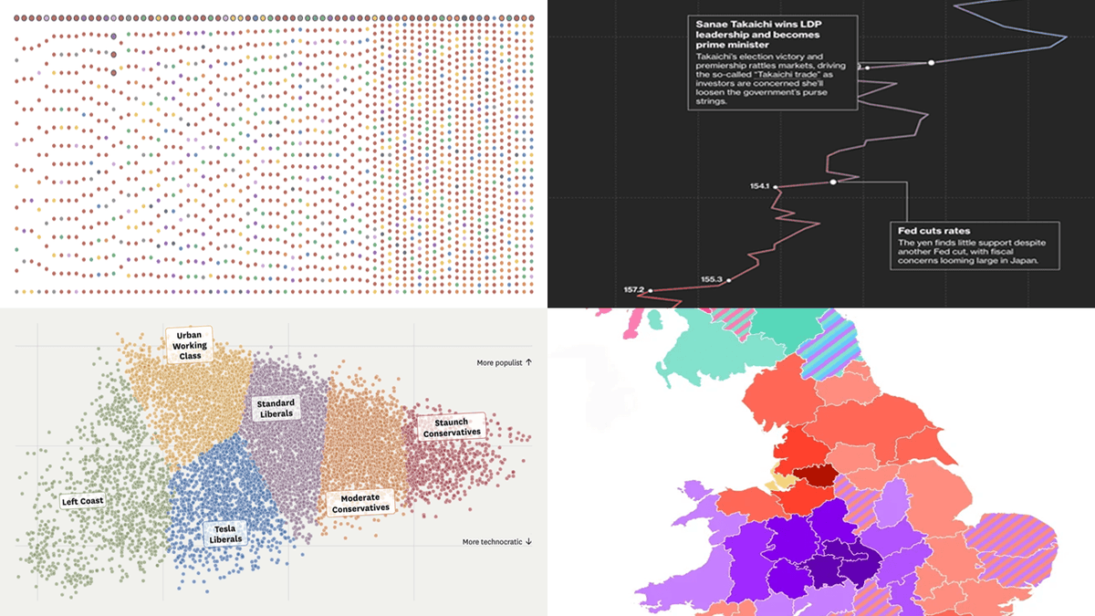
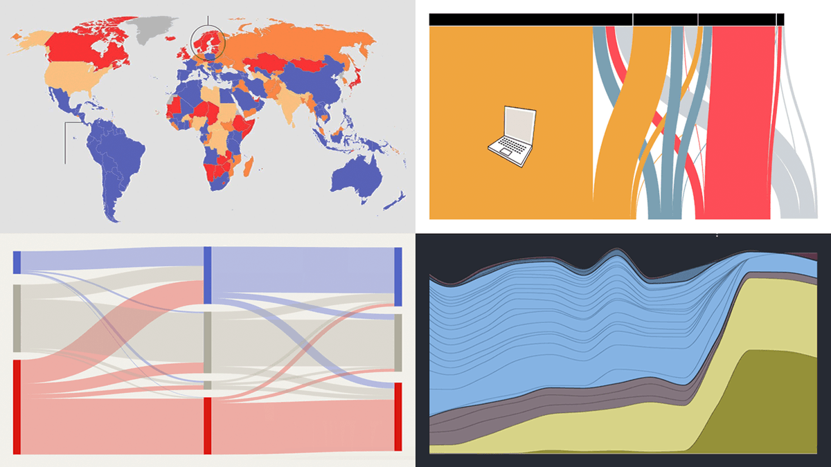
ALT Collage of four data visualization screenshots: AI content growth chart, divorce rates beeswarm chart, RSF World Press Freedom Index map, and Italy's pet boom alluvial diagram
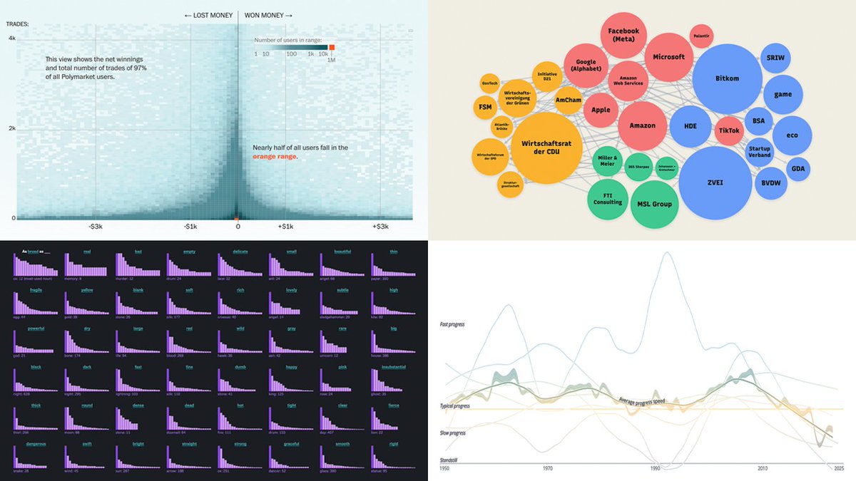
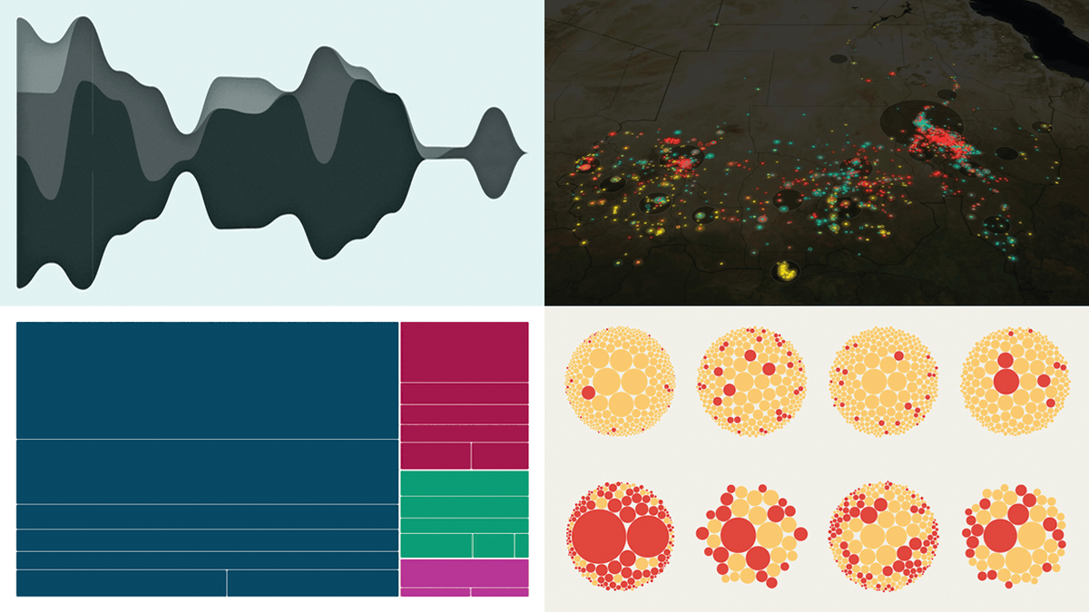
ALT Fresh Data Visuals That Caught Our Attention - Screenshots from Four Projects Featured in DataViz Weekly on May 1, 2026
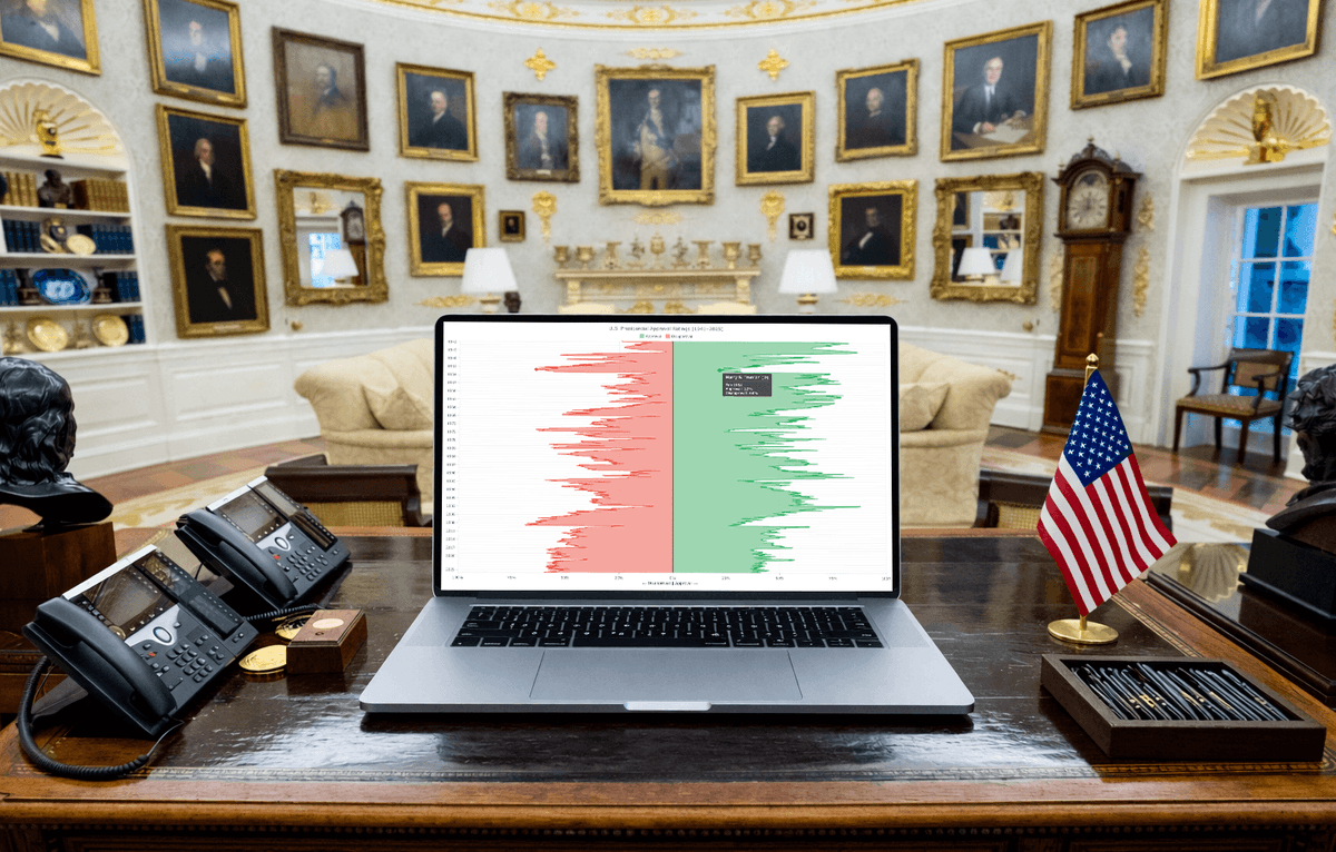
ALT JavaScript vertical area chart showing U.S. presidential approval ratings on a laptop screen in the Oval Office
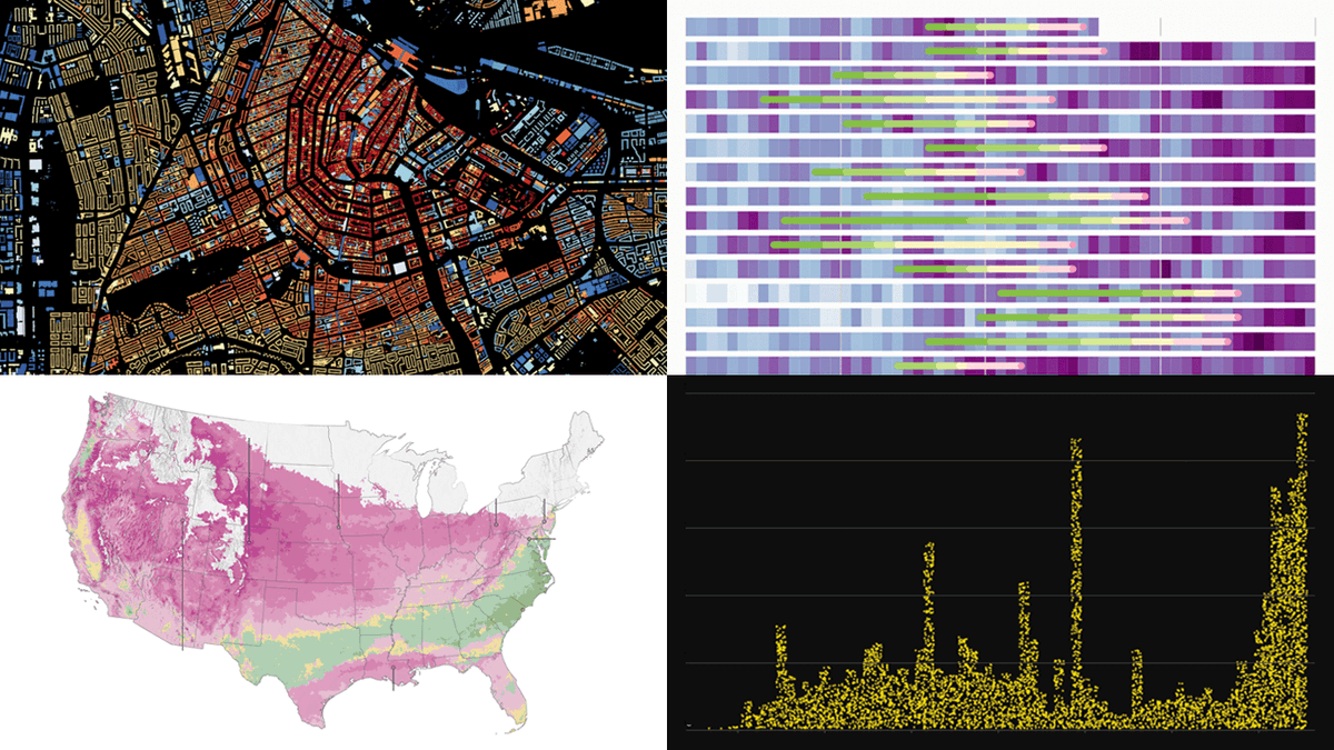
ALT More Great Charts and Maps to See — DataViz Weekly
ALT How Data Visualization Opens Up Complex Subjects — DataViz Weekly