
Iriseoireacht OT BÁC. Bohs. CLG. Haca Oighir. Polaitíocht. - Journalism TU Dublin. Bohs. GAA. Ice Hockey. Politics.
Joined September 2020
- Tweets 28,547
- Following 3,176
- Followers 1,581
- Likes 55,073
2,122 Photos and videos


Pinned Tweet

Apr 16
Right, I've finally got access to this account once again.
I notice a load of people have been sent a link to vote in something from this account. DO NOT CLICK ON ANY LINKS. ITS A PHISHING ATTACK.
Sorry to everyone who's received these scam links.
1
312
Matthew retweeted

Jun 13
On this day ten years ago we opened our EURO 2016 campaign with a draw against Sweden at the Stade de France!
Wes Hoolahan scored the opener before Ciaran Clark scored an own goal with under 20 minutes to go.
#EURO2016
1
34
1,108
Jun 12
We care for those struggling so much that, rather than paying an artist to design our poster, we will use AI, forcing the artist out of work.


2
57
Jun 12
Breaking news - the Statue of Liberty is now in LA.

69
Jun 12
I don't even know the stop number that I go from every day.
Would be helpful to show a map of it.
Especially if this is a regular thing throughout the summer.
Cause who the hell knows their stop number right off by heart?
Jun 10

#GAIserviceupdates
Due to a concert tonight ( June 10th ) in Malahide Castle there will be a diversion on #GAI102.
From: 21:30 to 23:30
Stops Affected: 3634, 3635, 3636, 905, 3643, 3583, 3584, 3585.
Two addition 102 services will be departing from Yellow Wall Road towards Dublin Airport after the concert to assist our customers getting home.
@TFIupdates
1
171
Jun 12
This is absolutely unreal.
Congrats to everyone who has been behind this.
Fáilte ar ais, Cumann Peile Luimnigh!
Jun 12

Treaty United FC are pleased to announce that they have entered into an agreement, in principle, under which they will acquire the intellectual property associated with Limerick FC and, subject to the completion of the necessary formalities and approvals, adopt the historic Limerick FC name at the beginning of the 2027 season.
Read more : treatyunitedfc.com/treaty-un…

3
879

Jun 8
I would be surprised BUT their OWN LOGO is upside down on THEIR OWN website. Surprising not.

Fixture updates for @GalwayUnitedFC in the SSE Airtricity Men's Premier Division.
Read here - leagueofireland.ie/news/galw…

452
Jun 8
I've to go up to Belfast next week, @IrishRail it would help so many commuters in the North County if Enterprise stopped in Malahide. Would save such a headache.
6
1
6,011
Jun 7
Only in Ireland

10:25 Portlaoise to Heuston service is operating 16 minutes behind schedule.
Due to heavy loadings of passengers travelling to the match at Croke Park.
As a result, the 09:30 Galway to Heuston service will additionally stop at Hazelhatch and Adamstown.
-AP
239
Jun 5
Utter nonsense.

🚨JUST IN: FIFA bans vuvuzelas from World Cup stadiums. The plastic horns now violate FIFA’s code of conduct.
They were extremely popular during the 2010 World Cup in South Africa


93
Jun 4
"We can tell" well you can't because you're fucking wrong aren't you, Erv?

You’re a fake Irish account. We can tell because your app location is from Nigeria. We can also tell because a real Irishman would know Bosnia away is a tough game for any team. No idea why you Nigerians pretend to be westerners on this app it’s so fucking weird and unhinged lol.
183
Jun 3
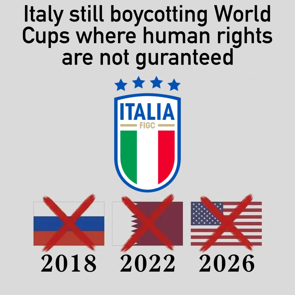
This will honestly be the worst world cup of all time.
Jun 3

🚨 NEW: Due to the recent heat waves, a Climate Central study has stated that 97 out of 104 World Cup games will be played in UNFAVOURABLY HOT conditions.
This could lead to the games having a slower pace. @La_SER
1
234
Jun 3
Bring back the Celtic Cup or Home Nations Championship, the latter could be a good litmus test for a United Ireland team for example.
Jun 2

🇪🇪🇱🇻🇱🇹 The Baltic Cup returns this week for its 30th edition, with the Faroe Islands once again taking part as a guest nation.
The competition was created in 1928 after Estonia repeatedly declared themselves the best footballing nation in the Baltics, leading to the creation of a tournament to settle the debate.
Nearly a century later, it remains the oldest active international football tournament in the world. Only the Home Nations Championship is older, although that competition is no longer played.
Poland and Finland were originally invited to participate. Poland have never taken part, while Finland did not make their debut until 2012.
Latvia are the most successful nation with 13 titles, while Estonia enter as reigning champions after ending an 83-year wait for the trophy in 2024.
Now, just days before the World Cup begins, the Baltic Cup returns for its 30th tournament

1
252
Jun 3
To everyone showing me sympathy for having the task of making sure no one turned off the floodlights at St Anne's the other night, I really appreciate it 😂
Hey I'm not complaining provided I'm being paid :)
108
Jun 2
So much for all those "essential works" over the weekend!
Update:
DART: 15-minute delays expected on some services.
Delays due to an earlier overhead powerline issue near Dalkey.
12:04 Malahide to Bray will operate:
12:30 Connolly to Bray
Due to a technical issue on the train scheduled to operate.
Update to follow.
-CL
102
May 31
There's gigs right near a rail line - let's just make that completely unusable for southside users!!
May 31
Additional services
💐Bloom
❌🍉Forbidden Fruit
🏐GAA at Croke Park
🎸Snow Patrol St Anne's Park
🏃♂️Cork City Marathon. -AD
❌NO DARTs between Connolly-Greystones
🚍Rosslare bus transfers Connolly & Bray
🚍Belfast bus transfers
Drogheda↔Dundalk
ℹ️irishrail.ie/en-ie/offer/add…
1
158

May 30
*Laughs in RTÉ*
May 29

🚨TNT GO AGAINST THE PRIME MINISTER❌
People will have to pay a subscription to watch the Champions League Final tomorrow night for the first time ever💰
GREEDY GREEDY GREEDY🤢🤮


1
107
May 24
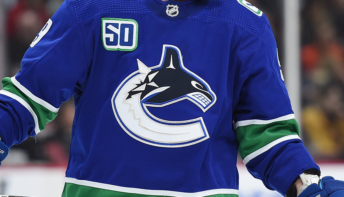
I hear a lot of debate online on these two Canucks logos, so as a long suffering Irish Canucks fan, who hasn't stepped foot in Canada for over a decade, let me give my unqualified two cents on the issue, which although not all that pressing, is still an interesting debate.

1
74
May 24
Another part of good logo design is, it should not be easily applicable to other cities. For example, if the Canucks were to ever move cities to say, Texas, then they would obviously have to change the logo. Makes no sense to have an orca in texas.
1
49
May 24
This is where the skate logo is poor, as apart from saying 'canucks', it could easily apply to other cities, with the wording changed. It shows no cultural identity for me, and feels nostalgic, nice to look at, but generic.
Therefore, the Orca reigns supreme to me.
37