
AEA Stage Manager: Theatre, Opera, Music, Events. Nerd, Gaymer, Sci-Fi fan. Tax prep. ISTJ, heavy on the J. Weird obsession w/ license plates. 🏳️🌈🎮🖖
Joined April 2009
- Tweets 21,241
- Following 319
- Followers 472
- Likes 15,175
1,443 Photos and videos


Pinned Tweet

10 May 2014
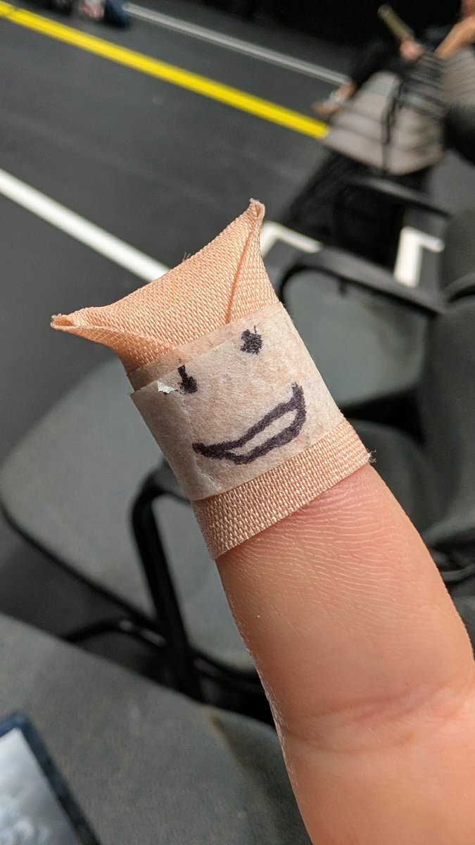
"I tell the actors what to do. Well, I tell them WHEN to do it anyway." #ExplainSMing
1
2
26
I'm working on "A Gentlemen's Guide to Love and Murder" and oh my goodness are Musicals without Production Numbers absolutely heaven to rehearse! #SMlife
1
12
BenSM retweeted

Any perk in destiny where the guy explodes when you kill him are always the best ones.
45
238
6,386
87,064
BenSM retweeted

Jun 13
what you need to understand about recommending a show to me is that no matter how much we both know I'll like it, I can't watch it until the Neurodivergence Department in my brain approves it. I don't know when that will be, and I don't have any more control over it than you do.
63
2,580
13,790
242,335
BenSM retweeted

Jun 13
Why don’t bank deposits go through on the weekends are the computer systems home with their families?
184
806
18,787
1,042,609
BenSM retweeted

In the garden of Eden, mankind fell to sin and the earth was cursed. Software is no exception.
4
28
654
42,881
Jun 2
I literally cannot understand L1/L2 and L/ZL. Bumpers and triggers for the win!

10 ans que j’ai la xbox j’ai jamais capté pourquoi les touche s’appellent LT-LB frr alors que la PS c’est simple L1 L2
23
Jun 2
It's wild to me when people are using Windows 11 and they have left all the default taskbar settings as is out of the box. The search bar is insane. Why would you not make it a button? Windows 10 has this same problem FWIW.
73
BenSM retweeted

May 30
Greatest commercial EVER!!!
May 29

Gen Z won't understand, but this woman dropped one of the hardest lines of the 2000's.

167
8,361
36,211
1,602,036
BenSM retweeted

May 29
Gen Z won't understand, but this woman dropped one of the hardest lines of the 2000's.
505
4,332
20,731
2,874,671
May 26
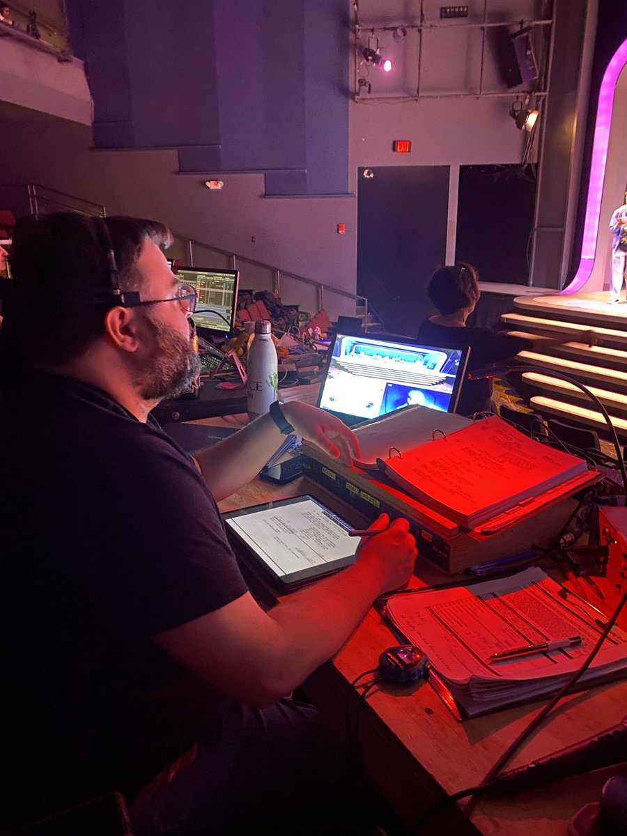
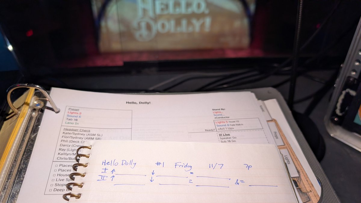
Guys, no one says "Cue" when they're calling a show (and if they do, they shouldn't). It's "Lights 1 Go" not "Lights Cue 1 Go" and ABSOLUTELY not "Cue 1 Go." #SMlife
1
1
19
BenSM retweeted

May 17
its cool how half the global economy is contingent on this shit

193
1,156
32,157
2,188,768
BenSM retweeted

May 13

Dunkin' is now launching its viral 48-ounce drink bucket nationwide
The bucket can be filled with iced coffee, iced lattes, and Refreshers


27
2,239
35,478
2,042,981
BenSM retweeted

May 12
This website is like a piece of paper that's glued to the wall like you ripped it off of a magazine. There's panning and scrolling. The mental model of the page is vividly clear. Navigation is straightforward and predictable. Menu doesn't move. The 'staticness' of these old sites is undervalued and now kind of forgotten.
Compare this with modern full screen webapps that give you no sense of where you are on the page and molasses-like animated UI that captures native scrolling. These websites have their own abstraction layer to navigate, browse and present things. Almost like motion picture that presents information to you and you don't have much control. Signifiers that visually inform you of interactability are misplaced or entirely missing. You have some illusion of control but it's nowhere as explicit as a static page.
There is an ad-tech-smell and "pop" in modern websites as they take over your visual field in mysterious, unpredictable ways. Doesn't let go of the attention easily. Huge typography and motion effects captivate users kinda like a 30-sec advertisement. Crack cocaine of information consumption.
Combine this with terrible decisions at the OS-level like making scrollbars invisible, practice of UI/UX is deeply unserious today. It's not like we don't have solutions and it's an unknown problem. We have the blueprints. We had it all and we deliberately abandoned it with great carelessness. But in a certain light, the practice of UI/UX today is deeply serious in the ad-tech aspects and bedazzles their userbase with ever-increasing sense of bedazzlement. What purpose does Apple Liquid Glass UI serve otherwise?
Open for discussion and critique.

Windows Mobile website in 2005
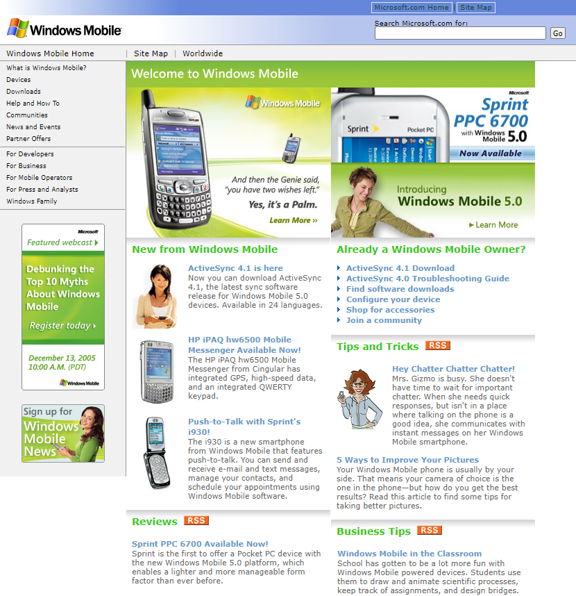
ALT Windows Mobile website in 2005
28
80
959
56,057
BenSM retweeted

May 10
You can’t really argue this. They believe in investing in the people and infrastructure.

1,142
17,252
110,932
2,281,912
BenSM retweeted

May 8
Why is sleeping at night so hard but sleeping in the morning is like drifting away on a soft fluffy cloud while time passes at 10x speed
228
3,795
61,839
2,800,297

BenSM retweeted

May 8
Nintendo has completed the infinity gauntlet of going back to a game. We have now the perfect guide for if a game is a remaster, remake etc.
I present the Starfox Scale.

278
6,142
45,829
1,043,148

What’s extremely weird about the sequel trilogy is they didn’t plan it out.
This is the biggest trilogy of all time by the biggest entertainment corpo that has ever existed and they couldn’t bother to write all three movies together.
The random nerd at the comic book store could have done a better job.

There's something uniquely and almost spiritually bad about The Last Jedi, you'll commonly hear people say "I watched it and realized I was done with Star Wars forever" as if it the film reached into the viewer's soul and snuffed out a last flicker of childlike wonder
162
362
7,574
327,474
BenSM retweeted

May 4
Before iPhones, this was the pinnacle of technology
83
1,586
14,923
343,877