
Constructive criticism of the graphics of climate science. Mostly @dougmcneall, climate scientist and statistician.
Joined November 2012
- Tweets 110
- Following 57
- Followers 268
- Likes 35
5 Photos and videos


Better Figures retweeted

8 Jun 2018
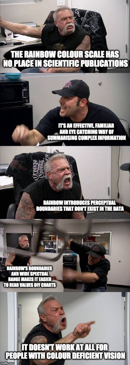
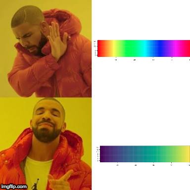
I've updated this @BetterFigures post on "picking a colour scale for scientific graphics" to include a colourblind-friendly categorical palette, and to reference viridis directly. betterfigures.org/2015/06/23… #endrainbow
3
9
Better Figures retweeted
4 Jun 2018
We tested Rainbow against Viridis colour palettes for finding a subtle feature in data. You probably will believe what happened: wp.me/p2JKQZ-8z #endrainbow
10
71
107
Better Figures retweeted
31 May 2018
Can you find the discontinuity? dougmcneall.shinyapps.io/dis…
This test app asks you to find the discontinuity in either Rainbow or Viridis colour palettes, and saves your answers. A bit of #endrainbow fun, idea by my friend Tim Graham
10
9
15
Better Figures retweeted
17 Apr 2018
UPDATED: We got some more data in from the Rainbow-palette figure count at #EGU18. Want to guess if it made it worse or better? betterfigures.org/2018/04/16… #endrainbow
4
1

16 Apr 2018
1
3
Better Figures retweeted
6 Apr 2018
Hey everybody, what’s the best climate (science) visualisation you’ve seen recently? #endrainbow #climate #climatechange #science #Visualization #visualisation
4
2
1
Better Figures retweeted

6 Apr 2018
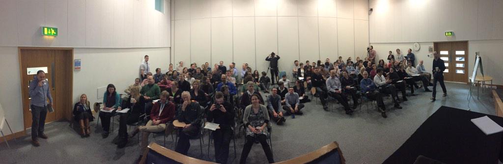
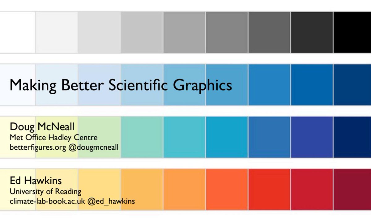
@BetterFigures stopped by @BAS_News to offer some thoughts and advice on scientific graphics. Slides available here:
betterfigures.org/2018/03/22…
1
13
18
22 Mar 2018
Pleased to report the nice people at @BAS_News are fully on board with @BetterFigures 👍 betterfigures.org/2018/03/22…
2
6
Better Figures retweeted

4 Dec 2017
So we need a standard that allows a presentation to be trivially broadcast to a room, and received by an app that can then recolour plots as desired by the user. Could also swap fonts, zoom, etc. Plugin for Powerpoint, etc. Feasible.
1
4 Dec 2017
Do our efforts to find better colour scales have a cost and entrench privilege? Interesting comment at @betterfigures betterfigures.org/2015/07/10…
1
3
1
Better Figures retweeted
14 Nov 2017
Nice discussion on color for priority and categorisation ux.stackexchange.com/questio…
1
2
14 Nov 2017
Do any "better" colour scales do as well as Rainbow at both categorisation and ordering? #endrainbow
1
14 Nov 2017
Theory: Rainbow colour scale is still popular because it does both categorisation and ordering (though imperfectly). #endrainbow
4
1
Better Figures retweeted

2 Nov 2017
Daily rainfall on Ben Nevis & in Fort William from 1893-1904. All rescued by volunteer citizen scientists. Thankyou! weatherrescue.org
2
11
34
Better Figures retweeted
30 Oct 2017
PhD researcher Hayley Bannister needs your help finding best methods to visualise climate model output
academictrial.az1.qualtrics.…
10
8
30 Oct 2017
Sexy Rainbow colour-scales #endrainbow x.com/akirathedon/status/923…
26 Oct 2017

Your Halloween costume is “Sexy” plus the thing you're most afraid of
4
Better Figures retweeted

29 Oct 2017
A colourblind scientist, a high school student, someone who does not speak English, @ed_hawkins, an editor, an artist?
1
1
2