
From West Kent, vaguely musical, likes quizzes and craft beer.
Joined December 2010
- Tweets 754
- Following 245
- Followers 38
- Likes 1,285
35 Photos and videos


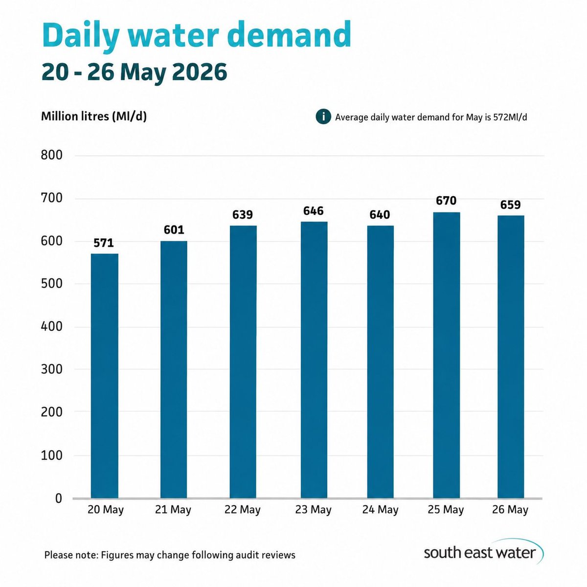
May 29
The graph is drawn to make the demand look much worse than it is, trying to shift the blame onto the customers who are merely trying obtain and use the product that they're paying for.
May 29

This chart is a masterclass in how to make ordinary variation look like a crisis.
The biggest problem? The y-axis starts at 500 instead of 0. That massively exaggerates the height differences between the bars, making a relatively modest increase in water demand look dramatic and alarming.
571 ML/d and 670 ML/d are only about a 17% difference — but visually the red bars appear almost twice as large as the green one.
Then there’s the colour coding:
🟢 safe
🟡 warning
🟠 danger
🔴 crisis
Those thresholds are arbitrary, but the design makes the audience feel like demand suddenly becomes catastrophic at 650.
This is why data visualisation ethics matter. Charts shouldn’t be designed to manipulate emotion — they should help people understand reality accurately.
A simple zero-based axis and neutral colours would tell the story honestly.

1
1
81
Simon Blake retweeted

May 29
@Ofwat simply has to remove @sewateruk license. South East Water are blaming Moody’s junk status on the last two major outages, whilst taps are dry again for thousands in Kent. SEW aren’t compliant with the conditions of their license & intervention is now urgently required.
1
5
159
May 8
Break out the trumpets !
May 8

David Hinton, the chief executive of South East Water, has resigned according to the beleaguered water company.
More here: bbc.in/4euvYkW

1
102
Simon Blake retweeted

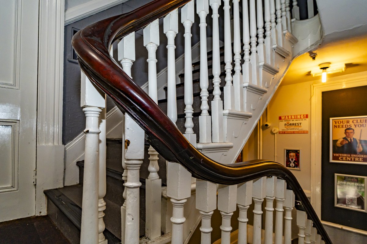
Apr 19
The Friendly Society Hall was designed by William Barnsley Hughes when he was apparently only 25 years old. An accomplished piece of Victorian eclectic design which deserves conservation as a building, not just as a façade …
Thanks Sarah Mott : Photographer
#tunbridgewells

1
2
5
345
Simon Blake retweeted
Apr 4
The Council's developers say the snooker hall has to go to make space for the cinema. We have shown this is not so. The snooker hall is valuable socially & the building for its history & architecture. We have shown the developers our alternative & are waiting for their reply.
1
3
7
547
Simon Blake retweeted

Apr 2
The crew of the Artemis are currently further away from Trump than any other humans.
Lucky bastards!
160
2,968
35,490
275,682
Simon Blake retweeted

NHS hospital: I noticed the clock on the wall showed the wrong time.
A nurse told me they knew, but they wouldn’t report it because replacing the battery through the NHS would cost £70.
A £2 battery... £70. How? Why?
That's when I began to dig further.
🧵
1,074
3,799
18,009
1,796,989
Simon Blake retweeted

Jan 22
🚨Tunbridge Wells Businesses 🚨
If you lost revenue in the December Water Outage then please fill in this form.
We will collate the responses and take them to South East Water, who have indicated that they may (may) look at extending their compensation scheme.
mike-martin.co.uk/water-comp…
6
31
55
14,441
Simon Blake retweeted

The "Dry Wells Action" meeting in Tunbridge Wells, organised by Jonathan Hawker, had more than 100 attendees last night at the Old Auction House.

'This is no way to live': The fightback group in 'water limbo'
trib.al/0n3stKJ
1
1
1
268
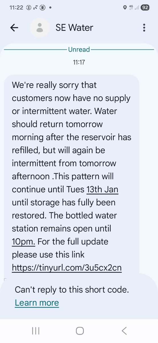
Jan 20
12:23pm. New text from SE Water - we are aware of an issue in my area. We've had no storm, no frost, what could have caused it this time ? The last one was a Tuesday as well, maybe Tuesdays are the problem.
1
1
3
102
Jan 20
No water at the moment, not sure when it went off as have been out.
1
56
Simon Blake retweeted

#TunbridgeWells a group of residents around the Forest Road area are organising a campaign re water supply issues. They've set up a website. Please get in touch if you are interested. Please spread the word.
drywellsaction.com/
3
10
17
1,094
Jan 16
Odd that the water came back on overnight (yay) but our heating broke (boo, but OK again now I have cleared the airlock). We were given a further 24 litres of bottled water overnight - I now have 132 litres of bottled water going spare - Let me know if you are in TW and need any.
1
7
265
Simon Blake retweeted
Jan 15
This is a phenomenal letter by @ThreshedThought It is quite clear that he simply isn’t going to stop until he has driven change in @sewateruk & provided his constituents with a reliable water supply. My money is on him not just succeeding but excelling in his aim.
Jan 15

I’m calling on the ultimate beneficial owners of South East Water to sack the board and bring in a turnaround team.
6
16
39
2,365
Simon Blake retweeted

Exclusive with Jasper Jolly: South East Water boss in line for £400,000 bonus despite outages
theguardian.com/business/202…
15
83
152
50,048
Jan 15
Did everyone get their water delivered overnight ? I lugged 72 bottles up the drive - no gym for me today 🤣- but not grey water at all - is grey water a different delivery or do I use the clean water for the loos (I've used 6 bottles of it already for that) - anyone know ?
45
Simon Blake retweeted
For those in #TunbridgeWells affected by the latest 36 hour dry spell, are you confident that water supplies will return to normal on Friday morning? (Begs the question what is a normal water supply? Can't remember - it's been so long.)
3%
Yes
97%
No
65 votes • Final results
2
5
4
703
Simon Blake retweeted

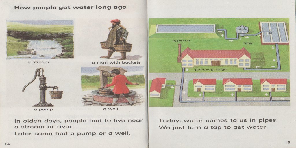
Jan 14
Ladybird Leaders ‘Water’ pp 14/15
‘Today, water comes to us in pipes.
We just turn a tap to get water.’
2
3
224