
Joined October 2021
- Tweets 465
- Following 1,079
- Followers 296
- Likes 2,590
8 Photos and videos


Brendan Curran retweeted

27 Mar 2024
Protecting households from the surging price of natural gas cost £78 billion of taxpayers' money when you were Energy Secretary...
@ret_ward tells @Jacob_Rees_Mogg following a report claiming Labour's plans to decarbonise the grid will cost £116 billion.
@GBNEWS | @GRI_LSE
1
2
5
835
Brendan Curran retweeted

12 Mar 2024
Belfast still has only 2 miles of segregated cycle lanes, according to new Sustrans report - Belfast Live. Massively disappointing figures indicating the utter failure of @deptinfra to support active travel. belfastlive.co.uk/news/belfa…
3
15
39
2,489
Brendan Curran retweeted

10 Mar 2024
This terrifying FT chart paints my lifetime in the inexorably rising colours of global warming
Eyeballing, it looks like, what, 0.75C of warming since the 1980s?
And just look at the way the coolest months in the 2020s are mostly hotter than the hottest of the 1980s!

44
383
768
120,920
Brendan Curran retweeted

11 Mar 2024
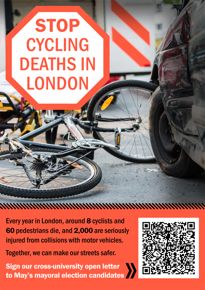
Following the tragic death of two LSE colleagues last year, staff and students at @GRI_LSE have teamed up with other London universities to send a letter to London's Mayoral candidates.
Staff members or students at London unis can sign the letter here 👇🏾
forms.office.com/pages/respo…
14
19
3,386
Brendan Curran retweeted

11 Mar 2024
We must stop cycling deaths in London. If your’re a member of staff or a student at one of London’s universities, please sign this letter and make this a big issue for the #London mayoral campaign. Thanks
11 Mar 2024

Following the tragic death of two LSE colleagues last year, staff and students at @GRI_LSE have teamed up with other London universities to send a letter to London's Mayoral candidates.
Staff members or students at London unis can sign the letter here 👇🏾
forms.office.com/pages/respo…
2
2
389
Brendan Curran retweeted

8 Mar 2024
this is incredibly funny theguardian.com/uk-news/2024…
17
222
1,311
152,907
Brendan Curran retweeted
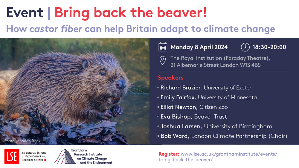
8 Mar 2024
Did you know that the beaver 🦫(which happens to be LSE's official mascot) could play a key role in the UK’s adaptation and resilience to climate change? To find out more join our panel discussion next month hosted with the @nationaltrust & @ClimateLondon
lse.ac.uk/granthaminstitute/…
2
13
18
7,119
Brendan Curran retweeted

7 Mar 2024
If you study or work at a London university, please sign and share this letter calling on mayoral candidates to make cycling in London safer
1
27
42
5,884
Brendan Curran retweeted

4 Mar 2024
Quite staggeringly confused debates about fiscal rules and the @OBR_UK "boxing the Chancellor in" over the last few days. A few clarifications as the Budget looms 🧵
14
209
451
235,033
Brendan Curran retweeted

28 Feb 2024
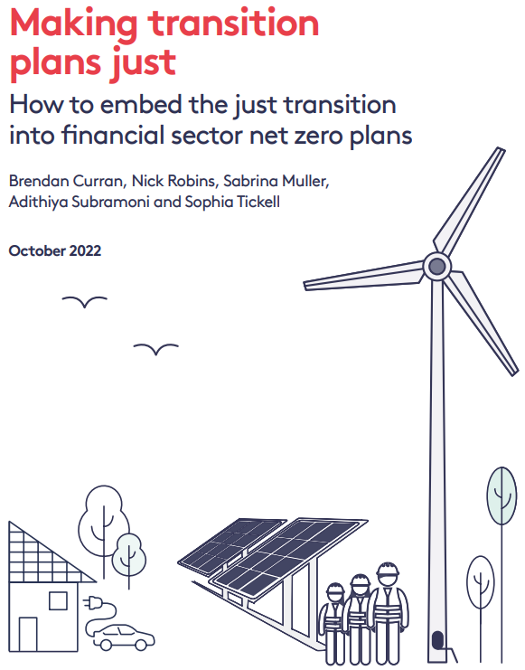
Pleased to share my latest article on @Forbes detailing the important launch of the @jtf_lab @GRI_LSE which will advance the #justtransition through research, advocacy, stakeholder engagement & solution design: forbes.com/sites/amynguyen/2… #netzero #energytransition #socialjustice
4
4
270

4 Mar 2024
RT @Microlambert: I thought this must surely be a typo, but no, the French really do charge €60,000 tax on cars emitting more than 194 g CO…
387
Brendan Curran retweeted

1 Mar 2024
To all those celebrating George Galloway “sticking it to the establishment”, a little reminder of which supposedly ant-establishment side he’s on:


197
1,065
3,241
225,404
Brendan Curran retweeted

29 Feb 2024
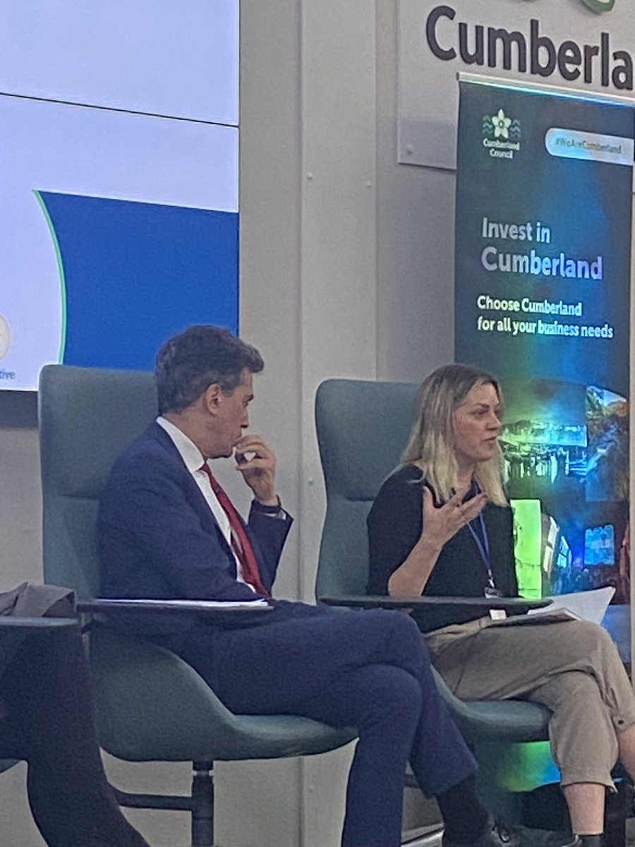
The Just Transition Finance Lab is working with @CumberlandCoun and @CityWestminster on attracting investment into local climate transitions.
Today we are at the Cumberland Economic Summit discussing clean and green growth👇
@Ed_Miliband @NVJRobins1

1
3
455
Brendan Curran retweeted
29 Feb 2024
‘We have $500 trillion in the global financial system & over $100trn wants to do #NetZero” says Rhianydd Griffith @jtf_lab at the @CumberlandCoun Economic Strategy ‘The challenge is how to attract capital that serves the needs of place’
4
8
755
Brendan Curran retweeted
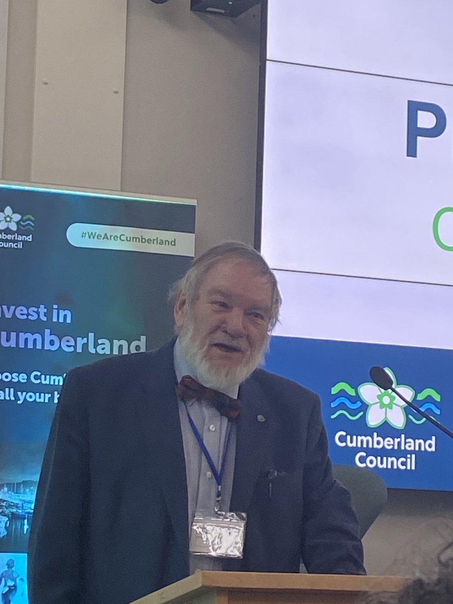
29 Feb 2024
‘Please build from what is positive’ says the passionate Prof John Fyfe @CumberlandCoun Economic Summit ‘Energise the green economy with jobs as well’ & ‘make it bloody work’
3
4
265
Brendan Curran retweeted
29 Feb 2024
“We have one golden opportunity to create good jobs & this is the clean energy revolution” says @Ed_Miliband at the @CumberlandCoun Economic Summit ‘We want our share for Britain & for Cumbria’ The ‘British Jobs Bonus’ to help deliver these in heartland areas

3
5
392
Brendan Curran retweeted
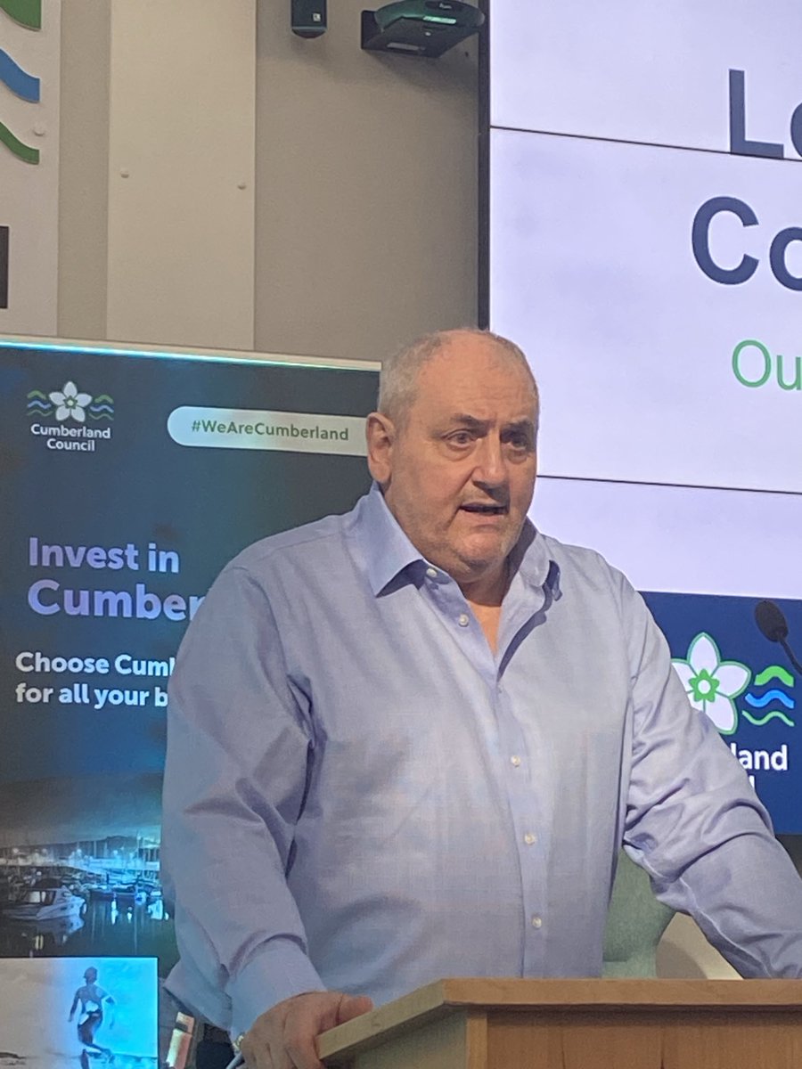
29 Feb 2024
“The next great economic revolution will come from changes in the climate” says Mark Fryer, leader of @CumberlandCoun highlighting the real opportunities for green job growth through a new economy of cooperation & collaboration Great start to Cumberland’s Economic Summit
1
4
639
Brendan Curran retweeted
28 Feb 2024
New Case Study⬇️
UK energy utility @SSE was one of the first to implement a just transition strategy as part of its net zero plan.
The experience provides important lessons on business strategy, market frameworks, metrics and stakeholder dialogue.
justtransitionfinance.org/ca…

1
1
51
Brendan Curran retweeted

28 Feb 2024
Drax is burning rare and ancient forests, and getting government subsidies to do it bbc.co.uk/news/science-envir…
15
158
231
19,107