Enrich your stories with charts, maps, and tables – interactive, responsive, and on brand. Questions? Write us: support@datawrapper.de
- Tweets 4,636
- Following 615
- Followers 26,902
- Likes 5,906


ALT Flow map of Hong Kong's microchip exports in 2025. The thickest arrow by far points to India ($5.2 billion), followed by Malaysia ($1.1 billion), Korea, the Philippines and Europe, with much smaller flows to China, the US and other destinations.

ALT Map of the migration route of Pingo, a Whimbrel fitted with a satellite transmitter in 2012. In fall, Pingo flew from Alaska across Canada and non-stop over the Atlantic to Brazil; in spring, it returned north over Central America and the US with several stopovers.

ALT Flow map of commuters leaving Cologne for work. The thickest arrows point to Bonn (17,041 commuters) and Dusseldorf (16,038), with smaller flows to six nearby towns and long-distance arrows toward Berlin and Frankfurt.

ALT Map of a two-week South Korea trip in April, starting and ending in Seoul. The route loops from Seoul to Sokcho, down the coast to Gyeongju and Busan, then by plane to Jeju Island, by ferry to Jindo for the Miracle Sea Road Festival, and back to Seoul by train
ALT A collection of heat maps illustrating frequent areas of field usage at all World Cups between 1966 and 2022. The change is evident in the shift from frequent passing from one end of the pitch to the other in 1966 to players now frequently using the middle of the field. Published by The Athletic.
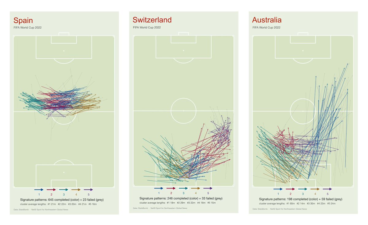
ALT A chart showing the top five most distinctive passing patterns for Spain, Switzerland and Australia during the 2022 World Cup. While Spain recorded the highest number of signature passes, Australia recorded the longest average pass length and had the highest amount of failed passes. Published by Northeastern Global News.
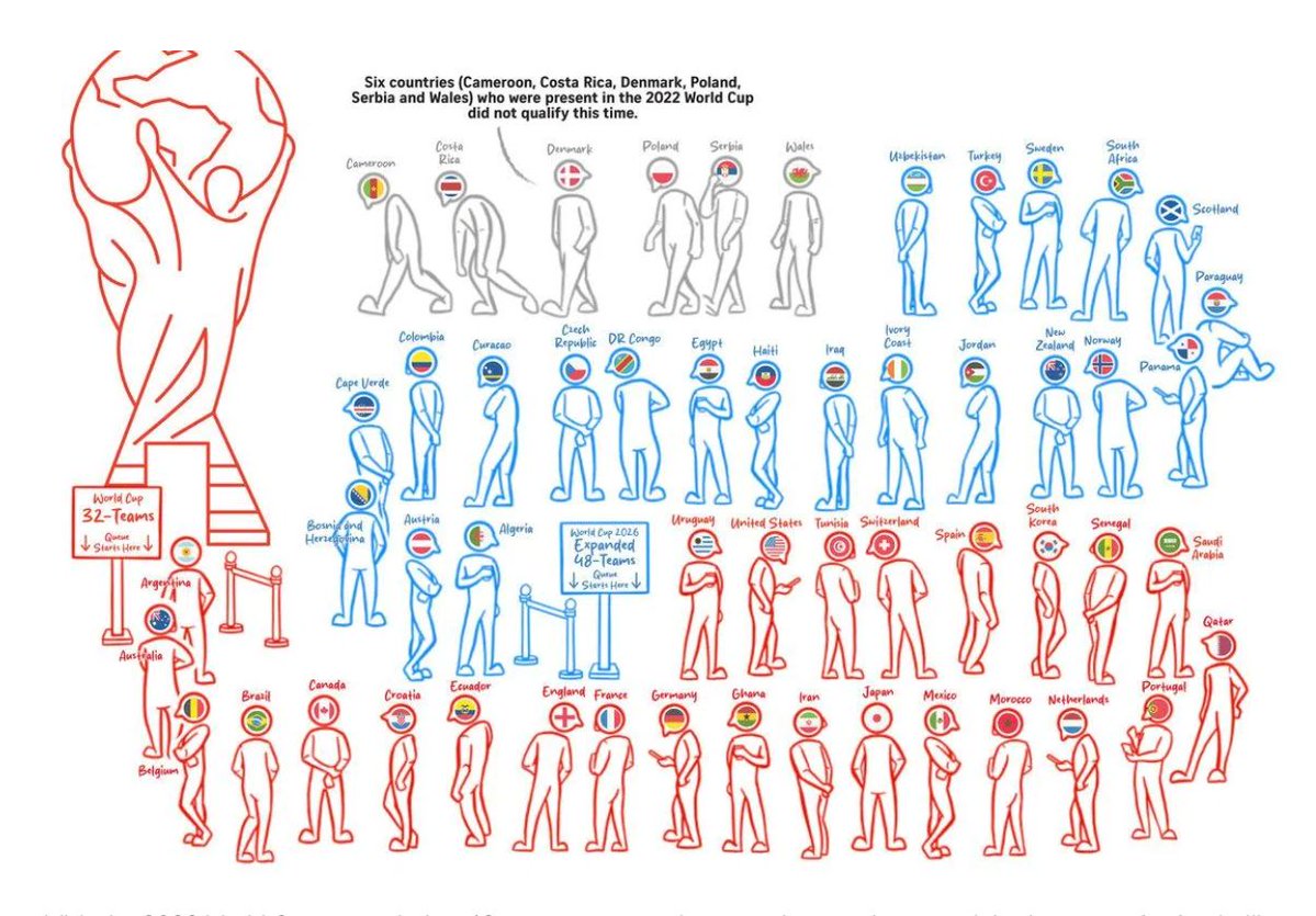
ALT An infographic visualizing the expansion of the 2026 World Cup tournament to include a record of 48 teams. As a result of the expansion, some countries that participated in the 2022 World Cup did not qualify this time. Published by The Straits Times.
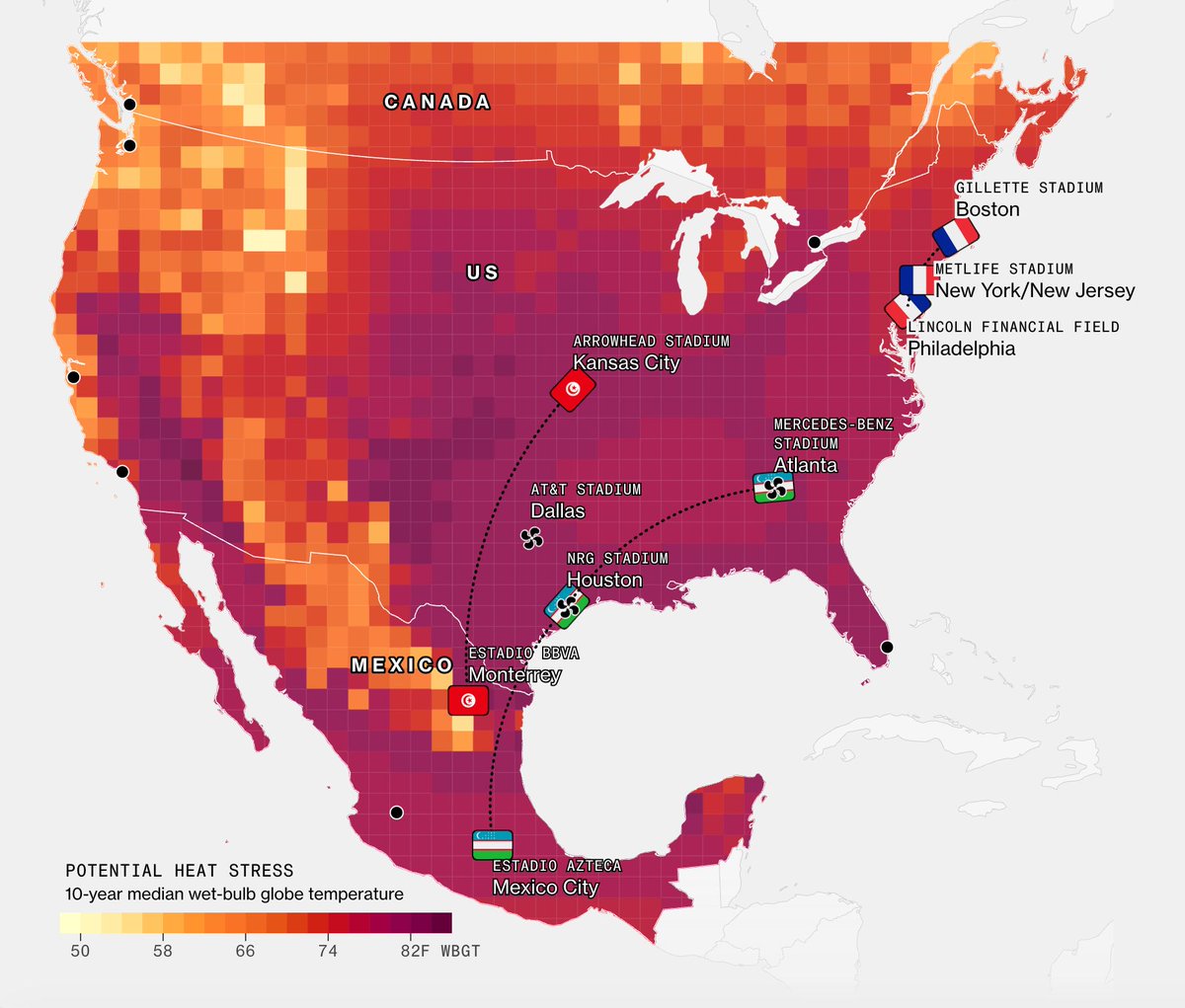
ALT A heat map illustrating the locations of the World Cup games that will potentially be affected by heat stress. Although Uzbekistan will be playing in some of the hottest cities in the U.S., air-conditioned stadiums are expected to keep temperatures indoors cooler. Published by Bloomberg.
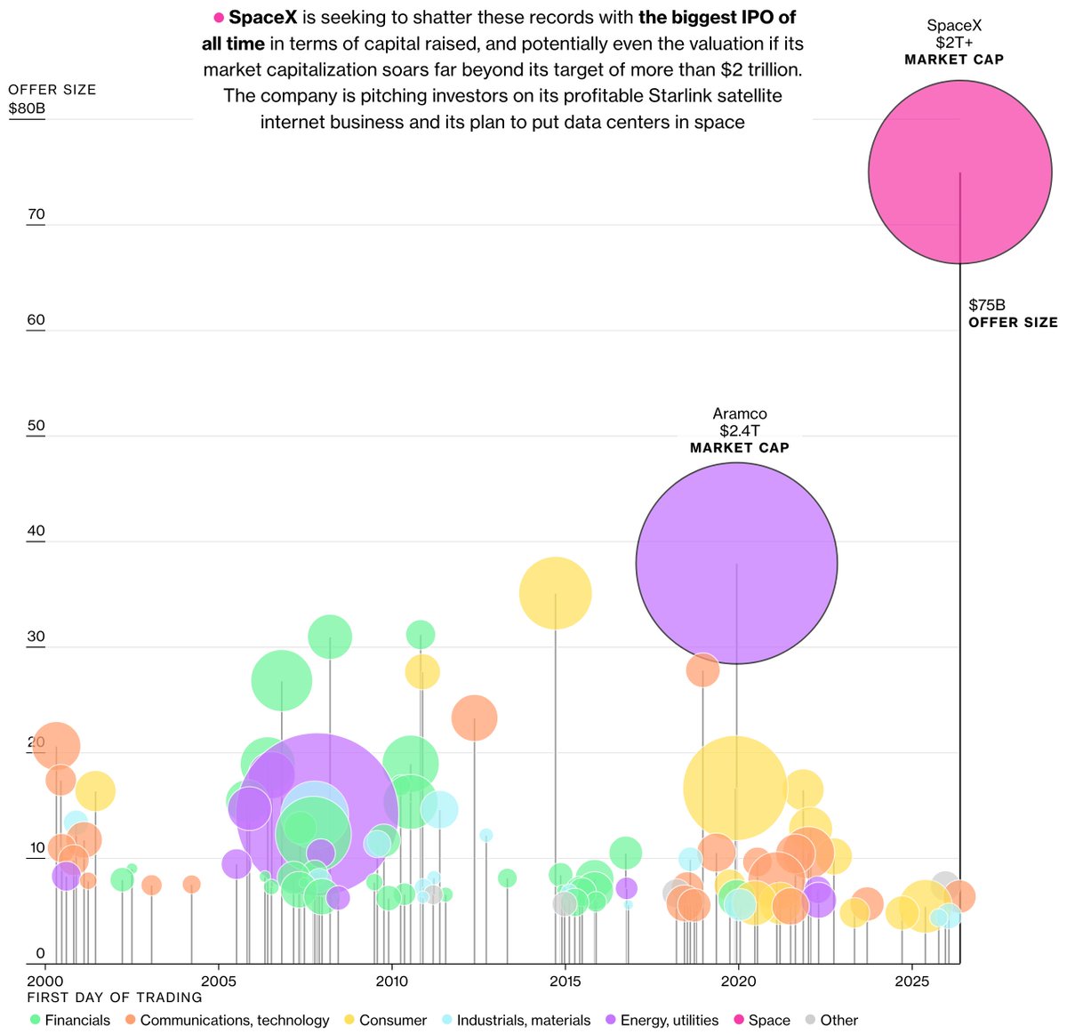
ALT A chart comparing SpaceX’s upcoming IPO against the top 100 listings globally since 2000. The company is seeking to raise as much as $75 billion at a valuation of more than $2 trillion. Published by Bloomberg.
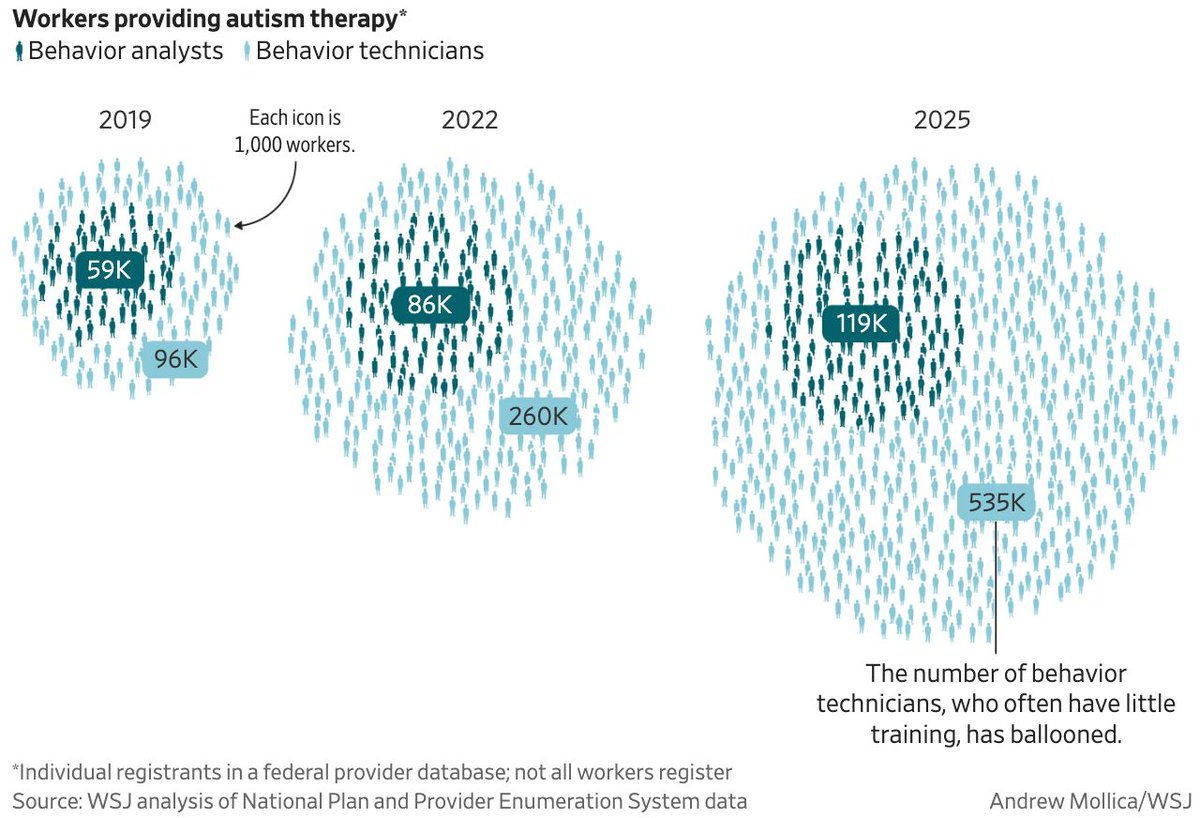
ALT A visualization showcasing the increase in workers providing autism therapy. While the number of behaviour analysts has increased from 59,000 in 2019 to 119,000 in 2025, the number of behaviour technicians, who require less training, has grown significantly, from 96,000 to 535,000. Published by the Wall Street Journal.

ALT A visualization portraying the melting of glaciers in the Swiss Alps. Higher temperatures are causing the region’s glaciers too shrink, with many likely to be completely gone by the end of the century. Published by Bloomberg.
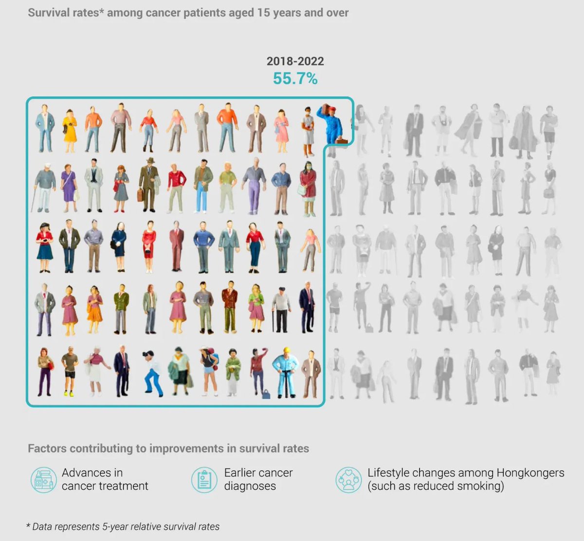
ALT A visualization showing the increase of cancer survival rates in Hong Kong. In 2010 to 2013 the survival rate among cancer patients aged 15 years and over was 49.1% and in 2018 to 2022 55.7%. Published by South China Morning Post.


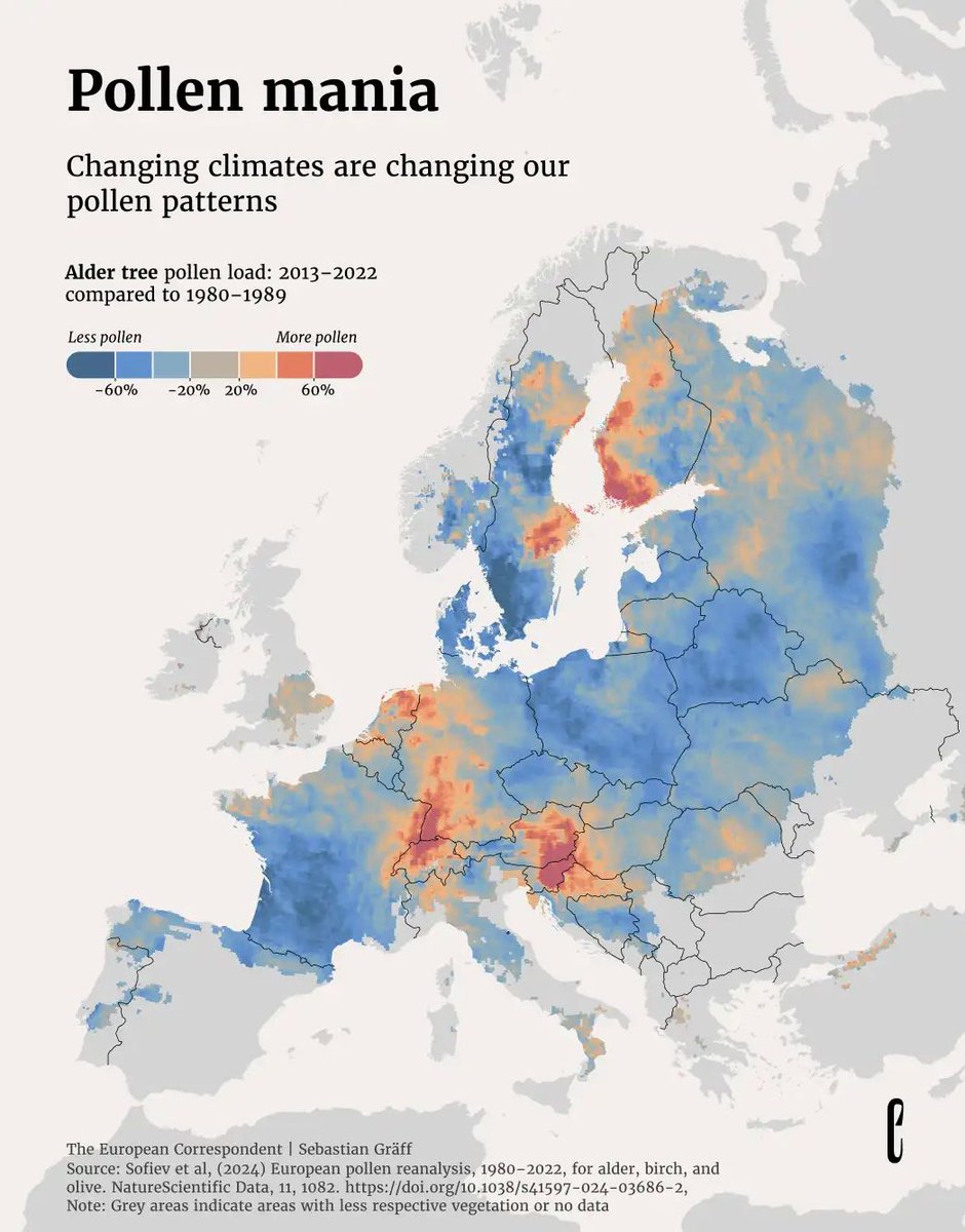
ALT A map illustrating changes in the pollen patterns of alder trees in Europe. By comparing pollen loads during the years 1980–1989 and 2013–2022, it can be seen that while some countries experienced a decline of pollen, others experienced an increase. Published by the European Correspondent.
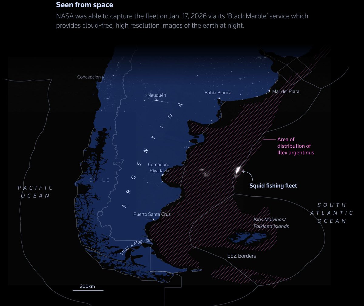
ALT A map visualizing a fleet of Chinese fishing vessels along the Argentinian coast. Around 200 of these vessels were monitored, focusing primarily on squid fishing. Published by Reuters.
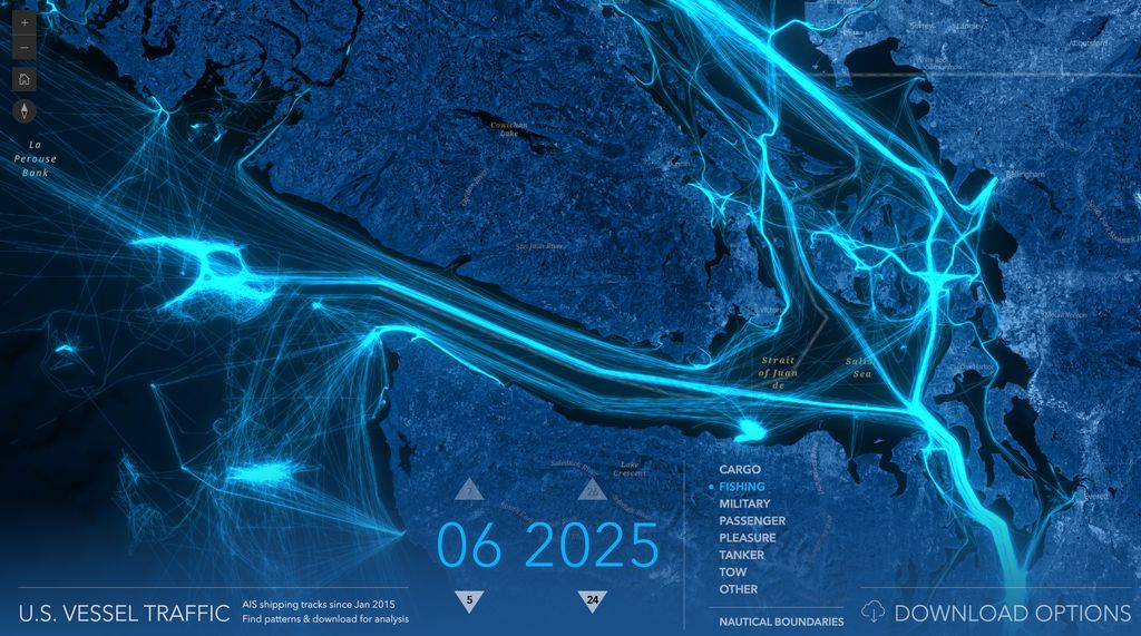
ALT An interactive map visualizing U.S. vessel traffic during different months. Published by John Nelson.
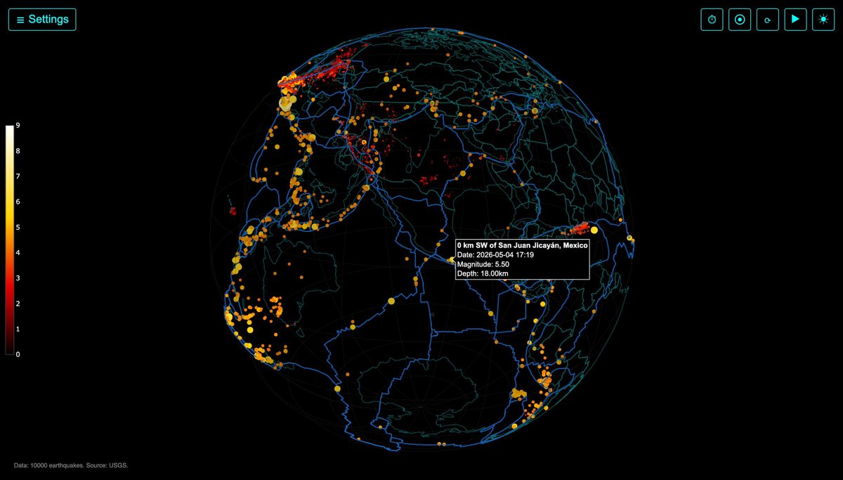
ALT An interactive 3D globe visualizing global earthquakes during a 30-day period. Published by Information is Beautiful.


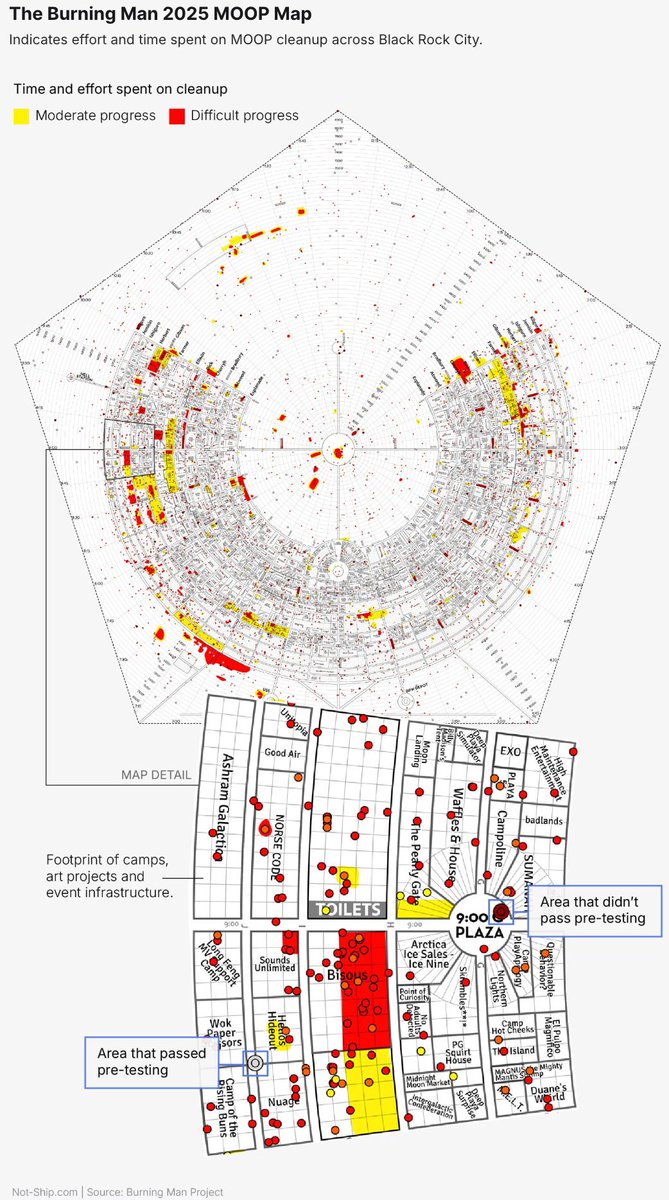
ALT A visualization of the 2025 Burning Man "Matter Out of Place" map. The map consists of data collected and logged during the clean-up operation that takes place after the festival. The map is colour-coded according to the severity of the clean-up required. Yellow areas represent moderate clean-up conditions and red zones are the most heavily affected. Published by Not-Ship.
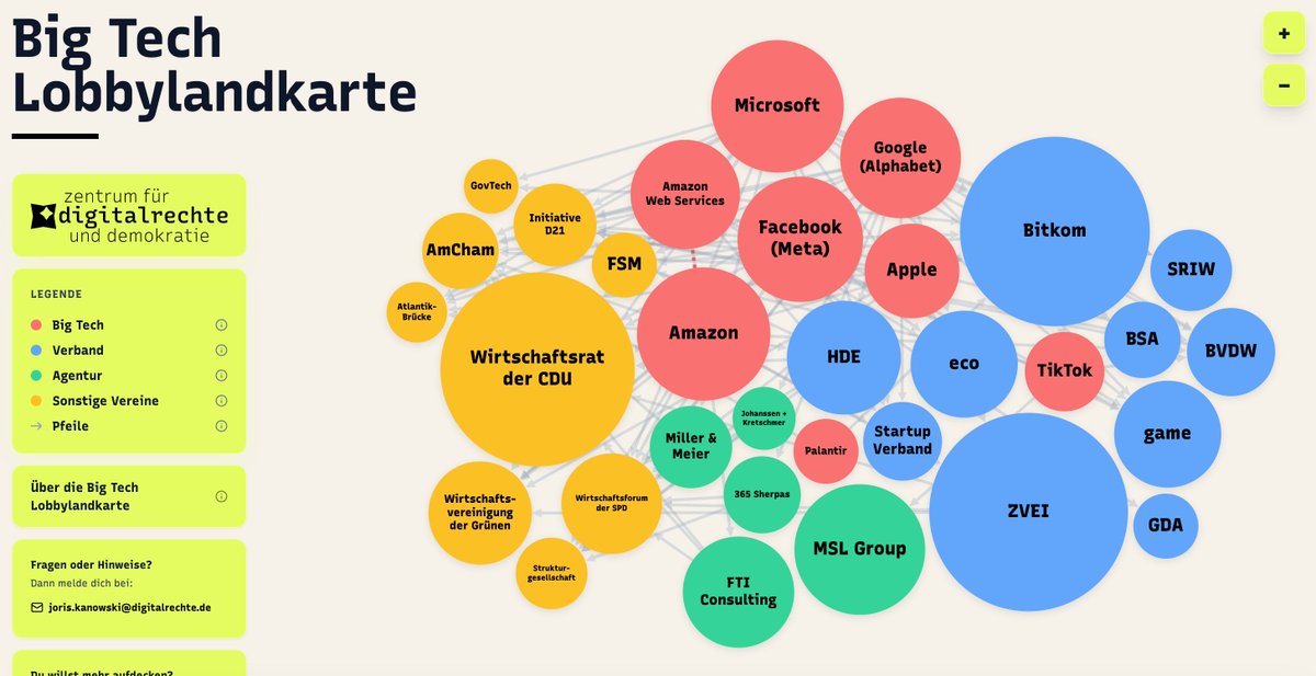
ALT An interactive tool showcasing big techs investment to influence German politics. The map depicts the network of tech companies and their many partners involved in lobbying. Published by the Zentrum für Digitalrechte und Demokratie.
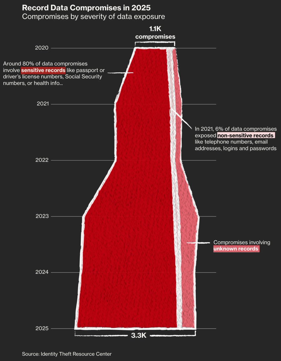
ALT A chart illustrating the number of data compromises and the severity of data exposure from 2020 to 2025. The year 2025 holds the record, with 3,300 compromises recorded, 80% of which consisted of sensitive records. Published by Bloomberg.
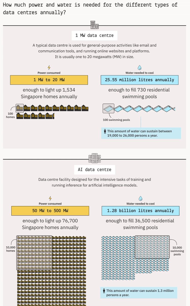
ALT A visualisation showing the different types of data centres and their annual power and water usage. "Massive AI Supercluster" data centres require the most resources, consuming between 500 MW and 1 GW of power and needing 12.78 billion litres of water per year for cooling purposes. Published by the Kontinentalist.