
WPL Gray Wolf @Starknet | Wolfpack daddy 🧔, electronics engineer, geek, passionate about technology, music, video games... and lots of other cool stuff
Joined February 2012
- Tweets 4,301
- Following 690
- Followers 272
- Likes 12,895
1,482 Photos and videos


Pinned Tweet

26 Dec 2025
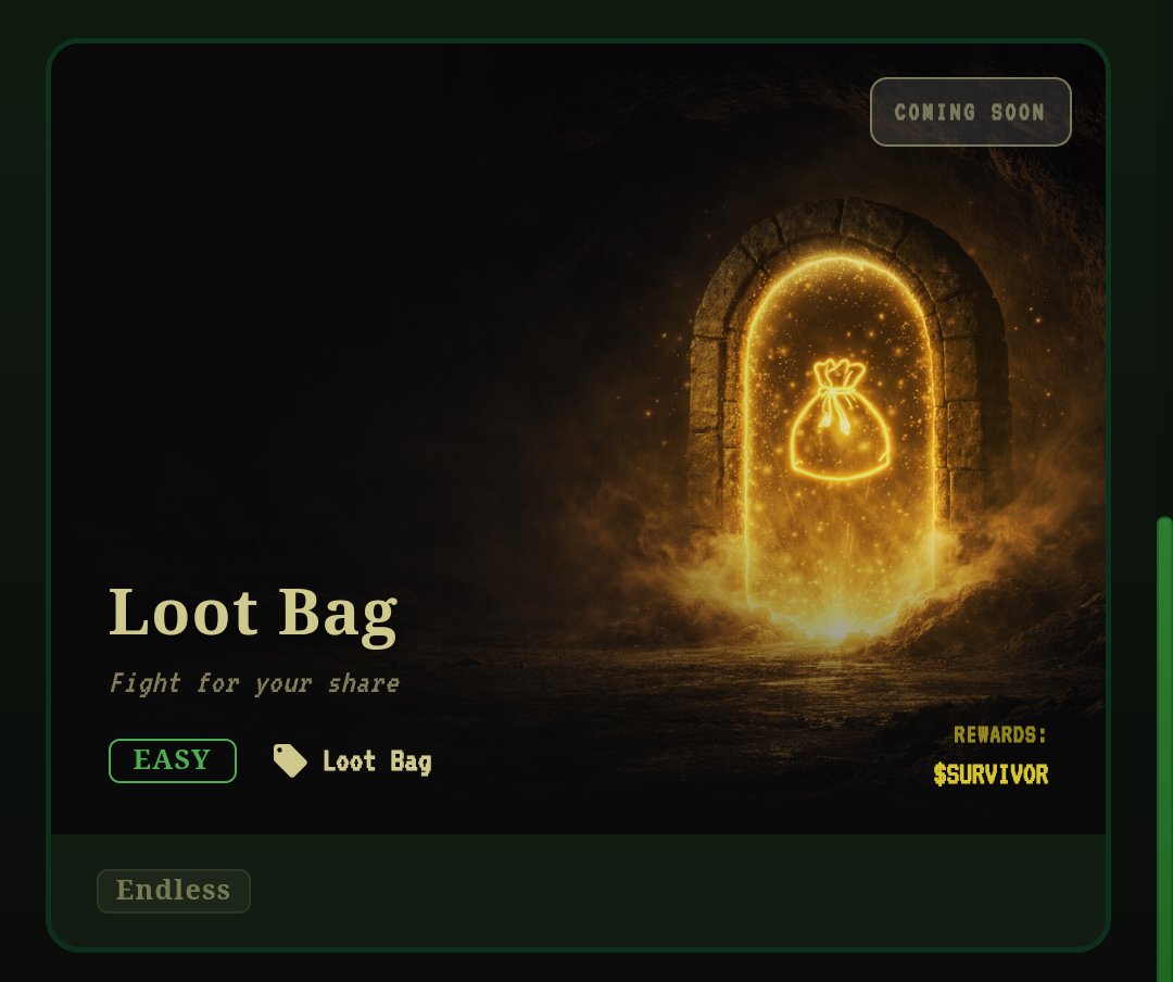
🧵Back into the Dungeon of Loot Survivor 2.
Same rules. New run. Don't die !🪦
The big question: will this run take me beyond Level 15?
Follow the thread 👇
I’ll also break down the core mechanics of the game as we go.
@LootSurvivor
4
9
29
3,258
Jun 11
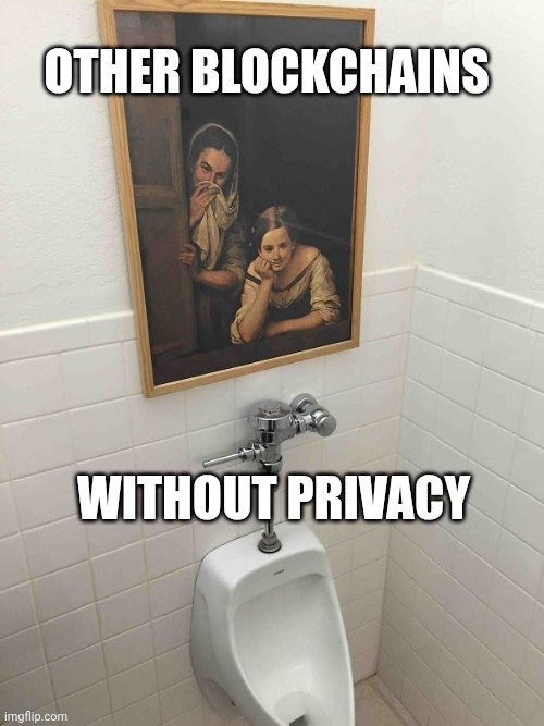
Privacy is live on @Starknet
It's time to remain peacefully liquid...
STRK20s on

Privacy finally found the right frequency.
[STRK20] is live on Starknet.
🧵
2
1
11
225
Jun 10
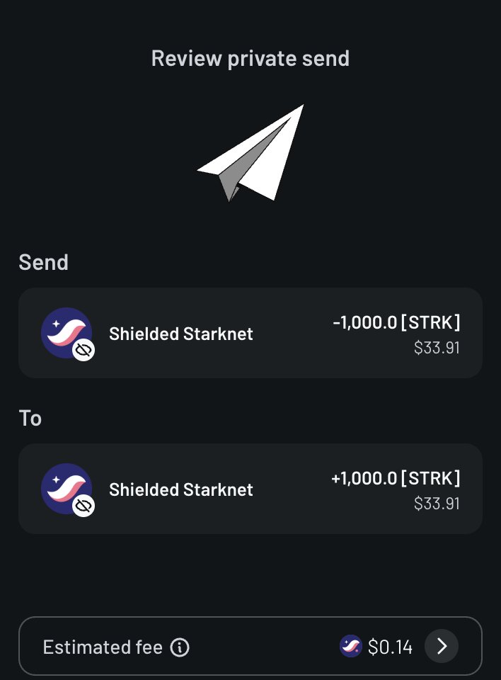
In terms of user experience, it’s smooth and completely transparent.
And in terms of privacy, it’s just incredible.
[STRK]
x.com/StarkWareLtd/status/20…
Jun 10

1/ JUST IN: practical privacy at real scale is now live.
1-click privacy, low-cost privacy, private DeFi…
For all assets, now live on Starknet 🧵
strk20.starknet.io/
2
2
22
1,027
shielded Fa.F🥷 retweeted

Jun 10
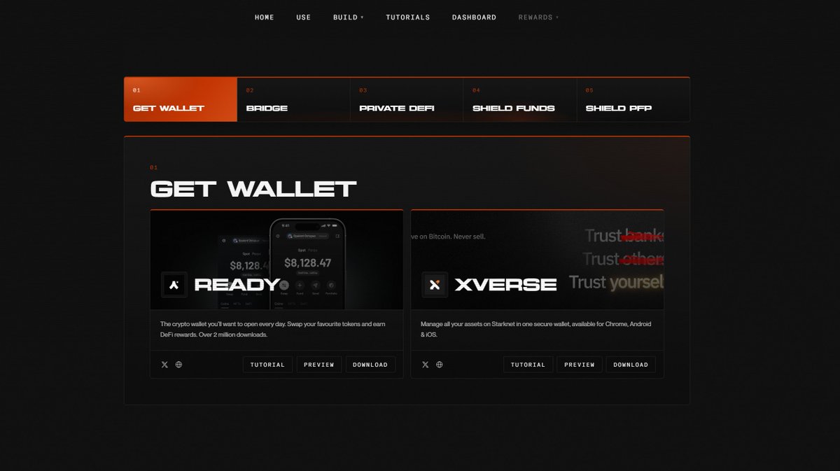
Everything you need to start using STRK20 is in one place.
Shield assets, explore live apps, discover private DeFi, track adoption, and see what can be built.
Get started below 👇
Jun 10
1/ JUST IN: practical privacy at real scale is now live.
1-click privacy, low-cost privacy, private DeFi…
For all assets, now live on Starknet 🧵
strk20.starknet.io/
21
21
133
9,443
shielded Fa.F🥷 retweeted

Your balance is visible to everyone right now. Every transfer. Every swap.
Today that changes.
STRK20 privacy is live on Xverse. One tap. Any @Starknet asset.
Shielded, safe from surveillance - for your eyes only.

31
20
160
717,788
shielded Fa.F🥷 retweeted
Privacy finally found the right frequency.
[STRK20] is live on Starknet.
🧵
69
91
390
759,553
Jun 9
Privacy for everyone.
For sure !
Privacy shouldn’t mean new assets, new wallets, or new applications.
What if it worked where you already use crypto?
June 9, privacy comes to [Starknet]
6
118
shielded Fa.F🥷 retweeted

Jun 8
Shielded mode is on.
Join us.
strk20.starknet.io/shielded
60
39
170
49,413
Jun 4
That's it finally !! 🥳
I got a score of 2000XP and capture 2 beasts in Death Mountain: Loot Survivor.
💀 A "Havoc Shout" Chupacabra ended my journey.
Watch the replay: deathmountain.gg/watch?id=0x…
@provablegames @lootsurvivor
2
5
16
512
May 27
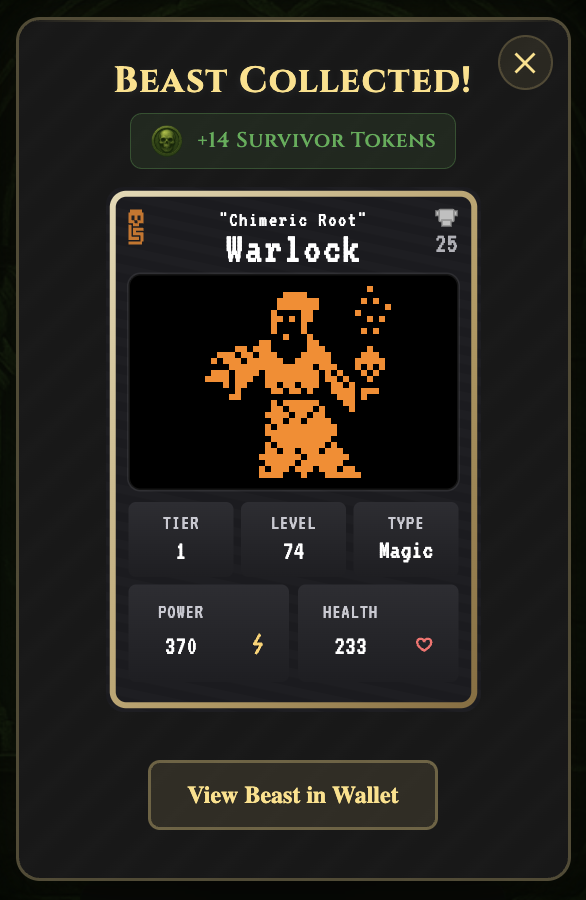
OK, I just capture this Warlock. ⚔️
That's not the final boss I'm looking for... but it's still cool to get an animated T1 beast. 🤘
@LootSurvivor
x.com/FaF_quest/status/20595…
May 27

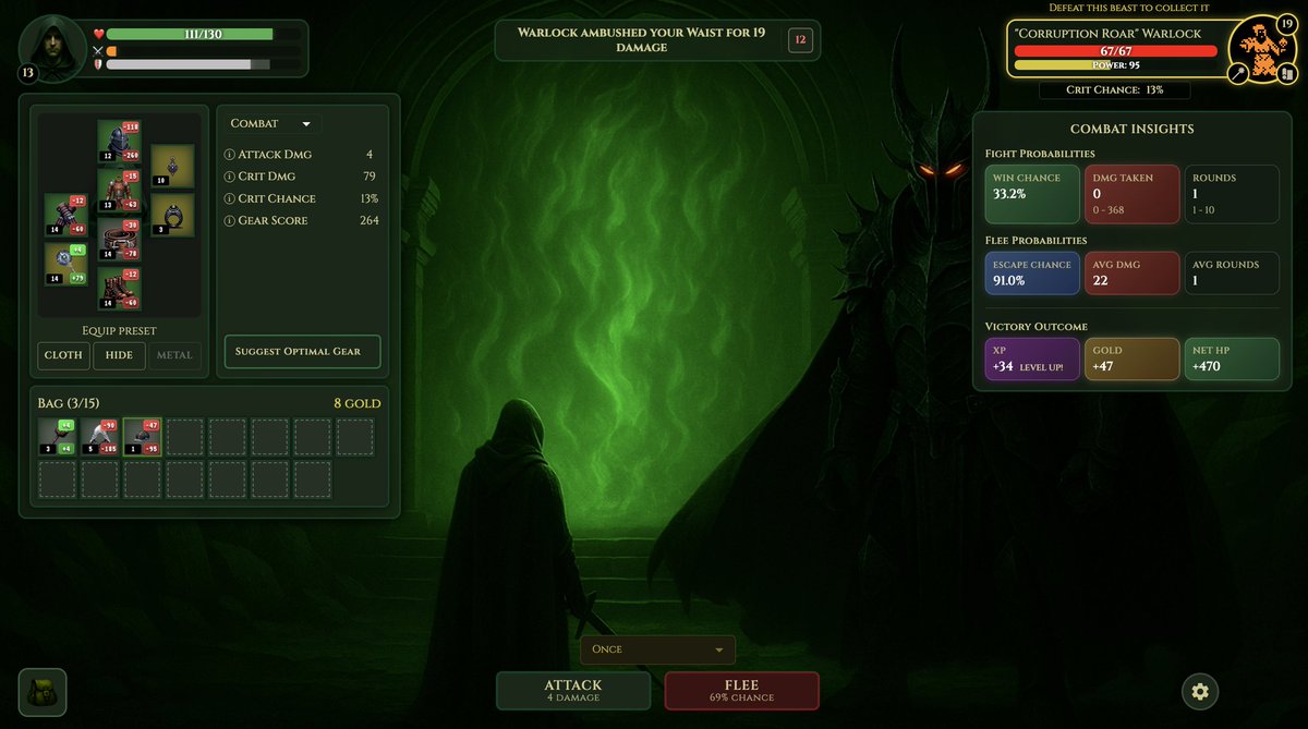
I’ve switched to hunter mode.
My vision is clear now.
I’m focused on a single goal: find and capture the Warlock.
But I don't know if I'm ready to be attacked by "Pain au Lait" 😆
x.com/FaF_quest/status/20044…
1
13
216
May 27
I’ve switched to hunter mode.
My vision is clear now.
I’m focused on a single goal: find and capture the Warlock.
But I don't know if I'm ready to be attacked by "Pain au Lait" 😆
x.com/FaF_quest/status/20044…
26 Dec 2025
🧵Back into the Dungeon of Loot Survivor 2.
Same rules. New run. Don't die !🪦
The big question: will this run take me beyond Level 15?
Follow the thread 👇
I’ll also break down the core mechanics of the game as we go.
@LootSurvivor
2
1
18
716
May 25
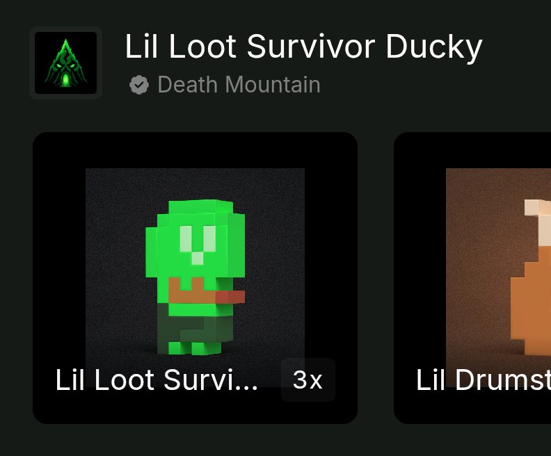
Hello ! ✌️
I got my 3rd lil Loot Survivor ducky today! 🦆💥🥳
Come try your luck on Death Mountain 👉 deathmountain.gg/
@DucksEverywher2
@LootSurvivor

2
14
166
shielded Fa.F🥷 retweeted

May 19
Visualizing the Social Layer of On-Chain Activity on Starknet
Data can often feel overwhelming and difficult to interpret, @Aegis_fyi introduces a new way to explore on-chain activity on Starknet through interactive visual intelligence.
StarkLens transforms wallet interactions, token distributions, and holder relationships into dynamic network maps, helping users understand how capital and communities move across the ecosystem. Instead of scrolling endlessly through raw transaction data, users can visually discover clusters, whale movements, exchange wallets, smart contracts, and interconnected holders in real time.
One of the standout features of StarkLens is the Bubbles Dashboard, which provides a graphical representation of token holder connections. Each bubble represents an address, while the links between them reveal behavioral and transactional relationships. This makes it easier to identify coordinated activity, liquidity hubs, exchange wallets, ecosystem participants, and potential market patterns at a glance.
The dashboard also includes advanced filtering tools such as:
Time-range analysis
Holder concentration tracking
Connection-depth visualization
Cross-token relationship mapping
Cluster identification
Supply balance filtering
For researchers, traders, ecosystem analysts, and curious community members, StarkLens offers a more intuitive way to analyze @Starknet 's growing economy. It helps in blockchain transparency and human-readable insights, turning complex on-chain data into something visual, interactive, and actionable.
Tools like StarkLens will help users better understand the networks, communities, and capital flows shaping the ecosystem.

3
2
14
203
May 19
May 14
That first tournament of GuessmyNft was really cool !
Congratulations guys @carldlfr @Nacto1122 for this fun game !!
x.com/GuessmyNft/status/2054…

5
2
17
352
May 18
🏴☠️ Pirate Scourge — 1577 pts before the storm claimed me.
36 turns. 452 gold. No mercy.
Dare to sail further? ⚓
reemjie.github.io/corsair/
1
1
7
105
May 15
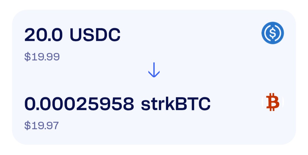
Just made my first bridge to strkBTC.
For this first experience, I chose @gardenfi 🌸: the UX is smooth and the gas fees was low. Fast execution and a really great experience.
Bitcoin has officially entered a new shielded and privacy-focused world. 🟧🔒
x.com/Starknet/status/205521…
May 15
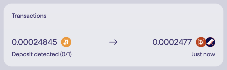
Shielding strkBTC takes one click.
After bridging your BTC via strkbtc.io/, @gardenfi, or @atomiqlabs, your strkBTC will appear in your @ready__x or @Xverse wallet.
From there, shielding happens directly inside your wallet. Starknet enables native privacy, which means you do not need a separate app, extra tool, or new flow to activate it. Everything is accessed through your wallet.
How to Activate Shielding
1. Select strkBTC
2. Click the Shield icon
3. Your balance moves into the private pool
4. Click Unshield whenever you want to go public again
2
2
26
1,395
shielded Fa.F🥷 retweeted
May 15
Shielding strkBTC takes one click.
After bridging your BTC via strkbtc.io/, @gardenfi, or @atomiqlabs, your strkBTC will appear in your @ready__x or @Xverse wallet.
From there, shielding happens directly inside your wallet. Starknet enables native privacy, which means you do not need a separate app, extra tool, or new flow to activate it. Everything is accessed through your wallet.
How to Activate Shielding
1. Select strkBTC
2. Click the Shield icon
3. Your balance moves into the private pool
4. Click Unshield whenever you want to go public again
23
33
233
15,460
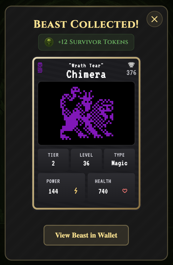
May 15
Nice !! 🥳
Just got my 200th beast… and not just any beast 👀
A shiny T1 beast!! ✨🔥
What a milestone for the collection. @LootSurvivor


6
2
18
467