
Joined February 2009
- Tweets 23,737
- Following 2,032
- Followers 71,098
- Likes 72,698
2,683 Photos and videos


Pinned Tweet

16 Oct 2025
My new book Soldier of Fortune: Warren Buffett, Sun Tzu and the Ancient Art of Risk-Taking is now available via amzn.to/3JfCPBq

41
39
455
98,882
Jun 12
Middle is right. Good chance you get him at a better risk:reward ratio in the future.

1
16
4,743
Jun 12
No one says it better than Pete:
Jun 12

My latest at @aier.
“The story of the the world’s first trillionaire is far less about egalitarian outcomes than about economic priorities. Markets are directing enormous amounts of capital toward highly uncertain, long-duration innovation while distributing the associated risks across numerous investors of varying levels of sophistication rather than concentrating them through leverage. That is not a flaw of market economies; to the contrary, it is a central mechanism for experimentation, adaptation, and growth.”
@elonmusk
thedailyeconomy.org/article/…
1
1
16
6,847
Jun 12
God bless America. This is how you know we're in the best timeline.


3
2
38
6,086
Jun 12
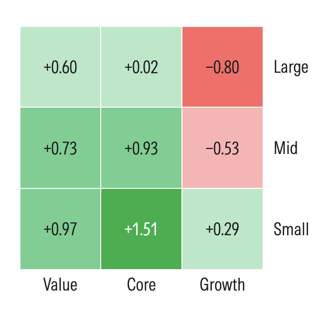
This week in value:
Value is working. Here’s why it can continue (TRowePrice)
AI, capital cycles and value investing (LiveWire)
US Stock Market Outlook: Returning to Balance of Growth and Value Stocks (Morningstar)
Jun 12

Weekly Investing Roundup – News, Podcasts, Interviews (06/12/2026)
Read the full roundup here
:
tinyurl.com/mr2ypjab

1
4
3,057
Jun 12
He is the man of his time.
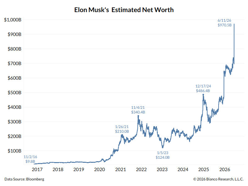
Jun 11

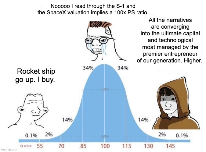
With SpaceX getting priced at $135 today, Bloomberg estimates Musk's net worth is now $970.5B
Tomorrow, any pop above the IPO price (or a Tesla rally) could make him the first Trillionaire!
6
34
14,516
Jun 11
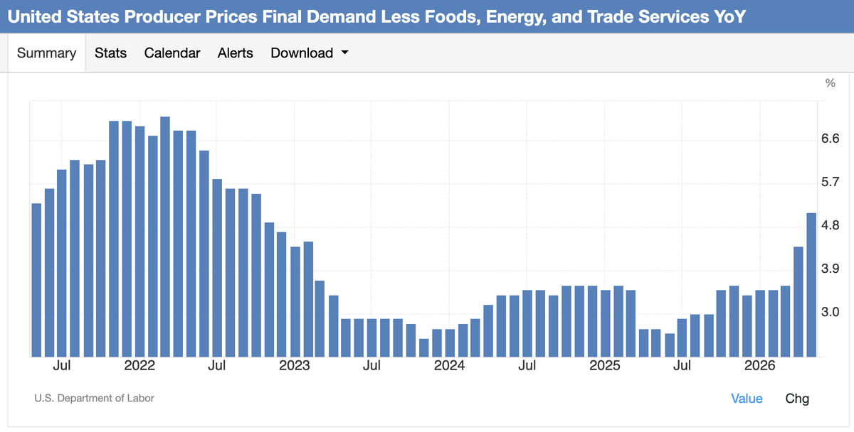
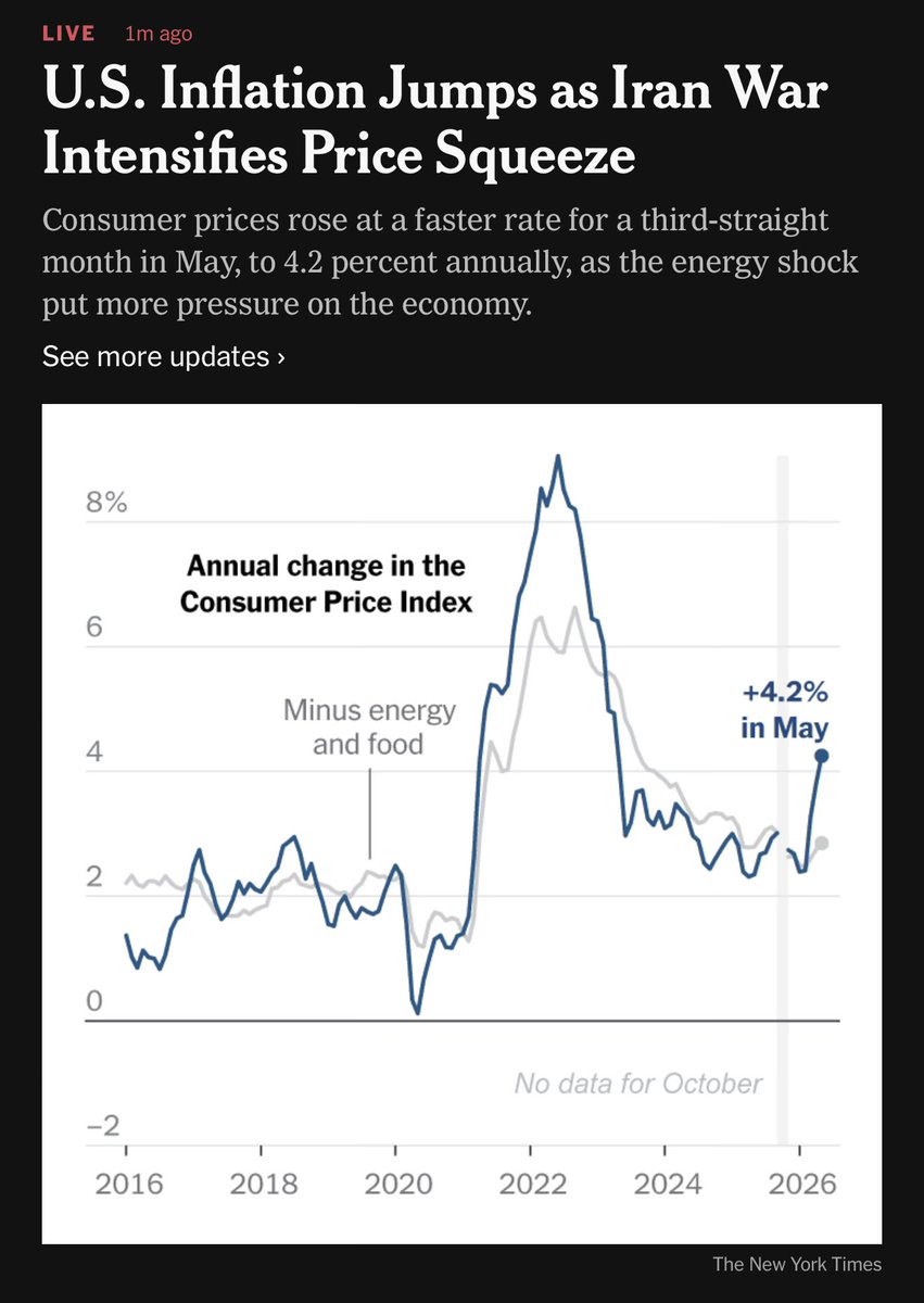
Inflation:

1
9
4,157
Jun 11
This is the classic Size Factor (SMB — Small Minus Big) decomposed into deciles, beta-hedged to isolate pure size alpha.
D1 (dark blue) = smallest stocks (micro/nano-cap)
D10 (dark red) = largest stocks (mega-cap)
1. The Small-Cap Premium is Real, But Lumpy
D1 outperforms dramatically over the full period, but the premium is far from smooth. It's essentially earned in a few concentrated windows (late 1970s–1982, post-2000) rather than steadily.
2. The D10 (Mega-Cap) Puzzle
Mega-caps persistently lose on a beta-hedged basis, meaning once you strip out market exposure, large caps are a structural drag. This makes intuitive sense: they're priced for safety and liquidity, not return.
3. The 1980 Peak is Striking
D1 (micro/nano-cap) reached ~4x growth of $1 around 1983. This aligns with the famous small-cap boom documented by Banz (1981) and Reinganum (1981), right when the size effect was first being published academically.
4. The "Size Effect Disappeared" Narrative
Post-1983, D1 (micro/nano-cap) collapses back toward $1 through the 1990s tech bubble, consistent with the well-documented post-publication decay of the size premium. Many academics argue the size effect was arbitraged away once discovered.
5. The 2000 Reset
Nearly all deciles converge to ~$1 around 2000, then re-separate, with small caps again outperforming in the 2000s, coinciding with the value/small-cap recovery after the mega-cap tech bust.
6. Post-2022 Small-Cap Stress
D1 (micro/nano-cap) has dropped sharply recently, likely reflecting:
* Rising rate sensitivity (small caps carry more floating-rate debt)
* AI/mega-cap concentration driving large-cap outperformance (Mag 7 era)
* Liquidity preference in uncertain macro environments
This chart is a masterclass in why factor investing requires patience and conviction (h/t @the_green_lark). The size premium has a near-century of data behind it, yet any investor running a pure small-cap beta-hedged strategy would have endured ~17 years of flat-to-negative returns from 1983–2000.
The question for today is whether we're at a 2000/1983-style inflection point, or a more structural shift driven by market concentration and passive investing crowding into mega-caps.
By metrics like price-to-sales and price-to-book, small caps haven't been this inexpensive relative to large caps since 1999, the last major historical inflection point. That's a direct analog to what you're seeing in the chart around 2000.
Small caps are trading at one of their cheapest levels relative to large caps in 50 years, despite earnings growing roughly in lockstep with large caps, meaning the valuation gap is a multiple compression story in large caps, not a fundamental deterioration in small caps.
Jun 9

Do large caps outperform small caps?
The plot shows beta-hedged performance of the market cap size decile according to the data from the K. French library.
What's interesting is that the decile with the largest stocks (deep red, decile 10) moves against all other deciles in long cycles.
The previous cycle started in the 70s and ended in the dotcom-crash. It lasted ~25 years.
We are now again ~25 years into a new cycle that started in 2000.
Of course it's speculation, but a new cycle might start after the next bubble forms and bursts.

1
7
4,131
Jun 11
1. Quality overwhelmingly wins over the long run The 15-year drift from ~2.55 down toward ~2.00 (before recovering) confirms that owning profitable small caps ($VIOO) persistently beats owning the broad universe ($IWM).
2. The 2020-2021 and 2024-2026 spikes were anomalies The speculative frenzies of 2020-2021 and 2024-now have temporarily made IWM look like a genius trade: Unprofitable growth companies, SPACs, and meme stocks all live in the Russell 2000. That spike completely reversed.
These two charts together make a compelling case for preferring quality small caps over small-cap exposure:
* Better long-term returns ( 52% more over 15 years)
* More reasonable P/E (15.8x vs. 26x)
* Less distortion from unprofitable companies
* More resilient in rate-rising environments
The only argument for Russell 2000 would be if you're making a tactical bet on a speculative/risk-on surge, which is what happened in 2020-2021 and again from 2024-now. But as a long-term core holding, the data strongly favors quality.
Jun 11

If you're considering small-cap exposure, the data here strongly favors quality-screened vehicles (like S&P 600) over broad Russell 2000 funds. You get better valuations without the drag of unprofitable companies distorting the picture.
The ~10 point spread between these two indices right now is the key story. This is historically unusual and has a specific explanation:
* The S&P 600 requires companies to have actual profitability to be included
* The Russell 2000 includes many money-losing companies (historically ~40% unprofitable)
* When unprofitable companies have negative or near-zero earnings, their P/E ratios get astronomically distorted, inflating the Russell 2000's average
1. Quality matters enormously right now The S&P 600 at 15.8x is actually near its historical average, arguably reasonably valued. The Russell 2000 at 26x looks stretched by comparison.
2. Profitability is a real concern in small caps The persistent gap suggests a large portion of Russell 2000 companies are still struggling to earn consistent profits, especially in a higher interest rate environment (post-2022).
3. Small caps are NOT uniformly cheap Headlines sometimes tout "small caps are cheap vs. large caps". This chart suggests that's only partially true, and depends heavily on which index you use.
4. Rate sensitivity The sharp P/E compression from 2021→2022 directly reflects the Fed's rate hiking cycle. Small caps with weak balance sheets got punished severely, visible in the S&P 600 dropping to ~11-12x.
5. Current setup Both indices have rebounded from their 2022-2023 lows, but neither is at euphoric levels. The S&P 600's ~15.8x could be appealing to value-oriented investors focused on profitable small caps specifically.
1
3
27
4,671
Jun 11
If you're considering small-cap exposure, the data here strongly favors quality-screened vehicles (like S&P 600) over broad Russell 2000 funds. You get better valuations without the drag of unprofitable companies distorting the picture.
The ~10 point spread between these two indices right now is the key story. This is historically unusual and has a specific explanation:
* The S&P 600 requires companies to have actual profitability to be included
* The Russell 2000 includes many money-losing companies (historically ~40% unprofitable)
* When unprofitable companies have negative or near-zero earnings, their P/E ratios get astronomically distorted, inflating the Russell 2000's average
1. Quality matters enormously right now The S&P 600 at 15.8x is actually near its historical average, arguably reasonably valued. The Russell 2000 at 26x looks stretched by comparison.
2. Profitability is a real concern in small caps The persistent gap suggests a large portion of Russell 2000 companies are still struggling to earn consistent profits, especially in a higher interest rate environment (post-2022).
3. Small caps are NOT uniformly cheap Headlines sometimes tout "small caps are cheap vs. large caps". This chart suggests that's only partially true, and depends heavily on which index you use.
4. Rate sensitivity The sharp P/E compression from 2021→2022 directly reflects the Fed's rate hiking cycle. Small caps with weak balance sheets got punished severely, visible in the S&P 600 dropping to ~11-12x.
5. Current setup Both indices have rebounded from their 2022-2023 lows, but neither is at euphoric levels. The S&P 600's ~15.8x could be appealing to value-oriented investors focused on profitable small caps specifically.
4
1
29
8,008
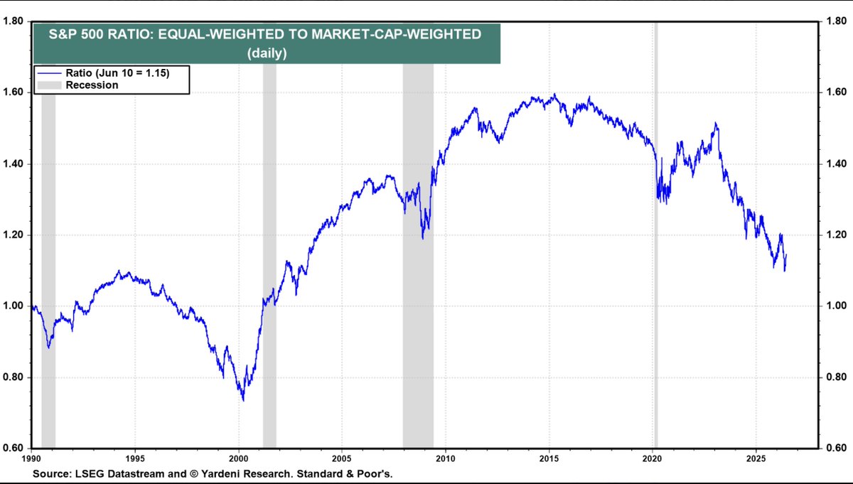
Jun 11
This chart is a concentration risk indicator. It doesn't predict when a rotation happens, but it shows the market is as lopsided as it's been since the dot-com bubble, which historically has been a poor setup for mega-cap outperformance going forward.
1. We're approaching dot-com era concentration levels. This is a warning sign historically. Extreme concentration has preceded major drawdowns.
2. The "Mag 7" effect is real and measurable. A handful of stocks (Nvidia, Apple, Microsoft, Meta, Amazon, Alphabet, Tesla) have driven nearly all S&P 500 returns. Most stocks have underperformed.
3. Equal-weight and small-cap may be poised to outperform When these ratios mean-revert (as they always have), it tends to be violent. The 2000–2013 period saw the equal-weighted index massively outperform the cap-weighted one.
4. Passive investors are more exposed than they think Buying an S&P 500 index fund today means ~35% in just 7 stocks, far more concentration than most investors realize.
5. The ratio is still elevated but slightly off peak Both lines appear to have ticked down recently from their highs, which could signal the early stages of rotation, but it's too early to call definitively.
3
2
25
3,526
Jun 11
Inflation:
Jun 10
The Federal Reserve has a problem
The Fed generally looks through temporary energy spikes.
However, if the energy shock spreads into broader inflation:
* Oil remains elevated.
* Wage growth stays firm.
* Inflation expectations rise.
* CPI remains 4–5% .
This is very similar to the policy dilemma of the 1970s.
If this scenario develops, the market leadership of the last several years (large-cap growth) becomes much less certain, while energy, commodities, value stocks, and cash-generative businesses become increasingly attractive.
1
9
3,525
Jun 11
After the extraordinary run in the market-cap weighted $SPY v its equal-weight version $RSP from April to mid May, it's interesting to see that the ratio has now retraced about half its gains (first chart, red/black).
In the very long-run, RSP > SPY (second chart, blue). Only in speculative markets like the late 1990s, 2007, 20202 and today do we see SPY > RSP.
When RSP > SPY, everything downstream of equal-weight does better on a relative basis: Small, mids, value and cyclicals.
1
1
11
2,419
Jun 10
This is exactly right. For mine, it is December 2008.
"If this is a bubble, then we are close to the end of the beginning of it, but it's not yet clear whether the correct analogy is April 2000 or December 1999, the two alternative analogies having very different short-term return implications. "

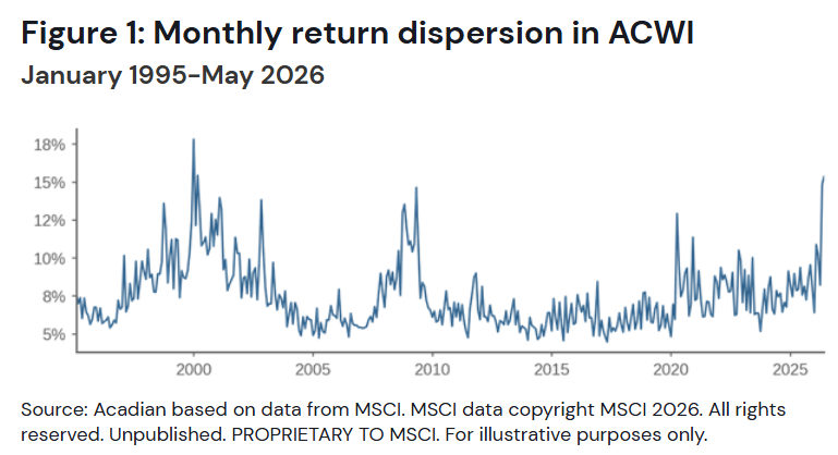
DISPERSION IS HERE
“Now this is not the end. It is not even the beginning of the end. But it is, perhaps, the end of the beginning.”
-- you know who
During the eighth step of the bubble, the flow of new investors starts shrinking while existing investors approach their risk and leverage limits. Volatility and dispersion grow, and gains become less uniform across stocks.
Now, dispersion is here.
Owen Lamont posted this graph today, which illustrates well how cross-sectional dispersion of monthly returns peaks at tops and bottoms.
My interpretation of the graph is not that high dispersion is always a sell signal, or a buy signal for that matter. To me, it's a signal that what has worked very well so far will stop working relatively soon. High beta was great during the late nineties, being short levered small caps was great going into the global financial crisis, and having just cash was great when Covid lockdowns hit. When the dispersion peaked each of those times, what worked on the way in stopped working soon, and what didn't work on the way in started working very well.
The obvious caveat is that we don't know that the dispersion has peaked yet. If this is a bubble, then we are close to the end of the beginning of it, but it's not yet clear whether the correct analogy is April 2000 or December 1999, the two alternative analogies having very different short-term return implications. To build on the analogy of the quote, the battle of El Alamein has started, but it hasn't been won (lost, if you're a Platner supporter) yet.
x.com/ptuomov/status/2054753…
1
4
32
9,569


Jun 10
Forget the Greeks — Only 2 Things Matter in Value Options Investing youtu.be/5UOnzMAmqs4?si=gC_a…
2
8
3,550
Jun 10

SpaceX’s initial public offering has attracted demand for more than four times the available shares, according to people familiar with the matter bloomberg.com/news/articles/…
1
11
3,478
Jun 10
The Federal Reserve has a problem
The Fed generally looks through temporary energy spikes.
However, if the energy shock spreads into broader inflation:
* Oil remains elevated.
* Wage growth stays firm.
* Inflation expectations rise.
* CPI remains 4–5% .
This is very similar to the policy dilemma of the 1970s.
If this scenario develops, the market leadership of the last several years (large-cap growth) becomes much less certain, while energy, commodities, value stocks, and cash-generative businesses become increasingly attractive.

5
4
17
8,020
Tobias Carlisle retweeted

The Buffett-Style Options Strategy: Get Paid While You Wait
During their recent episode of the Value Options Letter and Acquirers Podcast, Travis and Tobias discussed The Buffett-Style Options Strategy: Get Paid While You Wait. Here's an excerpt from the episode:
tinyurl.com/38es5eta
1
6
2,518
Jun 9
Good breakdown on Twitter/X numbers vs Bluesky and Threads.
I live in Fintwit and this is why I can't go elsewhere:
"The “Twitter killer” narrative fundamentally misunderstood what the product is. It’s not a feature set. It’s a specific concentration of people who actually care: politicians, journalists, founders, researchers, anon weirdos all in one place, in public, in real time. You cannot recreate that by pressing a button in Menlo Park."
Jun 9

This week's longform idea, we're talking about how Twitter/X is not dead, and the many, many people who predicted it would be are wrong hottakes.space/p/twitterx-is…
2
1
18
4,535
Jun 9
Homebuyer demand is near historic lows.
Today's sales activity is only slightly above the depths reached during the 2008 housing crash, despite unemployment being low and the economy avoiding a major recession.
Existing home sales are running at roughly 4.17 million annualized units.
Down 37% from the pandemic peak (~6.6 million)
Down 23% below pre-pandemic norms (~5.4 million)
Sales have been stuck around 4 million since 2023.
Housing is a major economic engine. Home transactions drive spending on:
* Furniture
* Appliances
* Renovations
* Moving services
* Real estate commissions
* Mortgage origination
When sales fall to recessionary levels, these industries suffer.
Sales activity is near levels historically associated with severe economic stress, yet prices have remained relatively firm because homeowners are locked into low-rate mortgages and are unwilling to sell. The result is an unusually illiquid housing market characterized by low inventory, low sales, and high prices. Housing remains one of the largest drags on economic activity today.
Jun 9

2) This is the same existing sales graph, but with every month included, going back to 1996.
You can see just how poor the last 4 years have been in terms of demand, and that there is no breakout occurring, despite some of the headlines.
(for comparison, May 2026 sales volumes were 37% below the cycle peak, and 23% below the long-term average)

3
5
18
5,797