
Joined February 2024
- Tweets 500
- Following 180
- Followers 209
- Likes 2,611
26 Photos and videos


27 Aug 2025
What's special about the website of Kit (formerly ConvertKit)?
Let's find out.
12
232
25 Aug 2025
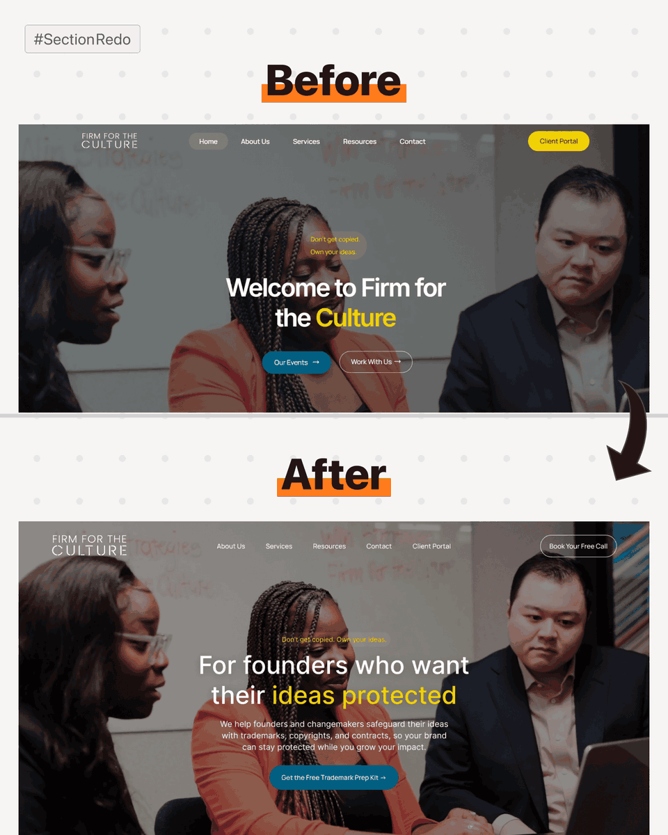
I redesigned the top section of this website.
Here are 6 major changes I made:
1) Replaced the vague headline with one that clearly explains what the company does.
2) Added a sub-headline to give more context and make the business easier to understand.
3) Made a freebie the 'primary CTA' instead of a weaker action.
4) Removed the bright yellow “Client Portal” button from the top navigation, as it doesn’t need that much focus.
5) Dropped the “Home” button since users already know the logo links back to the homepage.
6) Added a secondary CTA (“Book Your Free Call”) for visitors ready to take action immediately.
Is there anything else that should be improved?
#SectionRedo
5
14
272
25 Aug 2025
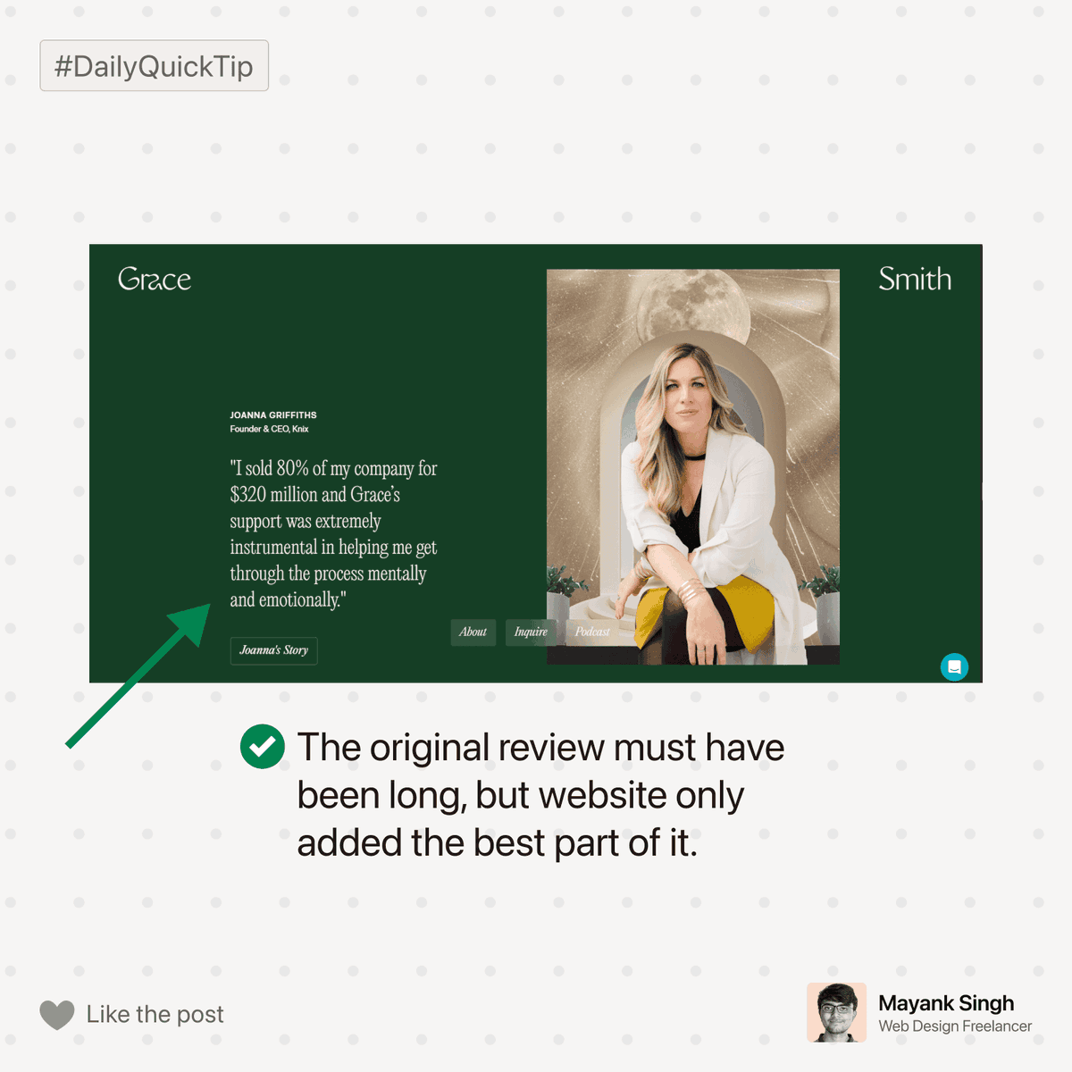
No one reads such massive reviews.
Avoid using such huge reviews. Instead, only add the best bit from it & which should be very small in length.
Users have small attentions span. They don’t have the attentions span to read an essay of the review :p
1
9
159
23 May 2025
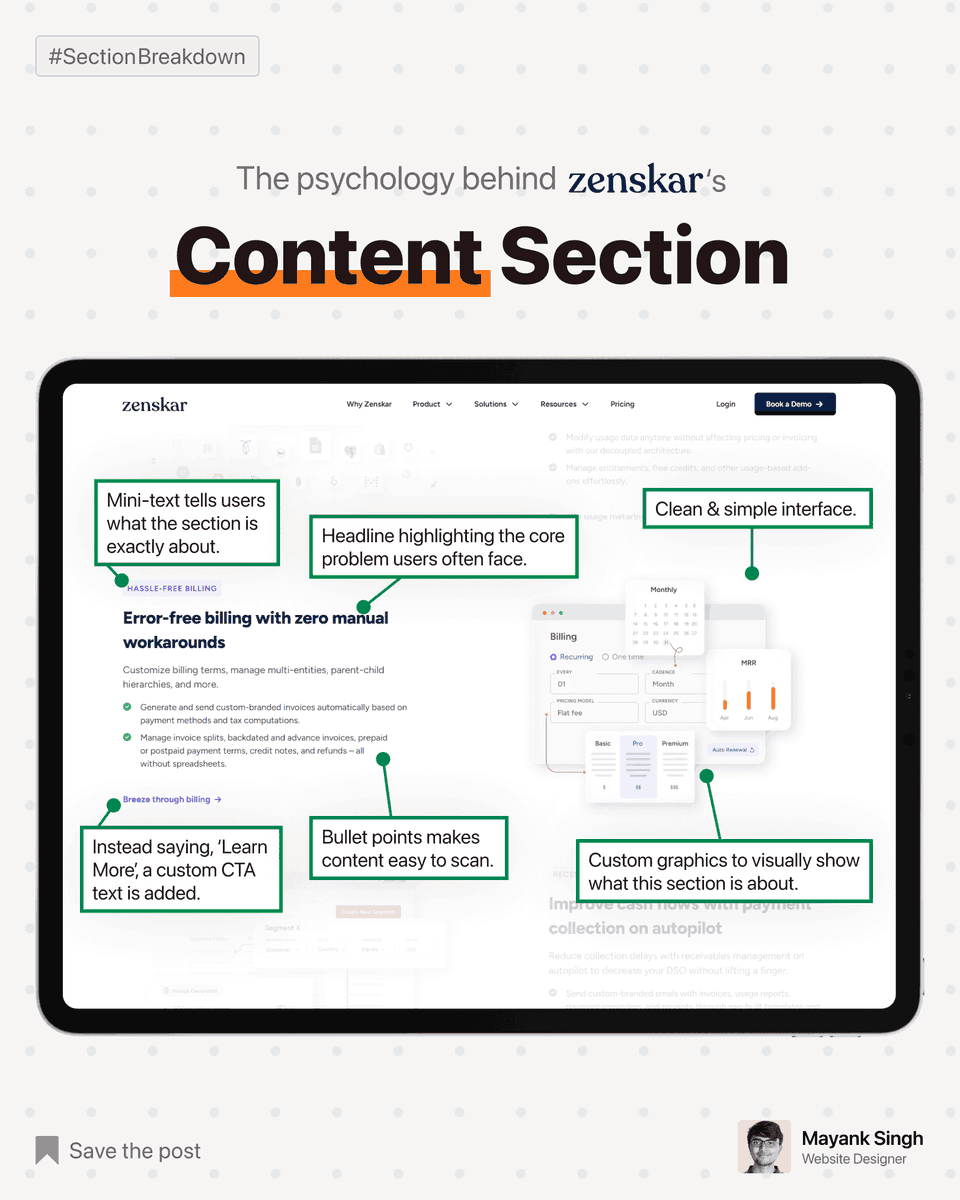
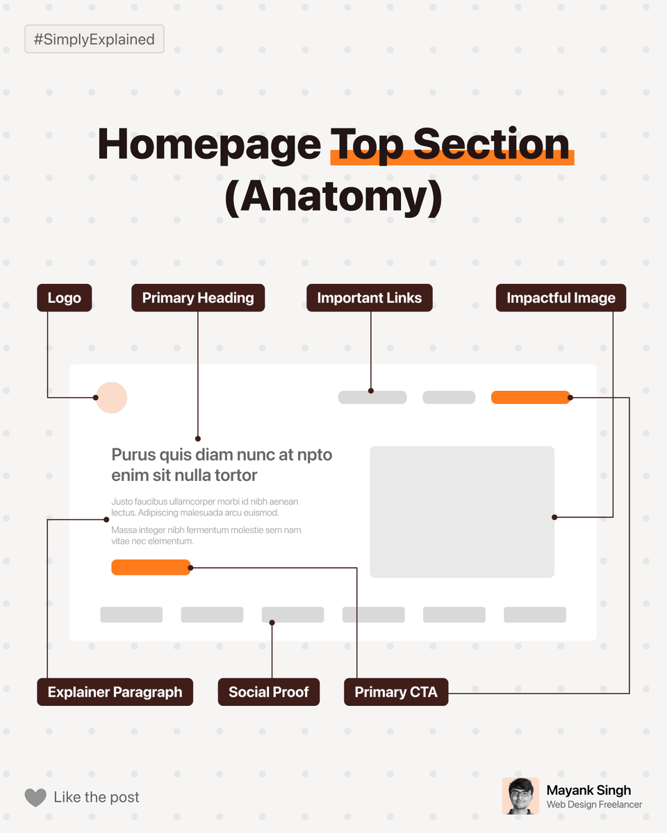
Zenskar's website uses a classic content section.
These are 5 most crucial parts of this section:
1) headline,
2) sub-headline (mini text),
3) easy to scan paragraph,
4) descriptive call-to-action, and
5) an image telling 1000 words.
Each of these 5 parts has a very specific problem they are solving.
You will notice this type of section being commonly used on various other powerful websites.
Do you know why?
Because it's great at covering *one topic* in an in-depth way, without overwhelming the end users.
Are you using this section on your website?
If not, give it a try ;)
#SectionBreakdown #WebsiteTip
12
238
21 May 2025
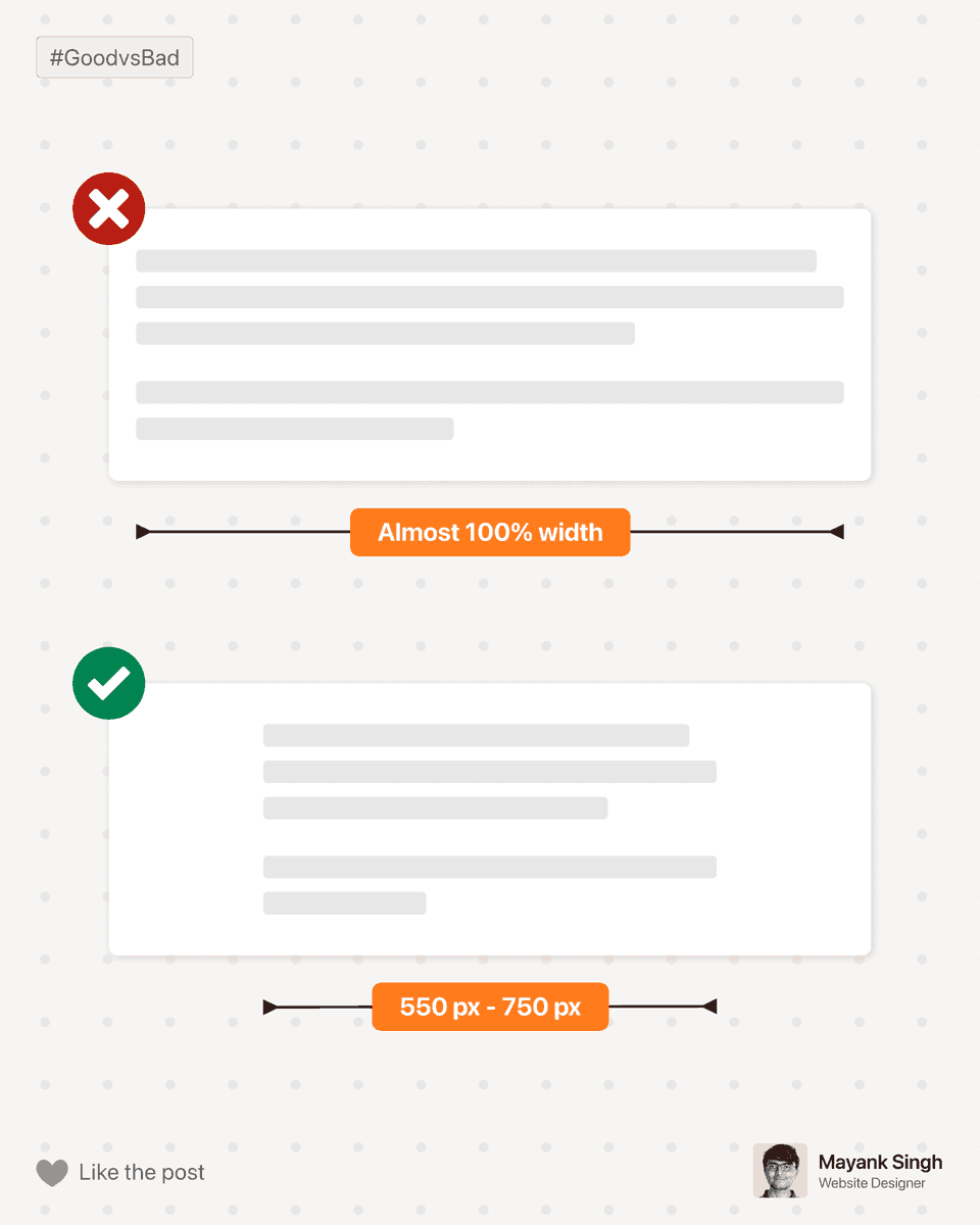
Don't make your content 100% width (on desktop).
You can make this mistake on your:
- blogs and
- paragraph sections
Doing so makes your content scary to read.
Solution: Limit your content length to a maximum of 750px (ideally less than this).
4
11
270
19 May 2025
I am a website designer.
So why am I giving tips on logo design?
So, the project starts, and my clients give me a logo.
90% of the time, the logo is just unworkable,
- I have to do some major fixes,
- create various versions of the logo (like favicon, dark background logo, etc),
- or worst of all, ask my client to get a new logo.
Getting a bad logo surely is not my client's fault.
How would they know what to expect?
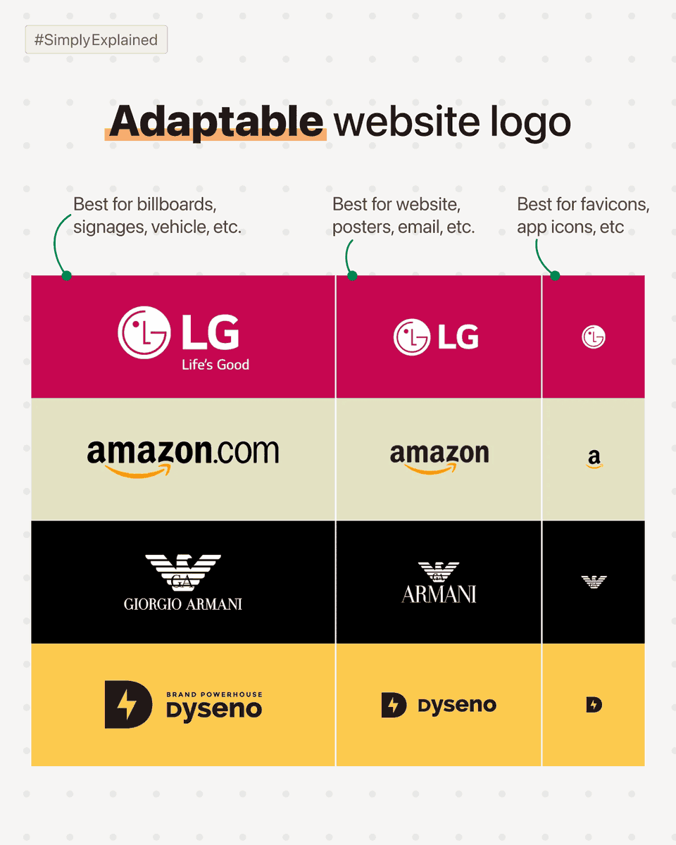
Here are 3 versions your logo designer *must* deliver:
Variation 1: Logo for large use cases.
→ In this use case, your logo can have small details, like a tagline near the main logo.
Use cases: Billboards, office walls, signage, etc.
Variation 2: Logo for normal use cases.
→ This version doesn't contain any tiny text & it *must* have more width as compared to height.
Use cases: Website, product, flyer, email signature, etc.
Variation 3: Logo for tiny use cases.
→ This version of the logo must be recognizable in 16 x 16 px size.
Use cases: Favicon (small icon on top of a website), app icon, etc.
There are a bunch of stuff that a *good enough* logo must have,
but being a web designer this point is most important for me.
#SimplyExplained #WebsiteTip
1
14
229
17 May 2025
Always avoid using meaningless sections, text, images, etc, just for the sake of design.
9
187
17 May 2025
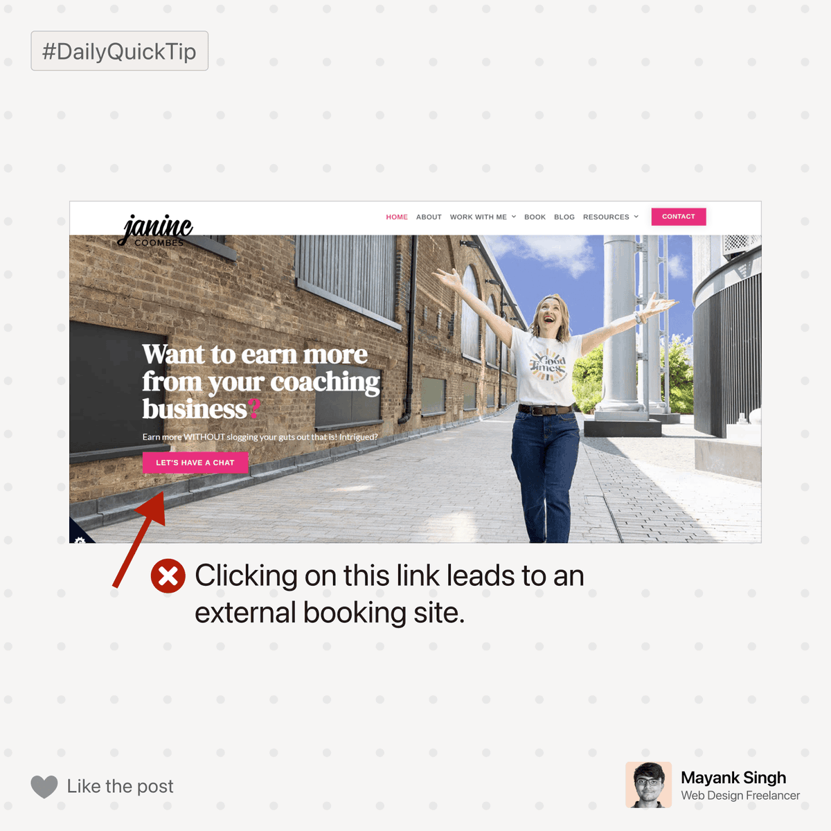
Business websites oftentimes add external links for various purposes.
Leading users to external links is never recommended. The functionality/page must be integrated within the website.
Doing so heavily increases conversion rates :D
1
6
169
16 May 2025
This is my profile on facebook. I just hit 100 followers😃🔥
2
7
160
16 May 2025
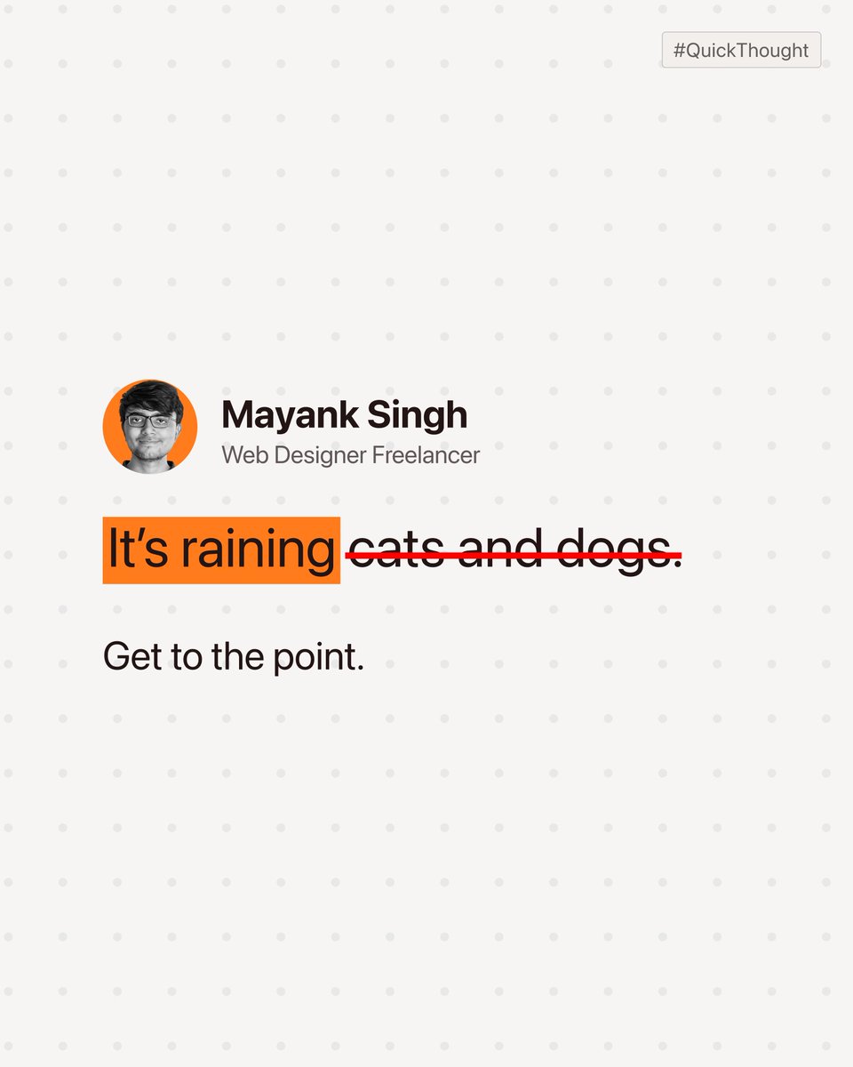
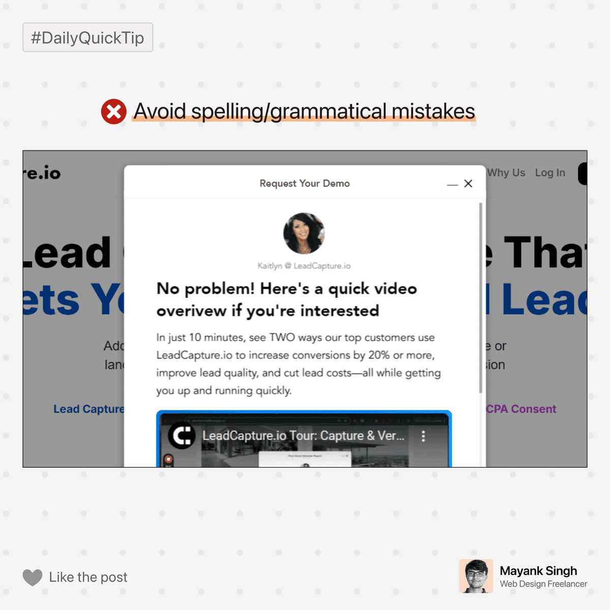
Spelling & grammar mistakes do a great job of distracting users. They also hurt the positioning of a business.
Triple-check your website text to avoid this mistake.
1
4
128
15 May 2025
Early on in my freelancing journey,
I cold messaged a lot of YouTube creators (to design their graphics).
Usually, they didn't respond to my cold pitches (of course).
This annoyed me. I thought, "Can't they just say no so I can move on?"
As a coping mechanism, I decided to say *mean things* if they didn't respond within a day.
(I know. But this was the sigma phase of my life 🗿)
I did so with a couple of people.
Then, one of them responded back.
They said, "I looked at your work yesterday and wanted to hire you, but just forgot. Now, I am not interested."
Result? Instant regret.
Conclusion: In business, never lose your calm while communicating; ALWAYS be professional.
P.S. Please don't unfollow me for my bad handwriting😭
1
1
14
208
15 May 2025
It doesn’t make sense to add large blocks of reviews, as users don’t have the time to go through them.
Add only the best parts of the full reviews, as:
• it saves users time
• highlights the real value the business has to offer
5
103
14 May 2025
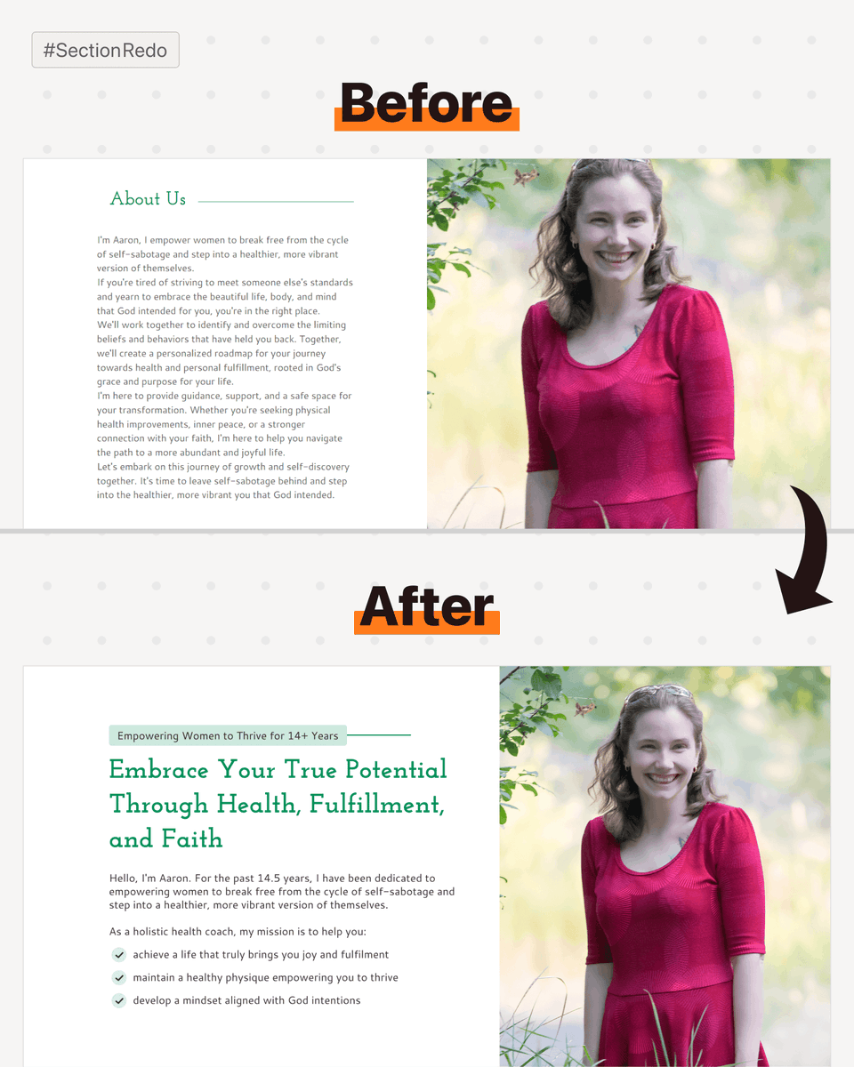
I redesigned the 'About Us' Section for Aaron's website.
Here are 5 quick tips to learn:
1. Don't just use 'About Us' as the headline for the About Us section. Instead, make it helpful for end users.
2. Headline isn't always enough. Occasionally use a sub-headline to share crucial info.
3. If you visit the real website, then the image is low quality. You lose authority by using low-quality images.
4. Avoid such huge chunks of paragraphs. Make the content to the point & easy to read.
5. Having a decently good design is crucial to put it all together. Don't underestimate it.
Conclusion: We might call it the 'About Us' section, but in reality, it's the 'About Them' section :)
6
107
14 May 2025
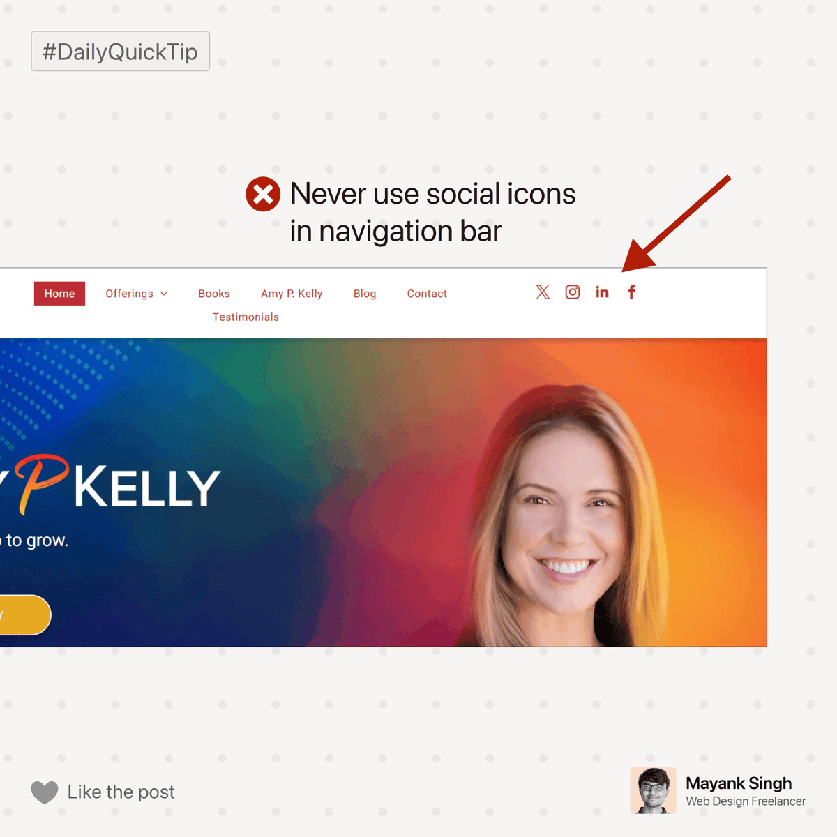
Businesses love adding social links in nav bar, but it’s a bad practice considering UX.
Once users click on the social icons, they will never come back, as its easy to get distracted by social platforms.
6
97
13 May 2025
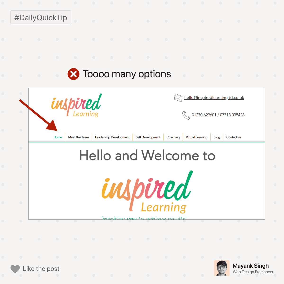
The navigation bar should be minimal, with no more than 7 options.
A lot of options confuse users & hurt user experience.
2
6
139
12 May 2025
Consistency in design always looks premium & professional😊

1
7
151
12 May 2025
Mentioned below is a review section.
The website used a crisp & professional photo of the reviewer. Doing so is a great strategy because:
• Websites often try to hide the identity of reviewers, so it helps with authenticity.
• It positions the reviewer & business as a professional.

1
8
136
8 May 2025
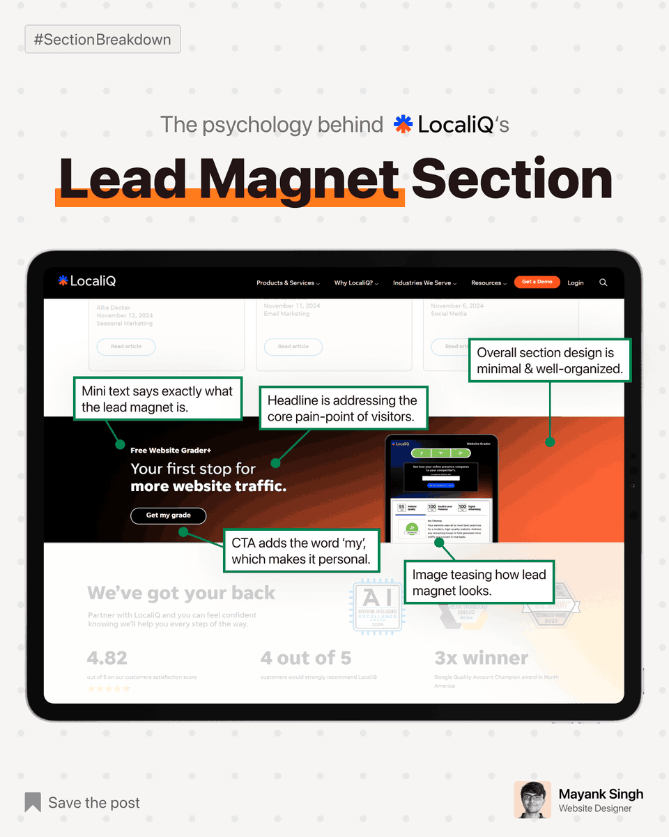
Today I brokedown LocaliQ's Lead Magnet Section.
But what's a lead-magnet section? → A section that redirects us to the lead-magnet landing page, is what I call a lead-magnet section.
2
11
207
2 May 2025
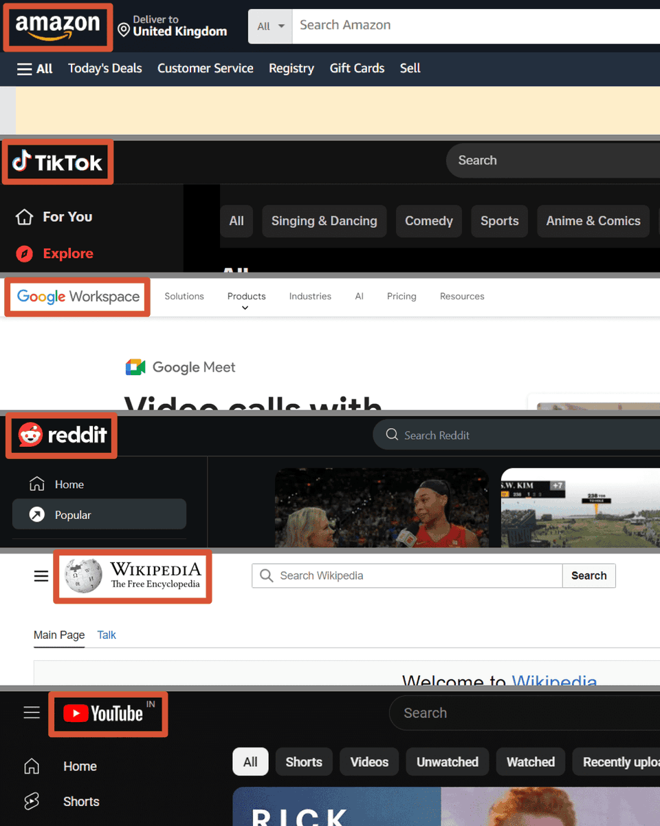
Here are a few of the most popular websites.
Can you notice what's 1 thing in common?
→ They all have their company logo left-aligned.
Website users are habitual to using these websites.
They expect the company logo to be on the left side.
7
168
30 Apr 2025
Readers judge a book by its cover, and
users judge a business by its hero section.
2
1
9
157