
Jun 10
@faithedigold explains the economics of Uganda’s oil refinery.
#CreatingLastingValue #SimplyExplained
Jun 10

"Firstly, cooking at home lets you plan better. You decide what, when and how much to cook. In energy, this is what economists call energy security. The ability to have reliable and predictable access to the fuel you need, without being fully exposed to disruptions outside your control." - Writes @faithedigold, Senior Petroleum Economist and Financial Analyst, @PAU_Uganda.
Today's @newvisionwire
#CreatingLastingValue #UGOilJourney #PAUAt10

99

Feb 21
❄️ Milano Cortina 2026 Events — Simply Explained
⛷️ Alpine Skiing — Race downhill through gates; fastest time wins.
🎯 Biathlon — Ski fast, shoot accurately; missed shots = penalties.
🛷 Bobsleigh — Push hard, ride fast; total run time decides medals.
🎿 Cross-Country Skiing — Distance races using classic or freestyle technique.
🥌 Curling — Slide stones toward the target; closest scores points.
⛸️ Figure Skating — Jumps spins judged on difficulty and artistry.
🎿 Freestyle Skiing — Moguls, aerials, halfpipe; speed or style wins.
🏒 Ice Hockey — Score more goals than your opponent.
🛷 Luge — Feet-first sled racing; fastest combined runs win.
🎿 Nordic Combined — Ski jump first, then cross-country chase race.
🏁 Short Track Speed Skating — Fast, tight races; first across wins.
🛷 Skeleton — Head-first sled racing; speed precision matter.
🪂 Ski Jumping — Distance style points decide the winner.
🏔️ Ski Mountaineering (NEW) — Climb up, ski down; fastest overall wins.
🏂 Snowboarding — Tricks (halfpipe/slopestyle) or head-to-head racing.
⛸️ Speed Skating — Long-track races against the clock.
👉 Follow for daily sports explained simply
#WinterOlympics #Olympics2026 #SimplyExplained
1
1
219

19 May 2025
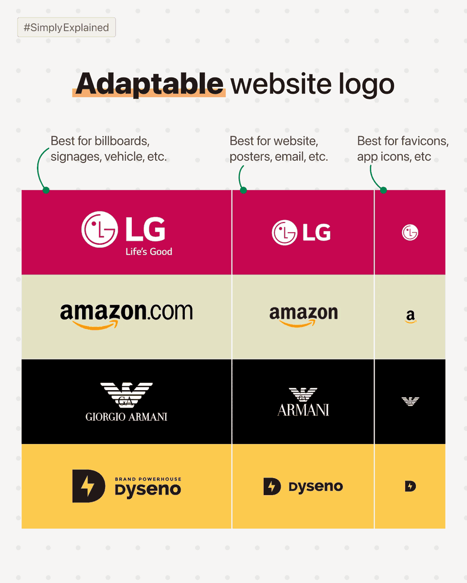
I am a website designer.
So why am I giving tips on logo design?
So, the project starts, and my clients give me a logo.
90% of the time, the logo is just unworkable,
- I have to do some major fixes,
- create various versions of the logo (like favicon, dark background logo, etc),
- or worst of all, ask my client to get a new logo.
Getting a bad logo surely is not my client's fault.
How would they know what to expect?
Here are 3 versions your logo designer *must* deliver:
Variation 1: Logo for large use cases.
→ In this use case, your logo can have small details, like a tagline near the main logo.
Use cases: Billboards, office walls, signage, etc.
Variation 2: Logo for normal use cases.
→ This version doesn't contain any tiny text & it *must* have more width as compared to height.
Use cases: Website, product, flyer, email signature, etc.
Variation 3: Logo for tiny use cases.
→ This version of the logo must be recognizable in 16 x 16 px size.
Use cases: Favicon (small icon on top of a website), app icon, etc.
There are a bunch of stuff that a *good enough* logo must have,
but being a web designer this point is most important for me.
#SimplyExplained #WebsiteTip
1
14
229

13 May 2025
🤔 Ever wonder how phase contrast #microscopy actually works? 🔬
Our #SimplyExplained video breaks it down in just 2 minutes:
📌 The key elements of a phase contrast microscope
📌 How it reveals nearly invisible cells — without staining
#phasecontrast #ibidiacademy
2
122

1 Feb 2023
'विकास और Employment को अगर हमे प्रोसेस करना है तो उसका रास्ता Infrasturcture से होके गुज़रता है'- वैभव डांगे (इंफ्रास्ट्रक्चर मामलों के जानकार)
#Budget2023 SimplyExplained with Vaibhav Dange
@newsindia24x7_
1 Feb 2023

'विकास और Employment को अगर हमे प्रोसेस करना है तो उसका रास्ता Infrasturcture से होके गुज़रता है'- वैभव डांगे (इंफ्रास्ट्रक्चर मामलों के जानकार)
#BudgetOnNI24X7 #Budget2023 #newsindia
@vaibhav_74 @vijaitrivedi @nsitharamanoffc @nsitharaman
5
8
301

3 Jan 2023
What does mental health mean? What is its impact as a public health concern? And does this impact necessitate government intervention?
@Ritwik__S explores the same in our first blog for 2023. Read it here: accountabilityindia.in/blog/…
#MentalHealth #SimplyExplained #PublicHealth
2
224

4 Oct 2022
#DeLe 12: SimplyExplained "ERC-20 Tokens" explanation vid.
Grateful that many people spend their time creating valuable content for others to learn, democratising information and breaking down knowledge privilege
Thank you @Savjee 🤓 (and Internet 📡)
youtube.com/watch?v=cqZhNzZo…
5

Here’s an explainer on how the #AccountAggregator accumulates the data for you. It is certainly going to make life easy for the investors.
Swipe to know more and tell us what do you think about it.
Disclaimer: bit.ly/longdisc
#SimplyExplained

2
6
51
Petrol prices touching the sky? #ElectricVehicles (EVs) are here to the rescue! But will the Indian EV industry witness an evolution soon?
Swipe to know more and tell us what you think about it!
Disclaimer: bit.ly/longdisc
#SimplyExplained #KotakSecurities
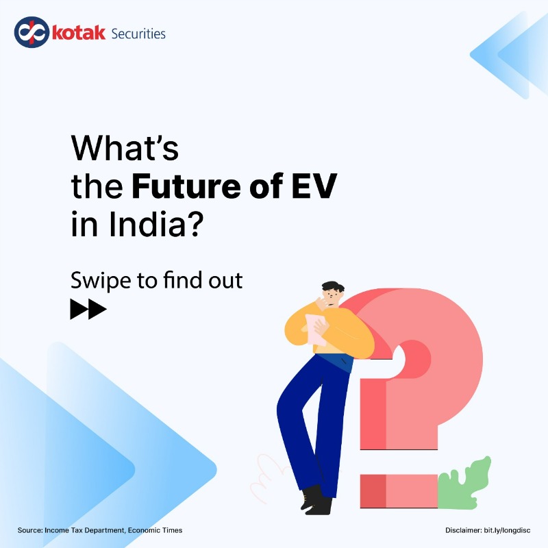
4
27

30 Aug 2022
“Co-Construction” is one of the key terms in our #research, and this is why we call our workshops “Co-Construction Workshops”.
In our first edition of #simplyexplained, we take a closer look at the term, learning what’s behind it and how it connects to #explainability and #AI.

1
1
1
The #AIS gives taxpayers all the information the #IncomeTaxDepartment has on them. Here's an explainer on its objectives, how it's different from Form 26AS, and much more here - bit.ly/KSec_AllAboutAIS
#SimplyExplained #Taxes #IncomeTax #KotakSecurities

1
2
18
Let us know your thoughts in the comment section below 👇🏼
#FuelPrices #CrudeOil #oilandgasindustry #investment #Trading #SimplyExplained #SimplyExplainedbyKotakSecurities #KotakSecurities
(8/8)

1
The #UnionCabinet recently approved the deregulation of sale of domestically produced #crudeoil in India which will be implemented from October 2022. How does this move affect the upstream oil & gas sector?
Know all about it here: bit.ly/KsecSimplyOilnGasBlog
#SimplyExplained
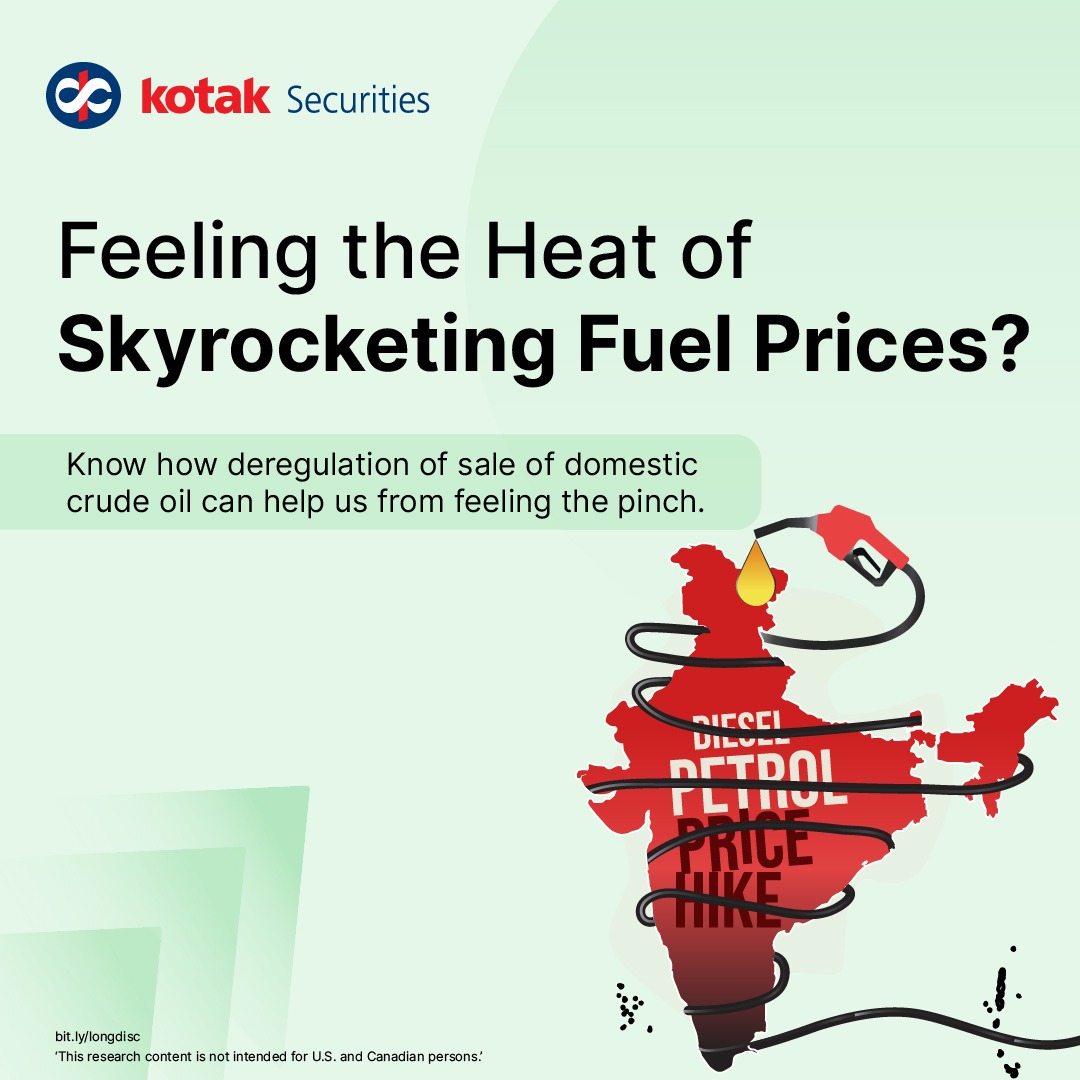
2
15
148

What is a repo rate? And how can a change in repo rate have implications for investors, sectors, and the economy at large?
In this week's #SimplyExplained, we take a look.
Read more on our blog: bit.ly/KsecRepoRateBlog
1/9

1
7
In this week’s #SimplyExplained, we take a look at how the industry has found a way to turn its waste into wealth.
Read more on our blog here: bit.ly/IndianPlasticIndustry
1/9
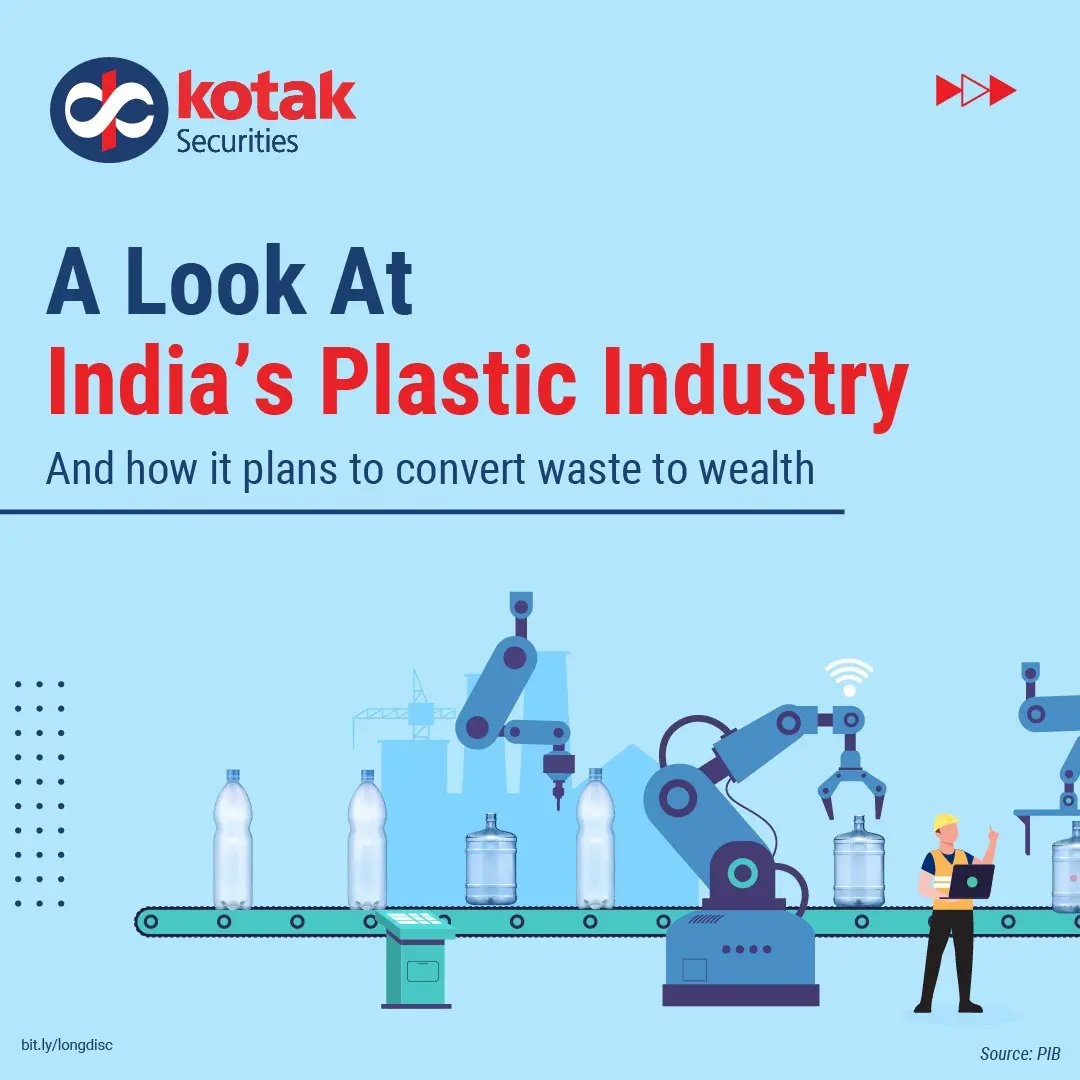
3
27
408
In today’s #SimplyExplained, we take you through how the Indian Infra Sector is highly responsible for India’s overall growth and development.
Read our blog to know more: bit.ly/KsecSimplyExplainedIn…
1/7

2
15
364

11 May 2022
1
1
5
The IPO of India's largest insurer LIC will open next month. And that comes as the government is keen to meeting the 12th May deadline.
In today's #SimplyExplained, we take you through what this deadline is all about and some other key details of the IPO.
1/9

2
8
175
The Indian sugar industry is trending bullish on the back of some recent developments & many sugar companies are said to benefit from the government's 2025 target of blending ethanol in petrol. Let's have a look at some of these drivers in today's #SimplyExplained
1/10

4
21
375