
Joined December 2022
- Tweets 848
- Following 2
- Followers 20
- Likes 999
474 Photos and videos


Pinned Tweet
SelfManager[.]ai v5 is live. Codename: BFR Booster(@elonmusk).
Our previous major release, v4, was the visible one - full redesign, UI and UX improvements, AI Plan, deeper personalization.
You could see the upgrade the second you opened the app.
v5 is the opposite.
Almost nothing visual changes.
We migrated the entire backend off our previous foundation and onto an enterprise database.
Every piece of data was re-modelled and moved over - tables, tasks, comments, notes, AI artifacts, the sharing model.
The most important release we have ever shipped, and you can barely see it.
The codename BFR Booster fits. A booster does not look like much from the outside, but it is what gets the rocket off the ground.
v5 is the booster for everything coming next.
What you get:
* Enterprise scaling. Built to handle whatever growth comes next - the sky is the limit.
* Multi-region performance. Same speed from Europe, the US, Asia, South America.
* Offline-friendly. The app loads from local cache before the network answers. No internet? Your changes are written locally and sync to the cloud the moment you are back online.
* Pages that load fast and stay fast. Whether you have 50 tables or 5000, opening a week or month view feels the same.
* A platform that lets us ship complex, data-heavy features without friction.
* Source code rebuilt on the latest Google technologies. Google has been our platform since 2016, when the first line of SelfManager[.]ai was written - using the best available tech has been a founding principle from day one.
* The bedrock for what is coming next.
What we get: features that took two weeks now take a few days.
We need that speed - tech and AI are moving at rocket speed speed, and v5 is our booster.
Migrations are not glamorous. No screenshots, no flashy demo.
But v4 made the app feel new, and BFR Booster makes it possible to keep making it better and serve more people at a higher standard.
Just watch what comes next.
#buildinpublic #AI @MarianSo99
1
2
54
SelfManager.ai retweeted

Jun 13
4 months ago, I said that Elon would become the first trillionaire.
Yesterday, he became the first trillionaire.
I like to do tech/business predictions for fun.

Feb 3

Hot take: there’s a 99% chance Elon becomes the first trillionaire.
Not because “stocks go up”… but because he’s stacking the most valuable parts of the modern tech economy into one vertical.
February so far:
1) SpaceX acquired xAI (and xAI already includes X / Twitter).
2) OpenAI shipped the Codex desktop app — multi-agent coding is now a first-class product, not a chat tab.
3) Rumor mill says Claude Sonnet 5 could drop any day (unconfirmed, but the noise is loud).
Zoom out and the pattern is obvious:
We’re moving from “AI as a feature” to “AI as infrastructure.”
The winners won’t just build apps.
They’ll own the rails: distribution data compute autonomy.
And right now… Elon is unusually positioned across:
- space comms (launch satellites)
- a global consumer distribution layer (X)
- an AI model org (xAI)
- plus Tesla/robotics sitting nearby
99% is a vibe, not math 😄
But the direction is hard to ignore.
Do you think the next trillionaires will be “platform/infrastructure owners”… or can app-layer companies still win huge in the AI era?
1
1
13
SelfManager.ai retweeted
May 24
Tesla and SpaceX will make Elon the first trillionaire. He's at ~$849B today.
Don't be surprised when he reaches $2T after xAI's global success.
He doesn't only have his own foundation model (Grok).
He also made bold moves in AI compute with Colossus.
And now with Terafab, he's going even deeper into AI infrastructure.
Here's what most people miss.
AI-first companies with top frontier models are valued at around $1T.
Anthropic (Claude) is closing in on $900B.
OpenAI (ChatGPT) is at $852B and targeting $1T at IPO.
xAI alone was valued at roughly $200B when SpaceX absorbed it in February, so on the model side, he's still catching up.
Nvidia is at $5.2T as the hardware builder and the go-to for every hyperscaler.
So look at what Elon is actually competing on:
1. With Grok, he's going head to head with Anthropic and OpenAI on frontier models.
2. With Colossus (555K GPUs, 2GW, the largest single-site AI training cluster on the planet), he's competing with AWS, Azure, and Google Cloud on raw compute scale.
3. With Terafab, he's stepping into chip manufacturing at every layer. He competes with Nvidia and AMD on chip design, and with TSMC and Samsung on the foundry side. Intel is the one big chip player he's partnering with, not fighting, since Terafab is built on Intel's 14A process.
One person, vertically integrating models, compute, and silicon, while everyone else is still picking which layer to play in.
On a personal note, Elon has been a real source of inspiration for me since 2014-2015.
He's the one person I watched who consistently amazed me - the scale of his goals, the first-principles physics thinking, the work ethic, and the raw intelligence he channels into actually shipping the business outcomes.
That combination is very rare.
Watching him operate shaped how I think about building.
2
3
5
104
SelfManager.ai retweeted
May 21
When I had more free time, I used to listen to books and interviews about physics just for fun, as a way to relax.
The big ideas and the mechanics of reality.
The number of discoveries that we have made in the last 200 years is mind-blowing.
It made me excited about future technologies and the vast possibilities the universe has.
And we did all of this from a tiny planet, a speck of dust in the largest desert on Earth when compared to the vastness of the universe.
Elon’s interviews back in 2015–2018 got me interested in finding out about physics. I have a lot to thank this man.
1
3
5
46

May 12
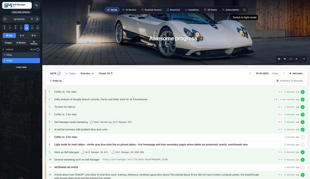
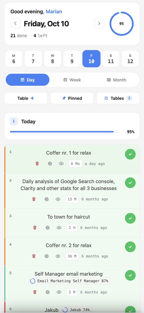
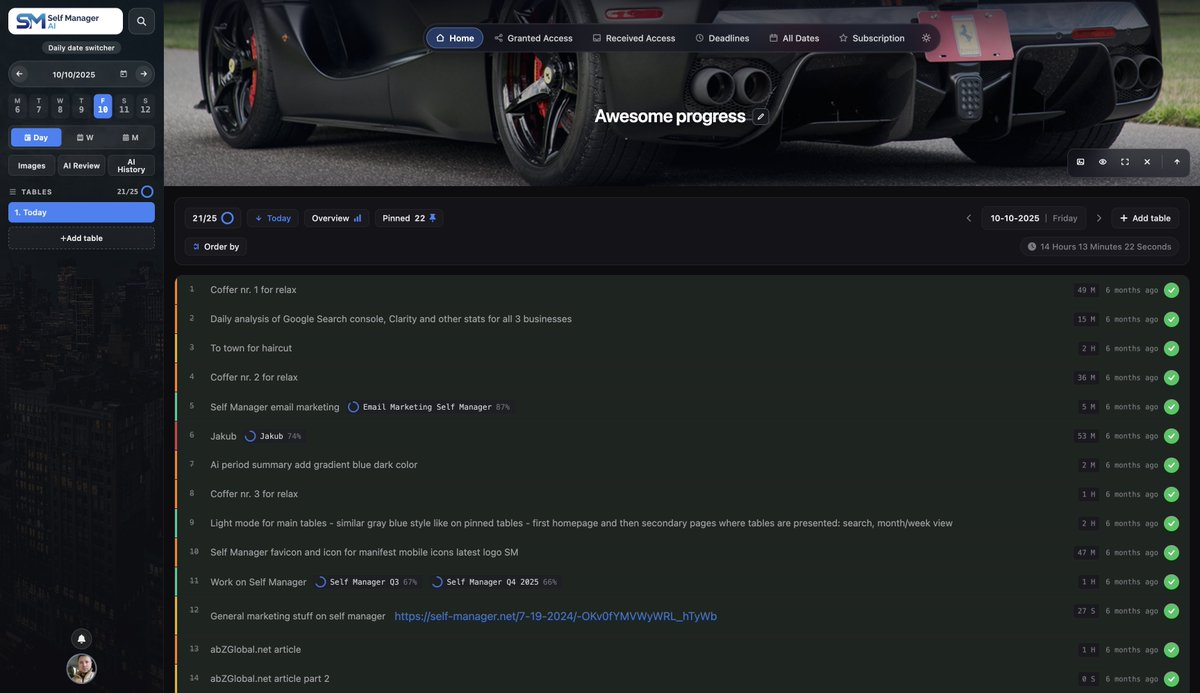
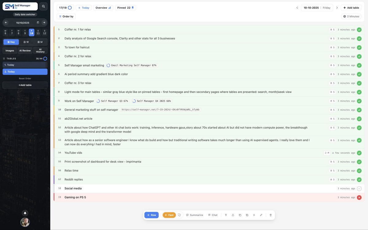
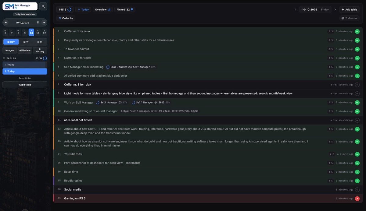
Over the past months, two big things got redesigned at SelfManager[.]ai:
→ v4 rebuilt the logged-in experience. Native mobile gestures, dark mode everywhere, every modal and dialog reworked.
→ v5 (BFR Booster) rebuilt the backbone. Migrated onto enterprise infrastructure - multi-region, offline-friendly, built to scale.
The third piece was overdue: the public pages. Homepage, Pricing, How it Works, FAQ, About, and Articles.
The thing is, these pages do something the other two can't. They're the front door.
They're what a person sees before they decide to create an account, before they ever experience the app itself, before they read a single product feature.
The first few seconds on these pages tell a visitor - without them realizing it - what kind of product this is.
A bit dated, a bit cluttered, a bit "fine"? That's what the app is going to feel like in their head, even before they sign in.
Crisp, deliberate, calm, premium? That's also what the app is going to feel like in their head.
So the public pages aren't a side project. They're the personality. They're the first handshake. They set the bar for everything a new user is about to experience.
And the bar should match what's actually underneath the hood: enterprise infrastructure, a redesigned product, nine years of work.
A premium tool deserves a premium first look.
v5 rebuilt the backbone.
v4 rebuilt the logged-in app.
The public pages were still the old version.
They're not anymore.
@MarianSo99


1
33
SelfManager.ai v5 is live.
Same app, new backbone.
We migrated to an enterprise database so we can ship features faster and hold up at any scale - and we really mean it.
We're talking scaling seamlessly to multiple continents without missing a beat.
v4 = Full redesign improved UX AI Plan
v5 = the engine that lets us keep going BIG
1
55
Apr 25
AI Plan just shipped - the 11th AI feature in SelfManager AI.
Pick a period (up to 31 days), describe the goal in plain English, get a structured plan back.
One table per day, 3-20 prioritised tasks each.
Edit before you commit.


1
1
35
Apr 24
Are you tired of losing tasks inside endless nested folders and complex Kanban boards? Discover SelfManager.ai, the date-centric AI task manager that organizes your work the way life actually happens: day by day.
In this video, we explore how SelfManager.ai eliminates decision fatigue by giving every single day its own workspace. We dive deep into the platform's "Everything belongs to a date" philosophy and show you how to plan today, execute faster, and let AI review your progress.
🚀 Key Highlights in this Video:
📅 Date-Centric Planning: No more dragging cards across boards or digging through folders. If a task, note, or project happens today, it lives in today's workspace.
🤖 10 Powerful AI Features: Powered by the latest Gemini models, you can generate tasks from raw text, chat directly with your tables, and get instant AI period summaries for your week, month, or quarter.
🤝 Flat-Rate Team Pricing: Stop paying per-seat software taxes. SelfManager.ai offers a flat $30/month Team plan for unlimited collaborators, so you are never punished for growing your team.
⚡ Built for Focus: Everything you need is built right in, including precise time tracking, rich-text notes, and the ability to upload up to 100 uncompressed images per table. Everything syncs in real-time across your devices.
Stop switching between apps and let your task manager do the heavy lifting.
#SelfManagerAI #Productivity #TaskManager #AITools #TimeManagement #ProjectManagement #WorkSmarter
15
Apr 22
🚀
Apr 22
9 years of features, then the redesign that glued them all together.
Functionality first, design after. That was always the plan. I could not design the final shell around a product that was still figuring out what it wanted to be.
So I kept shipping features, kept learning what the product actually needed, and kept the redesign in the back of my mind.
v4 is that redesign.
The logged-in experience finally looks like one product, not 9 years of additions.
x.com/Self_Manager99/status/…
1
1
15
Apr 21
Hey everyone,
Just pushed v4 live. Full redesign.
This is the biggest Design update I've shipped since I first put SelfManager online.
If you log in today, the first thing you'll notice is that it looks different.
Not "new theme" different - a ground-up redesign of the entire logged-in experience. Desktop, mobile, light mode, dark mode, every modal, every dialog.
Here's what actually changed, in the order you'll probably feel it:
Mobile finally feels native
This is the one I'm most happy about.
The old mobile view was basically desktop squeezed into a phone.
v4 has a proper gesture layer:
- Swipe right on a task → open settings
- Swipe left on a task → delete (with confirm)
- Double-tap → toggle complete
- Long-press text → select it, and you'll see the highlight marker pop up so you can color-code words
It tracks your finger 1:1, has a haptic pulse when you cross the commit point, and gets out of the way when you're just trying to scroll or select text. If you use SelfManager on your phone, this is going to feel like a different app.
Notes are actual notes now
The notes field used to be a plain textarea.
It's now a proper rich-text editor - bold, italic, headings, bullet and numbered lists, links, inline code.
Paste from Word or Google Docs and it cleans the formatting automatically.
There's an auto-save toggle that syncs across devices, plus version history if you need to roll back.
The editor only loads when you actually open a note, so if you don't use notes, nothing slows down.
Light mode that works everywhere
Light mode existed before, but was not on every authenticated page.
Every surface now respects the theme.
What you need to do
Nothing. Just log in. All your data, tables, notes, subscriptions are unchanged.
You'll just notice that everything feels tighter.
Thanks to everyone who stuck around through the rebuild. 9 years, 3,000 commits, and this is the version I've always wanted it to be.
- Marian


1
2
2
99


Apr 18
In the last few weeks we shipped a pile of updates to SelfManager[.ai] - eight ways to sign in now including Magic Link, phone and via Facebook account.
A full deadlines and notifications system, [@]mentions in comments, a brand new empty-day experience, and dark mode across the daily view.
1. Dark mode has been rolling out piece by piece for a while, but as of today it's fully available across every single component on the homepage. The components are: Pinned tables, Tables, AI features, comments, images, and notes. And you can see dark mode in the recording of this video.
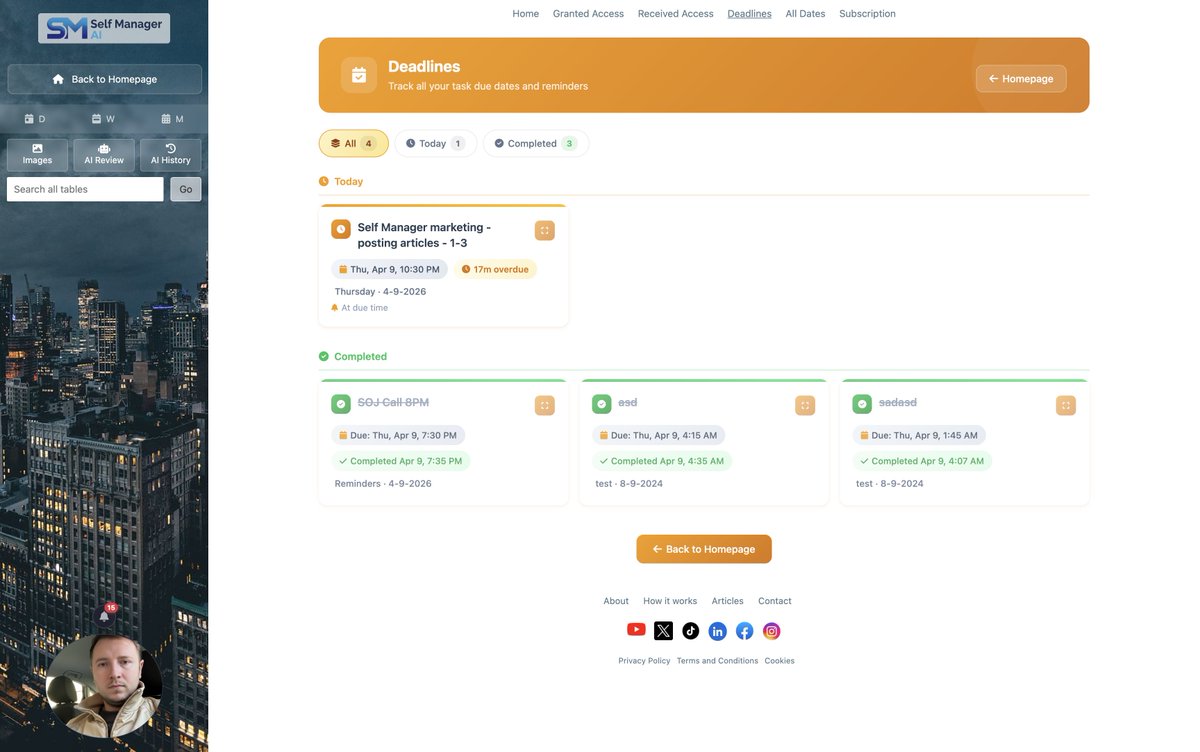
2. Deadlines - Tasks now support real due dates and due times.
And there's a new dedicated Deadlines page that pulls every upcoming deadline from every table into one view.
So instead of hunting through different tables to remember what's due Friday, you open one page and see everything in order.
And you can set a reminder, for example, 1 hour or any time before the deadline.
The reminder process is the following:
1. First, you receive a notification message in the app's User Interface - Left sidebar above the profile image on desktop, or in the top navigation on mobile
2. Push notifications - If you don't open the first step notification, maybe you are in another tab, shortly after, you will get a notification from your Operating System.
Note: make sure you have the setting enabled in your operating system to permit your browser to send notifications to it
3. Email notifications - If you didn't open the push notification, you will receive an email
And if you don't want to receive step 2 or 3 there is a notifications setting that allows you to turn this on or off
3. @mentions in comments - If you're in a team with multiple people having access to a table's data, you can now mention each other.
The notifications process is the same as it was described in the Deadlines update.
4. Notifications - As you saw in the description of the new feature, Deadlines, a new icon was added in the left sidebar on desktop and top navigation on mobile.
This is where all your notifications will appear.
You can mark them as "read" or delete them.
Also there are notification settings for:
1. Delivery Channels, meaning you can disable email or push notifications.
2. Disable/Enable a particular notification: @mention, reminder that a deadline is close, notification that the deadline time has occurred
5. Search by comments - You can now search any tables by the content of its comments
6. New Login Options & Account Linking
4 new login or account creation options have been added:
1. Phone number
2. Magic link - enter your email and you will receive a login link
3. By entering your email and password
4. Login via Facebook
The existing options that were already there are: Google, Apple, X/Twitter and Microsoft.
And if you signed in via Google and want to link your mobile phone so you can sign into the same account, you can do that.
Just go to profile settings and scroll to the bottom to link it.
The idea is simple: meet people where they already are. Different people prefer different sign-in methods, so we support all of them.
7. Custom range for AI Reviews page(Period Summary)
Before, you could only select a range of week/month/quarter but now you can select any range of days - up to 3 months
8. Empty Day Content Component
Here's the old problem. You open SelfManager on a fresh day, you haven't created any tables yet, and… you see a blank page.
Not exactly inspiring.
So we rebuilt that entire empty state into something educational, inspirational, and actually useful.
When you open a day that has nothing in it yet, you now see four things.
- One - random productivity quote
- Two - a feature showcase carousel
- Three - a 'How it works' popup with the demo video
- Four - quick action buttons
1
1
2
242
SelfManager.ai retweeted
Apr 16
1
2
27
Apr 15
🚀 Launch Alert 🚀
We are live on @FazierHQ
Please support us here 👇
fazier.com/launches/selfmana…
13
Apr 15
8