
Designer. Father, husband, lover of type, tech and crashing on a mountain bike. bento.me/sprior
Joined June 2010
- Tweets 2,370
- Following 1,372
- Followers 557
- Likes 2,133
389 Photos and videos


12 Jun 2025
How do large companies with a significant design reputation come up with something so poor from an accessibility perspective?

I am a graphics programmer, and here's my feedback on Apple's Liquid Glass beta. The idea is cool, but it's difficult to work with from a UX perspective.
Let's start with the main problems:
1 - Low Contrast: It's clearly not readable, but there are many different ways to fix it.
68
20 Apr 2025
Next street over from me. Pretty close.

1
1
55
4 Dec 2024
Very sad that a lot of colleagues and friends of mine got laid off yesterday and with no warning whatsoever. Brutal sweep of restructuring just before Xmas.
1
129
Steve Prior retweeted

17 Nov 2024
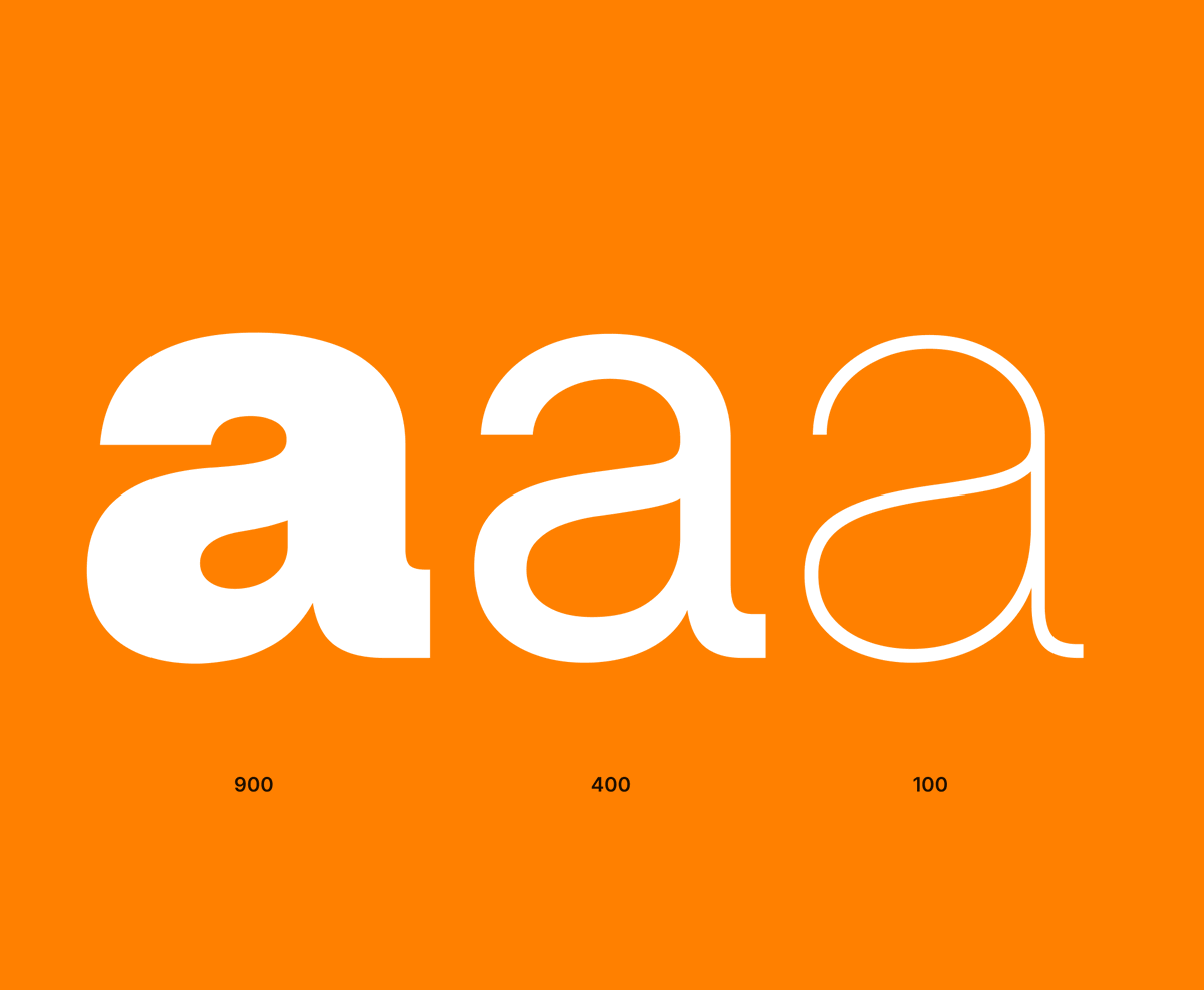
Spent a few hours this Sunday morning adding lower-case a with tail to Inter, which has been a popular request for a while. What do you think?


55
32
842
57,377
8 Nov 2024
The great thing about agile and software design is pivoting after months of hard work and redoing several key features because the right stakeholders were not at key meetings from the start. Better late than never.
43
28 Oct 2024
Welcome to the family ‘Dozer’. Our youngest cat is already friends with this little man. Guarding him all night last night. She never leaves his side.


33
23 Oct 2024
1st tattoo. Went big lol. After a double loss in the family over a 10 month period - and a slight mid-life crisis, I decided to sketch out a concept based on Aztec suns representing life and death and family. Super happy how these turned out.

2
90
20 Oct 2024
This. 👌. I see so many scroll jacking animations, horizontal scrolls that hides key content for users, spinning objects that move while you go down the page. Framer and Webflow have forced an industry acceptance that gimmick and distraction = good user experience. Please user test your 30,000px scroll animated landing page and tell me if I’m wrong. 👍
6
99
Steve Prior retweeted

1 Oct 2024
Finally! Duplicate *and* rotate is now available within @Figma. 🙏
55
226
2,915
180,726
7 Sep 2024
My eldest son has been featured on Redbull Free running’s Instagram account 🙌😍 so proud of him instagram.com/stories/steve_…
27
17 Aug 2024
The detail 😍


1
51
3 May 2024
Does every Fintech company now have to feature a quirky sans serif pale lime and pure black brand. Be good to see a new approach to Fintech rather than a sheep mentality.
1
79
Steve Prior retweeted

2 May 2024
To this day this is the most beautiful video made by Apple.
43
200
2,123
284,325
27 Apr 2024
So guilty of this. Current unfinished projects total 9
61
27 Apr 2024
18 years with @EE asked for a discount on new phone - not an unreasonable request. Inline with competitors may I add. They’re not interested. Oh well on to a new provider it is. I do miss the days where loyal customers were rewarded.
1
1
72