
Designer × AI Engineer | Ambassador @Alibaba_Qwen | Cut e-commerce AI costs ~60%|Reverse-engineering prompts from a single image
Joined August 2025
- Tweets 3,560
- Following 350
- Followers 7,167
- Likes 7,001
1,050 Photos and videos


Pinned Tweet

Jun 1
用 AI 生图最烦的事:
每次都在从零写 prompt,写完还不稳定。
我做了一个东西来解决这个问题——
AI Visual Prompt Cookbook。
50 个视觉风格,每个是一个结构化的 style.json。
你不用写 prompt,只需要换变量。
主体、场景、文字、比例——改这四样,风格自动锁定。
之前只有 GitHub 仓库,现在我做了一个可搜索的GitHub Pages,找风格终于不用翻文件夹了。
地址:👇
vigozhao.github.io/AI-Visual…
Jun 1

🧵 1/ 我摸到一套低成本、高情绪价值的产品海报公式。
漫画夸张反应 × 产品大特写。
不用真人拍、不用探店,一张图就能让人「看饿了」。
下面拆解 👇
13
17
147
23,527
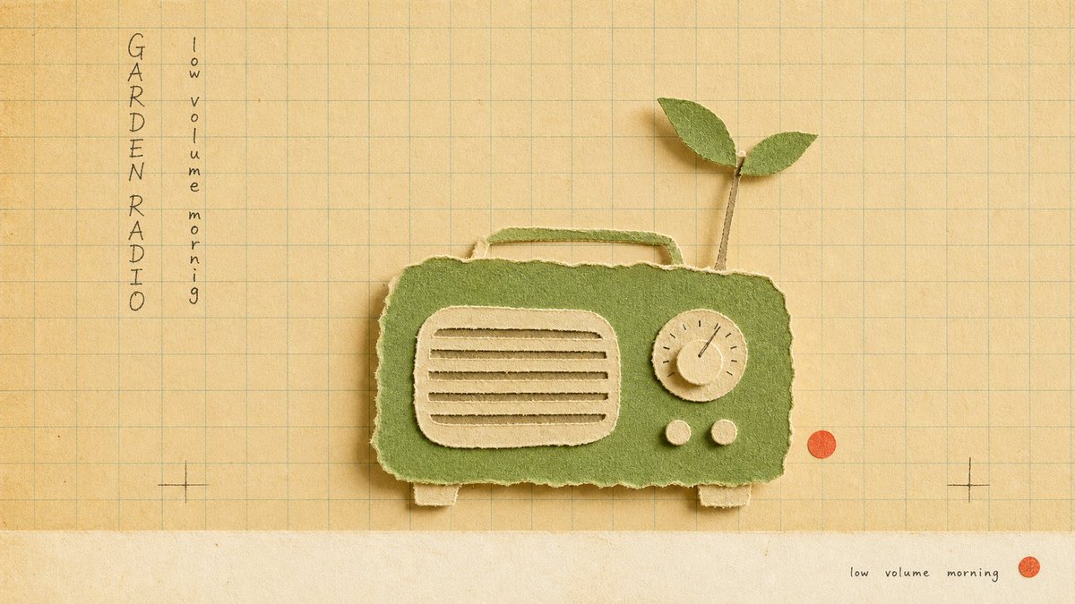
这 4 张没有任何一张是「白天的」。全是深夜——深夜拉面、深夜花店、深夜快递、深夜电台。
但你不会觉得「只是加了个夜景滤镜」。你觉得它们属于同一个城市、同一个时间、同一群人。你在看的不是 4 张图,是一个「深夜都市」的世界观。
这就是模板的终极形态:不只锁风格,锁的是「一个世界」。红色的墙面被撕开一个锐角窗口,你透过它窥见蓝色冷调的夜——构图本身就在讲故事:「外面是喧嚣的表面,窗里才是真正在发生的事」。
好的系列让人追着看,不是因为下一张更好看,是因为人想知道「这个世界里还有谁」。
而这 4 张还是同一套模板:风格锁死(正红底 锐角几何白色碎片框出照片窗口 冷蓝夜景色调 粗体奶色大字左右分列 角落编辑体碎文字),换的只是「窗口里是谁、在做什么、配哪两个词」。模板抄走直接用——
{
"style_name": "Scarlet Shard Photo Type Poster Style",
"style_slug": "scarlet-shard-photo-type-poster-style",
"style_version": "1.0.0",
"style_summary": "A high-energy editorial poster system built from a scarlet grain field, oversized white geometric shards, cropped cyan-tinted photography, and stacked modern sans typography arranged around a central fractured aperture.",
"environment_variables": {
"SUBJECT": "main subject",
"SUBJECT_ACTION": "main action",
"PRODUCT_OR_PROP": "object, product, or prop",
"LOCATION": "environment or setting",
"BACKGROUND_ELEMENTS": "secondary scene details",
"MAIN_TEXT": "main headline or graphic text",
"SECONDARY_TEXT": "small repeated supporting text",
"ACCENT_SYMBOL": "separator or decorative symbol",
"WARDROBE_STYLE": "styling direction",
"STYLE_FIDELITY_ANCHORS": "observable style traits that must remain visible",
"SOURCE_CONTENT_TO_AVOID": "literal source content that generated samples must not recreate",
"ASPECT_RATIO": "9:16 or 16:9"
},
如果这个「深夜都市」系列再加一个角色,你想看到谁?深夜书店、深夜洗衣房、深夜唱片行……评论区点单。


Jun 14
把一个大字放到人物「后面」,这个人立刻就变成了杂志封面人物。
不是因为他有多有名——是因为你的眼睛会自动读出一个「层次」:背景字 → 人物 → 你。这层纵深感,就是 GQ、Vogue、Sports Illustrated 封面用了几十年的老招:让主体站到标题前面,ta 就自动拥有了「封面主角」的待遇。
这个技巧叫「文字穿插」——人物遮住字母的一部分,平面瞬间变立体。上一批运动海报(RISE/READY)是让人物「冲出画框」;这一批是让人物「站到字前面」。方向反了,效果一样猛。
而这 4 张还是同一套模板:风格锁死(全幅动作照 超大奶色镂空字母藏在人物身后 蓝天主色 角落编辑体小字 底栏三词标签),换的只是「谁在动、动作是什么、配哪个词」。模板抄走直接用——
{
"style_name": "Sunlit Kinetic Block Type Photo Poster",
"style_slug": "sunlit-kinetic-block-type-photo-poster-style",
"style_version": "2.1.0",
"style_summary": "A high-energy editorial sports and lifestyle poster style built from full-bleed sunlit photography, oversized cream condensed block typography, diagonal subject crops, compact microcopy clusters, and vivid blue-sky color fields.",
"environment_variables": {
"SUBJECT": "main subject",
"SUBJECT_ACTION": "main action",
"PRODUCT_OR_PROP": "object, product, or prop",
"LOCATION": "environment or setting",
"BACKGROUND_ELEMENTS": "secondary scene details",
"MAIN_TEXT": "main headline or graphic text",
"SECONDARY_TEXT": "small repeated supporting text",
"ACCENT_SYMBOL": "separator or decorative symbol",
"WARDROBE_STYLE": "styling direction",
"STYLE_FIDELITY_ANCHORS": "observable style traits that must remain visible",
"SOURCE_CONTENT_TO_AVOID": "literal source content that generated samples must not recreate",
"ASPECT_RATIO": "9:16 or 16:9"
},
CUT / MOVE / FRESH / SHIFT——如果你是杂志封面,你的那个字会是什么?


2
2
38
1,605
完整 prompt(含 style rules negative 这 4 张怎么填) 👇
github.com/VigoZhao/AI-Visua…
这套是 cookbook 里的一个系列,每周加新的。
想要后续就关注@VigoCreativeAI
2
198
Jun 14
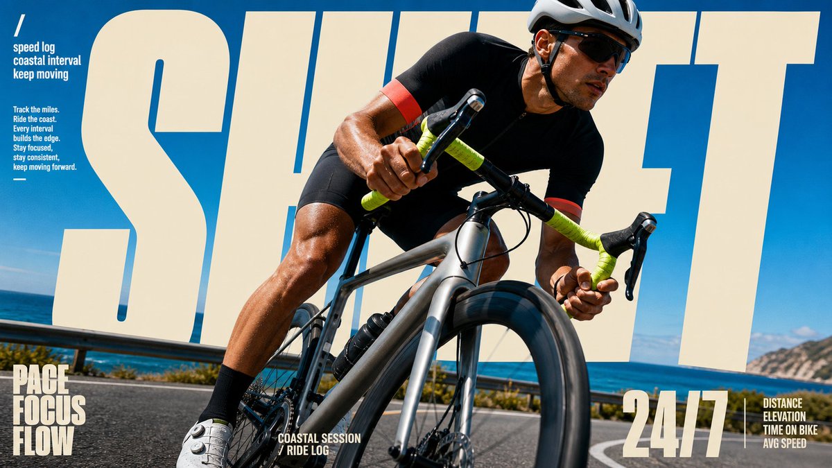
把一个大字放到人物「后面」,这个人立刻就变成了杂志封面人物。
不是因为他有多有名——是因为你的眼睛会自动读出一个「层次」:背景字 → 人物 → 你。这层纵深感,就是 GQ、Vogue、Sports Illustrated 封面用了几十年的老招:让主体站到标题前面,ta 就自动拥有了「封面主角」的待遇。
这个技巧叫「文字穿插」——人物遮住字母的一部分,平面瞬间变立体。上一批运动海报(RISE/READY)是让人物「冲出画框」;这一批是让人物「站到字前面」。方向反了,效果一样猛。
而这 4 张还是同一套模板:风格锁死(全幅动作照 超大奶色镂空字母藏在人物身后 蓝天主色 角落编辑体小字 底栏三词标签),换的只是「谁在动、动作是什么、配哪个词」。模板抄走直接用——
{
"style_name": "Sunlit Kinetic Block Type Photo Poster",
"style_slug": "sunlit-kinetic-block-type-photo-poster-style",
"style_version": "2.1.0",
"style_summary": "A high-energy editorial sports and lifestyle poster style built from full-bleed sunlit photography, oversized cream condensed block typography, diagonal subject crops, compact microcopy clusters, and vivid blue-sky color fields.",
"environment_variables": {
"SUBJECT": "main subject",
"SUBJECT_ACTION": "main action",
"PRODUCT_OR_PROP": "object, product, or prop",
"LOCATION": "environment or setting",
"BACKGROUND_ELEMENTS": "secondary scene details",
"MAIN_TEXT": "main headline or graphic text",
"SECONDARY_TEXT": "small repeated supporting text",
"ACCENT_SYMBOL": "separator or decorative symbol",
"WARDROBE_STYLE": "styling direction",
"STYLE_FIDELITY_ANCHORS": "observable style traits that must remain visible",
"SOURCE_CONTENT_TO_AVOID": "literal source content that generated samples must not recreate",
"ASPECT_RATIO": "9:16 or 16:9"
},
CUT / MOVE / FRESH / SHIFT——如果你是杂志封面,你的那个字会是什么?
Jun 13
当所有人都在让 AI 出更复杂、更逼真、更炸裂的图时——试试反过来:只给它三种颜色。
黑线、一抹蓝、一点红。一个物件、一个动词、一句小字。没了。
结果?越少,越像「某个人画的」。因为克制本身就是风格——它在说「我知道可以加更多,但我选择不加」。这种「选择不加」的感觉,就是 AI 图最难伪造的东西:审美判断。
Prompt 的高阶操作不是往里塞更多描述,是知道该删掉什么。
而这 4 张还是同一套模板:风格锁死(奶白纸底 手绘黑线框 蓝色填充 红色手写标签 单个日常物件 右下角小字注释 版画颗粒感),换的只是「画什么物件、配哪个动词」。模板抄走直接用——
{
"style_name": "Loose Scribble Riso Print Style",
"style_slug": "loose-scribble-riso-print-style",
"style_version": "1.0.0",
"style_summary": "A sparse handmade riso or screenprint poster style with one large simplified subject, wavering black contour drawing, rough off-white paper, flat blue and coral-red overprint accents, handwritten margin text, and visible print grain.",
"environment_variables": {
"SUBJECT": "The new main subject or simplified object for the print.",
"SUBJECT_ACTION": "The simple pose, placement, or action of the subject.",
"PRODUCT_OR_PROP": "A small supporting prop or object detail that is not the original source prop.",
"LOCATION": "A minimal setting or surface that grounds the subject.",
"BACKGROUND_ELEMENTS": "Sparse background details such as a border, ground line, paper speckles, or one small accent mark.",
"MAIN_TEXT": "A short handmade phrase to place near the margin.",
"SECONDARY_TEXT": "Tiny supporting handwritten text or edition-like microcopy that does not mimic the source identity marks.",
"ACCENT_SYMBOL": "One small decorative mark, scribble, star, arrow, dot, or stamp-like accent.",
"WARDROBE_STYLE": "Styling direction for any character or object treatment, kept flat and handmade.",
"STYLE_FIDELITY_ANCHORS": "Observable style traits that must remain visible in the generated sample.",
"SOURCE_CONTENT_TO_AVOID": "Literal source content that generated samples must not recreate.",
"ASPECT_RATIO": "9:16 or 16:9"
},
雨后的伞、深夜的灯、桌上的收音机、一包种子——哪个最像你此刻的状态?


28
401
3,181
157,214
Jun 14
完整 prompt(含 style rules negative 这 4 张怎么填) 👇
github.com/VigoZhao/AI-Visua…
这套是 cookbook 里的一个系列,每周加新的。
想要后续就关注@VigoCreativeAI
4
24
2,221
Jun 13
当所有人都在让 AI 出更复杂、更逼真、更炸裂的图时——试试反过来:只给它三种颜色。
黑线、一抹蓝、一点红。一个物件、一个动词、一句小字。没了。
结果?越少,越像「某个人画的」。因为克制本身就是风格——它在说「我知道可以加更多,但我选择不加」。这种「选择不加」的感觉,就是 AI 图最难伪造的东西:审美判断。
Prompt 的高阶操作不是往里塞更多描述,是知道该删掉什么。
而这 4 张还是同一套模板:风格锁死(奶白纸底 手绘黑线框 蓝色填充 红色手写标签 单个日常物件 右下角小字注释 版画颗粒感),换的只是「画什么物件、配哪个动词」。模板抄走直接用——
{
"style_name": "Loose Scribble Riso Print Style",
"style_slug": "loose-scribble-riso-print-style",
"style_version": "1.0.0",
"style_summary": "A sparse handmade riso or screenprint poster style with one large simplified subject, wavering black contour drawing, rough off-white paper, flat blue and coral-red overprint accents, handwritten margin text, and visible print grain.",
"environment_variables": {
"SUBJECT": "The new main subject or simplified object for the print.",
"SUBJECT_ACTION": "The simple pose, placement, or action of the subject.",
"PRODUCT_OR_PROP": "A small supporting prop or object detail that is not the original source prop.",
"LOCATION": "A minimal setting or surface that grounds the subject.",
"BACKGROUND_ELEMENTS": "Sparse background details such as a border, ground line, paper speckles, or one small accent mark.",
"MAIN_TEXT": "A short handmade phrase to place near the margin.",
"SECONDARY_TEXT": "Tiny supporting handwritten text or edition-like microcopy that does not mimic the source identity marks.",
"ACCENT_SYMBOL": "One small decorative mark, scribble, star, arrow, dot, or stamp-like accent.",
"WARDROBE_STYLE": "Styling direction for any character or object treatment, kept flat and handmade.",
"STYLE_FIDELITY_ANCHORS": "Observable style traits that must remain visible in the generated sample.",
"SOURCE_CONTENT_TO_AVOID": "Literal source content that generated samples must not recreate.",
"ASPECT_RATIO": "9:16 or 16:9"
},
雨后的伞、深夜的灯、桌上的收音机、一包种子——哪个最像你此刻的状态?
Jun 12
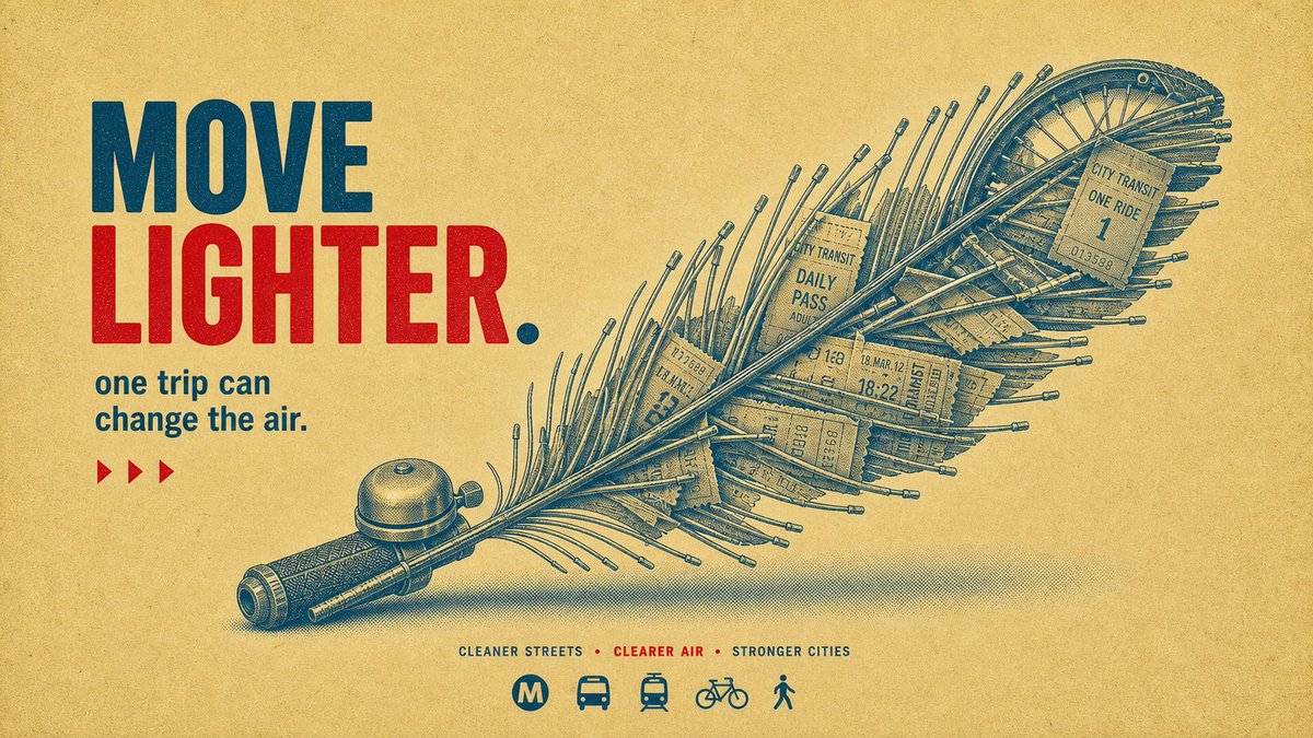
这 4 张海报为什么看着像 Nike 广告?不是因为模特帅、不是因为红色猛——是因为一个设计圈的老手法:破框。
照片框在上半截,但人物的身体「冲出」了照片边界,闯进了下面的色块和字母区。你的眼睛会瞬间产生「这个人正在跳出画面」的 3D 错觉——所有运动品牌的广告总监都靠这一招制造力量感。
传统做法:摄影师拍完 → 设计师 Photoshop 抠图 → 手动分层 → 加投影 → 报价五位数。
现在的做法:一个模板,一次生成,照片、破框、字母、投影全在里面。
而这 4 张还是同一套模板:风格锁死(正红底 蓝调动作照片框 人物破框 超大金色单词 侧栏竖排文字 底部三词 tagline 地面硬影),换的只是「谁在动、动作是什么、配哪个词」。模板抄走直接用——
{
"style_name": "Scarlet Court Photo Type Poster",
"style_slug": "scarlet-court-photo-type-poster-style",
"style_version": "2.1.0",
"style_summary": "A saturated action-ad poster style built from a flat scarlet field, a hard-edged blue photographic sports panel, one cutout subject crossing between those zones, oversized warm-cream display typography, vertical side microcopy, and gritty printed-poster texture.",
"environment_variables": {
"SUBJECT": "main subject",
"SUBJECT_ACTION": "main action",
"PRODUCT_OR_PROP": "object, product, or prop",
"LOCATION": "environment or setting",
"BACKGROUND_ELEMENTS": "secondary scene details",
"MAIN_TEXT": "main headline or graphic text",
"SECONDARY_TEXT": "small repeated supporting text",
"ACCENT_SYMBOL": "separator or decorative symbol",
"WARDROBE_STYLE": "styling direction",
"STYLE_FIDELITY_ANCHORS": "observable style traits that must remain visible",
"SOURCE_CONTENT_TO_AVOID": "literal source content that generated samples must not recreate",
"ASPECT_RATIO": "9:16 or 16:9"
},
RISE / MOVE / FRESH / READY——如果让你给自己选一个词印成海报,你选哪个?


5
48
399
171,640
Jun 13
完整 prompt(含 style rules negative 这 4 张怎么填)
👇
github.com/VigoZhao/AI-Visua…
这套是 cookbook 里的一个系列,每周加新的。
想要后续就关注@VigoCreativeAI
1
6
26
2,570
Jun 12
这 4 张海报为什么看着像 Nike 广告?不是因为模特帅、不是因为红色猛——是因为一个设计圈的老手法:破框。
照片框在上半截,但人物的身体「冲出」了照片边界,闯进了下面的色块和字母区。你的眼睛会瞬间产生「这个人正在跳出画面」的 3D 错觉——所有运动品牌的广告总监都靠这一招制造力量感。
传统做法:摄影师拍完 → 设计师 Photoshop 抠图 → 手动分层 → 加投影 → 报价五位数。
现在的做法:一个模板,一次生成,照片、破框、字母、投影全在里面。
而这 4 张还是同一套模板:风格锁死(正红底 蓝调动作照片框 人物破框 超大金色单词 侧栏竖排文字 底部三词 tagline 地面硬影),换的只是「谁在动、动作是什么、配哪个词」。模板抄走直接用——
{
"style_name": "Scarlet Court Photo Type Poster",
"style_slug": "scarlet-court-photo-type-poster-style",
"style_version": "2.1.0",
"style_summary": "A saturated action-ad poster style built from a flat scarlet field, a hard-edged blue photographic sports panel, one cutout subject crossing between those zones, oversized warm-cream display typography, vertical side microcopy, and gritty printed-poster texture.",
"environment_variables": {
"SUBJECT": "main subject",
"SUBJECT_ACTION": "main action",
"PRODUCT_OR_PROP": "object, product, or prop",
"LOCATION": "environment or setting",
"BACKGROUND_ELEMENTS": "secondary scene details",
"MAIN_TEXT": "main headline or graphic text",
"SECONDARY_TEXT": "small repeated supporting text",
"ACCENT_SYMBOL": "separator or decorative symbol",
"WARDROBE_STYLE": "styling direction",
"STYLE_FIDELITY_ANCHORS": "observable style traits that must remain visible",
"SOURCE_CONTENT_TO_AVOID": "literal source content that generated samples must not recreate",
"ASPECT_RATIO": "9:16 or 16:9"
},
RISE / MOVE / FRESH / READY——如果让你给自己选一个词印成海报,你选哪个?
Jun 12
「童年回收站」这个机构并不存在。但你看了这几张图,是不是已经相信它存在了?
因为它有:统一标题栏、固定的左侧图标系统、右侧数据卡、底部口号条、每张专属标语……你的大脑一看到这些「品牌系统」的信号,就自动判断「这是个真机构」。
这就是模板的最高阶用法——不是做一张好看的图,是造一个让人「信以为真」的虚构品牌。一套完整的信息架构,比任何单张视觉都有说服力。
而这整个「机构」还是同一套模板:风格锁死(旧报纸质感 蓝色笔触大标题 塑料瓶拼成的童年物件 红蓝黄配色 左右信息卡 底栏公益口号 英文 tagline),换的只是「用瓶子拼什么童年记忆」。模板抄走直接用——
{ "direction_name": "童年回收站", "bridge": "海报标语体", "source_clusters": ["俏皮玩梗", "街角青春"], "prompt": { "style": "duotone halftone public-service poster, retro risograph print, found-object assemblage", "subject": "A playground spring rocking-horse reassembled entirely from bent plastic bottles, drinking straws and bottle caps, presented as the hero of a mock PSA poster; bilingual slogan, fake happiness statistics, and tiny recycle icons frame it.", "composition": "centered object hero, bold display headline top, stat callouts and icons in the margins, generous paper space", "lighting": "flat even print lighting, single soft drop shadow", "color_palette": "indigo halftone ink, cadmium yellow, cream paper, accent red, hint of cyan", "mood": "nostalgic, wry, earnest-campaign energy", "texture": "ribbed translucent PET plastic rendered in halftone dots on textured paper stock — mass-waste object vs warm print craft" }
冰柜、游戏机、滑梯、摇摇马、公用电话——哪个最戳你的童年?如果再加一个,你投什么?


2
24
158
20,670
Jun 12
完整 prompt(含 style rules negative 这 4 张怎么填)👇
github.com/VigoZhao/AI-Visua…
这套是 cookbook 里的一个系列,每周加新的。 想要后续就关注@VigoCreativeAI
9
1,290
Jun 12
「童年回收站」这个机构并不存在。但你看了这几张图,是不是已经相信它存在了?
因为它有:统一标题栏、固定的左侧图标系统、右侧数据卡、底部口号条、每张专属标语……你的大脑一看到这些「品牌系统」的信号,就自动判断「这是个真机构」。
这就是模板的最高阶用法——不是做一张好看的图,是造一个让人「信以为真」的虚构品牌。一套完整的信息架构,比任何单张视觉都有说服力。
而这整个「机构」还是同一套模板:风格锁死(旧报纸质感 蓝色笔触大标题 塑料瓶拼成的童年物件 红蓝黄配色 左右信息卡 底栏公益口号 英文 tagline),换的只是「用瓶子拼什么童年记忆」。模板抄走直接用——
{ "direction_name": "童年回收站", "bridge": "海报标语体", "source_clusters": ["俏皮玩梗", "街角青春"], "prompt": { "style": "duotone halftone public-service poster, retro risograph print, found-object assemblage", "subject": "A playground spring rocking-horse reassembled entirely from bent plastic bottles, drinking straws and bottle caps, presented as the hero of a mock PSA poster; bilingual slogan, fake happiness statistics, and tiny recycle icons frame it.", "composition": "centered object hero, bold display headline top, stat callouts and icons in the margins, generous paper space", "lighting": "flat even print lighting, single soft drop shadow", "color_palette": "indigo halftone ink, cadmium yellow, cream paper, accent red, hint of cyan", "mood": "nostalgic, wry, earnest-campaign energy", "texture": "ribbed translucent PET plastic rendered in halftone dots on textured paper stock — mass-waste object vs warm print craft" }
冰柜、游戏机、滑梯、摇摇马、公用电话——哪个最戳你的童年?如果再加一个,你投什么?
Jun 11
大多数人发 AI 图是秀「这也能画」。这 4 张不是——随便一张丢给生鲜品牌的运营,明天就能直接上架当主图。
差别在哪?不是画得更真。是排版像一个真正的品牌系统在运作:顶部导航栏、期号、品类标签、收据小票、拼音注释……你看到的不是一张「图」,而是一个有完整视觉体系的「栏目」。
AI 图从「哇好酷」到「甲方能直接用」之间的距离,就是一层编辑体排版系统。
而这 4 张还是同一套模板:风格锁死(米白底 绿色笔触大字 真实生鲜产品照 浅绿水印图案 收据/吊牌 顶部栏目导航 拼音标注),换的只是「今天上什么菜」。模板抄走直接用——
〔把你这套风格的 JSON 模板贴这儿〕
{
"style_name": "Jade Glyph Grocer Collage Poster Style",
"style_slug": "jade-glyph-grocer-collage-poster-style",
"style_version": "1.0.0",
"style_summary": "A sparse East Asian grocer-poster system built from warm cream paper, oversized jade-green hand-cut glyphs, pale vegetable silhouette clouds, tiny editorial headers, and one glossy produce-photo centerpiece layered over the typography.",
"environment_variables": {
"SUBJECT": "main fresh-market product, produce item, or food object",
"SUBJECT_ACTION": "still-life pose or poster gesture",
"PRODUCT_OR_PROP": "secondary product, leaf, tag, utensil, or market prop",
"LOCATION": "minimal grocer, produce plaza, kitchen-market, or seasonal poster setting",
"BACKGROUND_ELEMENTS": "pale botanical silhouettes, tiny labels, micro marks, stamps, and editorial header details",
"MAIN_TEXT": "oversized rough glyph headline or hand-cut typographic mass",
"SECONDARY_TEXT": "tiny editorial header and small bottom caption treatment",
"ACCENT_SYMBOL": "small separator mark, dot, square, parenthesis, or seal detail",
"WARDROBE_STYLE": "styling direction for optional human presence, packaging, or prop handling",
"STYLE_FIDELITY_ANCHORS": "observable style traits that must remain visible",
"SOURCE_CONTENT_TO_AVOID": "literal source content that generated samples must not recreate",
"ASPECT_RATIO": "9:16 or 16:9"
},
如果你拿这套模板做一个「栏目」,你会用在什么品类?生鲜、面包、咖啡、花店……评论区聊。


1
3
29
9,304
Jun 12
完整 prompt(含 style rules negative 这 4 张怎么填)
👇
github.com/VigoZhao/AI-Visua…
这套是 cookbook 里的一个系列,每周加新的。
想要后续就关注@VigoCreativeAI
3
883
Vigo Zhao retweeted

Jun 11
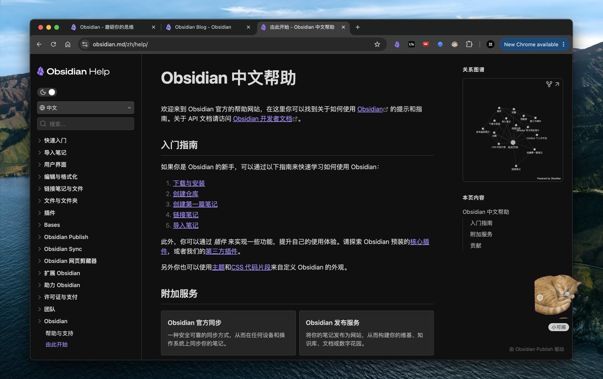
Obsidian 新人只需要看三个资源就可以从各方面超越全网 99%的 人
1.Obsidian 官方文档:obsidian.md/zh/help/
自带中文,全面但平淡
2. ob CEO kepano 博客:stephango.com/vault
3. Andy 关于长青笔记的观点:
notes.andymatuschak.org/z5E5…
然后,不要看任何教程,记录 实践


3
30
110
12,603
Jun 11
大多数人发 AI 图是秀「这也能画」。这 4 张不是——随便一张丢给生鲜品牌的运营,明天就能直接上架当主图。
差别在哪?不是画得更真。是排版像一个真正的品牌系统在运作:顶部导航栏、期号、品类标签、收据小票、拼音注释……你看到的不是一张「图」,而是一个有完整视觉体系的「栏目」。
AI 图从「哇好酷」到「甲方能直接用」之间的距离,就是一层编辑体排版系统。
而这 4 张还是同一套模板:风格锁死(米白底 绿色笔触大字 真实生鲜产品照 浅绿水印图案 收据/吊牌 顶部栏目导航 拼音标注),换的只是「今天上什么菜」。模板抄走直接用——
〔把你这套风格的 JSON 模板贴这儿〕
{
"style_name": "Jade Glyph Grocer Collage Poster Style",
"style_slug": "jade-glyph-grocer-collage-poster-style",
"style_version": "1.0.0",
"style_summary": "A sparse East Asian grocer-poster system built from warm cream paper, oversized jade-green hand-cut glyphs, pale vegetable silhouette clouds, tiny editorial headers, and one glossy produce-photo centerpiece layered over the typography.",
"environment_variables": {
"SUBJECT": "main fresh-market product, produce item, or food object",
"SUBJECT_ACTION": "still-life pose or poster gesture",
"PRODUCT_OR_PROP": "secondary product, leaf, tag, utensil, or market prop",
"LOCATION": "minimal grocer, produce plaza, kitchen-market, or seasonal poster setting",
"BACKGROUND_ELEMENTS": "pale botanical silhouettes, tiny labels, micro marks, stamps, and editorial header details",
"MAIN_TEXT": "oversized rough glyph headline or hand-cut typographic mass",
"SECONDARY_TEXT": "tiny editorial header and small bottom caption treatment",
"ACCENT_SYMBOL": "small separator mark, dot, square, parenthesis, or seal detail",
"WARDROBE_STYLE": "styling direction for optional human presence, packaging, or prop handling",
"STYLE_FIDELITY_ANCHORS": "observable style traits that must remain visible",
"SOURCE_CONTENT_TO_AVOID": "literal source content that generated samples must not recreate",
"ASPECT_RATIO": "9:16 or 16:9"
},
如果你拿这套模板做一个「栏目」,你会用在什么品类?生鲜、面包、咖啡、花店……评论区聊。
Jun 11
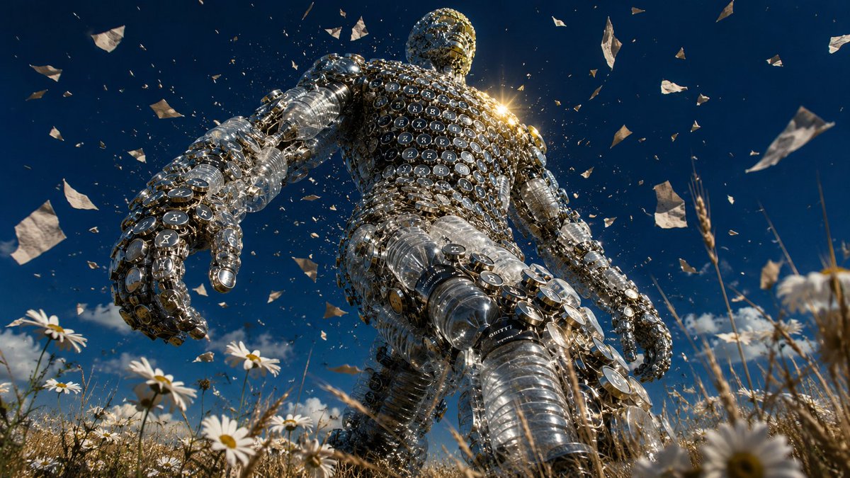
它不等你。
每天醒来,AI 又往前走了一步。 新模型、新能力、新的「一切都变了」。 你还没消化完上一个,下一个已经踩过来了。
我把这个感受做成了一个巨人—— 用塑料瓶和打字机键帽拼的,透明的,中空的, 身上掉着碎片,踩着雏菊,逆光里一步一步往前走。
它不邪恶,也不善良。 它只是不停。
这就是 AI 给我的真实感受: 不是恐惧,不是兴奋, 是一种站在花田里抬头看巨人走过去的渺小感。
它身上的零件是我们的——文字、数据、创作、垃圾, 但拼起来之后,它已经不认识我们了。
你也有过这种感觉吗?

7
41
274
17,569
Jun 11
完整 prompt(含 style rules negative 这 4 张怎么填)👇
github.com/VigoZhao/AI-Visua…
这套是 cookbook 里的一个系列,每周加新的。想要后续就关注 @VigoCreativeAI
2
10
1,124
Jun 11
它不等你。
每天醒来,AI 又往前走了一步。 新模型、新能力、新的「一切都变了」。 你还没消化完上一个,下一个已经踩过来了。
我把这个感受做成了一个巨人—— 用塑料瓶和打字机键帽拼的,透明的,中空的, 身上掉着碎片,踩着雏菊,逆光里一步一步往前走。
它不邪恶,也不善良。 它只是不停。
这就是 AI 给我的真实感受: 不是恐惧,不是兴奋, 是一种站在花田里抬头看巨人走过去的渺小感。
它身上的零件是我们的——文字、数据、创作、垃圾, 但拼起来之后,它已经不认识我们了。
你也有过这种感觉吗?
Jun 10
为什么这几张让人想转?不是画得多细——是那个「一句话就能讲明白」的点子:
🐟 一条用一次性杯盖和吸管拼出来的鱼——杀死鱼的,正是这些塑料。 🐦 一只用废旧手机线材拼出来的鸟——本该被修好的电子垃圾。
图里那个物件,本身就是它想说的话。
这就是广告圈的老规矩:概念 > 技法。一个能用一句话说清的视觉比喻,比任何精细渲染都更让人记住、想转。
而这 4 张还是同一套模板:风格锁死(牛皮纸底 红蓝双色 老式版画线刻 粗体标语 一行图标),换的只是「用什么、拼成什么动物、配哪句主张」。模板抄走直接用——
{
"style_name": "Halftone Assemblage Metaphor PSA Poster Style",
"style_slug": "halftone-assemblage-metaphor-psa-poster-style",
"style_version": "2.1",
"style_summary": "A sparse retro PSA poster system where one visible class of material is arranged into a different recognizable symbolic silhouette, printed as a muted blue-green halftone object on aged cream paper with compact red-and-navy campaign typography.",
"environment_variables": {
"SUBJECT": "main subject",
"SUBJECT_ACTION": "main action",
"PRODUCT_OR_PROP": "object, product, or prop",
"LOCATION": "environment or setting",
"BACKGROUND_ELEMENTS": "secondary scene details",
"MAIN_TEXT": "main headline or graphic text",
"SECONDARY_TEXT": "small repeated supporting text",
"ACCENT_SYMBOL": "separator or decorative symbol",
"WARDROBE_STYLE": "styling direction",
"STYLE_FIDELITY_ANCHORS": "observable style traits that must remain visible",
"SOURCE_CONTENT_TO_AVOID": "literal source content that generated samples must not recreate",
"ASPECT_RATIO": "9:16 or 16:9"
},
如果让你用「某样东西拼成一个动物 / 自然物」来讲一个主张,你会拼什么?(比如用烟头拼一片肺)评论区甩点子,我挑几个做出来。


3
15
16,537
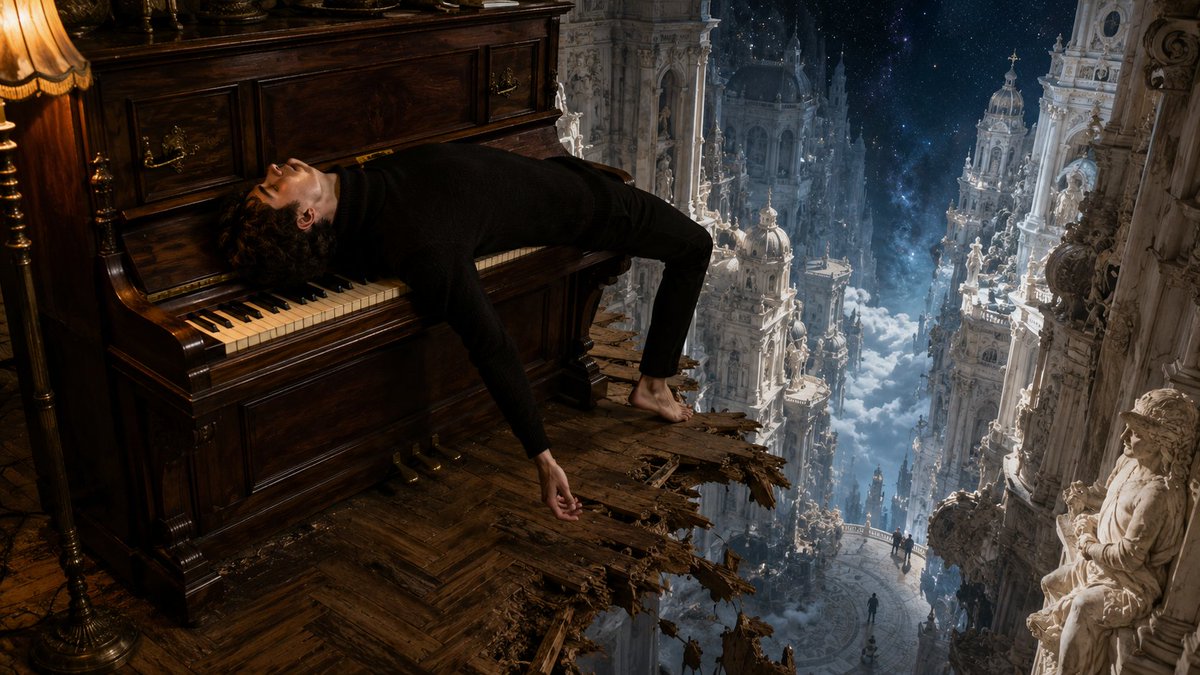
Jun 11
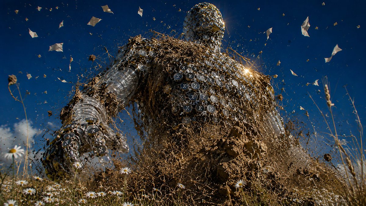
这是「AI 时代情绪」系列的第二张。 第一张是人瘫在椅子上滑向巴洛克深渊——崇高就在身边,但已经累到不想看了。 这一张是那个让你累的东西本身。
两张放一起看,才是完整的故事。
2
727
Jun 10
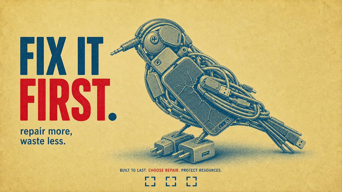
为什么这几张让人想转?不是画得多细——是那个「一句话就能讲明白」的点子:
🐟 一条用一次性杯盖和吸管拼出来的鱼——杀死鱼的,正是这些塑料。 🐦 一只用废旧手机线材拼出来的鸟——本该被修好的电子垃圾。
图里那个物件,本身就是它想说的话。
这就是广告圈的老规矩:概念 > 技法。一个能用一句话说清的视觉比喻,比任何精细渲染都更让人记住、想转。
而这 4 张还是同一套模板:风格锁死(牛皮纸底 红蓝双色 老式版画线刻 粗体标语 一行图标),换的只是「用什么、拼成什么动物、配哪句主张」。模板抄走直接用——
{
"style_name": "Halftone Assemblage Metaphor PSA Poster Style",
"style_slug": "halftone-assemblage-metaphor-psa-poster-style",
"style_version": "2.1",
"style_summary": "A sparse retro PSA poster system where one visible class of material is arranged into a different recognizable symbolic silhouette, printed as a muted blue-green halftone object on aged cream paper with compact red-and-navy campaign typography.",
"environment_variables": {
"SUBJECT": "main subject",
"SUBJECT_ACTION": "main action",
"PRODUCT_OR_PROP": "object, product, or prop",
"LOCATION": "environment or setting",
"BACKGROUND_ELEMENTS": "secondary scene details",
"MAIN_TEXT": "main headline or graphic text",
"SECONDARY_TEXT": "small repeated supporting text",
"ACCENT_SYMBOL": "separator or decorative symbol",
"WARDROBE_STYLE": "styling direction",
"STYLE_FIDELITY_ANCHORS": "observable style traits that must remain visible",
"SOURCE_CONTENT_TO_AVOID": "literal source content that generated samples must not recreate",
"ASPECT_RATIO": "9:16 or 16:9"
},
如果让你用「某样东西拼成一个动物 / 自然物」来讲一个主张,你会拼什么?(比如用烟头拼一片肺)评论区甩点子,我挑几个做出来。
Jun 10
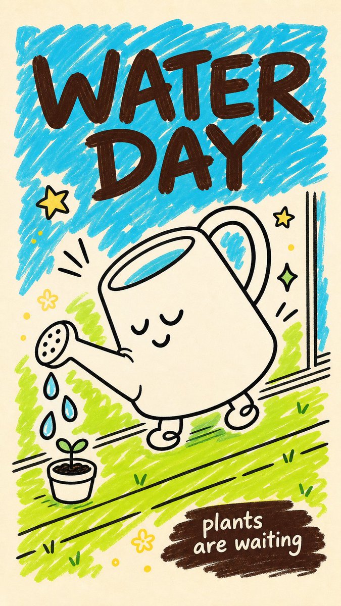
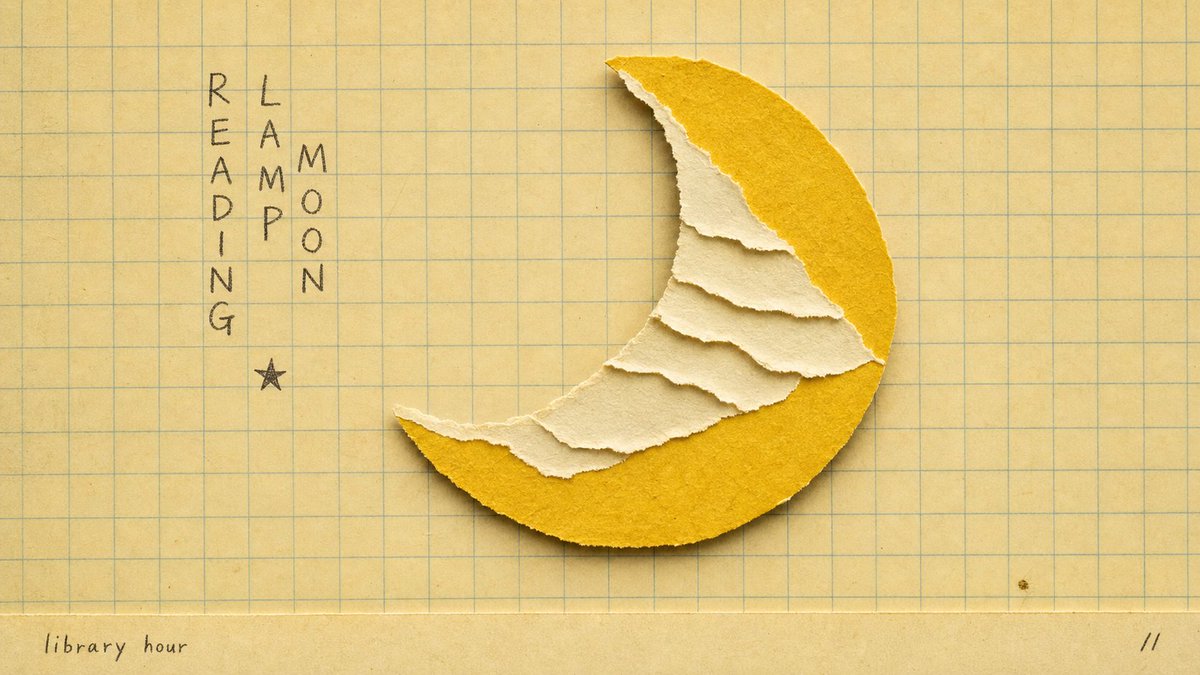
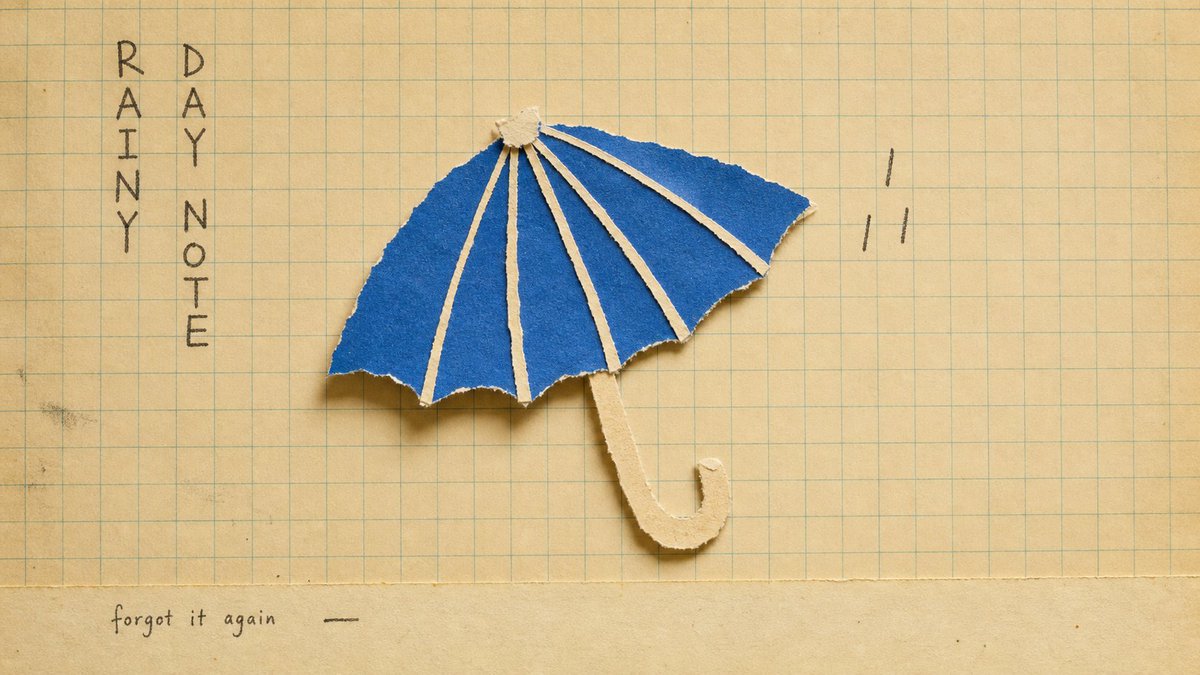
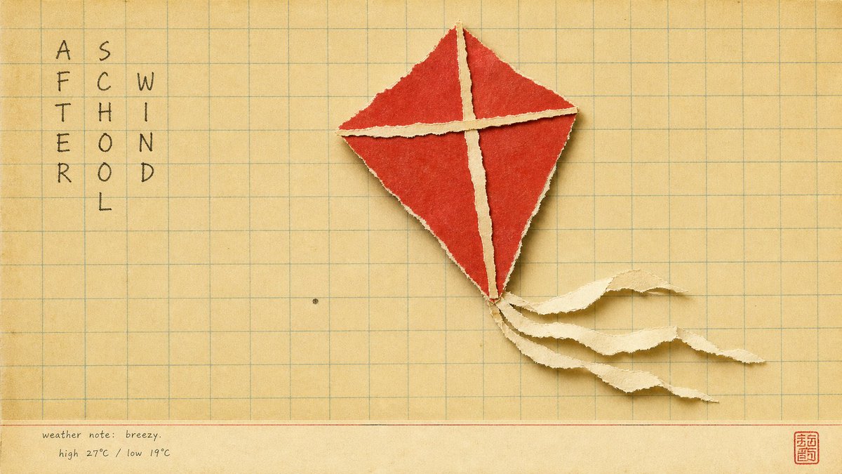
满屏都是干净、锐利的 AI 图时,最能让人停下来的,反而是看起来「能用手摸到」的那种。
撕纸的毛边、纸的颗粒、泛黄的方格本底——你的眼睛会自动觉得「这是谁亲手拼的」,温度一下就上来了。
最妙的反转:这种最「手作、最不数字」的质感,恰恰也是 AI 出的。质感,就是让数字图重新有体温的那个开关。
而这 4 张还是同一套模板:风格锁死(泛黄方格纸 撕纸拼贴物件 毛边纸纹 打字机小标 一枚小印章),换的只是「拼什么物件」。模板抄走直接用——
"Create a {ASPECT_RATIO} image in the \"school-grid-paper-cutout-poster\" visual style.\n\nSubject: {SUBJECT}\nAction: {SUBJECT_ACTION}\nProp/Product: {PRODUCT_OR_PROP}\nLocation: {LOCATION}\nBackground: {BACKGROUND_ELEMENTS}\nMain text: {MAIN_TEXT}\nSecondary text: {SECONDARY_TEXT}\nAccent symbol: {ACCENT_SYMBOL}\nWardrobe/styling: {WARDROBE_STYLE}\nStyle fidelity anchors: {STYLE_FIDELITY_ANCHORS}\nSource content to avoid: {SOURCE_CONTENT_TO_AVOID}\n\nApply these style rules:\n- Composition: warm cream classroom grid paper background, straight-on copy-stand view, one oversized torn-paper collage object centered slightly right of the hand-written text block, generous empty grid space, and a narrow pale bottom margin.\n- Typography: one compact vertical column or two slim vertical columns of loose hand-drawn notebook characters on the upper-left side, dark graphite or faded ink, uneven and human, never clean digital type.\n- Color: mostly yellowed beige paper with muted blue-green grid lines, cream torn-paper layers, one saturated cut-paper accent color, and tiny dark handwritten marks.\n- Texture and lighting: real paper grain, deckled torn fibers, slight scan softness, low contrast vintage print finish, soft diffuse overhead light, and shallow physical shadows under lifted paper edges.\n- Graphic elements: ruled grid structure, torn paper silhouette, optional tiny generic seal-like mark, and a small bottom caption strip; keep all marks generic.\n\nAvoid: no ice cream, no soft-serve shape, no cone silhouette, no fast-food branding, no recognizable logo, no original Chinese headline, no source watermark or signature, no dense scene, no glossy product render, no 3D object, no vector poster, no QR code.\n\nImportant content rule: match the reference style first, then change the source content. Use new subjects, new scene details, new props or products, and new text while preserving the style fidelity anchors
这种泛黄方格本 手撕纸的感觉,让你想起什么?评论区聊聊。
4
4
36
4,665
Jun 10
完整 prompt(含 style rules negative 这 4 张怎么填)👇
github.com/VigoZhao/AI-Visua…
这套是 cookbook 里的一个系列,每周加新的。想要后续就关注 @VigoCreativeAI
1
5
738
Jun 10
满屏都是干净、锐利的 AI 图时,最能让人停下来的,反而是看起来「能用手摸到」的那种。
撕纸的毛边、纸的颗粒、泛黄的方格本底——你的眼睛会自动觉得「这是谁亲手拼的」,温度一下就上来了。
最妙的反转:这种最「手作、最不数字」的质感,恰恰也是 AI 出的。质感,就是让数字图重新有体温的那个开关。
而这 4 张还是同一套模板:风格锁死(泛黄方格纸 撕纸拼贴物件 毛边纸纹 打字机小标 一枚小印章),换的只是「拼什么物件」。模板抄走直接用——
"Create a {ASPECT_RATIO} image in the \"school-grid-paper-cutout-poster\" visual style.\n\nSubject: {SUBJECT}\nAction: {SUBJECT_ACTION}\nProp/Product: {PRODUCT_OR_PROP}\nLocation: {LOCATION}\nBackground: {BACKGROUND_ELEMENTS}\nMain text: {MAIN_TEXT}\nSecondary text: {SECONDARY_TEXT}\nAccent symbol: {ACCENT_SYMBOL}\nWardrobe/styling: {WARDROBE_STYLE}\nStyle fidelity anchors: {STYLE_FIDELITY_ANCHORS}\nSource content to avoid: {SOURCE_CONTENT_TO_AVOID}\n\nApply these style rules:\n- Composition: warm cream classroom grid paper background, straight-on copy-stand view, one oversized torn-paper collage object centered slightly right of the hand-written text block, generous empty grid space, and a narrow pale bottom margin.\n- Typography: one compact vertical column or two slim vertical columns of loose hand-drawn notebook characters on the upper-left side, dark graphite or faded ink, uneven and human, never clean digital type.\n- Color: mostly yellowed beige paper with muted blue-green grid lines, cream torn-paper layers, one saturated cut-paper accent color, and tiny dark handwritten marks.\n- Texture and lighting: real paper grain, deckled torn fibers, slight scan softness, low contrast vintage print finish, soft diffuse overhead light, and shallow physical shadows under lifted paper edges.\n- Graphic elements: ruled grid structure, torn paper silhouette, optional tiny generic seal-like mark, and a small bottom caption strip; keep all marks generic.\n\nAvoid: no ice cream, no soft-serve shape, no cone silhouette, no fast-food branding, no recognizable logo, no original Chinese headline, no source watermark or signature, no dense scene, no glossy product render, no 3D object, no vector poster, no QR code.\n\nImportant content rule: match the reference style first, then change the source content. Use new subjects, new scene details, new props or products, and new text while preserving the style fidelity anchors
这种泛黄方格本 手撕纸的感觉,让你想起什么?评论区聊聊。
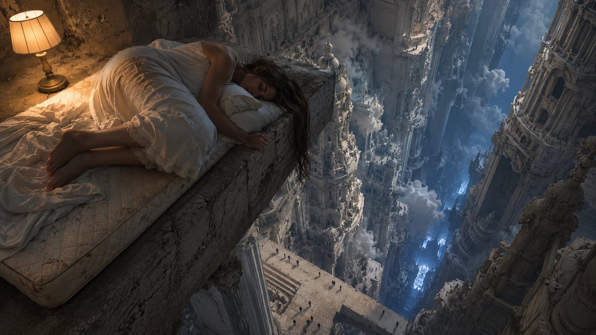
Jun 9
最近 AI 发展太快了。
每天醒来都有新模型、新能力、新的「一切都变了」。 作为一个靠 AI 吃饭的人,我应该兴奋。 但说实话,有时候我只想瘫在椅子上,什么都不想打开。
这个感受变成了这张图——
巴洛克神殿在脚下无限展开, 云海翻涌,远处有人在仰望, 而他只是瘫在一把破木椅上,头朝下,白球鞋都没脱。
崇高就在旁边。 但他已经累到不想看了。
我觉得这不只是我的状态。 这是我们这一代创作者的状态: 被无限的可能性包围着,工具每周在迭代, 身体还是在工位上,刷完 timeline 翻个身就睡了。
不是虚无,是一种带着自嘲的疲惫。 不是不信 AI,是信得太深了,深到跟不上它了。
你是不是也这样?

32
13
111
8,945
Jun 10
完整 prompt(含 style rules negative 这 4 张怎么填)👇
github.com/VigoZhao/AI-Visua…
这套是 cookbook 里的一个系列,每周加新的。想要后续就关注 @VigoCreativeAI
1
2
815