
Renaissance man. Building Digital Businesses since birth @SenditMarkets, @CosmoverseHQ, memeber @superteamAE | ecom & shopify wiz
Joined February 2012
- Tweets 9,069
- Following 1,668
- Followers 3,134
- Likes 14,868
470 Photos and videos


Pinned Tweet

Mar 10
I built an AI that lets you spy on any brand's Facebook ads and ask it what's working.
No dashboards. No scrolling the ad library for hours. Just ask.
"What are their winning ads?"
"What hooks are they running?"
"What launched this week?"
Free access in next tweet
14
7
51
7,855
May 31
follow for more below, even tho you probably wont make the effort to click and get redirected off of twitter but apparently this is what people say i should do... youtube.com/@BasilNas
1
149
Basil retweeted

May 28
we're spending 150k on 15 founders this july.
if you're building:
- a datacenter inside a bunker
- robots in your mums basement
- hardware devices that extend life
- crypto products that help real people
or something truly audacious,
we want to talk to you.
42
20
273
17,967
Basil retweeted

May 18
I told 500,000 ppl watching online
that we were going to kill forma popups
but.. something just changed
let me explain
36
14
169
21,047
May 7
so what comes after Founder Led Marketing?
cause thats gonna get saturated and won't hold as much credibility weight as it used to
5
6
113
May 4
Long physical communities
Long Forma!!
May 4

Popups are the new startups.
We spent the last 2 years traveling around the world hosting popup villages with @solana
Announcing our next chapter. We're going permanent, and we chose the UK 🇬🇧
Here's why:
5
2
13
1,085
Apr 23
1 Prompt on Adwhispr to make winning ad creatives all using claude in one click
x.com/basilnas_/status/20314…

1
276
Apr 19
so this is a retarded farm engagement post. why?
Well lets say i have one of those fake restaurants with "XYZ Nashville Hot Chicken" as the brand name.
Fine lets say i get an order. Then i go and drop service that order from another restaurant that actually cooks and sells this chicken and i take the difference... lets say this restaurants name for this example is "Chickers" idk but
When the order is delivered to the customer and he gets a "Chickers" branded bag and sandwich you dont think the customer knows something is wrong?
100% of the time they will cancel and request a refund from "XYZ Nashville Hot Chicken" from uber eats and you will never sell chicken again...

People are making $30,000 a month running ghost kitchens that never cook a single meal
Doordash and Uber Eats let anyone list a restaurant on their app in under an hour
The way it works is almost stupidly easy
You pick a name like "Nashville Hot Chicken Co", scrape a menu off a real restaurant's website and mark every item up 40%
There is no kitchen behind the listing
When a $22 sandwich order comes in, you open Doordash on a second phone and order the same sandwich from a real restaurant three blocks away for $14
You change the delivery address to the customer's house and the driver picks up the real food from the real restaurant thinking your ghost kitchen made it
You pocket $8 without touching a single piece of chicken
Run 10 fake restaurants at once, each a different cuisine under a different name, and you're clearing $30,000 a month without owning anything
Some scaled it further by renting a UPS mailbox as the address so the listing passed verification
Others built networks of 30 or 40 fake brands all feeding off the same three real restaurants in a single zip code
The customer never knows. They order a sandwich, get the sandwich and leave a 5 star review for a business that doesn't exist
The real restaurant is cooking overtime for a competitor that exists only as a logo on an app
The whole model runs on one simple fact. Nobody on either platform actually checks if the kitchen is real
The craziest part is that most of it is technically legal
You're allowed to resell food. You're allowed to mark up prices. You're allowed to list a business on a platform that doesn't verify addresses
The only line you cross is the fake restaurant name and photos, which is misrepresentation, but no platform has ever pressed charges over it
At worst your account gets banned and you open a new one the next morning under a different LLC


1
2
538
Apr 14
Steal your competitor's best ad. legally.
their top performer has been running for 247 days. same hook. same format. printing money daily.
I built a tool that finds it, breaks down why it works, and clones it for your brand in 10 seconds.
3
3
44
10,709
Apr 12
Clone the Best Ads in ONE CLICK.
Comment "CLONE" ill give you Free Access for a week!
Apr 11

you'll never guess how much this client paid for these product images...
also redesigned their product page (concept)
1
10
1,295
Basil retweeted
Mar 10
I built an AI that lets you spy on any brand's Facebook ads and ask it what's working.
No dashboards. No scrolling the ad library for hours. Just ask.
"What are their winning ads?"
"What hooks are they running?"
"What launched this week?"
Free access in next tweet
14
7
51
7,855
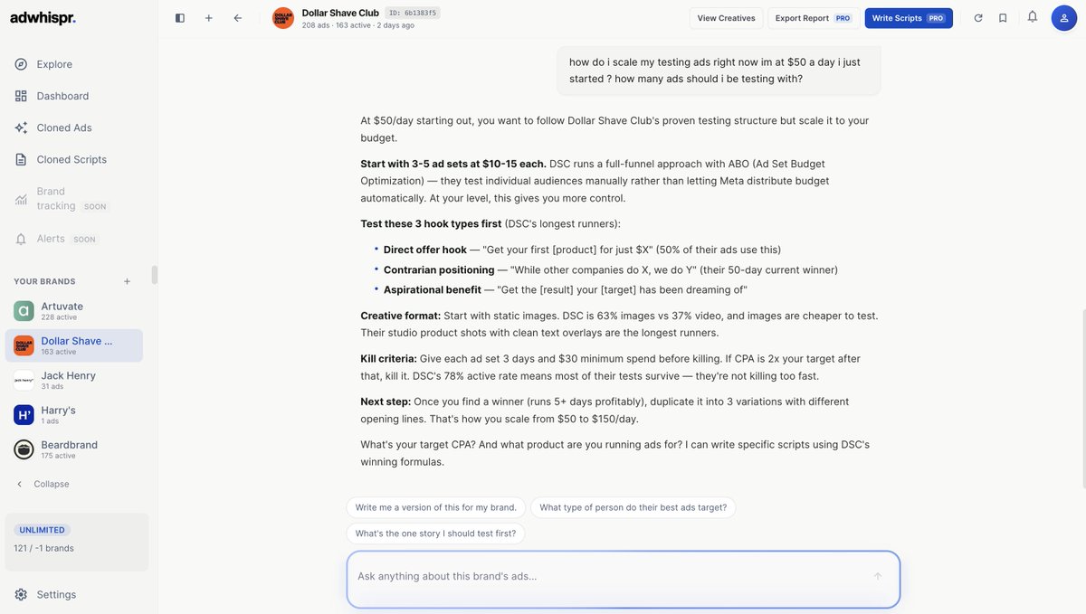
Apr 9
AI is now giving Ad Optimization and Testing Strategies based on Dollar Shave Club
wtf!
1
9
458
Apr 9
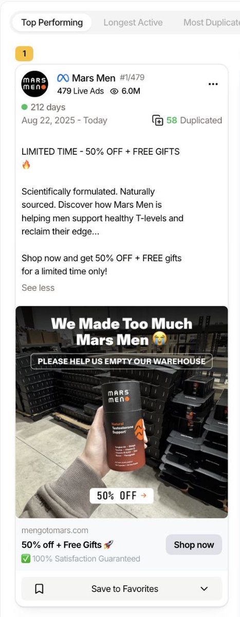
Full Breakdown on Mars Men Ads
Selling Test to bozo founders
Apr 8

This Mars Men testosterone ad has been running for 212 days straight as their #1 performing ad out of 479 live ads, and it's pure direct-response mastery.
Let me break down why this banger printed like crazy:
1. The Hook = Instant Urgency Chaos
"We Made Too Much... Mars Men 😭
PLEASE HELP US EMPTY OUR WAREHOUSE"
This is elite-level urgency framing because it frames the entire situation as:
- Time-sensitive (we need to move this NOW)
- Limited (finite inventory that needs to go)
- Opportunity-based (you can benefit from our mistake)
Your brain immediately goes: "Wait...I can get a massive deal because they overproduced?"
That's powerful psychological positioning because it doesn't feel like a typical "sale", it feels like you stumbled onto a rare opportunity.
2. It Uses The "Inventory Mistake" Angle
This is a classic winner in direct response, and even if it's not literally true, it feels believable.
It creates the perception of:
- A temporary glitch in their system
- A rare opportunity that won't repeat
- Insider access to a pricing error
That creates FOMO instantly because people think "if I don't buy now, I'll miss this mistake-based pricing forever."
Robert Collier was a master at this type of price-cut mechanization: creating a believable STORY around why the price is slashed makes it 10x more effective than just shouting "50% OFF!" with no context.
3. The Offer Is DEAD Simple
"LIMITED TIME - 50% OFF FREE GIFTS 🔥"
That’s all.
The dumber the offer, the better it converts for bottom-of-funnel audiences who already know what they want.
4. Visual = Warehouse Proof (This Is Key)
The image shows:
- Stacks of black product boxes in an industrial warehouse
- Real inventory piled up on pallets
- Hand holding the actual product bottle
- Industrial shelving in the background
This does two critical things:
1. Makes the story believable: You can SEE the surplus, so the "we made too much" claim feels real instead of fabricated
2. Signals scale: This isn't some dropshipping operation, this is a real brand with real inventory and real distribution
When you show visual proof of the problem (too much stock), people believe the solution (discounted pricing to clear it).
5. Product-In-Hand Shot = Trust
Holding the bottle in a real warehouse creates:
⦁ Tactile reality (feels like something you could touch)
⦁ UGC energy (not polished brand photography)
⦁ Human element (someone's actually there in the warehouse)
This lowers resistance because it doesn't look like a corporate ad, it looks like someone showing you a real situation happening right now.
6. The Copy Is Minimal (On Purpose)
Look at how simple the ad copy is:
⦁ Problem: Low testosterone, need energy/edge
⦁ Solution: Mars Men supplement
⦁ Mechanism: "Scientifically formulated. Naturally sourced."
⦁ Offer: 50% OFF FREE gifts
⦁ CTA: Shop now
The reason behind this simplicity is it’s hitting an already-aware audience aka, men who already know they want testosterone support and are just waiting for the right offer to pull the trigger.
7. It Hits A High-Pain Male Market
3 things are actually being sold here:
1) Testosterone = ego, masculinity, identity
2) Energy = performance, status, capability
3) "Reclaim their edge" = return to who they used to be
You might think this is some sort of health optimization, but it’s not.
This is masculinity status identity restoration.
And that emotional territory ALWAYS converts in the men's supplements space because it taps into deep insecurity about declining performance and vitality.
8. It Combines 3 Of The Strongest Conversion Levers
1) Urgency - "Limited time" "Empty our warehouse"
2) Discount - 50% OFF (massive price reduction)
3) Bonus - FREE gifts stacked on top
Most brands use one lever.
This ad uses all three simultaneously, which compounds the psychological pressure to buy NOW instead of later.
9. It's Infinitely Duplicatable
The ad shows "58 Duplicated" in the interface.
That tells you everything you need to know about scalability.
Why can they duplicate it 58 times?
It’s because the angle is universal (urgency works everywhere), the offer is timeless (discounts never go out of style), and the problem is evergreen (men will always want testosterone support).
This is a scaling ad - from all angles.
And when most ads die within 2-4 weeks from creative fatigue.
This one ran for 7 months because it avoids the three things that kill ads:
1. Creative complexity: Simple warehouse shot that doesn't get old
2. Niche appeal: Speaks to a massive market (men 30-60 wanting vitality)
3. Offer dependency: The "warehouse clearance" angle can run indefinitely
The combination of universal problem simple visual aggressive offer = evergreen performance.
Plus, this isn't designed to educate new people or build brand awareness.
This is a "strike while the iron is hot" ad for people already in their ecosystem.
Which indicates men who:
⦁ Visited their website before
⦁ Watched their content
⦁ Engaged with previous ads
⦁ Know the brand exists
It's hitting Stage 4-5 market awareness (Product Aware → Most Aware) where people already know Mars Men, already want testosterone support, and are just waiting for the right deal to buy.
That's why it gets massive spend from Facebook's algorithm.
It's converting warm traffic at a profitable CPA, so the algo keeps feeding it more budget.
However…
Just like everything, this type of ad has a ceiling.
It crushes hard for months by hitting all the warm retargeting audiences, but eventually performance drops as frequency climbs and you exhaust the pool of people who already know you.
That's why you need a mix in your account:
- Bottom-of-funnel ads like this to capture immediate sales from warm traffic
- Top-of-funnel ads to keep bringing in new cold audiences who've never heard of you
Don’t be one of those brands who only run one or the other and wonder why they can't scale.
So What You Should Steal From This?
If you're selling supplements, especially in the men's health space:
1. Use the "inventory mistake" angle (creates believable urgency)
2. Show visual proof (warehouse, stacks of product, not just bottle shots)
3. Keep the offer dead simple (50% OFF FREE gifts, no complexity)
4. Tap into identity/status (not just health, but masculinity and edge)
5. Stack 3 conversion levers (urgency discount bonus)
6. Product-in-hand shots (feels real instead of feeling like polished corporate)
7. Minimal copy for aware audiences (they know what they want, just give them the deal)
8. Frictionless CTA ("Shop now" instead of "Learn more")
If your supplement ads are doing educational content for cold audiences and wondering why CPAs are high, look at this.
It removes all thinking and just presents a no-brainer deal to people who already want the solution.
So, respectfully, this is a dumb ad…and that's why it works.
You don't need to be creative, you need to remove thinking.
This ad doesn't win because it's smart.
It wins because it makes buying feel like the easiest, fastest decision possible for someone who already wants testosterone support."
This ad ran for 212 days and got duplicated 58 times because it understood one thing: when someone's already warm and ready to buy, you don't need to educate them, you just need to give them urgency, a massive discount, and a reason to act today instead of tomorrow.
3
280
Apr 9
I believe you king!
Apr 8

MEDVi statement in response to external speculation
FDA letter
In September 2025 and February 2026, the FDA sent an unprecedented number of warning letters to dozens of telehealth companies, drug companies and pharmacies regarding their direct-to-consumer advertising practices. In one of the FDA's letters, the URL mentioned is medvi.io - not MEDVi's actual address of medvi.org.
The letter addressed to MEDVi was directed at an affiliate marketing agency whose website contained outdated copy.
We immediately reached out to the affiliate and required them to remove the materials allegedly at issue. We understand the affiliate also directly responded to the FDA.
My company MEDVi has never received a letter from the FDA. If we were to receive such a communication from any regulatory authority, we would act swiftly and collaboratively to address the matter.
So-called "fake doctors"
We have recently become aware of what appear to be advertisements featuring potentially AI-generated medical practitioners.
Since we became aware of this issue, we have updated our marketing practices to make clear that this type of advertising and / or promotion is prohibited. We continue to proactively address this issue.
Additional statement from Mr. Gallagher
Building a company the size of MEDVi and scaling so quickly involves many learning moments. At each of these stages, I have course-corrected immediately and appropriately. I will continue to do so.
The New York Times was recently given unprecedented access to MEDVi's business information and also interviewed our business partners and other collaborators.
As I continue helping our customers achieve their health goals, I remain committed to building and operating transparently.
home.medvi.org/communication
3
291