
Brand identity designer ✱ Selling business stories professionally using design ✱ contact me : graphixbydani@gmail.com ✱ 234 70 7925 4131
Joined September 2025
- Tweets 163
- Following 115
- Followers 37
- Likes 523
35 Photos and videos


Pinned Tweet

My 2026 introduction.
I’ve been quiet on here, and it was intentional.
I’m Daniel Ekpenyong, a brand designer.
Over the last few months, I stepped back to re-evaluate my work and my standards.
I reached a point where “typical” wasn’t enough anymore.
So I shifted.
1
4
151
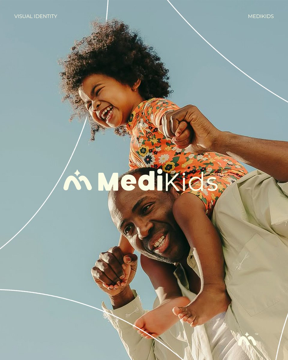
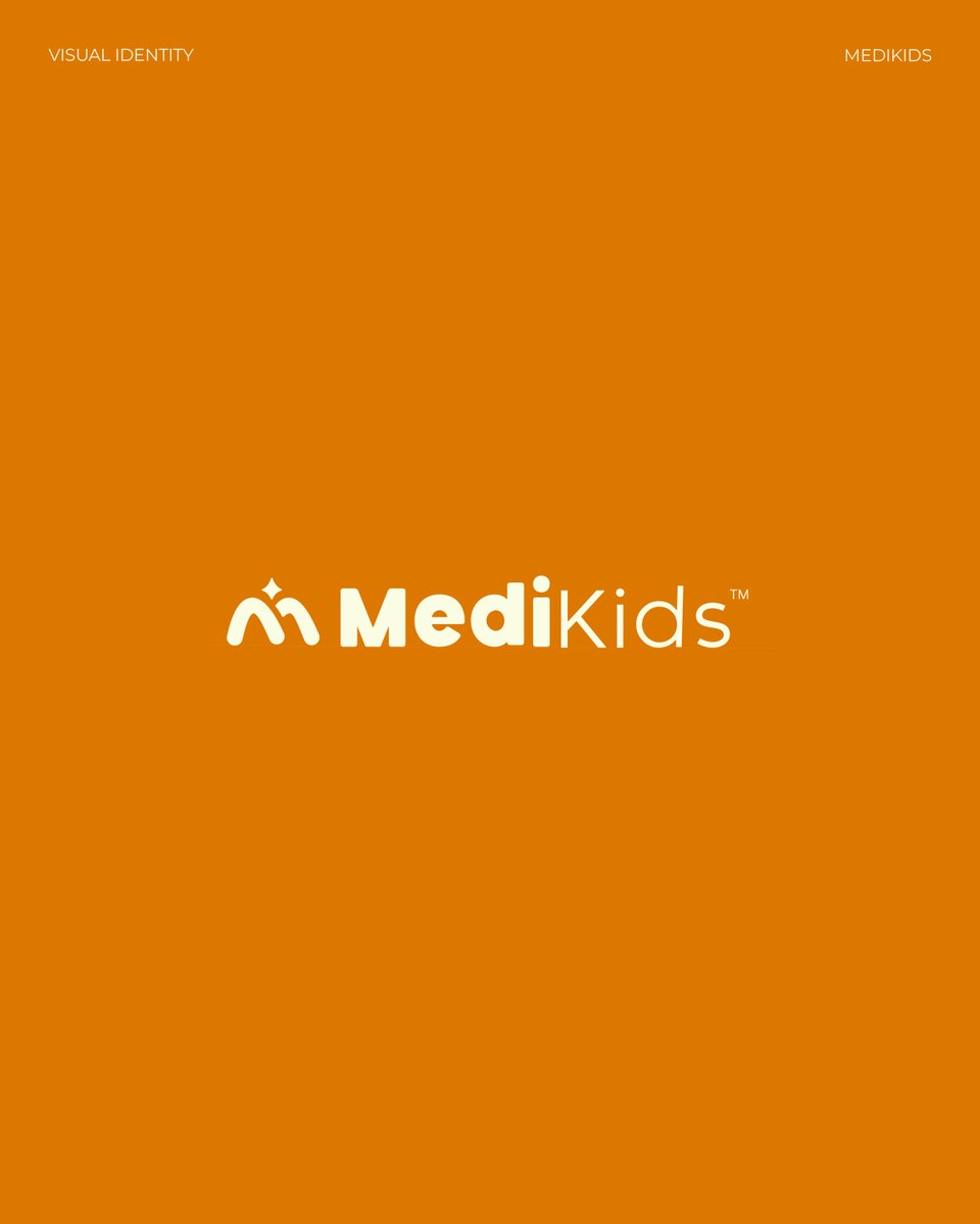
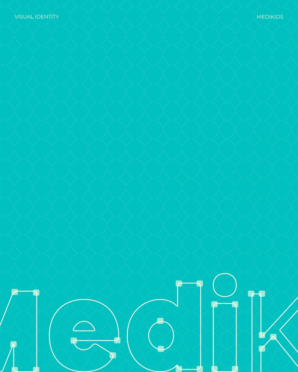
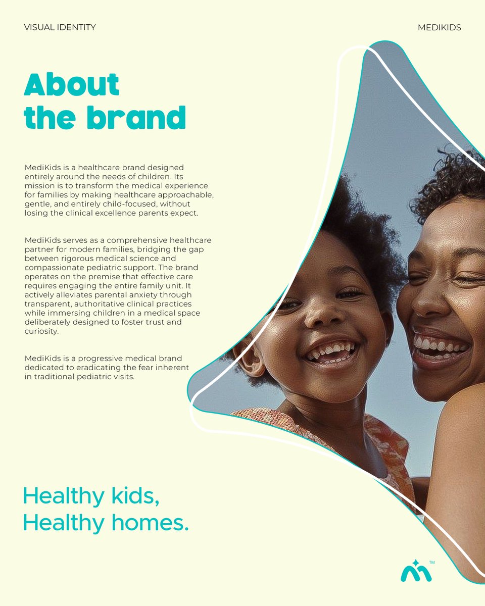
Pediatric healthcare does not have to feel so sterile. 🩺
Meet the new visual identity for MediKids, a brand dedicated to making medical visits gentle, approachable, and entirely child-focused. Let's look at the details🧡💙

2
1
9
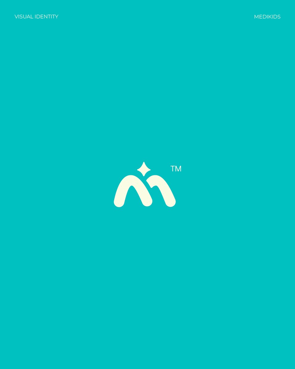
The logo is built on playfulness. It combines soft curves and doodle-like roundedness to resonate directly with kids. The curved edge star acts as the focal point, denoting the energy, excitement, and vibrant nature of a truly healthy child. ✨

1
1
7
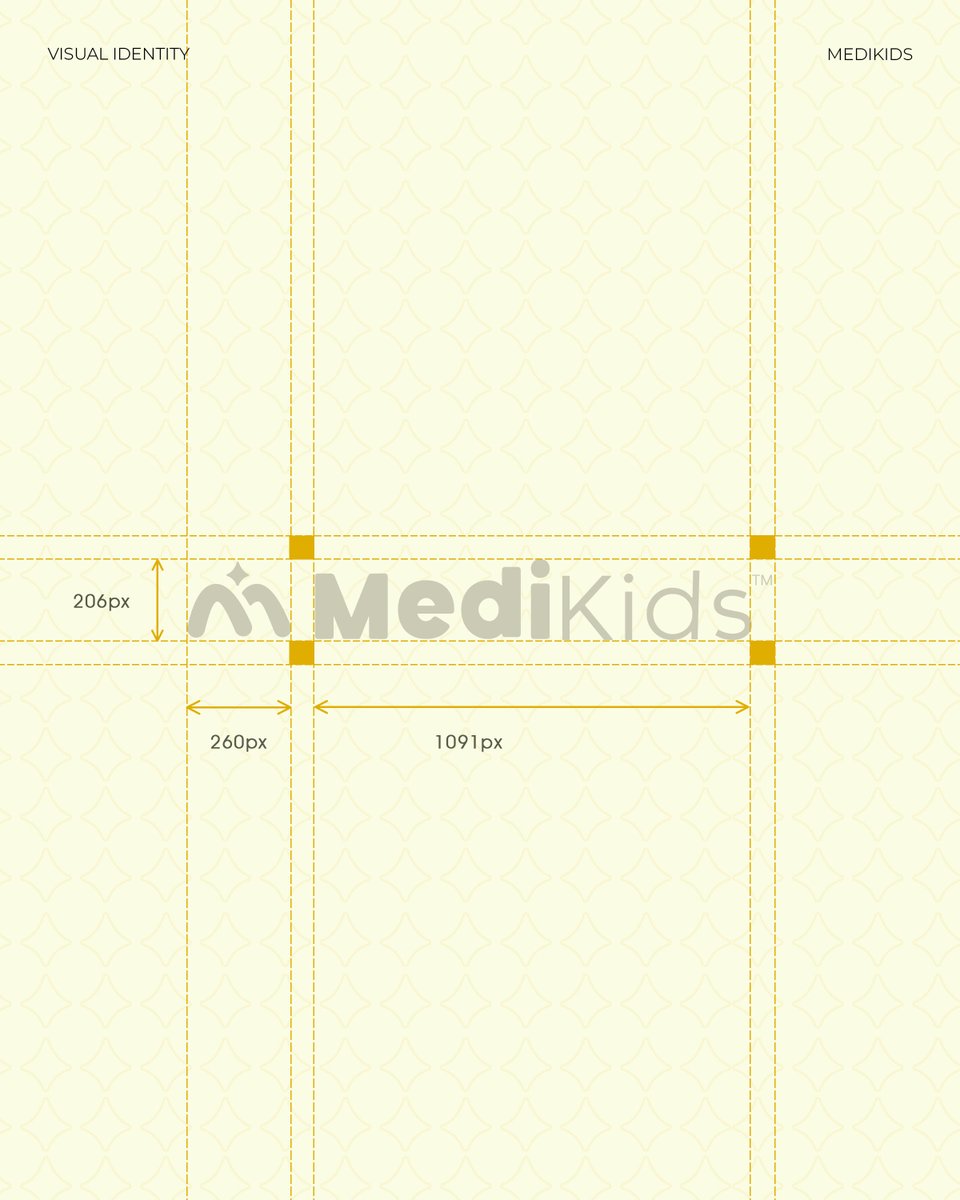
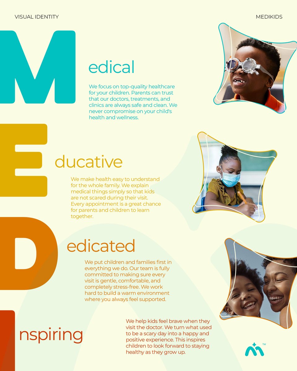
By anchoring the brand with a structured layout and intentional typography, we created a visual system that parents can trust and children can love.
Medical. Educative. Dedicated. Inspiring.

1
7
Daniel Ekpenyong retweeted

Well, meet the team: Team DIAL, we finished top 3 after the first 3 rounds of quizzes and assessments, taking us to the top 50 teams. In the end we didn’t make top 10 that pitched on stage 😔
Was an amazing experience tho.@gtbank @OfficialSquadCo
#squadhackathon


Activee at Squad hackathon 3.0 🙂↕️
#squadhackathon
1
6
40
772
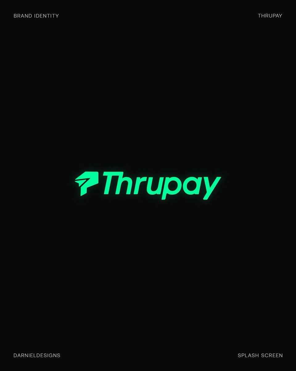
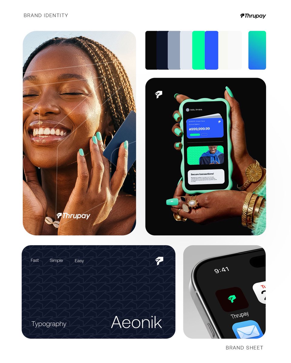
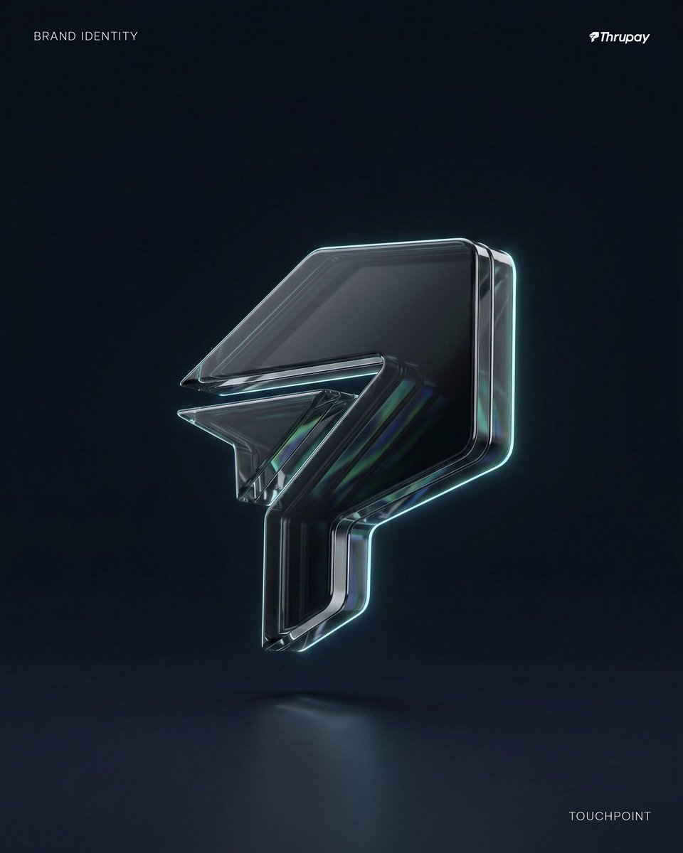
Built a fintech brand concept called Thrupay around one idea:
Finance should feel frictionless. Not rigid.
Not overwhelming. Not slow.
Here’s the visuals:
#BrandIdentity #FintechDesign #Thrupay #VisualIdentity #BrandStrategy


1
1
16
The identity and brand name combines:
Movement (Thru)
Trust (True)
Utility (pay)
With a custom “P”
Communicating speed, affirmation and secure movement.


1
1
17
Here’s to week one of my brand identity challenge:
Thrupay✨


1
9
Daniel Ekpenyong retweeted

Mar 29
Officially reintroducing myself as a student who’s keen in learning and carrying others along. As someone who’s curious on how things works in the civil engineering sector I got to learn how to use AutoCAD. And In the same space I’m a mobile photographer.

5
7
42
2,534
Few tips I learnt on this project✨:
Mastering the basics as a designer is so crucial to curating the best of designs out there! That’s how you really stand out from the crowd of designers out there.
Design thinking and process is also an important skill to master as a designer.

1
2
29
Competence isn't always about being "the best"; it’s about being grounded.
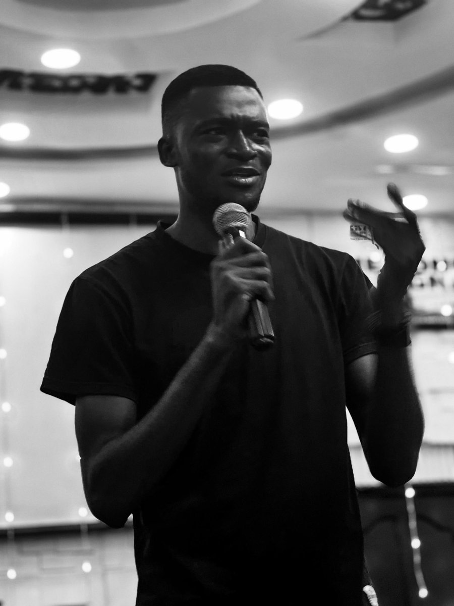
Last Saturday, I was invited to speak on the tangible impact of branding and graphics design on small-scale business growth.
1
2
29
My 3 years of self-taught experience felt more valuable than ever. It’s a reminder to keep building your roots, understanding the core basics of what you do, even when you feel like you aren't "there" yet.
1
22
I’m officially back in the mix and looking for new branding collaborations. If you’re ready to make your brand more impactful, let’s talk. ⚡️
#DesignTwitter #Branding #SmallBiz #BrandDesign #GraphicDesigner #design
22
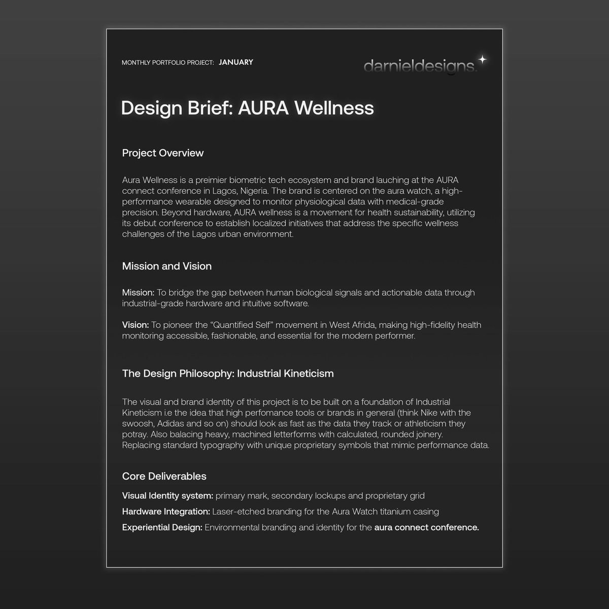
Building capacity as an identity designer is a journey of navigation. ✦
Showing up daily while balancing roles as a student, professional, or leader is a tasking reality. AURA Wellness has been my training ground for navigating this pressure.
A thread:
1
2
6
93
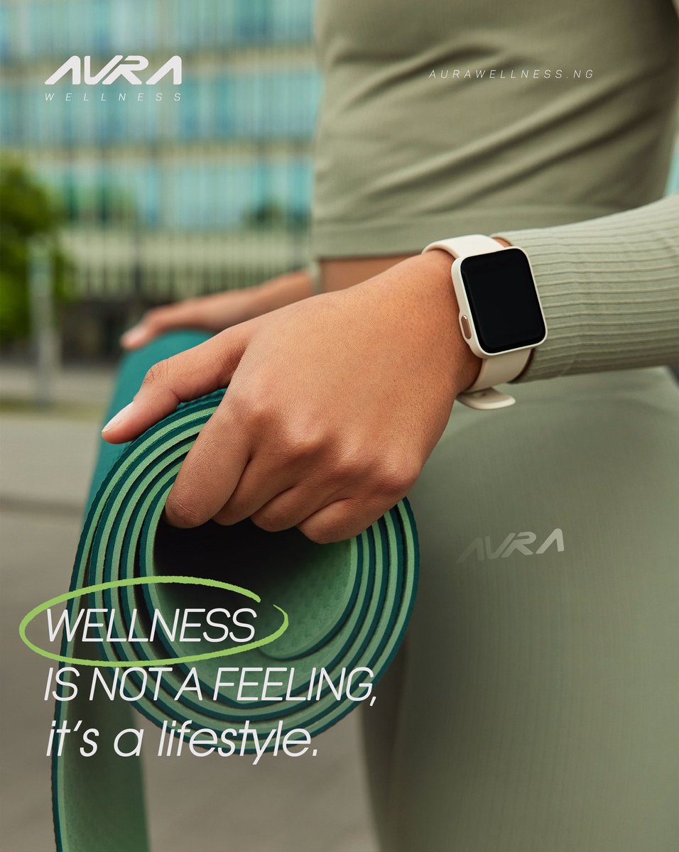
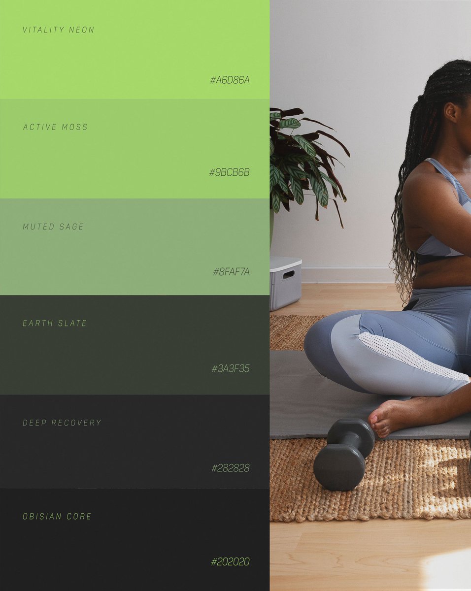
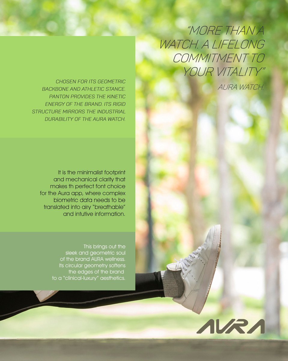
The AURA identity exists at the intersection of the grit and high- performance of workout with the clinical-softness of wellness.
The goal: Combine the grit of fitness with a geometric flow to create a brand that feels both industrial and empathetic.
Grit meets Softness. ⚖️

2
1
48
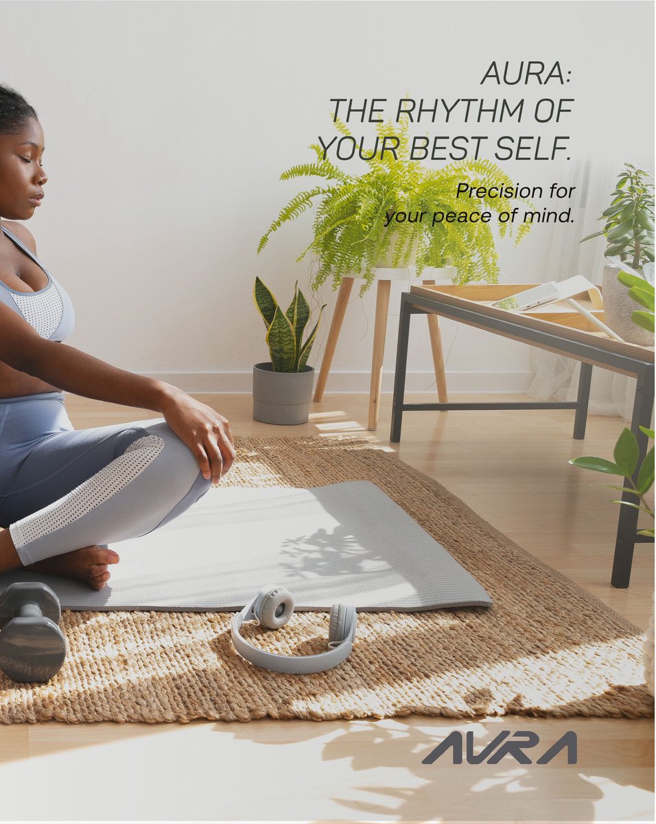
Wellness isn’t a feeling,it’s a lifestyle.
AURA provides the structure to ensure your "lifestyle and routines" match the tenacity of your training. We’re moving wellness from a fleeting emotion to an achievable reality. 🏗️
#BuildInPublic #BrandIdentity #AuraWellness #LagosTech
2
35
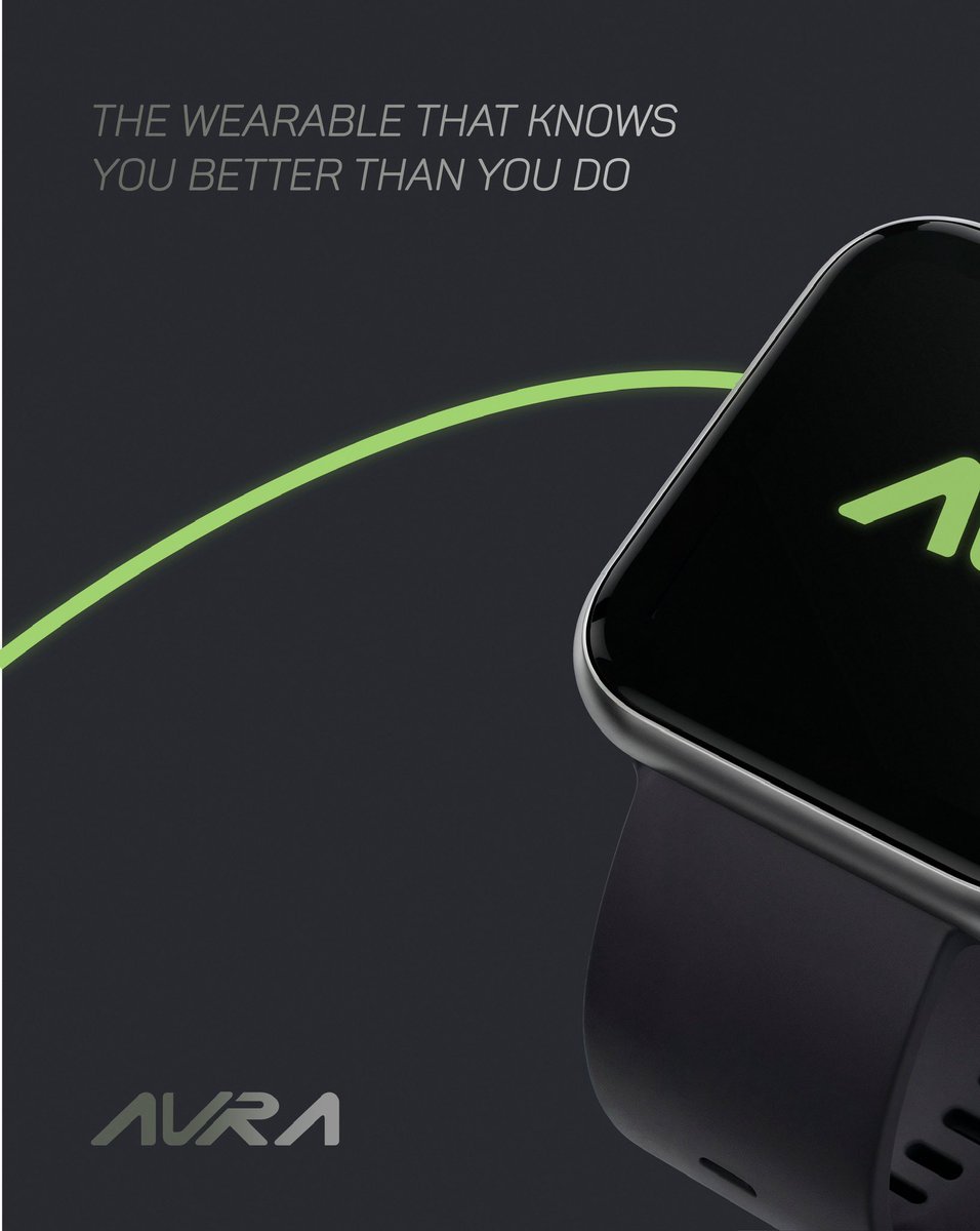
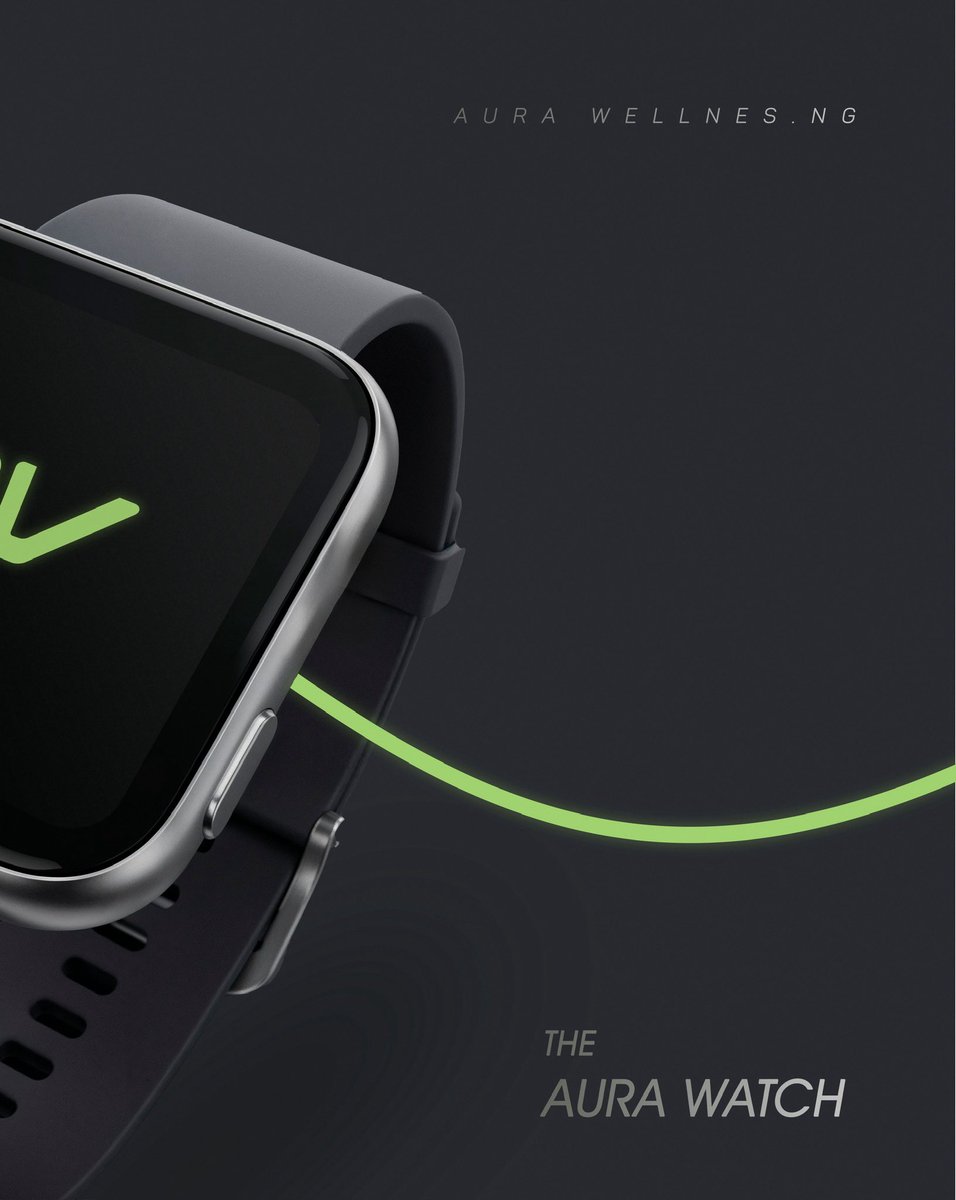
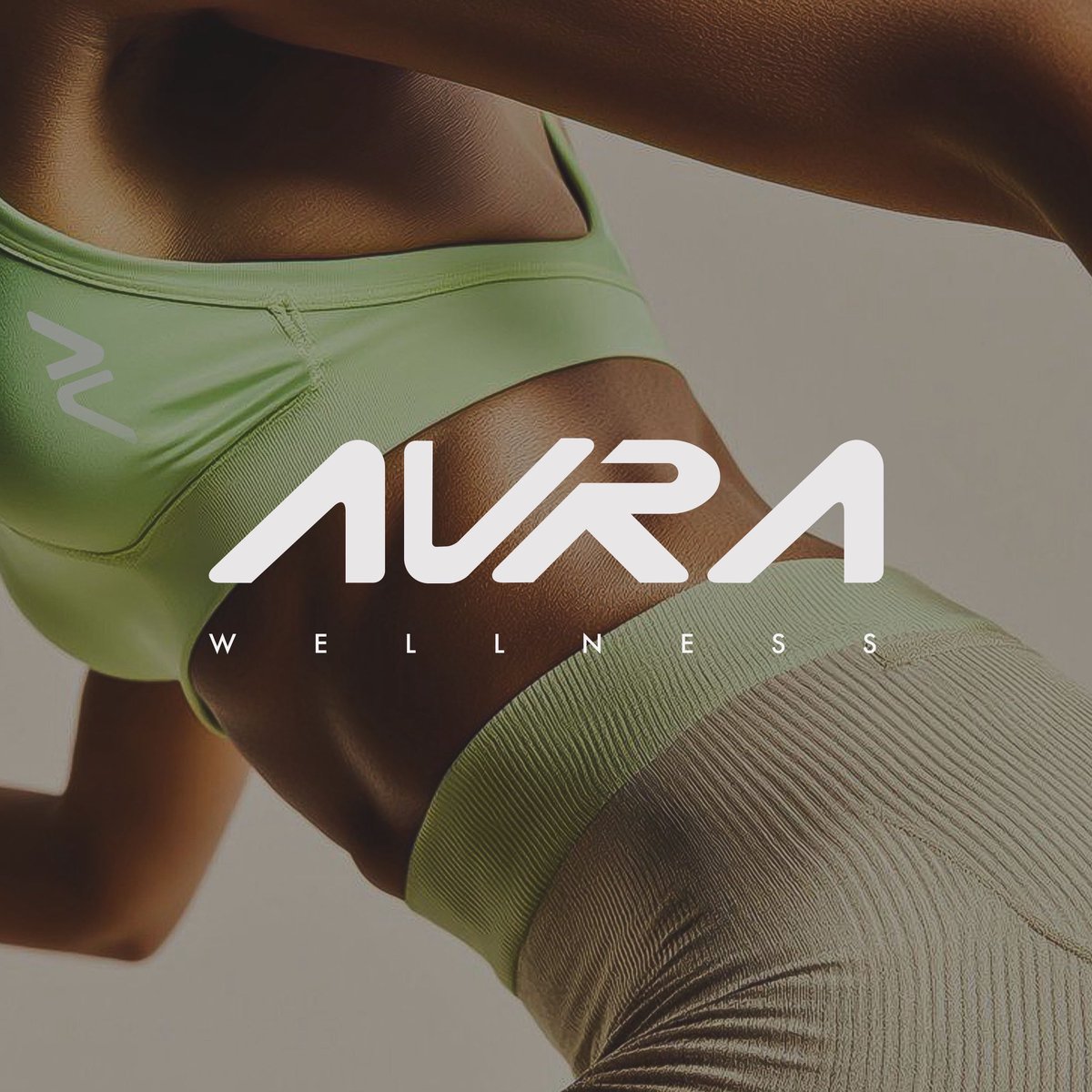
After a week of explorations and a number of iterations, the AURA Wellness logo mark is finally here.🗿 ✨
This part of the project focused on achieving balance: a mark that is strong, fluid, precise, and forward-moving.


1
1
6
87
I started with sketching, testing, and refining a number of iterations to come up with a unique logo mark that reflects the brand’s Liquid-Industrial language: heavy, engineered forms with a 25° athletic slant, designed for speed and forward movement.
1
45
Every design decision was intentional to make the logo scalable, and versatile, ready to live across hardware, apps, and experiences.
More on the full design process coming soon.
#LogoDesign #BrandIdentity #DesignSystems #VisualIdentity #DarnielDesigns #HealthTechDesign
43