
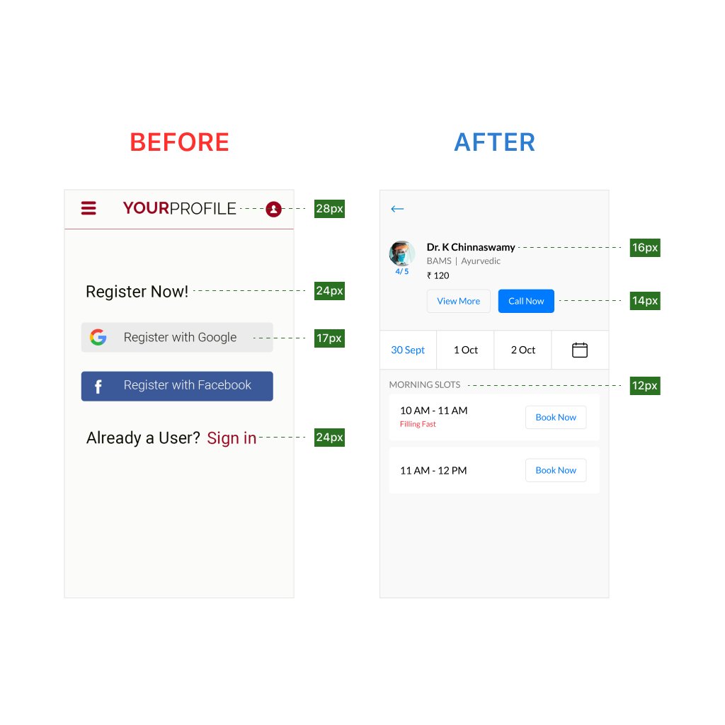
🚀 Before vs After: The Power of Intentional UI/UX Design
Most users don't leave because your product lacks features.
They leave because the experience feels outdated, cluttered, and difficult to use.
This redesign explores how strategic UI/UX decisions can completely transform a real estate marketplace experience.
What Changed?
✅ Improved visual hierarchy for faster scanning
✅ Social proof elements to increase engagement
✅ Cleaner property cards with better information architecture
✅ Stronger CTA placement for improved conversion
✅ Modern navigation system for effortless exploration
✅ Enhanced spacing, typography, and consistency
Design Insight
Good UI is not about making things look pretty.
Great UX is about helping users achieve their goals with less effort.
In the "After" version:
• Property listings feel more premium
• Content is easier to consume
• User engagement opportunities are more visible
• The overall experience builds trust and credibility
Every pixel should serve a purpose.
The goal isn't decoration.
The goal is conversion.
💡 Small design improvements can create massive business impact when they reduce friction and improve user confidence.
What do you prefer — Before or After?
#UIUX #UIDesign #UXDesign #ProductDesign #MobileDesign #AppDesign #UserExperience #UserInterface #DesignThinking #Figma #UXResearch #InteractionDesign #VisualDesign #CreativeDesign #RealEstateApp #UXPortfolio #DesignInspiration #StartupDesign #DigitalProductDesign #UXStrategy

1
15

Refinement is where UI design becomes difficult.
Anyone can add elements.
Knowing what to remove,
what to simplify,
and what to leave untouched -
that's where judgment matters.
#UIDesign #DesignCraft #VisualDesign
1
9

2D to 3D Logo Animation 🌐 #3D #3DLogo #3DDesign #fyp #Blender3D #branding #3DAnimation #VisualDesign #3DModeling #BlenderArtist
1
13

SPRITE – Refresh Your World
Key Visual & Social Media Design
#graphicdesign #graphicdesigner #design #designlife #designer #creative #creativity #digitalart #artwork #designinspiration #visualdesign #designstudio #creativeprocess #designideas #designtips #dailydesign #design

5

20h
A personal exploration across branding, campaign design, packaging, and ecommerce.
Full project: behance.net/gallery/25104206…
#BrandIdentity #ArtDirection #VisualDesign

1

Les baigneurs continuaient leurs vacances, pendant que l’univers se repliait discrètement sur le rivage.
#Midjourney #AIart #GenerativeArt #ArtDirection #SciFiArt #DigitalArt #ConceptArt #VisualDesign

1
10

Design for a brand #Throwback
#GraphicDesign #FlyerDesign #CreativeDesign #DesignInspiration #PosterDesign #BrandDesign #VisualDesign #Typography

1
6

Jun 12
🎨 IntellGraphic. com – Premium Domain Name For Sale! 🚀
#CreativeAgency #VisualDesign #ContentCreation #DataVisualization #Innovation #FutureTech #TechStartup #SaaS #Brandable #PremiumDomain #DomainForSale #DigitalBrand 🎨🚀🌐
16

Jun 12
Tried visualizing the SpaceX IPO through a single metaphor.
A bullish candlestick transforming into a rocket launch.
#SpaceX #IPO #VisualDesign #GraphicDesign #CreativeDirection #ArtDirection #PosterDesign #ConceptDesign #EditorialDesign #DesignThinking #CreativeProcess

1
1
64


Jun 12
I've been working on this project since yesterday, not fully done but I'll be posting the full process earnestly soon.
#VisualDesign #UIDesign #UXResearch #Figma #Portfolio #Organic #DecodeLabs #Wireframing #HighFidelity
#ProductDesign
1
2
6
90

Jun 12
They say Consistency is the Key, No hard feelings let make use of the key.
Social Media Design for Solo Hair
#graphicdesign #socialmediadesign #branddesign #visualdesign
1
6


Nobody reads a page from top to bottom.
They scan. They jump. They look for the thing that matches what they came for- and they leave if they don't find it fast enough.
This isn't laziness. It's how attention actually works.
Neisser's research on visual search showed that the brain doesn't process a visual scene sequentially. It runs parallel searches, constantly scanning for features that stand out against their surroundings. Color. Contrast. Movement. Familiar shapes. The eye is drawn to difference, not content.
Norman connected this directly to interface design through the principle of visibility: the right information needs to be in the right place, at the right visual weight, at the right moment. Not buried. Not competing. Present.
Here's what this means in practice:
If everything on your page has equal visual weight, nothing gets found.
If your most important element doesn't stand out from its surroundings, the scan misses it.
If you're relying on users reading carefully to understand your product: you've already lost most of them.
Hierarchy isn't a design preference.
It's a map for the scanning brain.
The page you design and the page your user experiences are two different things.
One is carefully constructed.
The other takes about 200 milliseconds to judge.
#DesignedMinds #UXDesign #ProductDesign #CognitivePsychology #VisualDesign #UserExperience #DesignThinking
2
31

Jun 12
Whitespace isn’t wasted space, it’s a powerful design tool. It improves readability, creates focus, and gives your content room to breathe. The strongest designs aren’t crowded; they’re intentional.
• Increase margins
• Create clear visual hierarchy
• Group related elements together
• Keep spacing consistent
• Let important elements stand out
Whitespace isn’t empty space it’s where good design begins.
#DesignLayout #Whitespace #GraphicDesign #DesignTips #VisualDesign #BrandDesign #CreativeDesign #Typography #DesignThinking #UXDesign
1
5

Jun 12
Vulkan API Example Walkthrough | prepareVertices() youtu.be/6v116UMm6pc?si=cLX1… | #vulkanapi #vulkan #computergraphics #vulkancompute #gameengine #howtoprogram #visualdesigner #visualdesign #graphics #learnvulkan #learncomputergraphics #tutorial
4

Jun 12
What if your AI assistant actually felt good to use?
Exploring Axia, a concept UI for an AI chatbot app with code generation, live preview, bug fixing, and conversation history. All in one place, zero friction.
Have a project? Let's Discuss and Collaborate: cal.com/orenji-studio/30min?…
#UIUX #Visualdesign #Mobileapp #Appdesign #Productdesign


3
81


Jun 11
Experience the evolution of digital production through this refined visual interface. Explore the synthesis of high-end design and functional philosophy. What defines your aesthetic? #DigitalProduction #VisualDesign
4

Blooming elegance in motion 🌸✨
payhip.com/b/D42Sm
20s Full HD floral animation loop — soft, smooth & aesthetic.
#AestheticAnimation #FloralLoop #BloomArt #MotionGraphics #HDVideo #CreativeAssets #DigitalArt #YouTubeShorts #FlowerAnimation #VisualDesign
15