
I love storytelling |📊 Passionate about turning raw data into visual stories | | Helping insights come to life one chart at a time! | 1X Hackathon winner!
Joined October 2024
- Tweets 20
- Following 126
- Followers 154
- Likes 219
2 Photos and videos
Your Data Storyteller retweeted

19 Jul 2025
One of the PowerBI project with students @ ESanalysis.
Writing DAX and structuring Dashboard is only hard when you learn the wrong way.
To join the next cohort contact @edwige_songong
18 Jul 2025

I teach my students how to design and get used to white backgrounds because it’s clean, professional, easy to read, and puts your visuals in the spotlight.
Master clarity before creativity.
#Datafam #Dashboarddesign
5
12
88
3,161

Your Data Storyteller retweeted

15 Jul 2025
New to dashboards and feeling overwhelmed by the UI/UX?
Here are 7 sites to spark your dashboard design creativity:
Pinterest.com
TableauPublic.com
PowerBIGallery.com
Dribbble.com
#DataViz #DashboardDesign #PowerBI #Tableau #UXUI #Inspiration

4
28
114
8,187
Your Data Storyteller retweeted

28 Jun 2025
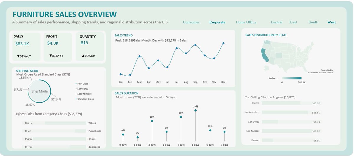
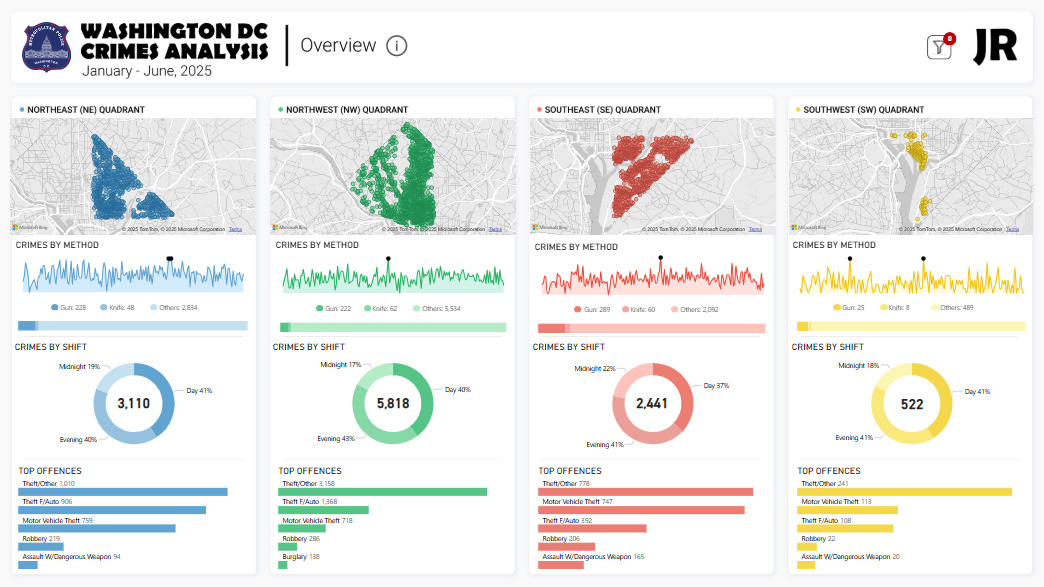
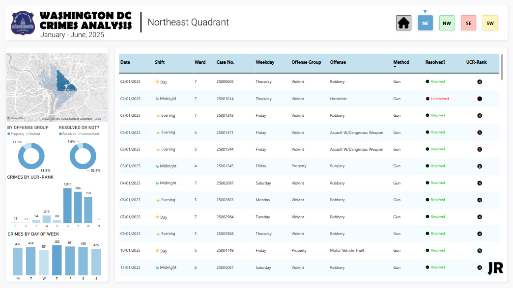
Hi #DataFam, this month I decided to look into crimes in Washington D.C.
DC is divided into four quadrants, and that’s the perspective I chose.
Here's what I found:
- The Northwest quadrant accounts for nearly half of all reported crimes.
- Theft-related offenses dominate citywide.
- Most crimes occur during evening hours.
Here's the interactive Power BI dashboard:
lnkd.in/e2PXqqAJ
I made a LinkedIn post too:
tinyurl.com/4jvunuy8
This is 6/12 of my #OneDashboardaMonth challenge.
Feedback is welcome.

11
9
41
2,117
Your Data Storyteller retweeted

12 Jun 2025
Hey #DataFam Just finished building one of my favorite dashboards yet and this time, I did it differently. I wanted to build something different this time.
Not sales. Not finance
Just something more visual, fun, and personal.
Interact here👇
app.powerbi.com/view?r=eyJrI…
#PowerBI


39
47
309
14,720
Your Data Storyteller retweeted

11 Jun 2025
Morning guys,
due to popular demand, Below is the link to this dashboard.
The dataset, Analysis and the Dashboard
You can Explore it and possibly Recreate it
Have fun. 👇👇
docs.google.com/spreadsheets…
#Datafam
11
41
294
24,102
Your Data Storyteller retweeted
2 Jun 2025
I've been getting some questions in my DM lately.
Here’s what #TheFirst30 is:
- You’ll master common data analysis tools.
- You’ll write actual SQL queries.
- You’ll build and share dashboards.
- You’ll get one short lesson in your inbox every day.
It’s everything you need to get started and build real skills, delivered one day at a time.
So, in essence, when we launch, you'll get one short lesson in your inbox every day over the course of 30 days.
To sign up: thefirst30.xyz
8
15
39
2,725
Your Data Storyteller retweeted

20 Jan 2025
25 Data Analyst Projects ideas for your portfolio Datasets. A thread🧵
Grocery Retail 🛍️🛒
1. Grocery Demand Forecasting Using Sales Data
2. Market Basket Analysis
3. Customer Loyalty Trend Analysis
4. Customer Segmentation Analysis
12
170
894
61,051

5 Jan 2025
This is value-filled.
Join in or listen when you're less busy
x.com/i/spaces/1mrGmMaZVbNGy
1
155
Your Data Storyteller retweeted

23 Nov 2024
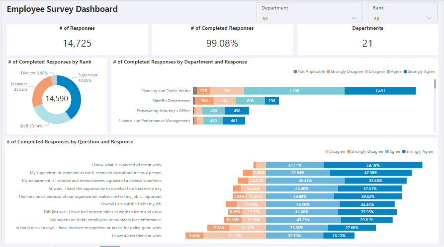
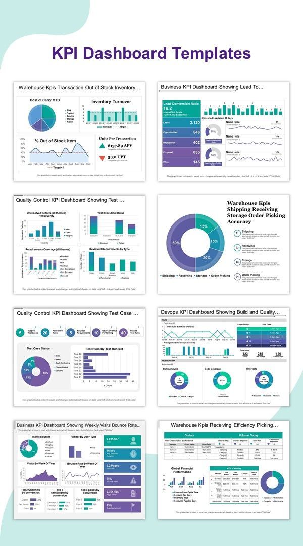
8 KPI Dashboard Templates:
4
226
1,243
90,487
9 Nov 2024
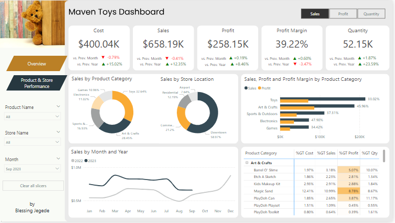
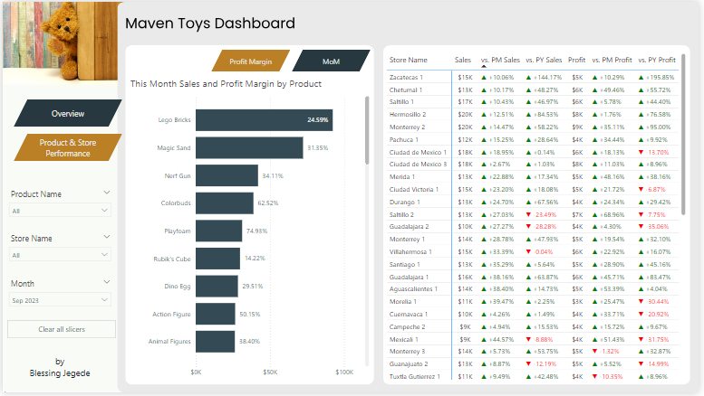
I completed another data project using Power BI.
Thanks @Rita_tyna! It was insightful learning from you 🥰
Link to Dashboard: app.powerbi.com/view?r=eyJrI…
Enjoy!
2
5
23
940
25 Oct 2024
I learned an amazing technique this week—how to display all negative values on one side and positives on another, in Power BI charts.
It was an insightful analyzing the data to uncover insights. Feeling proud of how it turned out! 😍
Explore in Power BI: app.powerbi.com/view?r=eyJrI…
1
1
8
348