
Joined April 2023
- Tweets 999
- Following 100
- Followers 111
- Likes 504
376 Photos and videos


Pinned Tweet

11 Mar 2024
🚀 Issue 109 of our #newsletter is here, packed with the latest in #frontend.
👉 frontendplanet.com/latest-re… 👈
Subscribe for more weekly insights 💌 at frontendplanet.com/newslette…
1
1
1,242
23 Jul 2024
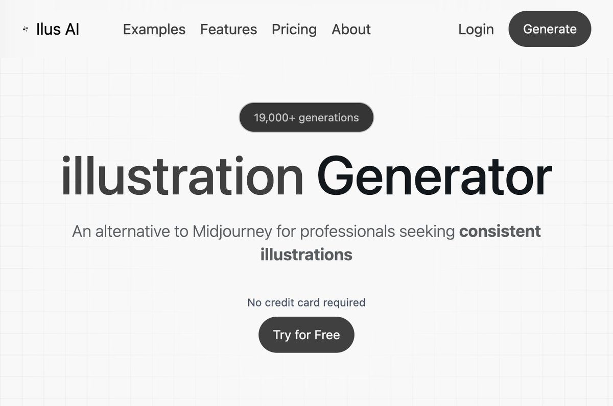
Generate stunning AI-powered illustrations and graphics for your projects with Ilus.ai. Transform your ideas into beautiful art effortlessly.
by @KristjanRetter
👉 ilus.ai/ 👈
#AI #Design
2
585
23 Jul 2024
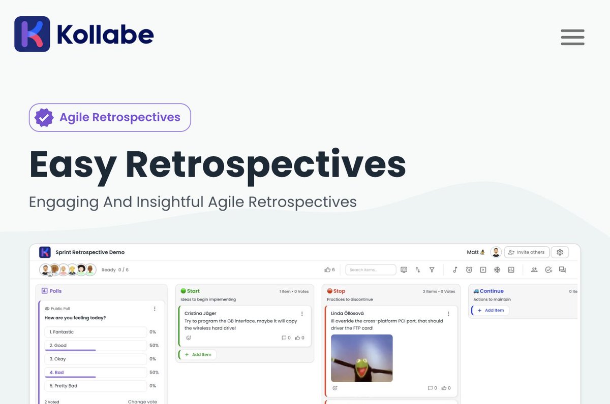
Conduct effective and engaging retrospectives with Kollabe's free online tools, perfect for Scrum and Agile teams to improve processes and collaboration.
by @Kollabe_
👉 kollabe.com/retrospectives 👈
312
23 Jul 2024
Discover the key insights and trends from the 2023 State of React survey, highlighting the latest in React development, tooling, and community practices.
👉 2023.stateofreact.com/en-US 👈
#React #webdeveloper #FrontEnd
117
29 Jun 2024
Unleash your creativity with Figma AI! 🚀 Get started faster, find assets quickly, and let AI handle the details. From generating mockups to renaming layers and translating text.
by @figma
👉 figma.com/ai/ 👈
#Figma #AI #DesignTools
155
29 Jun 2024
Notion Sites is here! Easily turn your Notion pages into websites. Perfect for personal blogs, portfolios, or team wikis. No coding needed!
by @NotionHQ
👉 notion.so/product/sites 👈
#Notion #WebDesign #NoCode
86
Frontend Planet 🪐 retweeted

6 Jun 2024
projectManager reddit.com/r/programmerhumor…
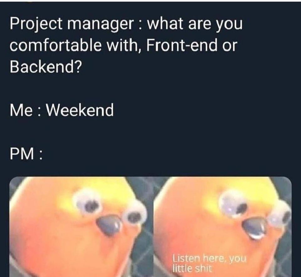
5
319
3,617
397,943
Frontend Planet 🪐 retweeted

27 Apr 2024
The trick here was creating a function that takes GSAP eases and converts them to CSS linear() 🔥
A flicker effect is a GSAP RoughEase that gets converted 👨🔬
Once you generate different custom easings, you can drop them in and use them elsewhere 🤙
27 Apr 2024

Flicker effects with modern CSS in 2024 🚀
1. Animate opacity
2. Use custom linear() timing 🔥
:root { --flicker: linear(0 0% 0.5%, 0.1723 0.7925% ... ); }
.flicker {
animation: dim 4s infinite var(--flicker) alternate;
}
@keyframes dim { opacity: 0.25; }
4
41
414
51,607
Frontend Planet 🪐 retweeted

25 Apr 2024
Astro 4.7 is here to raise the bar!
... The Astro dev toolbar, that is. We've made it easier than ever to build toolbar apps through several API improvements, new helpers and more.
astro.build/blog/astro-470/
7
62
365
32,122
Frontend Planet 🪐 retweeted
24 Apr 2024
CSS scroll-driven "CTA to Nav" 🗺️
nav {
grid-template-columns:
auto calc(var(--grow) * 240px) auto;
transition: 1s var(--custom);
}
@keyframes expand { to { --expand: 1; } }
body {
animation: expand steps(1);
animation-timeline: --hero;
animation-range: exit;
}
19
156
1,343
263,187
23 Apr 2024
Get your free copy of the Frontend Handbook 2024!
23 Apr 2024

The Front End Developer/Engineer Handbook 2024 — A Guide to Modern Web Development
We just released the highly anticipated Frontend Handbook 2024 (frontendmasters.com/guides/f…), by Cody Lindley!
(frontendmasters.com/guides/f…
frontendmasters.com/blog/fro…
85
18 Apr 2024
Fantastic animation! Love seeing the behind-the-scenes process. 👏

Learn how we built our interactive 3D badge for Vercel Ship with React Three Fiber.
vercel.fyi/ship-badge
96

🧞♂️ Today we have some ideas for scroll-based text highlight animations for you!
Have a look: tympanus.net/codrops/2024/04…
#gsap #animation
8
97
7,575
15 Mar 2024
Discover top-tier, AI-created stock images and royalty-free photos for any project, available at no cost.
by @lummipics
👉 lummi.ai/explore 👈
1
1
205
15 Mar 2024
Explore a collection of Open Graph examples to enhance your website's social media integration and user engagement.
by @DmytroKrasun
👉 opengraphexamples.com/ 👈
89
15 Mar 2024
Transform your code snippets into visually appealing images with CodeSnap's editor. Perfect for developers aiming to enrich their digital content.
by @Mokkapps
👉 codesnap.dev/ 👈
1
105
15 Mar 2024
An open-source React.js library for advanced canvas shading, It includes components like Lumiflex, Zenitho, and Novatrix for diverse visual effects.
by @latent_cat
👉 uvcanvas.com/ 👈
1
164
15 Mar 2024
Dive into Gradientor by Rodolfo Fanti. Move, click, scroll, and press SPACEBAR to craft & copy unique CSS gradients.
by @3DRudy
👉 gradientor.app/ 👈
1
45
15 Mar 2024
Explore diverse web animation techniques through a practical comparison, making a ball bounce using Vanilla JS and various other methods.
by @hearsparkbox
👉 sparkbox.github.io/bouncy-ba… 👈
57
14 Mar 2024
Dive into the Popover API's versatility for UI components like dropdowns and tooltips, featuring flexible anchor positioning and seamless interaction.
by @FrontendMasters
👉 frontendmasters.com/blog/men… 👈
1
96
14 Mar 2024
Explore the comprehensive guide to visual testing using Playwright. Learn techniques to ensure your app's appearance stays consistent across browsers and devices.
by @browsercatco
👉 browsercat.com/post/ultimate… 👈
1
55