

ねんどろもしくはfigmaで出して欲しい、、
ウサギさんは付属品としては変だけど描きたくて入れてしまいました🐰
他のねんどろと絡ませて面白くしてくれるやつ誰かにやって欲しいですw
3


old? we want design to code done well. not the other way around.
who's running figma these days?

2

Milanote é uma das melhores ferramentas de criação que eu já usei até hoje. Dá pra organizar paletas, mesclar ideias, arrumar referências lado a lado com os posts
E acho que resolvi o meu problema de "setas que só existem minha cabeça" com o Figma
2


全然そんなことないですが、ありがとうございます🥰
次はfigmaで、、と思ったものの遅くなりそうだったので今回もCanvaで制作しちゃいました!次こそfigma、、笑
光沢感頑張ったので嬉しいです💓
4


#駿河屋日本橋乙女館 よりお知らせです!
【figma 宝鐘マリン 「ホロライブプロダクション」】入荷しました! 2階レジ前ショーケースにて展開中です! ご来店お待ちしております♪
※売り切れの場合がございますのでご了承ください。
#ホロライブ

41
#駿河屋日本橋乙女館 よりお知らせです!
【figma 白銀ノエル 「ホロライブプロダクション」】入荷しました! 2階レジ前ショーケースにて展開中です! ご来店お待ちしております♪
※売り切れの場合がございますのでご了承ください。
#ホロライブ

47

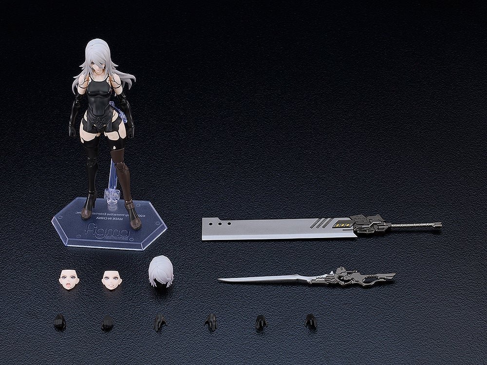
Girls' Frontline 2: Exilium Figma figurine Klukai 16 cm Max Factory
Plus d'information sur france-figurines.fr/girls-fr…
Figurine articulée de Klukai en PVC tirée du jeu vidéo Girls' Frontline 2: Exilium, dans la gamme figma de Max Factory. Elle mesure environ 16…

3

Pretty UI is a rounding error.
If your product underperforms, it is rarely because the interface is not pretty enough.
Yes, good design matters. But in most SMEs I work with, the real conversion killer is much less glamorous:
People land in your app/portal/SaaS and they do not know what to do next.
So they hesitate. They click around. They bounce. Or worse, they complete the wrong thing and then your ops team gets the angry email.
The other common culprit is even more predictable:
You built the journey on internal opinions instead of evidence.
It happens with the best intentions. A senior person says, "Our customers will want X." A stakeholder says, "Competitor Y has this." Someone else says, "Make it cleaner and more modern." Then you end up polishing the wrong thing very nicely.
If you want a practical fix (that does not require a 12-week discovery phase and a small novel of documentation), do this before you open Figma.
Step 1: Write the one-sentence job-to-be-done.
Not a feature list. Not a mission statement. A single sentence that finishes this:
"When I am in situation X, I want to do Y, so I can achieve Z."
Examples:
- "When I need to reorder stock, I want to do it in under 2 minutes, so I can get back to serving customers."
- "When I need to submit a claim, I want to know exactly what is required, so I can get it approved first time."
If you cannot write this sentence, you are not ready to design. You are about to design vibes.
Step 2: Speak to five real users.
Five. Not fifty. You are not trying to produce statistically significant research. You are trying to stop guessing.
And here is the part most teams get wrong: do not ask what they would do.
Ask about the last time they tried to do that job.
"Tell me about the last time you tried to [do the job]. Where were you? What triggered it? What did you do first? What got in the way? What did you do when you got stuck?"
People are brilliant at describing what happened.
They are terrible at predicting what they will do in a hypothetical future.
Step 3: Map the next step.
Once you have those five conversations, you will spot patterns fast:
- The moment they get confused
- The words they actually use (which will not match your internal terminology)
- The hidden steps you assumed were obvious
- The workaround they already do (usually in email and spreadsheets, because of course they do)
Then, and only then, open Figma.
At that point, the interface decisions get easier because you are not designing "a dashboard". You are designing a clear next action for a specific person in a specific moment.
The design will almost draw itself.
And if you still want it to look lovely at the end, great. Just earn the right to polish by making it obvious what to do next.

6


デザイン領域での応用難しそうですね。
例えば終了条件を「デザインマスターと本番コードの一致」にして、毎朝figmaのデザインデータとgithubのmasterリポジトリを比較させ、差異があればClaude to figmaでデザインマスターを最新化させる、とか出来ると人間による保守コストの削減になったりしそうですね。
1
1
29

育休明けのキャッチアップで今更ながらOKLCHなるものを知りました....まだFigma対応できてないのかな。。
16 Jul 2024

OKLCHカラースペースが便利だったのでnote記事をかきました!デザインシステムのカラーパレットを定義したいときに便利なので、ぜひ読んでみてください。
カラーパレットのコントラスト比を揃えるのにOKLCHカラースペースが便利だった|よつくら @_yotsukura #note note.com/yotsukura/n/n89997b…
8

When will Figma provide design system management? These components are orphans. Mostly for one-off ideation but not that helpful if it isn’t integrated into a design system.
2