


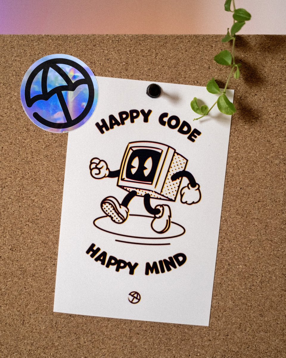


ALT A jolly looking CRT monitor with arms and legs, with the tagline above and below it reading “happy code, happy mind”, and the poolside parasol logo


ALT Colorful mid-century modern inspired books for Vercel Guides, with input from @prekesh__'s Open Graph illustration explorations.

ALT Upcoming centred article design for the blog, optimized for Vercel's typeface family, Geist and Geist Mono. Created alongside @henryheffernan, @oyaaaaaaaasumi, @stylesshDev, @typicalmitul and Fede.
ALT Black and white vercel.com hero inspiration using Japanese localisation, made in tandem with @raunofreiberg

ALT Code owners marketing demonstration, showing a code ownership tree, inspired by @dizzyup's initial interface exploration.
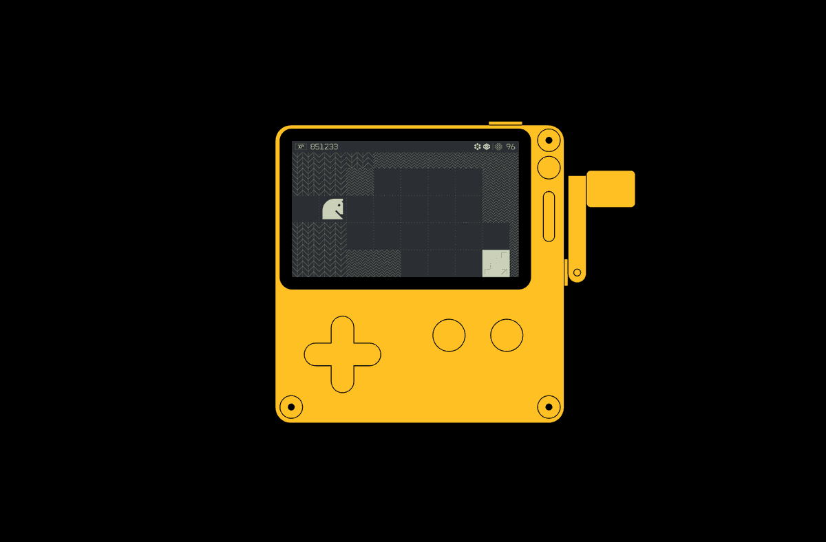
ALT Art direction and branding for QuestyChess, a video game for the Panic Playdate — a handheld console. Shows a full grid-based design language, utilises simple and scaleable elements for optimal legibility and a simple graphic interface that evokes a 'terminal' aesthetic from the early 1980s. https://arkotype.co/project/questy-chess
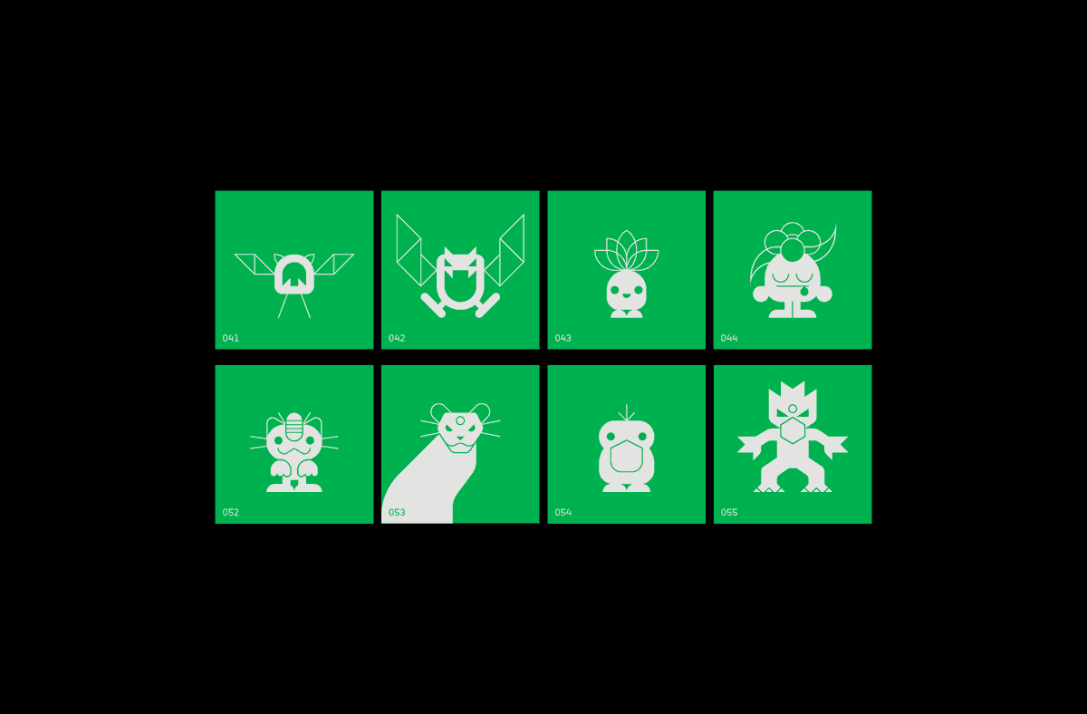
ALT A print project based on Pocket Monsters. The print features all 151 of the first generation of monsters - Each designed utilising a 40x40 grid - and the prints were produced in various colours in reference to the 4 variants of the game released in Japan. https://arkotype.co/project/pm151
![SONY® PlayMan — Mk.1 [Concept], a handheld gaming console. Explores an alternate reality where Sony released a gaming portable which was fundamentally different to the PSP. The design is directly inspired by the Minidisc Walkmans of the mid 1990s and the goal was to reference an era of product design that was perhaps less elegant but equally as charming.
In addition to the hardware itself, a brand for the product was imagined which directly references Sony's famous 'WALKMAN' typeface, as well as other elements of the product including an LCD headphone remote which would display game information, and the design of the MiniDiscs. https://arkotype.co/project/sony-playman-concept](https://venexa.site/media/GUdccdWXEAAUPbO.png)
ALT SONY® PlayMan — Mk.1 [Concept], a handheld gaming console. Explores an alternate reality where Sony released a gaming portable which was fundamentally different to the PSP. The design is directly inspired by the Minidisc Walkmans of the mid 1990s and the goal was to reference an era of product design that was perhaps less elegant but equally as charming. In addition to the hardware itself, a brand for the product was imagined which directly references Sony's famous 'WALKMAN' typeface, as well as other elements of the product including an LCD headphone remote which would display game information, and the design of the MiniDiscs. https://arkotype.co/project/sony-playman-concept
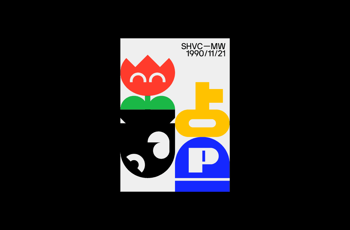
ALT A limited edition print to celebrate the 25th anniversary of the Japanese release of the Super Famicom title Super Mario World. The design takes cues from graphic objects and enemies found throughout the game. https://arkotype.co/project/smw-025