
Nuclear engr prof, S/W developer, energy analyst (he/him/his). My postings here are my own & do not necessarily represent my employer. @gonuke.bsky.social
Joined July 2007
- Tweets 5,938
- Following 961
- Followers 1,683
- Likes 6,421
250 Photos and videos


25 Oct 2024
I did my part to #FillTheHill this morning - come and help out our department with your own contribution l.facebook.com/l.php?u=https…
25 Oct 2024

WAKE UP and smell the FUNds! Pour yourself a cup of flamingo fuel and join the flamingo foolery! ☕️🦩uwflamingos.com/wisalumni24
#UWflamingos

1
8
242
19 Sep 2024
I had a great time covering a variety of topics in my visit to the @NuclearTitans podcast. Thanks for inviting me to talk about my own journey, my research, and my outreach interests.
19 Sep 2024

Listen in to our latest episode featuring Paul Wilson, Chair of the Department of Nuclear Engineering & Engineering Physics at the University of Wisconsin-Madison. This episode is another installment in our Titans of Teaching series, which highlights standout professors.

3
274
Paul P.H. Wilson⚛ retweeted

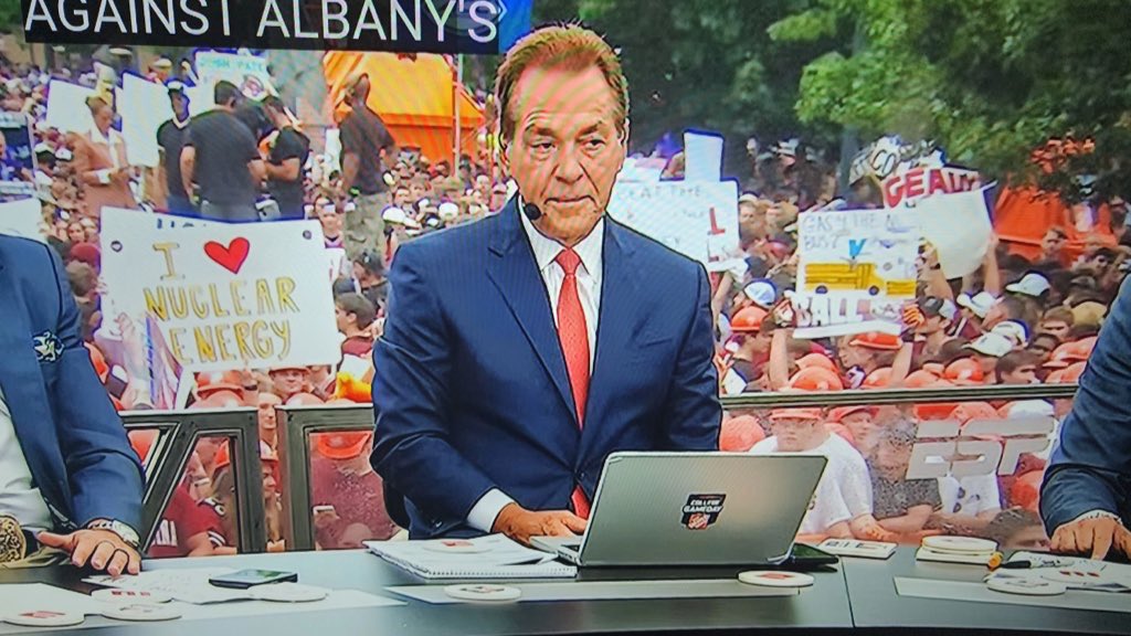
Things are getting real. Special props to @NA_YGN and @UWMadisonNEEP for getting nuclear energy front and center on @CollegeGameDay and @FOXSports Big Noon Kickoff 🏈⚛️
2
10
76
4,578
19 Aug 2024
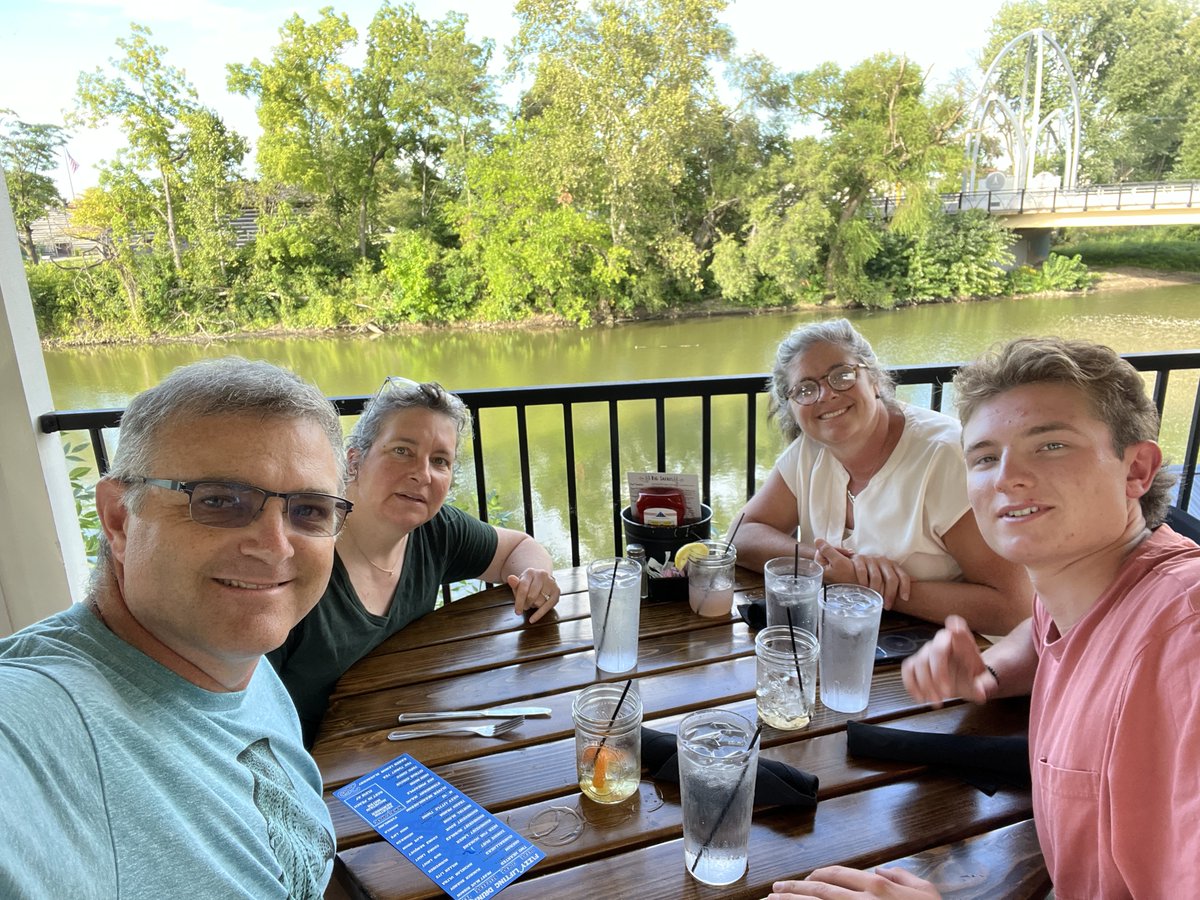
6 days, 2096 miles of driving (~45 hours behind the wheel), $283 in tolls, $317 in gas, 5 return trips across the GW Bridge, 1 meal with my sister/nephew in central Indiana... Operation Move Moira is complete without incident
ALT Four people sit at a dinner table under a gazebo at river's edge in Fort Wayne, IN
4
219
18 Aug 2024
New paper alert:
Contrastive Machine Learning with Gamma Spectroscopy Data Augmentations for Detecting Shielded Radiological Material Transfers mdpi.com/2913658 #mdpimathematics via @MathematicsMDPI
1
148
26 Jun 2024
It was great to participate in the @UWMadison #175 celebration at @shinefusion in Janesville yesterday. We discussed how @UWMadisonNEEP played a role in the ideas that led to this new exciting technology
25 Jun 2024

UW-Madison is celebrating its 175th anniversary Tuesday with an event that recognizes the launch of new technology to fight cancer. wmtv15news.com/2024/06/25/sh…
199
Paul P.H. Wilson⚛ retweeted

Don't miss #FastestPathToZero's @deniadjokic, @AnnV_H & @ToddAllen5 at the #ANSannual session: Integrating Socially Led Co-Design into Consent-Based Siting of Interim Storage Facilities w/ @kuhika @gonuke & Hank C. Jenkins-Smith.
TOMORROW (6/19) at 8AM PDT in Banyan C.
1
1
173
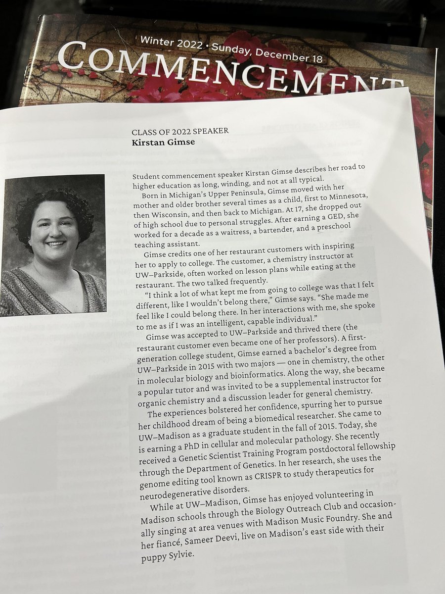
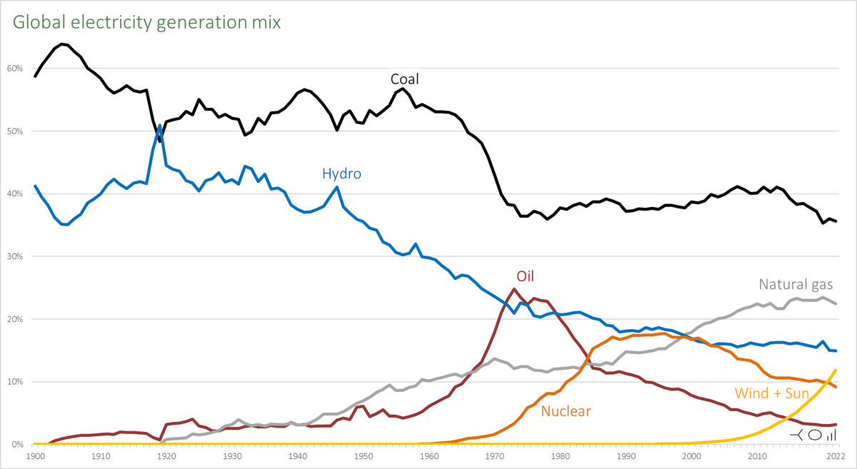
10 Mar 2024
Do none of the commenters (or the OP) want to acknowledge that this a graph of the *SHARE* of generation and not the absolute generation? Nuclear energy, for example, generates roughly as much today on a global basis as it ever has
9 Mar 2024

In terms of share of global electricity output, coal peaked in 1905.
Hydro peaked 100 years ago. Oil before the, well, oil crisis.
Nuclear peaked in the 1990s and gas, maybe, has just passed its peak.
And then there is the yellow line...
1
3
609
12 Feb 2024
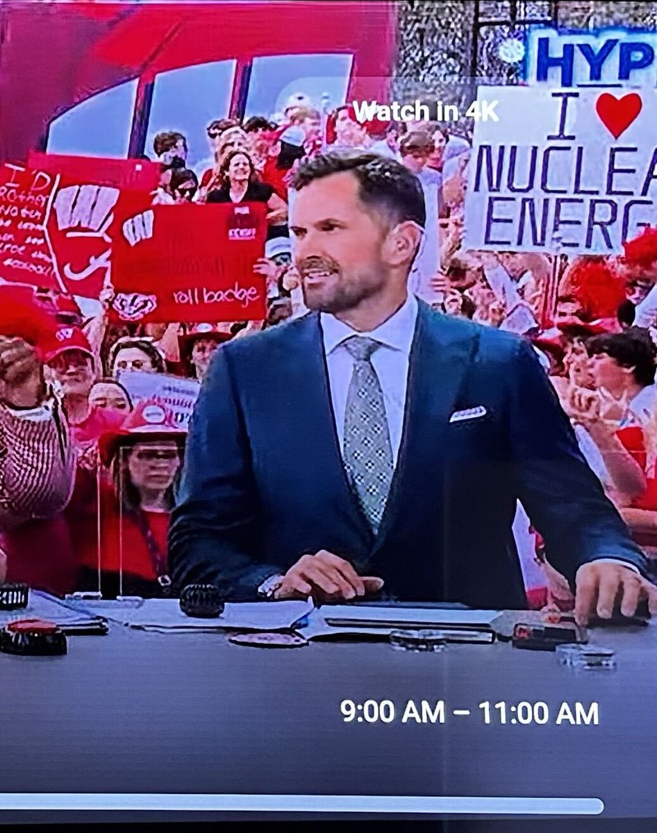
Super Bowl halftime analysis has the same guy sitting at both ends of the desk!
244
Paul P.H. Wilson⚛ retweeted

22 Nov 2023
Them: Don't talk about gerrymandering during Thanksgiving
Me:
195
7,254
52,098
3,515,287
20 Nov 2023
I have a few invite codes to share with mutuals for that other place, especially to beef up #nuclearSky or #energySky
2
440
20 Nov 2023
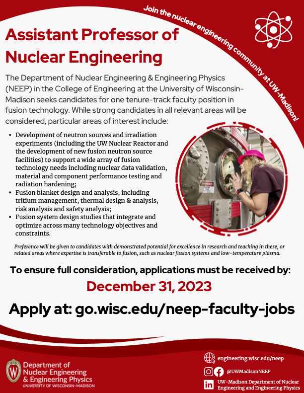
ICYMI - @UWMadisonNEEP in @UWMadEngr seeks candidates for one tenure-track faculty position in fusion technology. Candidates who are able to transfer experience from nuclear fission system design and analysis to fusion technology will be considered. go.wisc.edu/neep-faculty-job…
ALT A flyer for a tenure-track job posting - all details in accompanying link
2
1
507
13 Nov 2023
Congratulations to @UWMadisonNEEP alumni Andy Klein on becoming a Fellow of the @ANS_org , and Patrick Snouffer (@snoupa of @zeno_power ) for being awarded the Young Member Excellence award
1
3
741
15 Oct 2023
Where are the big brands all going when they leave here? How do we engage their customer service in a meaningful way?
1
274
Paul P.H. Wilson⚛ retweeted

20 Sep 2023
Learn about Dr. Sara Villari's DTE3 research these past weeks at the JET tokamak, on water activation in fusion devices. Crucial insights for the future of #fusionenergy. Watch now! youtu.be/TFITTdkKjjU #Road2Fusion @ConsorzioRFX @ENEAOfficial @UKAEAofficial
4
7
587

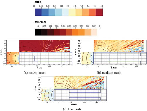
Our paper "Shutdown Dose Rate with Cartesian Mesh for High-Energy Nuclear Systems" uses model-based reaction rates for activation on mesh for systems like SNS. Thanks to Nancy Granda-Duarte for all the work to make this happen & to our @ORNL collaborators.
tandfonline.com/doi/full/10.…
1
2
251
6 Oct 2023
1
1
472
29 Sep 2023
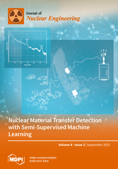
Our paper "SNM Radiation Signature Classification Using Different Semi-Supervised Machine Learning Models" was chosen for the cover art of this special issue. Thanks to Jordan Stomps for his leadership on this work. mdpi.com/2373534 #mdpijne @MDPIOpenAccess @uw_cnerg
ALT Journal cover art depicting radiation spectrum and map of facility where spectrum was measured.
1
3
192