


18 Apr 2024
If u have an iPhone hmu there’s lots of really good apps for using it to make music outside of a DAW esque framework (Audulus etc)
1
3
182

Audulus 4.3 is out now! You can do a LOT more with the Free version! Multicore processing in Audulus Pro gets up to a 400% speed boost! synthtopia.com/content/2023/…
3
17
674

18 Oct 2023
Principles of Design:
Things that look more aesthetically pleasing are perceived as easier to use
This is called the ‘Aesthetic-Usability Effect’. Actually, the research evidence for this is mixed, but given how biased we seem towards beauty, and how forgiving we are of flaws in things we consider attractive, I would be more surprised if this is not true.
Note that this rule is about perception, not reality. There are plenty of apps, including some of the ones pictured below, that are beautiful but have a steep learning curve or have some other aspects of their design that may not make them enjoyable to use, despite how pretty they are. Speaking personally, though, I tend to want to use apps I find aesthetically pleasing much much more than apps I find ugly.
There are definitely people who care about beauty less than others, and that is fine. These people are actually lucky, in many ways! But if I find an app is ugly, I need a very compelling reason to keep using it if there are alternatives I could use instead.
These are a few UIs of iOS music production apps that I personally like a lot - this list is by no means exhaustive, these are just a few of my top picks! Names here, photos below.
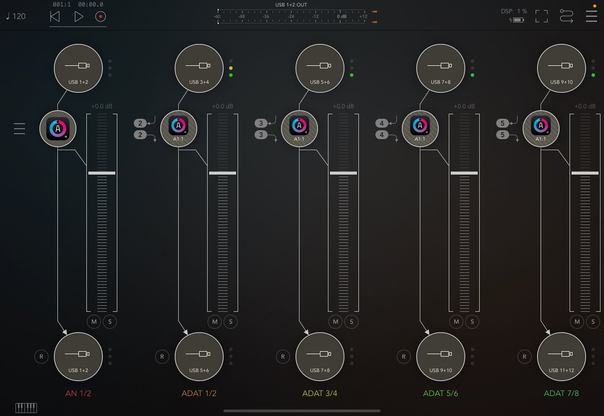
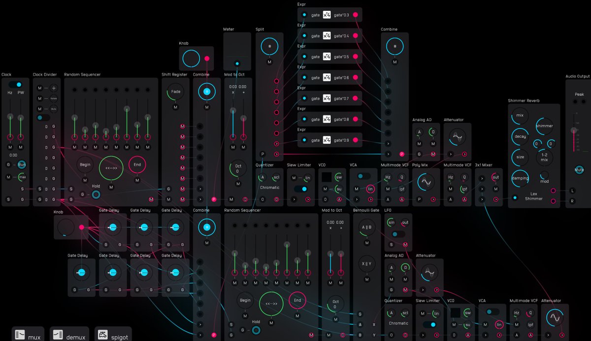
Audulus
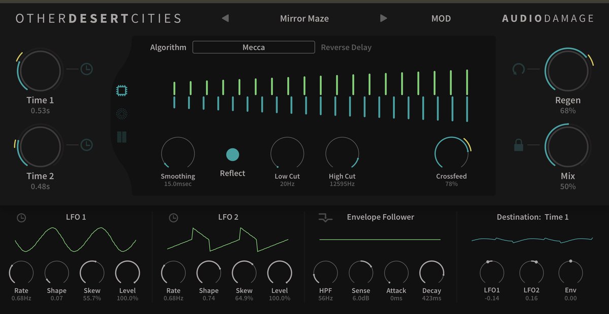
Audio Damage Other Desert Cities
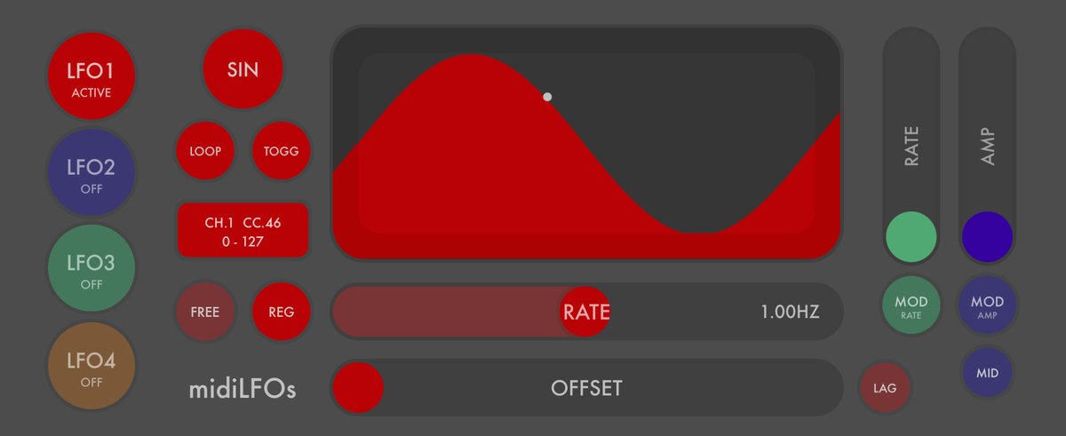
Art Kerns midiLFOs
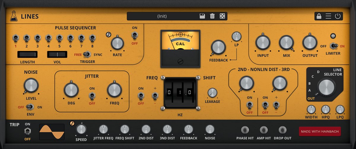
AudioThing Lines
Bleass Motion FX
BeepStreet Combustor
Bram Bos Fluss
John Howes Strokes
Michael Tyson Loopy Pro
Corne DriesProng Cykle
FabFilter Saturn2
sqsl Circle
PS: See my tweet from yesterday for a giveaway of 10 monthly subs for the Transcriptionist app by Wooji Juice!
#design #app #UI
4
1
12
1,311

13 Sep 2023
こちらのモジュール、Audulus(iPadのモジュラーApp)と併用で使ってるお客さまがいて、めっちゃ便利だなーと思ったモジュール…!!
13 Sep 2023

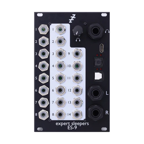
Expert Sleepersからユーロラックモジュラーの為のオーディオインターフェース、ES-9が入荷しました!ラック内でパッチするだけでDAWへ録音でき、音楽への集中度が高まります。CV入出力にも完全対応。小型版のES-8も在庫あります。ESはDisting EX/mk4も入荷しました!
clockfacemodular.com/collect…
1
2
2,819
29 Aug 2023
This ebook trilogy by @Rofilm1 - around 900 pages total - on making #generative music using #modular looks interesting. I don't use hardware, but bet these would be useful for people exploring tools like #Audulus and #mirack on iOS, or #vcvrack
dev.rofilm-media.net/node/59…
@audulus #synth #experimentalmusic #Eurorack
1
10
576

27 Jun 2023
Borderlands Granular is coolish but adjusting the granulators is a bit plain apps.apple.com/us/app/border…
Audulus is super flexible but also fairly normal modular graphs apps.apple.com/us/app/audulu…
Bloom is a classic tho it’s closer to an instrument than a DAW apps.apple.com/us/app/bloom/…
3
373

24 Jun 2023
2
5
818


16 Jun 2023
2
10
898


26 May 2023
Touché, and my apologies. That's fair. I honestly forgot that was a thing, searching past purchases; I'm so used to just finding things on the App Store🤦♀️
Fwiw, Audulus is one of those things I look at and go "that's amazing looking!" and my ADHD brain goes "nope." 🙃
1
2
30

15 May 2023
お久しぶりに電子楽器烏合の衆に伺いますー!
私めの目的はAudulusを使いこなせるようになること…!
そしてそしてOHPを持っていきます…!
実験させていただきます…!
5 May 2023

🐣電子楽器 烏合の衆の再履修
🍘電子楽器(実機)と仲良くしたいみんな向け、おやつ食べながらのシンセサイザー自習室です。
シンセ一個もわからん人は、まず触ってみましょう。経験あるけど知識ふわふわな中級者以上の方もどうぞ。
誰も一回では理解しきれないですからご安心のうえ加わってください。

1
1
4
1,043


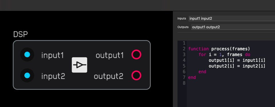
. @Audulus modular on iOS, macOS now lets you add your own DSP easily with Lua scripts. Code your own modules! cdm.link/2023/04/audulus-mod…
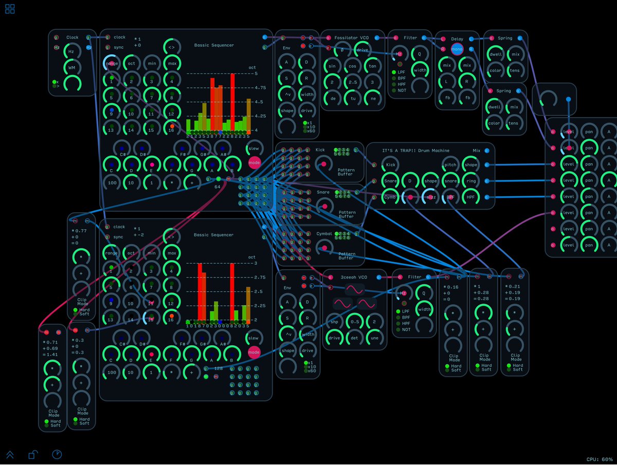
4
33
10,661
Primitives Demo patch available on our Discord!
Star the repo here: github.com/markalanboyd/Audu…
#lua #programming #audulus

1
447