
One of the fastest military-industrial growth rates the modern world has seen.
Source: DataExplained
voronoiapp.com/current-event…

8
No incoming Fed Chair has inherited inflation this high since Paul Volcker took over in 1979. Kevin Warsh has his work cut out.
Source: @dataexplained
voronoiapp.com/economy/Every…

14
96km is all that separates the Americas from having a single continuous road from Alaska to Argentina. And Highway 1 in Australia, a 14,500km thoroughfare circling an entire continent, is the longest road on earth, looping a country of just 27 million people.
Source: @dataexplained
voronoiapp.com/maps/Mapped-T…

10

May 14
🪖 U.S. Wars Ranked by Cost Per Day
1. Iran Conflict 🇮🇷
$1.88 Billion per day (first 6 days)
2. Iraq War 🇮🇶
$684 Million per day
3. Korean War
$355.3 Million per day
4. Afghanistan War 🇦🇫
$315.1 Million per day
5. Vietnam War 🇻🇳
$137 Million per day
Source: DataExplained / Al Jazeera / The Data Project
36
43
467
66,540

May 1
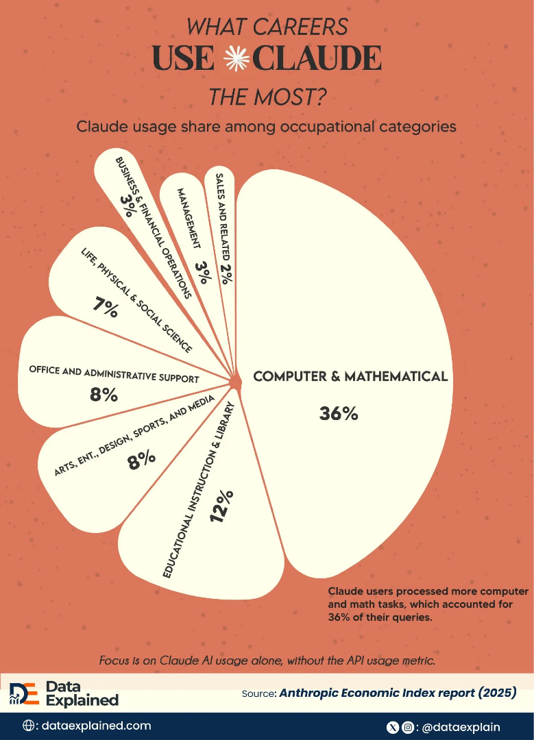
What Occupation Uses Claude AI the Most? 🤖
DataExplained explores this trend here: voronoiapp.com/category/What…
1
4
15
968

People are asking real questions every day:
Why is everything more expensive?
Is my income actually improving?
Something is happening globally, how does it affect where I am?
The answers exist.
But they’re buried in long reports, PDFs, and data nobody has the time or patience to understand.
That didn’t sit right with us.
It's why we started DataExplained (@dataexplain)
We're not a team of hundreds, but we are trained journalists, visual illustrators, and data analysts.
It comes down to this:
Data stories become more understood when we’re able to explain contexts in their simplest, true form.
We want to be able to take a credible data, make it understandable through visualization, and then provide context behind the numbers in a balanced, ELI5 way.
Because what’s the point of data if people can’t actually use it?
Some platforms present data in a way that feels too academic. Others simplify it but strip away the context.
We’re building something different.
A place where data is:
1. visual
2. clear
3. and actually useful in real life
We want to help people understand the world they live in, using numbers that already exist, just explained better.
If you’ve ever:
1. questioned what’s really going on
2. argued a point and wished you had the data to back it up
3. or just wanted clarity in a noisy world
Then you’re exactly who we’re building for.
Follow along: @dataexplain

1
2
75
When we think of dangerous animals, large predators usually come to mind, but the real threat often comes from much smaller sources. Mosquitoes top the list because they spread diseases like malaria and dengue, while human activity accounts for hundreds of thousands of deaths each year through violence and conflict. Animals such as snakes, dogs, and crocodiles cause far fewer deaths in comparison, mostly due to venom, rabies transmission, or rare but deadly encounters.
#interestingengineering #sciencefacts #dataexplained #globalhealth #nature

1
3
10
1,618

Jan 21
In this episode of Top 10 Trends 2026, we examine a major global lifestyle shift - the steady decline in alcohol consumption.
In this eye-opening clip from a discussion with Ruchir Sharma, discover how Americans drinking alcohol has dropped to the lowest since the 1930s (66% to 54%), mirroring declines in the UK and Russia due to health awareness that even moderate drinking harms.
Alcohol stocks have tanked 65% this decade while markets soared 158%, signaling a global shift, cannabis rises as an alternative with fewer side effects. India stands alone with consumption up 2.5%, bucking the trend amid rising awareness worldwide.
Watch the full forecast on shifting habits, stock impacts, and why things are accelerating.
Live on DeKoder: youtube.com/live/m1QY0S7GgqU…
Presented by 360 ONE and Powered by India Sotheby's International Realty
#Top10Trends #PeakAlcohol #GlobalTrends #LifestyleShift #PublicHealth #DataExplained #AlcoholDecline #DrinkingHabits #EconomicForecast
2
9
43
2,690

Data looks both ways.
Descriptive = past. Predictive = future.
You need both to make smarter decisions.
#DataExplained #Analytics #fyp #dataanalysis #datascience
1
5
85
Bad data doesn’t just give wrong answers.
It creates confident mistakes.
#data #dataliteracy #dataanalysis #dataevangelist #DataExplained
1
5
59
Insight is where decisions change, money is made, and mistakes are avoided.
Most people stop at information. Winners go for insight. 🚀
Want to finally understand data without the jargon? Follow me for more.
#DataExplained #DataVsInformation #InsightMatters #DataEducation
3
33

17 Dec 2025
When we think of dangerous animals, large predators usually come to mind, but the real threat often comes from much smaller sources. Mosquitoes top the list because they spread diseases like malaria and dengue, while human activity accounts for hundreds of thousands of deaths each year through violence and conflict. Animals such as snakes, dogs, and crocodiles cause far fewer deaths in comparison, mostly due to venom, rabies transmission, or rare but deadly encounters.
#interestingengineering #sciencefacts #dataexplained #globalhealth #nature

2
8
17
2,610

23 Apr 2024
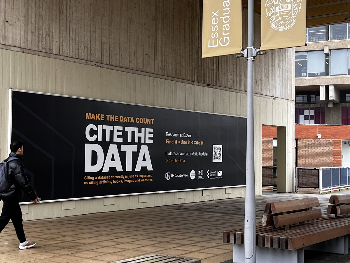
Great advice here from Univ of Essex, and one that @RDS_Scotland and @ScotStat definitely encourage in Scotland. Fortunately with @adr_uk improving guidance we now produce #userguides, #datadictionarys and #dataexplained reports - to name the dataset used in research!!
23 Apr 2024

Make the data count @ResearchEssex.
Citing a dataset correctly is just as important as citing articles, books, images and websites.#CiteTheData @Uni_of_Essex @UKRI_News @ESRC
4
233

24 Feb 2024
In today's @DataBreedAfrica #DataExplained, we look at the main SQL Sub Languages.
1. DML - Data Manipulation Language
2. DDL - Data Definition Language
3. DQL - Data Query Language
4. TCL - Transaction Control Language
5. DCL - Data Control Language
Retweet to help another soul
1
2
2
134
20 Apr 2023
Great to have completed our first #dataexplained document, created to help @adr_uk colleagues when using the Scottish Government’s Longitudinal Looked After Children Dataset. bit.ly/3Ad1COo
@ADR_Wales @ScotStat @ADRC_NI @RDS_Scotland

6
10
500

Read this #DataExplained from @ADR_Wales and @MickeyLJ on the @HAPPEN_Wales dataset!
adruk.org/fileadmin/uploads/…
Make sure to also click the video below to learn more about its focus on children's health and wellbeing.
9 Mar 2023

A new Data Explained publication from @MickeyLJ reviews the @HAPPEN_Wales dataset and its focus on children's health and wellbeing. Listen below 👇and read here 👉 adrwales.org/6329/
youtu.be/5MH2aP12KkY
2
2
376

The latest in a new series from our #CentreOfExcellence @ADR_Wales, #DataExplained, is aimed at approved researchers using pathology data... 'we see the utility & strengths of these data being used as part of ongoing research and intelligence in #Wales'...
popdatasci.swan.ac.uk/wp-con…

4
7


28 Jul 2021
DataExplained - dataexplained.net/ - helps scientists and data analysts explain their analytical choices more transparently...users can obtain a graphical representation of their workflow to help them communicate their analytical choices to others
#ukrnLeeds
26 Jul 2021

Academics come to vastly different research conclusions even when given the same questions and dataset, raising the need for scholars to meticulously document the decisions and judgements they make during their work, a @esmtberlin study has found.
bit.ly/3iEqSUB
1
3
3

19 Jul 2021
The first of many amazing and important deep dive projects from the @dct_media data team is now live🥳. #datajournalism #datamatters #dataexplained thecourier.co.uk/fp/news/loc… via @thecourieruk
1
3
8